SMT201 AY2019-20G1 EX1 Seah Si Qi Christel
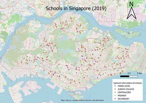
1a) The map above shows the distribution of the different levels of schools across Singapore, which allows us to better see the concentration of different levels of schools in which areas. From the map above, we see that primary schools are the most prevalent and are evenly distributed across Singapore. In the North and West areas, we see an evident lack of junior colleges. Finally, an open street map was added for better representation of the school distribution.
1b) The map above shows the network of roads in Singapore.
1c) Land use maps shows the current and potential uses of a piece of land. The areas I chose to represent in the map eg. Agriculture/cemetery are potential areas for development in Singapore, given the issue of land scarcity which. We see that land use for residential purposes make up majority of land use as Singapore’s land scarcity issue makes it necessary to have more residential dwellings to accommodate the high population density
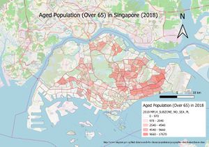
2a) Aged population (+65) in 2010 and 2018. From both 2010 to 2018, spatial distribution of the aged population did not vary much as it still remained much concentrated in the North East Areas (etc Serangoon and Bedok). While doing data preparation, I initially encountered the problem of my values all having the data type of text instead of integers (which returned null) This was circumvented by replacing all the blank values by 0 and formatting the cells (changing to numbers in the csv file). I later derived the aged population (above 65) and represented it on the map. Looking in terms of absolute numbers, Singapore is indeed facing an ageing population (610 to 970) in the first category classification. One pro of such a classification method is that one can immediately gauge how much the aged population increases in an area based on absolute numbers. However, the clustering of many shades of colour in an area may make it hard to compare and quickly draw conclusions from it.
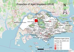
2b) Proportional of aged population in 2010 and 2018
Representing proportion is a good way to easily compare the changes in the portion of elderly persons. From the map above, we can easily see which areas has the greatest increase in elderly population
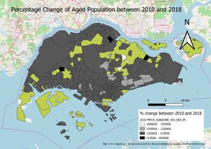
2c) Percentage change of aged population is derived by taking 2018-2010, then divided by 2010.Areas with the lightest shade has the largest percentage change


