SMT201 AY2019-20G1 EX1 Lin Xing
Part 1: Thematic Mapping
Primary School Allocation According to Subzones
In order to have more information about Singapore School, three different layers were made. Apparently, the further from central of Singapore, the more numbers of primary school are allocated.
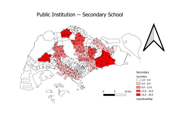
Secondary School Allocation According to Subzones
As you can notice from graph above, allocation of Secondary school is pretty much similar to Primary School. In certain extent, Singapore has put in a lot of efforts to make sure basic education is available for all kids.
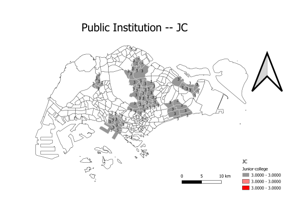
Secondary School Allocation According to Subzones
From the thematic map above, you can notice all JCs are located nearer to central area. Each subzones has same number of JCs.
Overall, we can tell that, Singapore has allocated schools well for its residents. Allocation of primary schools and secondary schools are able to fulfill kid's basic education. On top of that, adding up other types of schools, it will not be too crowded as seen from map.
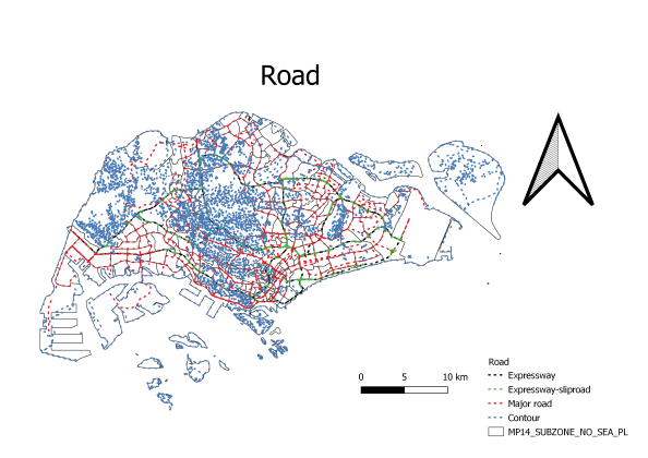
Road Network System
In order to differentiate types of roads in Singapore, different colors were presented in the map. As different colors are relatively more noticeable, it could effectively help the readers knowing the roads without referring to legend too many times.
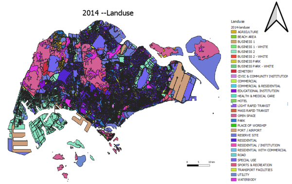
2014 Land use
Different colors were used to categorize different purpose of land using. Even though there are too many category in the thematic map. We can still observe that:
Most part of land are: 1. Open Space 2. Residential 3. Business
Part 2: Choropleth Mapping
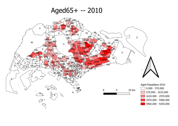
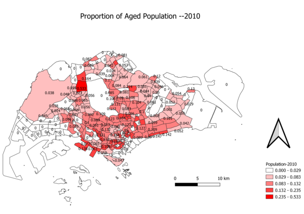
Age Population 2010
As you can see from above graphs. In 2010, aged population is generally less than 10% for each subzones
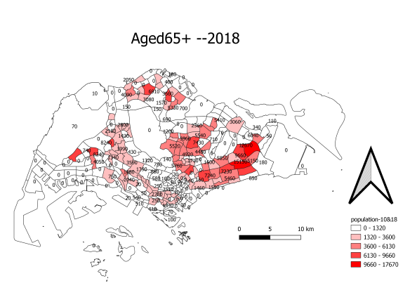
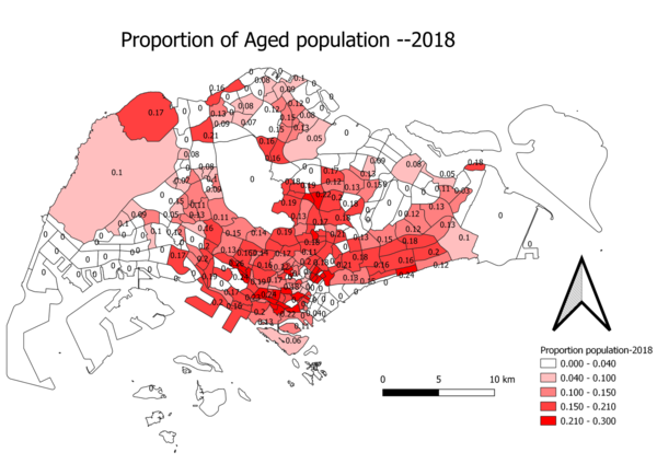
Age Population 2018
In 2018, aged population in most of subzones has increased to more than 10%
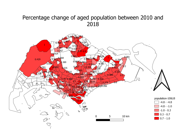
By comparing 2010 and 2018 aged population, we can easily find out that the proportion of aged population has significantly increased. In other words, the total population did not increase too much in past few years. Thus, the proportion increased further.
Age Population 2018
First of all, all the data above are categorized by Subzone. In order to let people easily observe the difference between 2010 and 2018, I used same theme color. However, not only the different between colors, another graph is added at the last to tell the percentage of changes from 2010 to 2018. As you may notice, most of subzones are filles in deep red color. In other words, they had increased more than 50% in aged population.

