SMT201 AY2018-19T1 EX1 Soh Ze Yu
Contents
- 1 Part I
- 2 Part II
- 2.1 Number of Aged Population (65 and Above) in Singapore for Year 2010
- 2.2 Number of Aged Population (65 and Above) in Singapore for Year 2018
- 2.3 Proportion of Aged Population (65 and Above) in Singapore for Year 2010
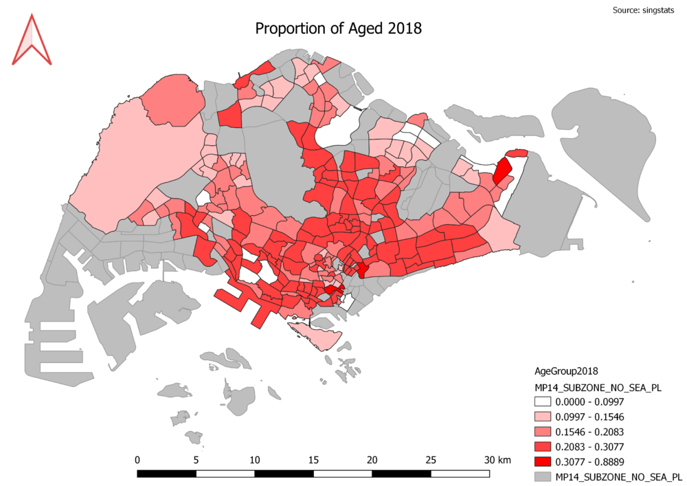
- 2.4 Proportion of Aged Population (65 and Above) in Singapore for Year 2018
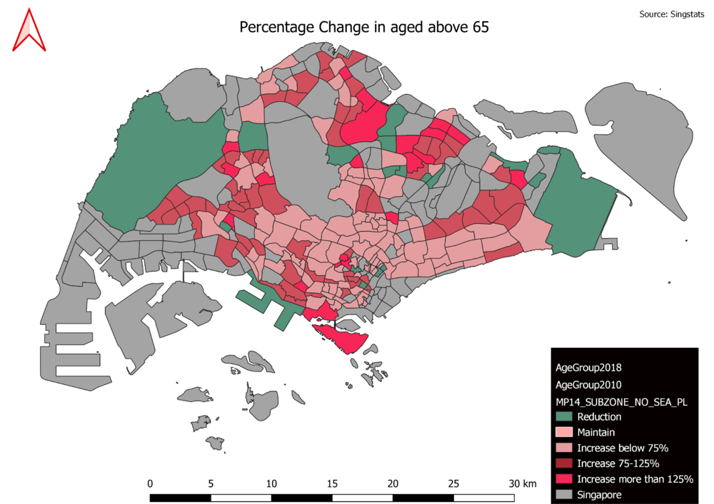
- 2.5 Percentage change of Aged Population in Singapore since 2010
Part I
Public education
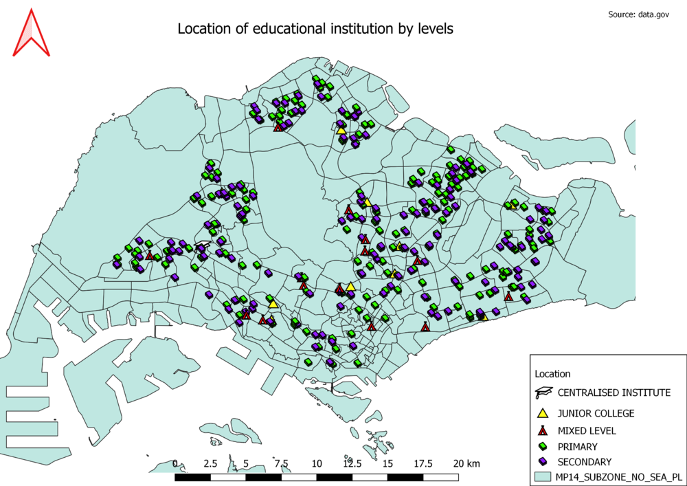
General educational institution information was found from data.gov and the excel sheet was loaded into qgis using python console. The file had already pre-categorised it into primary, secondary, mixed, junior college and centralised institutions. This information was also loaded into qgis and used to sort at the symbology table. Since secondary and primary school number the most and is easily understood, they have the same symbol but different colours. As there is only one centralised institution, it was given a larger icon to stand out.
Road type
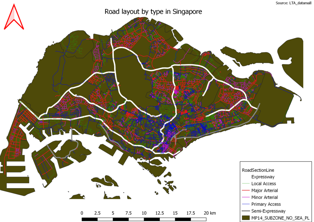
For the creation of road hierarchy, a new attribute column was created and the roads were sorted into the 6 main categories: Expressway, Semi-expressway, Major arterial, Minor arterial, Primary access and Local access. Further breakdown of category will make the classification scope too narrow and result in too complicated map design. For the major and bigger roads, their size were edited to make them more obvious and show their capacity to hold more cars as compared to smaller roads.
Master plan
For the creation of the thematic map, the initial categorisation was too messy and colourful for it to be useful for users. Hence recategorization was done on a new attribute column, grouping subtypes into main types such as residential, commercial, agriculture, recreational, infrastructure, transport, green spaces, road, water body, hospitality and others. Users who need more specific information can always click on the map for further details. Colour scheme was decided at random but specific land use was chosen for more intuitive design such as green for green spaces and blue for water body.
Part II
Number of Aged Population (65 and Above) in Singapore for Year 2010
Number of Aged Population (65 and Above) in Singapore for Year 2018
Proportion of Aged Population (65 and Above) in Singapore for Year 2010
Proportion of Aged Population (65 and Above) in Singapore for Year 2018
Percentage change of Aged Population in Singapore since 2010
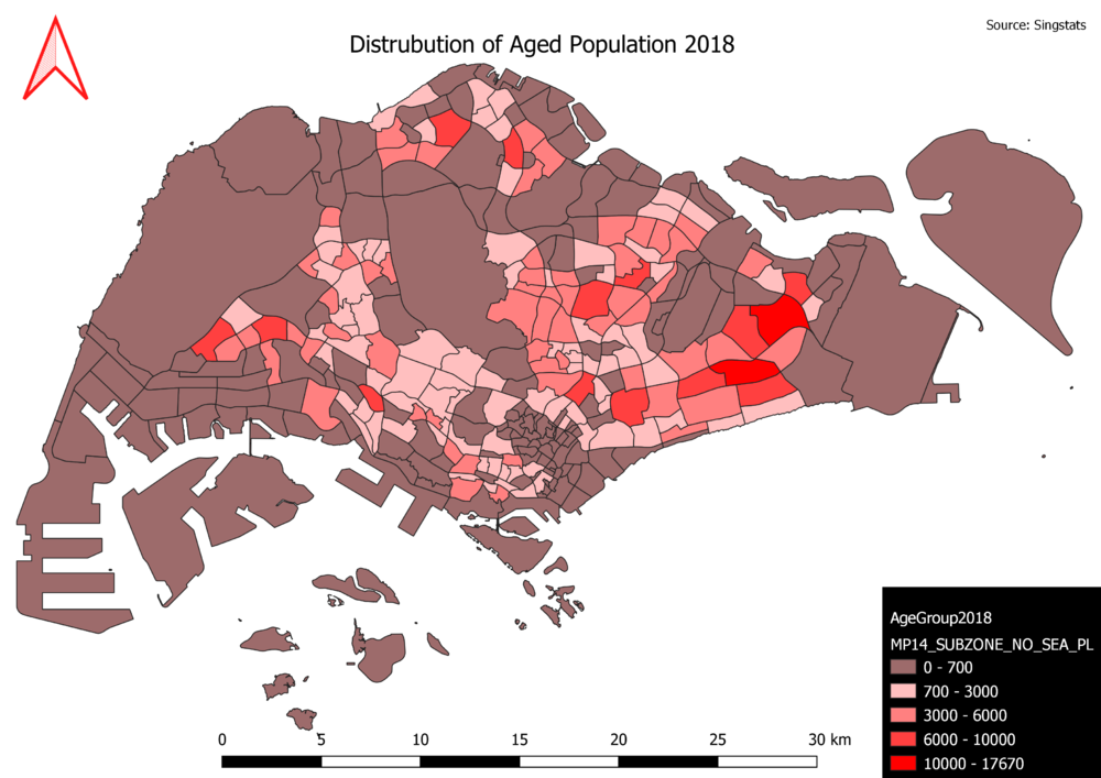
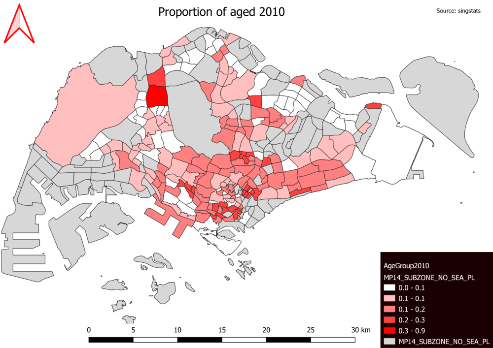
In the creation of the maps, since the main purpose was to show severity and distribution of aged throughout the areas, graduated symbology was used. For the proportion mapping, joint tables were used in conjunction with field calculator to derive the percentage of aged vs the population. For the change in percentage of aged population, the respective years had to compile a separate column of total aged 65 and above before joining with the map. Then, field calculator was used again to find out percentage change by using the difference between the years divided by the number of aged in 2010. As there were instances where there were negative percentages, it is assumed to be a reduction in those above 65 of age. When categorising, I made sure to make both legends to have the exact same bin value for better visualised comparison from 2010 to 2018. To show growth, negative percentages were binned separately and given a different colour to indicate and make reduction in aged obvious, while if there was no change, grey was used. I had to overlay a separate map(Singapore) behind as there were missing pieces of the map where there are null values due to them being commercial areas or with no residents.
