SMT201 AY2019-20G1 EX2 Eugene Choy Wen Jia
Contents
Objective
To identify a suitable location for building a National Communicable Disease Quarantine Centre.

Part One - Map Views w Roads, Buildings, Natural Areas and Elevation
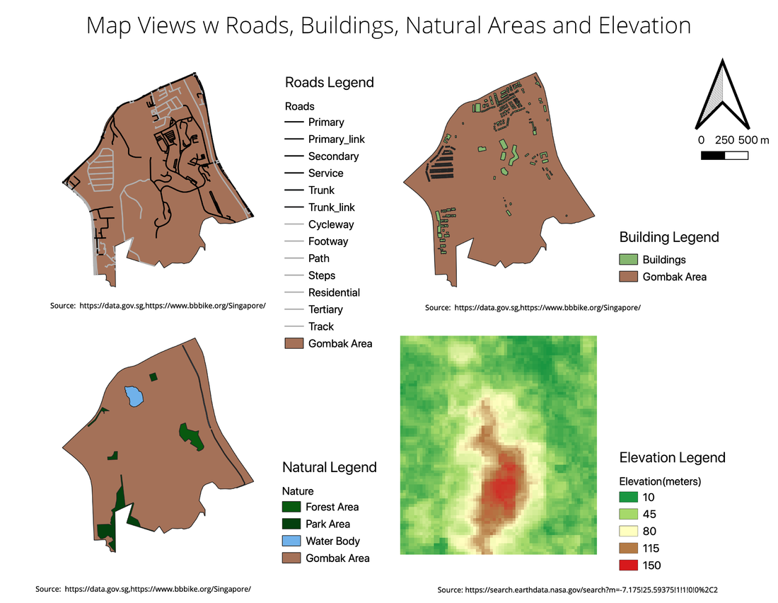
Map View w Roads
The road network in Gombak seems to be somewhat sparse as there are large areas which are not covered by roads. This will be a consideration as we are looking for suitable location that are accessible. However, the lack of road network could also suggest that there are large plot of area that might be available for our selection process. For the map view, I used black to represent the roads that can be used for transportation of materials to a suitable site. The grey roads represents paths/walkways or roads that leads to residential area which will not be used for this study. The roads indicate in grey will be excluded for the next part of the analysis such as the proximity map.
Map View w Buildings
The Buildings in Gombak is also somewhat sparse which means that are large area of land that are available for us to pick from as suggested previously by the sparse road network in Gombak. Most of the buildings in Gombak seem to be concentrated near the perimeter of the Gombak area.
Map View w Natural Areas
There are also some Natural Area features found in the Gombak Area. There are some forest and park area represented in dark green as well as water bodies represented in blue in this area. They are located near to the perimeter of the Gombak Area. However most of the natural areas seem to be near already existing buildings so it probably will not play a very huge part in the selection of area.
Raster w Elevation
The raster is represented with green being the low-lying land, yellowish to be medium elevated land and red being land that are elevated at the highest. From the raster map, it seems like the lower middle of Gombak is the most elevated part, which probably is the reason why that area seem to be the least populated with road networks or even buildings.
Part Two Proximity Raster w Roads, Buildings, Natural Areas and Slope Raster layer
Proximity Raster w Roads
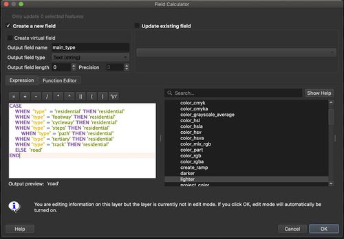
The Gombak road area is first processed to export a layer with non Residential roads first before a Road raster is generated on the non Residential Road followed by the Proximity Raster for the layer. This is because roads that links to residential area should not be considered since we will already be using buildings to represent the population. It is also unlikely for resources to be transported on those road networks.
As Accessibility is one of the important consideration for the selection of the ideal area, The Proximity Raster map is used to determine the distance of a road from a particular (5*5) pixel in the area. Green is used to represent pixels that are closest to a particular road, yellow being moderately close and red representing that a particular pixel is a big distance away from the road. The bins for the colour gives preference to pixels less than 150m away from road with the colour green and anything else more than that will be either yellow or red
Min = 0 meters Max = 768.8464965820312 meters
Proximity Raster w Buildings
Since we are trying to avoid building the Quarantine center near to the population (HDB, Schools, Public Area...), the Proximity Raster map gives preference to pixels which are at least 250 meters away from the building which is indicated with the color green as ideal. Anything lower than 250 will be labelled either yellow or red with red being alarmingly close to the buildings in Gombak.
Min = 0 meters Max = 844.0379638671875 meters
Proximity Raster w Natural Areas
It will also be ideal if the selected site can be a distance away from any natural areas in the Gombak Area. Since we are trying to avoid the area. The Proximity Raster is labelled similarly to the Proximity Raster for buildings. The raster map gives preference to pixels which are at least 200 meters away from any natural areas in the Gombak area. Any raster pixel which is at least 200meters away from a natural area is in green, anything nearer than that will either be yellow or red.
Min = 0 meters Max = 887.144287109375 meters
Slope Raster Layer
The Slope Raster Layer is created to show the degree of slopes in the Gombak Area. Green represent slopes which are less than 15 degrees while anything more than 15 will either be yellow or red. Judging from the mass of green in the slope raster, it seems like most of the slopes in the Gombak Area is somewhat of a low degree. Most of the slopes are concentrated around the center of the area.
Min = 0 Degrees Max = 34.21861267089844 Degrees
Part Three - Criterion Scores for various Layers
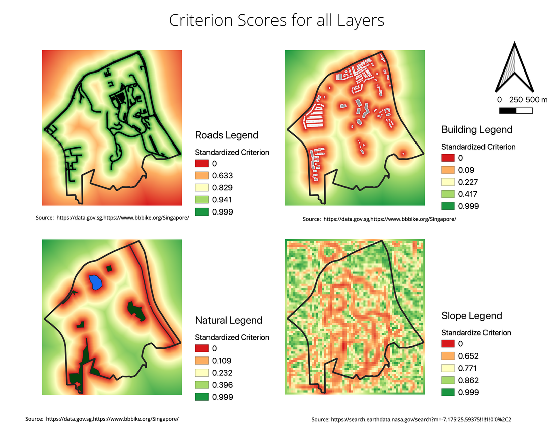
The Min-Max method is used to standardise the various raster layer to derive the various criterion score from the Proximity Rasters. Most of the reasoning for the color scheme is also similar as the one in the proximity maps.
Criterion Score for Roads
Formula: 1 - (X - 0 meters ) / 768.8464965820312 meters
The standardised score is derived by 1 - (MinMax) is because the closer to the road, the better the score should be. Therefore I applied it to show closer roads has a higher standardised score
Criterion Score for Buildings
Fomula: (X - 0 meters) / 844.0379638671875 meters
The further buildings are from the raster pixel, the higher the standardised score
Criterion Score for Natural Areas
Fomula: (X - 0 meters) / 887.144287109375 meters
The further natural area are from the raster pixel, the higher the standardised score
Criterion Score for Slope
Fomula: 1 - (X - 0 degree) / 34.21861267089844 Degrees
The standardised score is derived by 1 - (MinMax) is because the lower the degree, the better the score should be. Therefore I applied it to show slopes with a lower degree has a higher standardised score
Analytical Hierarchical Process input matrix
After inputing all the criteria into the AHP table, I realised the health risk factor is the number one consideration when selecting the plot compared to the other factors. This can be seen where the AHP score for Health Risk Factor is 0.477. The number one factor when consideration should be health risk since the main purpose of a Quarantine center is to ensure that no other human is put into health risk.
The second most important factor would be accessibility, this is for 2 reasons. Firstly, to ensure that resources are easily transported to the quarantine center when building and even maintaining the place. Secondly, patients should be able to be moved to the quarantine center easily. It does not make sense for a patient to have to be transported more than 500m from the main road to the quarantine center.
I gave same weightage for both slopes and natural conservation, however since accessibility was more important, it caused the slope AHP to have a slightly lower score than Natural Conservation. Personally, I dont feel both factors are important considerations since the top 2 purpose of a Quarantine center would be to prevent further spread of dangerous diseases as well as the ability to transport patients to the center easily.
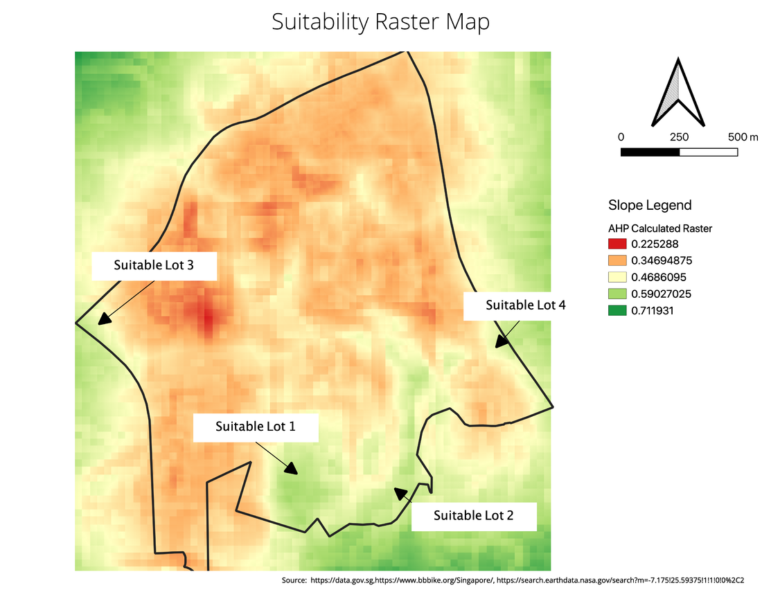
Formula for Generating Raster to evaluate suitability: ("Gombak_Raster_Proximity_Road_MinMaxz@1"*0.256)+("Gombak_Raster_Proximity_Building_MinMax@1"*0.477)+("Gombak_Raster_Proximity_Natural_MinMax@1"*0.138)+("Gombak_Raster_Slope_MinMax@1"*0.128)
Suitability Land Lots
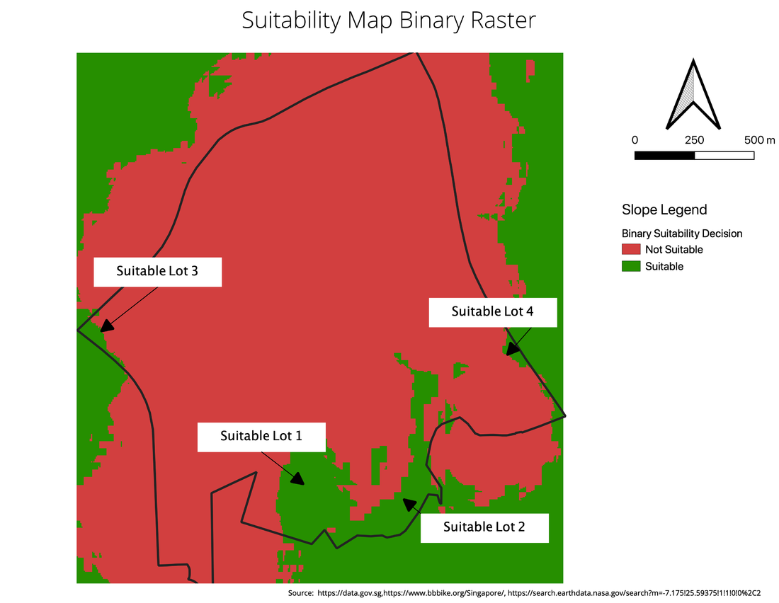
After running Raster Calculator to obtain the Raster for Suitability, I was able to identify 4 potential plots to be considered for choosing. However, I wasn't very sure if the plots were at least > 0.5 in terms of standardised score. I decided to run a Raster Analysis to Reclassify by Table to come out with a binary of Suitable and Not Suitable. Any raster pixel that was able to obtain >= 0.5 in terms of standardised score will be labelled as suitable pixel.
This was the results i obtained after choosing what is the suitable value to consider. It seems like all 4 plots of land were still suitable for consideration. I then decided to Vectorize the raster to find out the area of these plots.
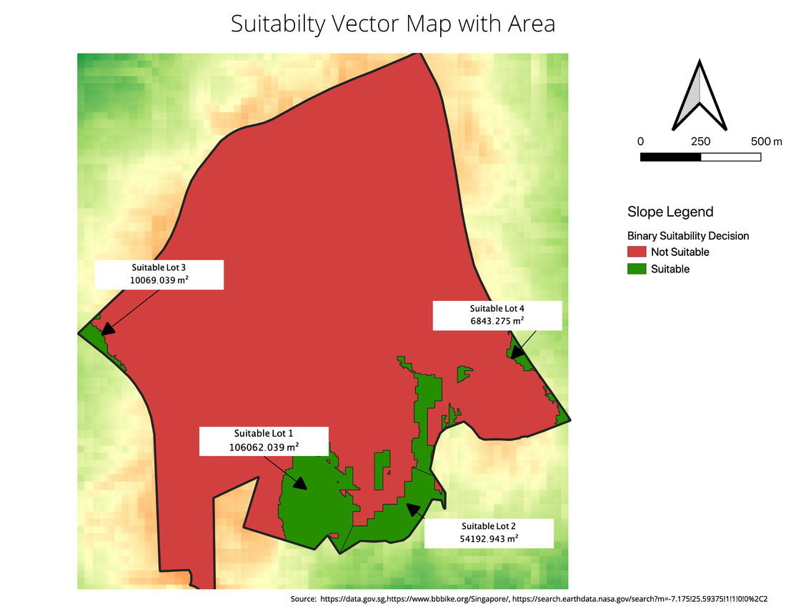
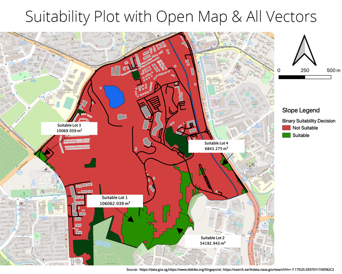
This is what it looks like after converting from a raster to a vector. I sliced one of the vectors into two different polygon as Region 1 and 2 was combined before splitting the feature. Both area was bigger than 10,000m2 even after splitting. Although it seems like most of the region were suitable, I still decided to take a quick look at the rounds just outside the perimeter of the various regions since all the regions were very near to the perimeter of Gombak area.
By looking at the perimeter of Gombak Area, I would argue that Suitable Lot 1 is the best plot among the other plots. Because upon a closer look at the other plots with Open Map in the background, it seems like the other lots were close to buildings in the other area. With Suitable Lot 1 being one of the biggest at about 100,000m2 , the Quarantine center can be built in the middle of Suitable Lot 1 with some buffer around the Quarantine center. In addition, it looks like only 1 road is leading to there, which makes it accessible but not overly open with cars passing by. This makes it accessible while not unnecessary open to public access.
Thus, I would recommend Suitable Lot 1 to be used for building the Quarantine Center.
References
The Colors on Map - https://www.thoughtco.com/colors-on-maps-1435690ra
Photo by Thad Zajdowic from https://freeimages.com/
