SMT201 AY2019-20T1 EX1 Christal Poon
Part 1: Thematic Mapping
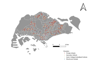
a) Distribution of Public Education institution
For this thematic map, the categorisation of the different types of schools can be seen by the different coloured symbols.
From the map, it can be seen that there are generally more Primary schools and Secondary schools than Junior Colleges / Centralised Institutes and Mixed Level Schools.
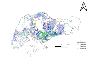
b) Hierarchy of road network system of Singapore
The roads can be seen via the line symbols and are catergorised into Expressways, Major Roads, and Minor Roads.
I created a new field called 'RD_CLASS' to differentiate the different types of roads
1. Expressways -- They have the term 'Expressway' in them
2. Major Roads -- They have the term 'Road' in them
3. Minor Roads -- The rest of the roads fall under here
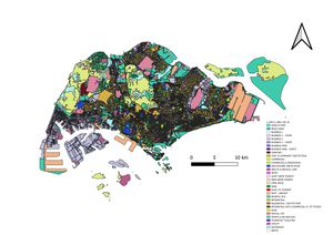
c) 2014 Master Plan Landuse
I have categorised the Masterplan Map by the type of uses for the land, by using the coloured categorised symbology. The different colours represent the different Land Use type.
From the map, it is clear that land use for business gathers towards the west of Singapore, and commercial land uses are generally spread out at the bottom half of Singapore.
Part 2: Choropleth Mapping
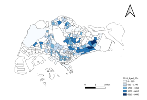
a) 2010: Aged Population (65 years old and above)
2018: Aged Population (65 years old and above)
I have graduated the map by the number of Aged residents living in each subzone. By ensuring that their legends and colour coding represented the same set of values, visualising how the literal number of aged residents in each subzone has increased. From the graph, areas that have a low number of aged population in 2010 has increased in 2018, and new subzones which used to not have any aged residents do so now.
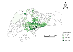
bi) 2010: Proportional of Aged Population (65 years old and above)
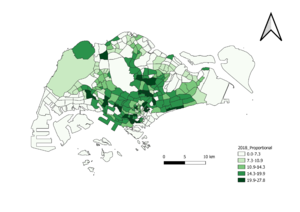
2018: Proportional of Aged Population (65 years old and above)
I have interpreted "Proportional of Aged Population" as the total number of aged residents (65+) divided by the total number of residents in a subzone, multiplied by 100 to get a percentage. From the graph, it can be seen that areas such as Kallang and Queenstown grew in their proportion of Aged Residents from 2010 to 2018. There is generally an increasing percentage of Aged residents in each subzone.
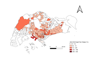
c) 2010-2018: Percentage Change of Aged Population (65 years old and above)
I have graduated the graph by percentage change, taking the number of aged residents in 2018 minus the number of aged residents in 2010, over the number of aged residents in 2010 * 100. From the graph, it can be seen that the percentage change of aged population over the years have increased generally, especially in subzones where there are residential land uses.
