SMT201 AY2019-20T1 EX2 Tan Zi Ying
Part 1: Thematic Mapping
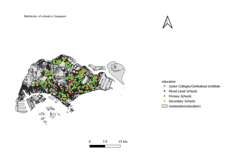
Distribution of Public Education Institution by School Types
source: datagov.sg
In order to classify the data, I categorized the different type of education by colours. I chose to use square shaped symbols as it provides greater readability. The schools are classified by – “Junior College/Centralised Institute” , “Mixed Level Schools” , “Primary Schools” and “Secondary Schools”.
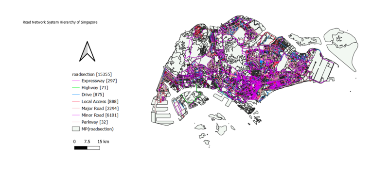
Road Network System Hierarchy of Singapore
source: datagov.sg
I used calculator field function to categorize the different road network system according to “Expressway”, “Highway”, “Drive”, “Local Access”, “Major Road”, “Minor Road” and “Parkway” so that it would be more readable. Different categorised colours are used for the different types of road. A light background is used so that there will be contrast between the hue colours and the light-coloured map.
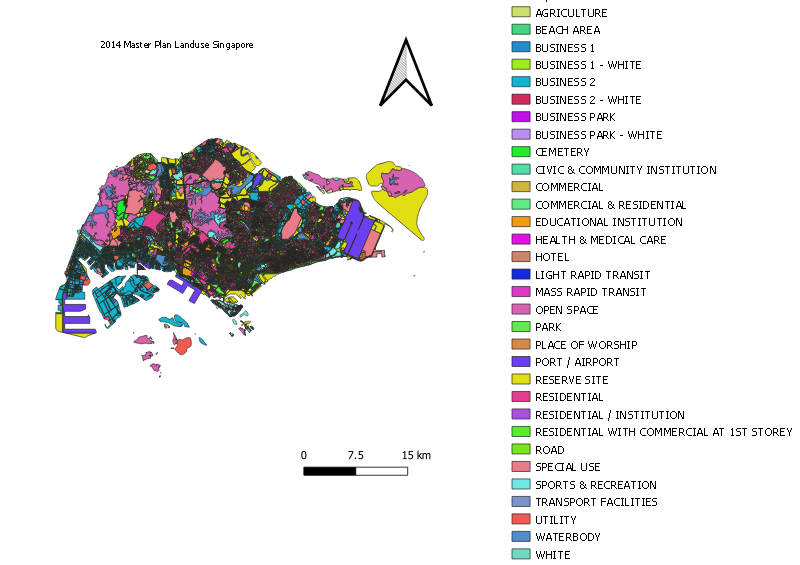
2014 Master Plan Landuse Singapore
source: datagov.sg
The different colours are used to represent the URA zone such as “Hotel”, “Sports & Recreation” and “Waterbody”. Categorized colours are used to differentiate the different area.
Part 2: Choropleth Mapping
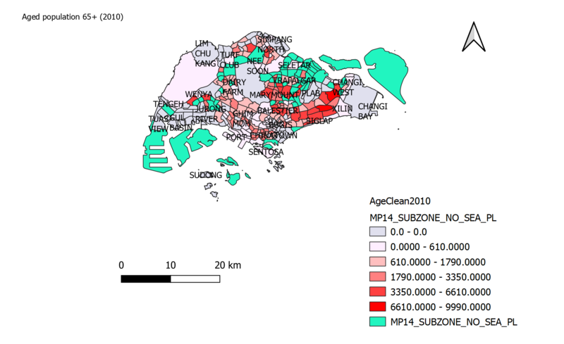
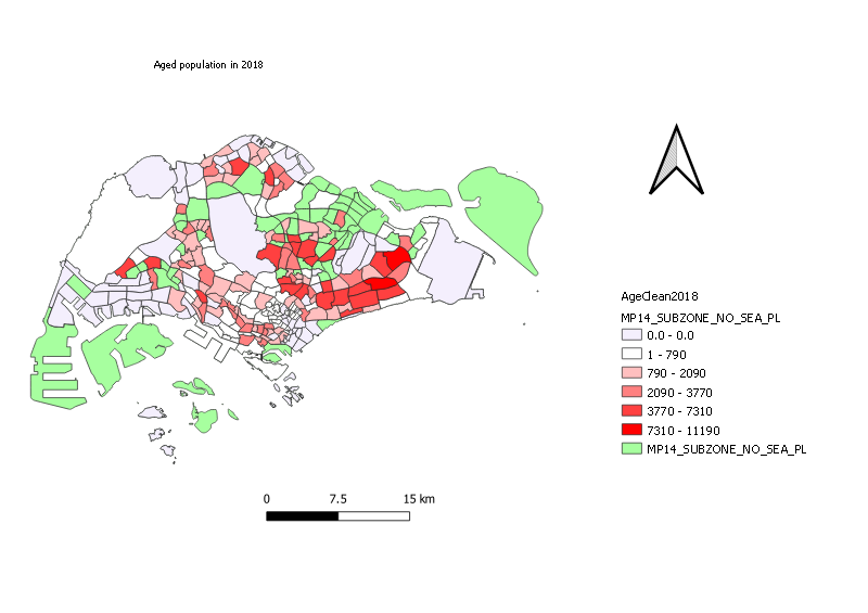
Aged Population (+65) in 2010 and 2018
source: singstat.gov.sg
source: singstat.gov.sg
The number of aged population increased overall in 2018, as compared to 2010.
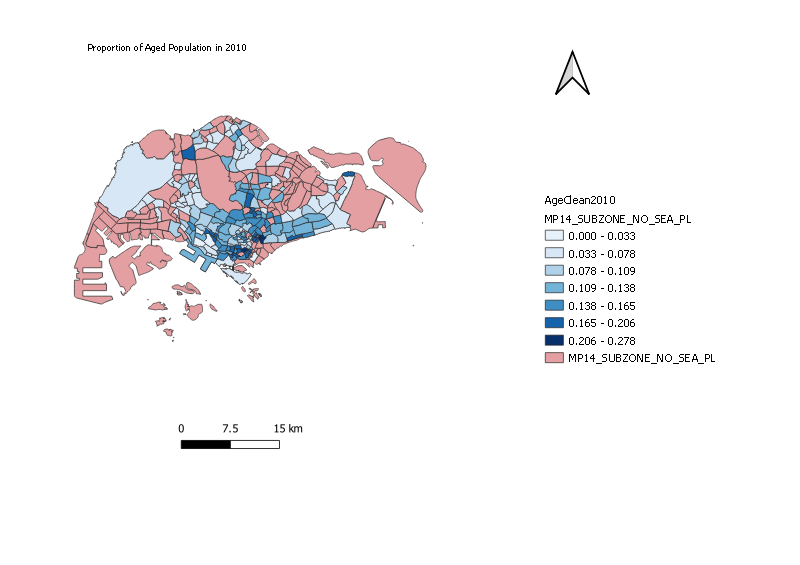
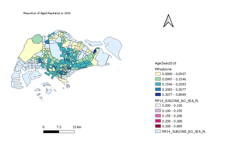
Proportion of Aged Population in 2010 and 2018
source: singstat.gov.sg
source: singstat.gov.sg
source: singstat.gov.sg
The proportion in 2010 is obtained by using (Agedpopulation2010)/(Totalpopulation2010) whereas the proportion in 2018 is obtained through the formula (Agedpopulation2018)/(Totalpopulation2018). The proportion of the aged population increased in 2018, as compared to 2010. Additionally, it can be observed that the north-east part of Singapore holds a higher proportion of aged population than the rest of Singapore subzones.
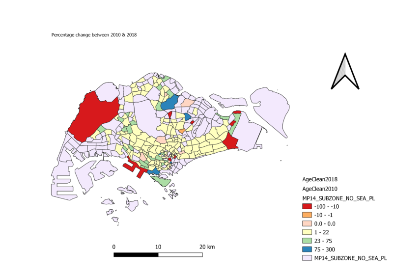
Percentage Change of Aged Population between 2010 and 2018
source:singsta.gov.sg
The percentage change is obtained through the formula (Agedpopulation2018-Agedpopulation2010)/Agedpopulation2010. Through this choropleth map, we observed that there more than half of the subzone experienced a positive change in aged population.
Discussion
In order to see the difference between the quantitative data, graduated colours were used to differentiate the quantity in the subzones. I obtained the data file from Singstat and summed the population aged 65 and above by using the calculator field function.
For the Aged population (+65) in 2010 and 2018, the 2010.cvs file and the 2018.cvs file is added into the map respectively. The value is used wholesale from the summed total.
Whereas, for the Proportion of Aged Population in 2010 and 2018, the value is obtained through the formula: (Agedpopulation2010)/(Totalpopulation2010) whereas the proportion in 2018 is obtained through the formula: (Agedpopulation2018)/(Totalpopulation2018).
Finally, the percentage change is obtained through the formula (Agedpopulation2018-Agedpopulation2010)/Agedpopulation2010.
I choose Natural Breaks (Jenks) for the different map as it shows the greatest differentiation between each category. I manually added a 0 class for each of the map to observe the absence of aged population in that subzone.
