SMT201 AY2018-19T1 EX1 Lim Jia Yang James
Part 1: Thematic Mapping
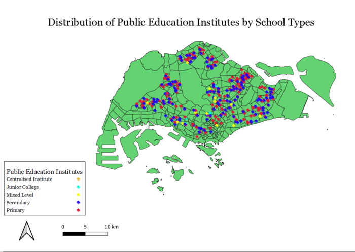
Distribution of Public Education Institutes by School Types
I differentiated the different public education institutes namely "Primary", "Secondary", "Mixed Level", "Junior College" and "Centralised Institute" by using Categorized for variable "main_level". Although the original CSV file contains 344 records, my copy only contains 342 records, as I believe that 2 records were lost while geocoding.
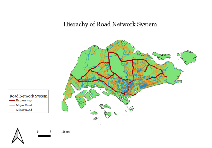
Hierarchy of Road Network System
All of Singapore's roads are shown in the map above, broadly categorized to Expressways, Major Roads and Minor Roads. To mimic real world conditions, I made lines representing Expressways thicker and I also chose a darker color. Likewise, I chose a darker color and thicker width lines for the Major Roads as compared to the Minor Roads.
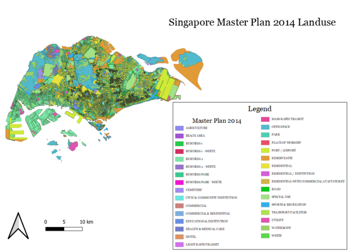
Singapore Master Plan 2014 Landuse
As there are many categories in this layer, the border lines of each segment caused the overall map to look extremely black and hence unable to provide useful information at one glance. I overcame this by reducing the width of the border lines to 0.05mm, this softened most the dark regions and hence the color of the segments are able to come through.
Part 2: Choropleth Mapping
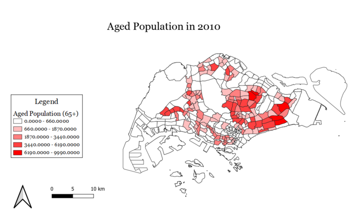
Aged Population in 2010
After downloading the csv file of Singapore's age breakdown, I joined it with the subzone layer. As the subzone layer I used had more subzones than the csv file containing the ages, there were subzones where there were null values for all ages. I replaced these missing values with 0, so as to have a complete looking map as an end product. I then used the Field Calculator to sum up all the age bins from 65 and above to a column 65+ and used that column for Categorizing using Natural Breaks. From this map, I can infer that there were significantly more aged population towards the east side of Singapore in 2010.
Aged Population in 2018
Similar to that of 2010, however, looking at the legend we can see that there is a general increase in the aged population.
Proportion of Aged Population in 2010
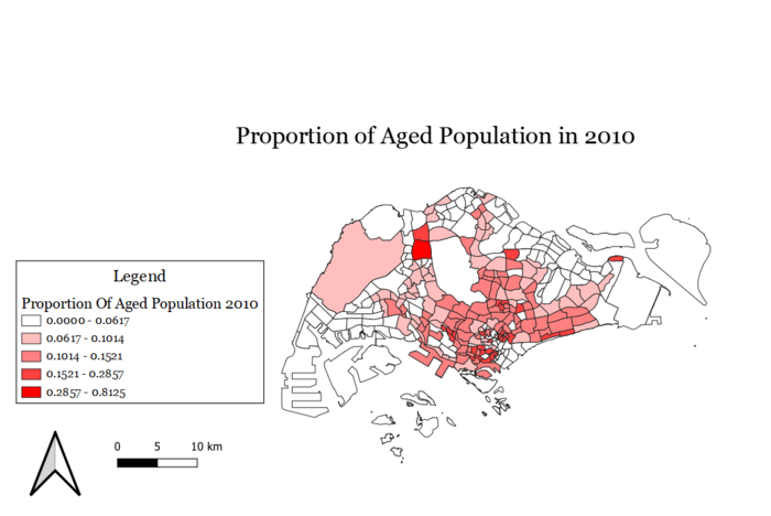
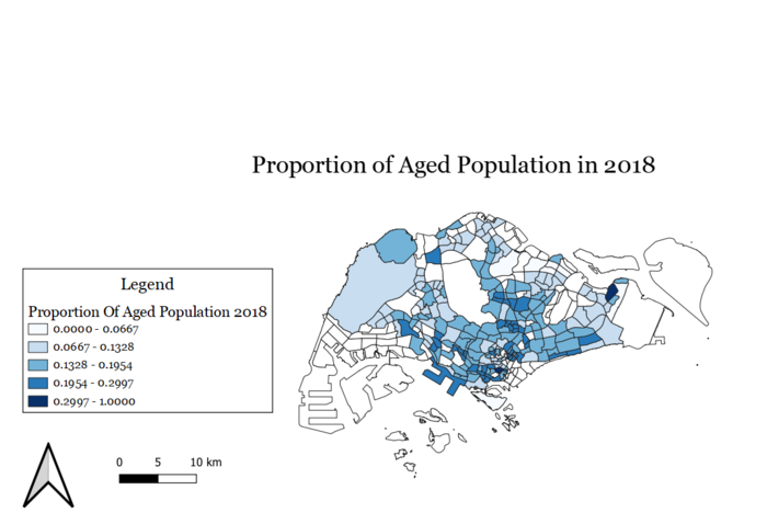
For the proportion of aged population for each year, I used the calculated field to take the aged population divided by the total population in each subzone. From the maps, we can see that there is a higher proportion of elderly in the southern parts of Singapore, and in Sungei Kadut at the north. We also can see that the proportion of elderly approximately doubled from 2010 to 2018.
Proportion of Aged Population in 2018
Percentage Change of Aged Population from 2010 to 2018
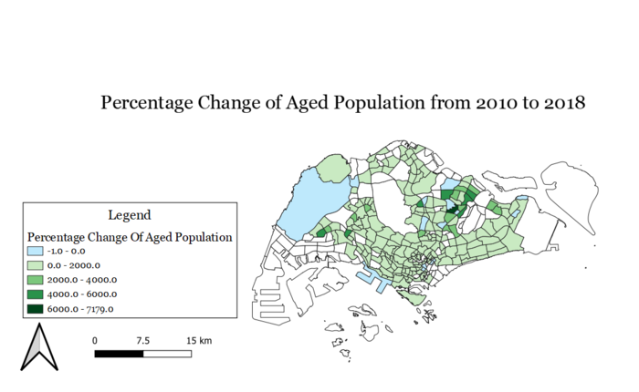
There are several data covered in the area coloured in grey. Firstly, it is data which existed in 2018 but not in 2010, thus no percentage change is shown. Secondly, data in 2010 could be non-existent and still remain so in the 2018 data. Lastly, being unable to change null values to 0 as in terms of percentage-wise, 0 represents a change in the aged population. Therefore, in ensuring that the data representation remains accurate, double layers are used fill-up the empty subzones. In terms of the aged population, the data generally showed that there is a high-density population on the East side of Singapore. After taking into consideration the total population, the density of aged population has spread across the west side of Singapore, although showing that the central part of Singapore consisting of the highest density. Atlas, the percentage change of the aged population accurately depicts the spread of the aged population as well as the proportion of the aged population which is in line with the density population of the areas as shown previously. Within 8 years, majority of the subzones actually showed a higher density as compared to 2010 while only a few subzones actually decreased in density, thus we can safely conclude that there is a growing ageing population in Singapore.
