SMT201 AY2019-20G1 Ex1 LeeHuiYun
Contents
Part 1: Thematic Mapping
1.1 Distribution of public education institution
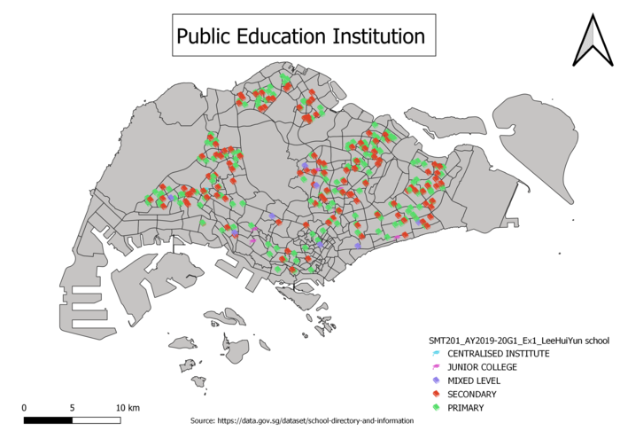
In this thematic map, it shows the distribution of public education institution in Singapore. The public education institution categories into 5 different categories which show in the legend such as Primary, Secondary, Mixed Level, Junior college and Centralized Institution. My choice of classification for this image is categorized by mainlevel in the data. In addition, for visual, I used SVG marker to differentiate the different types of public education institution.
1.2 Hierarchy of road network system of Singapore
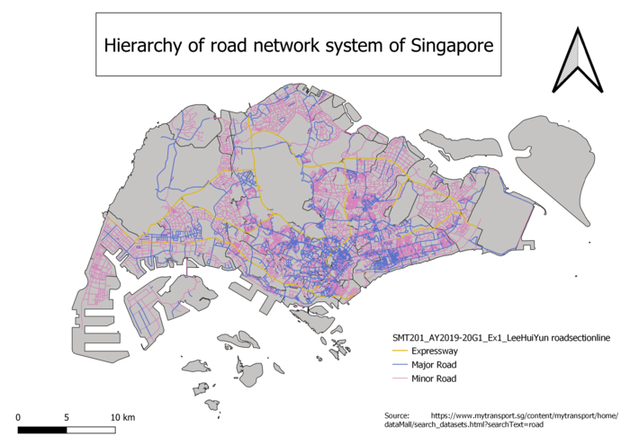
In this thematic map, it shows the hierarchy of road network system of Singapore. Hierarchy of road network system of Singapore can be differential in expressway, major road and minor road which shows in the legend. My choice of classification for this thematic map is to categorized by RD_TYPE. RD_TYPE was not given in the data so for this part I need to create a new field by editing the open attribute table. For visual of this thematic map, the expressway is thicker than the rest follow by major road and minor road respectively.
1.3 2014 Master Plan Landuse
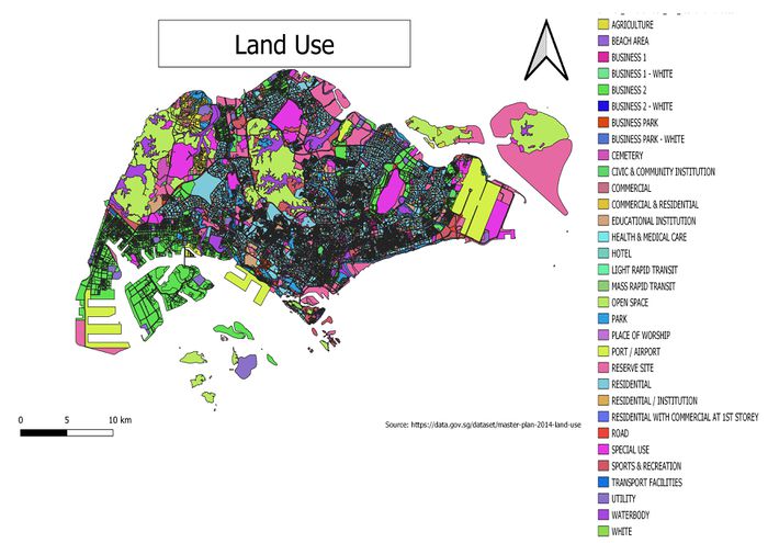
In this thematic map, it shows the land use of Singapore. The land use of Singapore can be categories into different areas which shows in the thematic map given. My choice of classification for this thematic map is categorized by LU_DESC in the data and choose random colors to differential different areas.
Part 2: Choropleth Mapping
2.1 Aged population (+65) in 2010 and 2018
2.1.1 Aged population (+65) in 2010
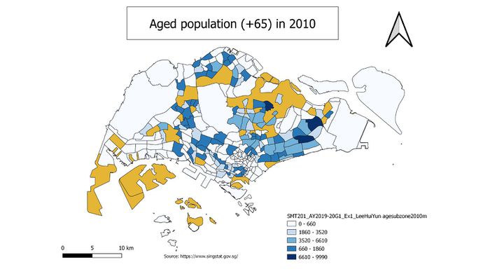
In this choropleth map, it shows the aged population from 65 and above in 2010. My classification choices for this choropleth map is graduated by the new variables that I have created which is Aged65+. The new variables are derived by summing up the fields which fall under the age group from 65 and above with open field calculator. The spatial patterns that I found in this choropleth map is that there are more aged 65 and above in the area of Tampines and Bedok which are darker blue.
2.1.2 Aged population (+65) in 2018
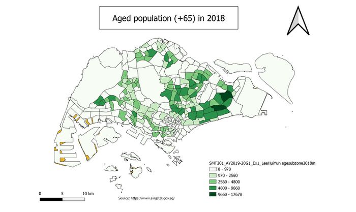
In this choropleth map, it shows the aged population from 65 and above in 2018. My classification choices for this choropleth map is graduated by the new variables that I have created which is Aged65+. The new variables are derived by summing up the fields which fall under the age group from 65 and above with open field calculator. The spatial patterns that I found in this choropleth map is around the same as the previous choropleth map, however there seem to be an increase of aged population from 65 and above as color become darker tier.
2.2 Proportional of aged population in 2010 and 2018
2.2.1 Proportional of aged population in 2010
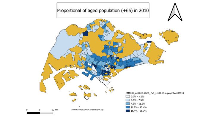
In this choropleth map, it shows the proportional of aged population from 65 and above in 2010. My classification choices for this choropleth map is graduated by the new variables that I have created which is propotional+65. The new variables are derived by summing up the fields which fall under the age group from 65 and above then divide it with the grand total field and multiply with 100 to get the percentage of proportional with open field calculator. The spatial patterns that I found in this choropleth map is that the proportional of aged population from 65 and above is higher in the bottom center area of Singapore.
2.2.2 Proportional of aged population in 2018
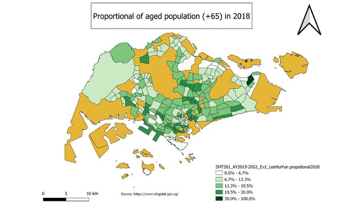
In this choropleth map, it shows the proportional of aged population from 65 and above in 2018. My classification choices for this choropleth map is graduated by the new variables that I have created which is propotional+65. The new variables are derived by summing up the fields which fall under the age group from 65 and above then divide it with the grand total field and multiply with 100 to get the percentage of proportional with open field calculator. The spatial patterns that I found in this choropleth map is same as the previous choropleth map that the proportional of aged population from 65 and above is higher in the bottom center area of Singapore.
2.3 Percentage change of aged population between 2010 and 2018
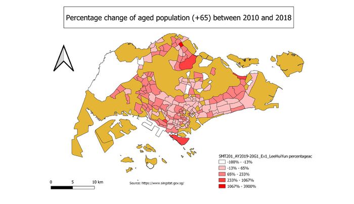
In this choropleth map, it shows the percentage change of population between 2010 and 2018 for aged population from 65 and above. My classification choices for this choropleth map is graduated by the new variables that I have created which is percentage+65. The new variables are derived by summing up the fields which fall under the age group from 65 and above for 2010 and 2018. After that use the amount that I get for 2018 minus 2010 then divided by the 2010 amount and multiply with 100 to get the percentage of change with open field calculator.
