SMT201 AY2019-20G1 Ex1 Luo Haonan
Part1: Thematic Mapping
The distribution of public education institution
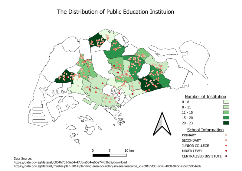
I used different shades of red dots to represent the 4 different styles of institutions. The darker the color, the higher the level of the institution, this is to indicate the level of the institution on the map. Also, I used "graduate" in symbology to indicate the number of institutions in each planned area and used natural breaks method to classify them into natural groups. The darker the color in the subzone, the higher the number of institutions. By looking at this map, viewers can instantly understand the distribution of institutions by school types and which subzone has more institutions without counting the number of dots.
The hierarchy of road network system
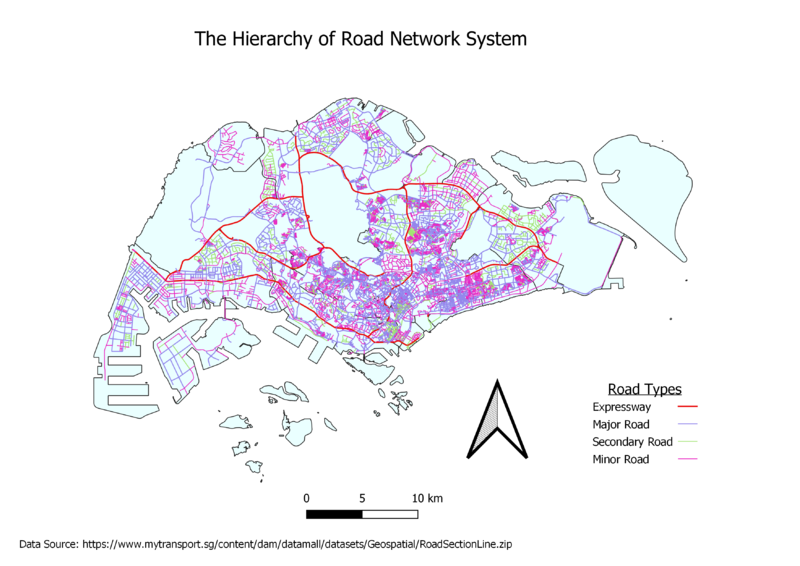
I differentiated the roads according to Singapore's road naming convention. For example, if the description contains "Expressway", I will classify them as an expressway. If it contains words like "Ave" or "Road", I will classify them as "Major Road" etc. Also, I set Expressway as thickest, followed by major road, secondary road, and minor road. This is to help viewers to differentiate them easier.
2014 Master Plan Landuse
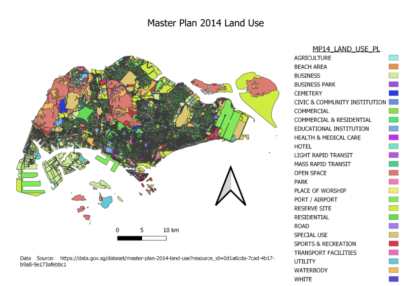
For Master Plan Landuse data, i used the categorized function on LU_DESC to display different types of landuses in different colors. Also, there were a lot of sub-categories for business, residential and business parks categories, thus I merged those categories into 3 big categories to have a better presentation on both the legend and the map. If not, the map and the legend will look messier.
Part2: Choropleth Mapping
Aged population (+65) in 2010 and 2018
 |
|
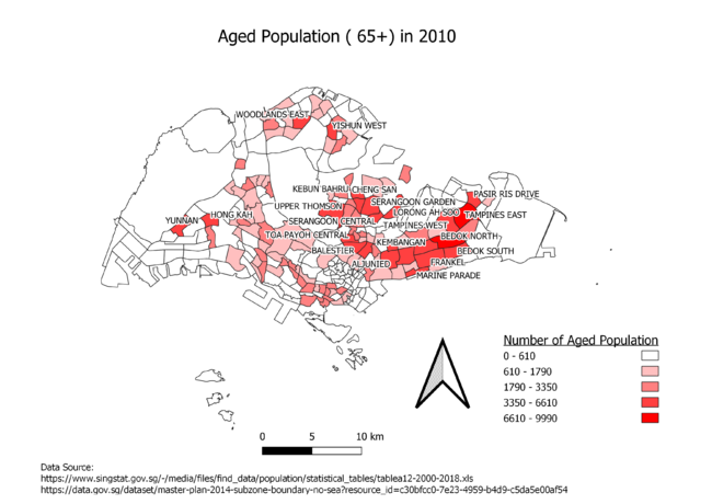
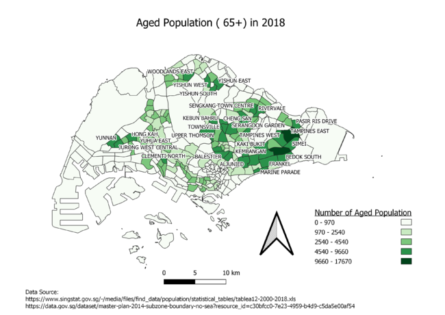
By using the data from Singstats, I summed the population above the age of 65 and grouped them by subzone, the new data are inserted into a new attribute field for classification purpose. Also, I used "graduate" in symbology to compare the number of elderly in each subzone and used natural breaks method to classify the data into natural groups. Simply looking at the legend, we can assume that Singapore is facing an aging population problem.
Also, i coded the rules of labels to show the label of subzone that contains more elderly (according to their natural groups). This will instantly tell viewers which are the subzones with more elderlies. By looking at the map and their labels, we can instantly tell that most elderlies in Singapore live at the east side, around areas like "Tampines East", "Bedok", "SIMI" etc.
The proportion of the aged population in 2010 and 2018
 |
|
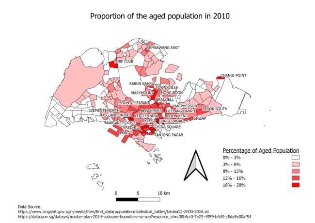
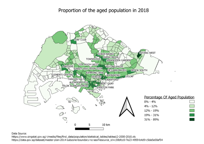
For this question, I interpreted it as the percentage of elderlies in the subzone compared to the total population in that subzone. Thus, i used using the data of the number of elderlies in each subzone in my new attribute field "65+" to divide the total population in that subzone to get the percentage of elderly in that subzone. This is being stored in a new attribute field for classification purposes and the next question.
I used "graduate" in symbology to indicate the percentage of elderly in each subzone and used natural breaks method to classify them into natural groups. The darker the subzone, the higher the percentage of the elderly in that subzone.
Also, i coded the rules of labels to show the label of subzone that has a higher percentage of elderly (according to their natural groups).This will instantly tell viewers which are the subzones that contain a higher percentage of elderly. By looking at the map and their labels, we can instantly tell that there is a higher percentage of elderly the central subzones of Singapore such as "Tanjong Pagar" and "China Square".
The percentage change of aged population between 2010 and 2018
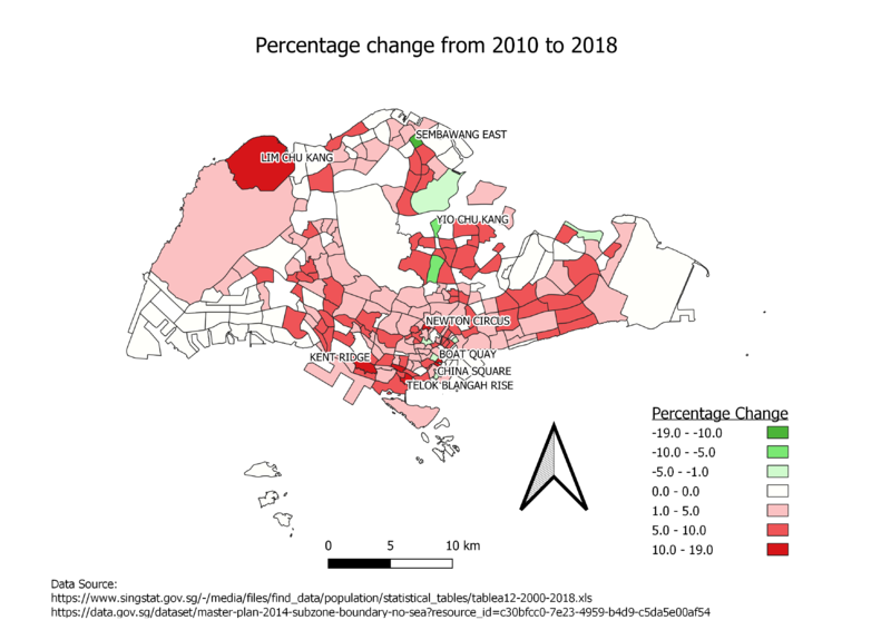
I interpreted the question as to the percentage difference of elderly in different subzones between 2010 and 2018. Firstly, I used join function to link the attributes "Percentage" in both 2010 and 2018. Then I created a new attribute by using the percentage of the elderly attribute from 2018 dataset minus the percentage of the elderly in 2010 dataset. Then I classified them into 2 colours, the green means fall in the percentage of elderly and red means increase in the percentage of elderly in that subzone. As seen on the map, the percentage of elderly in most subzones has increased, this indicates that the number of elderly is increasing at a faster rate compared to the growth rate of the population in Singapore.
Also, I coded the rules of labels to show the label of subzone that has a higher percentage change in the number of elderly(according to their natural groups). As shown in the map, the percentage of elderly is growing at a very fast rate of 10-19% in subzones such as "China Square", "Boat quay" and "Telok Blangah Rise" and it is decreasing at a fast pace(10%-19%) in areas such as "Yio Chu Kang" and "Sembawang East". From the map, we can tell that the percentage of the elderly is increasing in most areas of Singapore.
There are some missing values when I try to join the datasets in 2010 and 2018 together, it is probably because there are some of the new locations create after 2010. This causes null values in my new percentage change attribute. Since those locations did not exist in 2010 dataset, it is pointless for me to consider them when comparing 2010 and 2018, therefore I changed those null values to 0.
