SMT201 AY2019-20T1 EX1 Sabrina Liau Ying Ying
Contents
Part One
Public Education Institution Distribution in Singapore
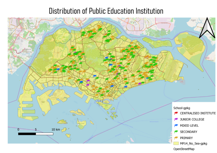
In this thematic map, I have used 3 different layers to show the distribution of the Public education institution in Singapore. Firstly, is the School information that I geocoded from the data that I got from data.gov; I used SVG marker and color code to differentiate the different types of institutions. Secondly, I used the OpenStreetMap to give the map more colors and detail. And finally, I used the MP14_Planning Subzone map to highlight the Singapore map.
Singapore's Road Section Line
For this thematic map, there are the sections are separated into 4 categories Expressway, Local Access, Major Road and Minor Road. And to make it simple for the readers, I adjusted the width and the opacity of the symbols. In addition, as I have done in the previous map, I make use of the OpenStreetMap and MP14_Planning Subzone to beautify and present more detail to the user.
2014 Master Plan Landuse
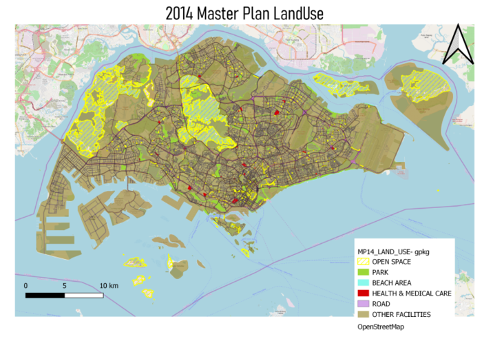
For this thematic map, I chose to merge some of the categories together as I hope to emphasis on some of the important land. For instance, the open space left that could be used in the future, or how much land spaces are a park, is it sufficient. OpenStreetMap is used to give a more detailed map.
Part Two
Age Population (65+) in Singapore by Subzone for Year 2010 & 2018
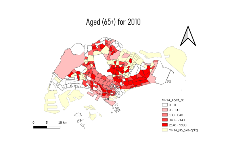
To prepare this Choropleth Map, I had to use 3 different layers, the MP14_Subzone and the 2 CSV file containing the Age Population for 2010 and 2018. I have to first join the Age.csv with the MP14 via the Subzone_n and then create a new field called the aged(+65) for the separate years using the field calculator. As shown in this map, the East region has the most aged population for both 2010 and 2018. This could be a consideration as to where the elderly homes can be focused on.
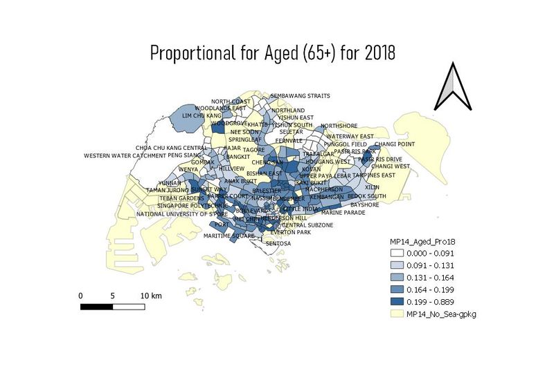
Proportion of Aged Population (65+) in Singapore by Subzone for Year 2010 & 2018
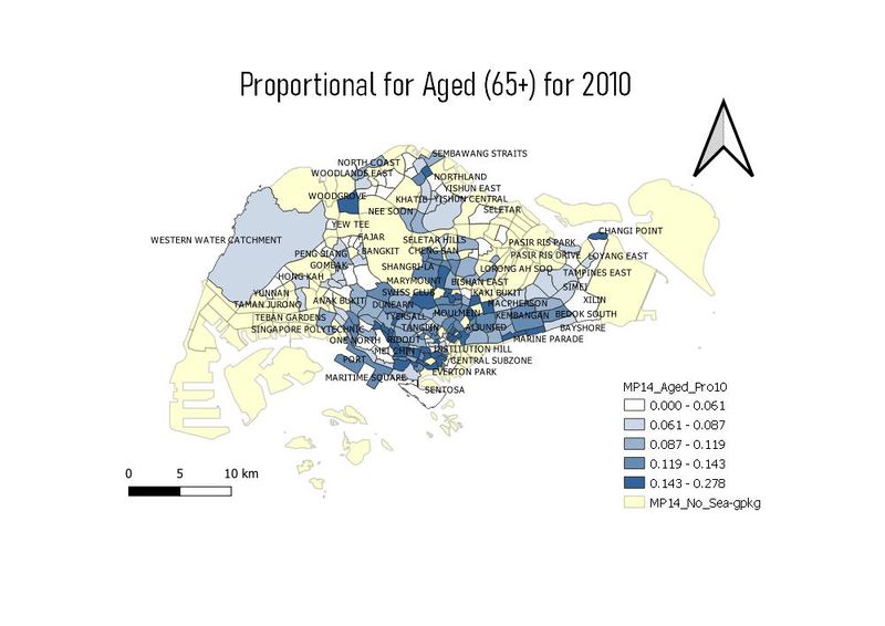
To prepare this Choropleth Map, I used the aged population divided by the total population for the year to derive the proportional of the aged. I used the labeling for the Subzone n to make it easier for the user to visualize the area where the proportional is the highest for each of the years. Comparing the data in 2018 and 2010, there is a significant increase as the darker color increase in the map in 2018.
Percentage Change of Aged Population (65+) in Singapore by Subzone from the Year 2010 to 2018
To prepare this Choropleth Map, I created a new field called the PercenChange to show differences in the proportional between 2010 and 2018. My calculations are proportional2010 - proportional2018 and multiply by 100 to get the percentage. As shown in the map, the area with the highest increased of proportional is Boon Lay with a 19% increase. This could be a concern and an area to improve in future projects
