SMT201 AY2019-20T1 EX1 Kok Su Yee
Contents
- 1 Take Home Exercise 1: Mapping the Urban World
- 2 Part 1: Thematic Mapping
- 3 Part 2: Choropleth Mapping
- 3.1 Aged population (Above 65) in 2010
- 3.2 Aged population (Above 65) in 2018
- 3.3 Proportion of Aged population in 2010
- 3.4 Proportion of Aged population in 2018
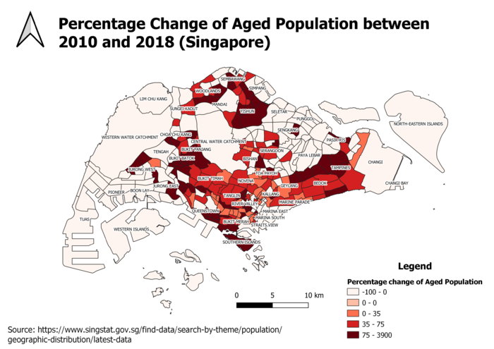
- 3.5 Percentage change of Aged Population between 2010 and 2018
- 3.6 Reasoning for classification choices, deriving new variables and handling of missing values
- 4 References
Take Home Exercise 1: Mapping the Urban World
Part 1: Thematic Mapping
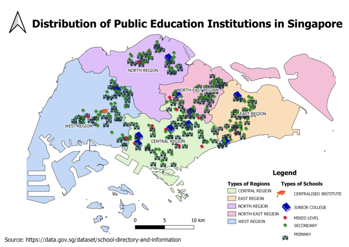
Distribution of Public Education Institutions in Singapore
Figure 1
Distribution of Public Education Institutions in Singapore
This map depicts the distribution of public education institutions and the school information layer is geocoded. Different SVG markers are used to classify the school types. School types with low number of schools have larger marker size. I have segregated the maps into regions, allowing us to have an overall picture of where the types of schools are. The number of Primary and Secondary Schools are evenly spread out in the five regions. There is only 1 central institute in Singapore as compared to the number of Junior Colleges, showing the low demand due to longer course of study.
Road Network Systems in Singapore
Figure 2
Road Network Systems in Singapore
The road network system of Singapore is classified in the hierarchy of:
- Expressway
- Major Road
- Minor Road
- Local Access Road
To further visualise the road network system clearly on the map, I increased the thickness of the road lines in terms of hierarchy basis. I have also segregated the areas in Singapore into regions. From here, this highlights the boundary and we can spot how closely connected Singapore is. I used red colour to represent the expressway as this bright colour is able to bring out how the expressway is linked across the five regions.
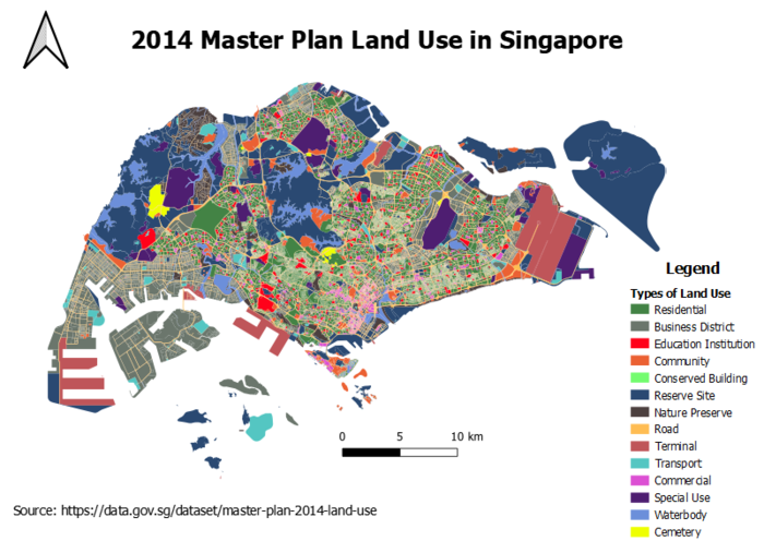
2014 Master Plan Land Use in Singapore
Figure 3
2014 Master Plan Land Use in Singapore
In displaying the types of land use, a new field called LU_CLASS is created to classify them into 14 broad categories. Darker colours hue such as blue and green are applied for types that occupy high amount of land. Such simple view let us recognise that a lot of land has been used as reserved sites for future land development purpose. Residential area is another land type that takes up most part of Singapore given that it is a highly densely populated country. The terminal land use is expected to expand with the opening of Terminal 5 in the future.
Part 2: Choropleth Mapping
Aged population (Above 65) in 2010
Figure 4
Aged population (Above 65) in Singapore (2010)
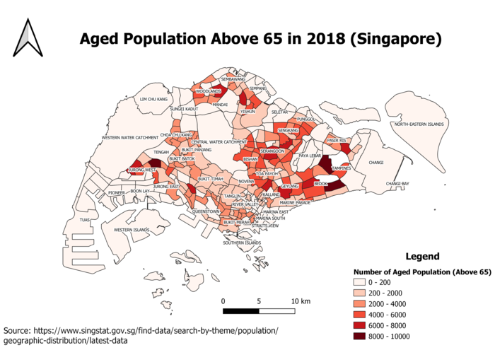
Aged population (Above 65) in 2018
Figure 5
Aged population (Above 65) in Singapore (2018)
The above maps are classified with graduated symbology where the darker intensity of red colour means the area is even highly populated with the aged. In comparing the above two maps that shows the aged population of over 65 years old in Singapore in 2010 and 2018, we can find that there is a trend of increasing aged population over the years. The areas that were highly populated with the aged before in 2010 remains in 2018, specifically in the areas of Tampines and Bedok.
Proportion of Aged population in 2010
Figure 6
Proportion of Aged population in Singapore (2010)
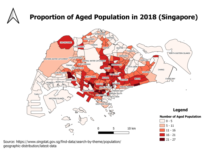
Proportion of Aged population in 2018
Figure 7
Proportion of Aged population in Singapore (2018)
The choropleth maps of aged population proportion in 2010 and 2018 revealed that there is a growth in the proportion of aged populations over the eight years. There are more areas which become even highly populated with elderly in 2018. For instance, the areas are Lim Chu Kang, Bedok and Toa Payoh, just to name a few. This could signify that the ageing population challenge will get worse in years to come as people’s life span is expected to be longer. Thus, Singapore must be prepared to handle the issue by providing greater support for the aged in the future.
Percentage change of Aged Population between 2010 and 2018
Figure 8
Percentage change of Aged Population between 2010 and 2018
This map shows that there is a percentage increase in the aged population between 2010 and 2018, particularly the people living in the areas of Yishun and Tampines have increased number of elderly. The percentage increase is very significant in the central region of Singapore. The mode of class in classifying the values of the percentage change is quantile (Equal count), this divides the distribution of the aged population into four equal parts. This ensures the extreme values of percentage change does not affect the visualisation.
Reasoning for classification choices, deriving new variables and handling of missing values
In designing the choropleth maps for the aged population, I have applied the graduated symbology in classifying the aged population count. Equal interval mode is set for the maps of aged population and proportion of aged population. This is because there are no values that are below 0. Conversely, quantile count mode is applied for the percentage change of aged population map as I would need to split the distribution into equal count taking into consideration that there are negative values and outliers involved. In regard to the choice of colour, I have chosen a red colour ramp as it is highly visible to identify the areas that is highly populated with the aged where the colour intensity of red is darker.
Before I start importing the downloaded Singapore Resident Population csv file from SingStats website into QGIS as a delimited text layer, I performed data cleaning to the dataset. Filtering is done to retrieve the data from only year 2010 and 2018. All null values detected are treated as zero. Besides, I capitalised the names of the subzone areas so that joining of this data with the 2014 Subzone region shapefile is possible in QGIS. New columns are created for population count, total population count, population proportion and percentage change in 2010 and 2018. After the data cleaning process, the new csv file is imported as a delimited text layer into QGIS.
References
Data Gov 2014 Master Plan Land Use Data "2014 Master Plan Land Use"
Data Gov 2014 Master Plan Region Data "2014 Master Plan Region"
Data Gov 2014 Master Planning Area Data "2014 Master Planning Area"
Data Gov Types of Schools in Singapore Data " Types of Schools in Singapore"
DataMall Road Section Line Data "Road Section Line"
Singstats Singapore Resident Population Data "Singapore Resident Population Data"
Understand Road Categories "Road Line Plan Explanatory Notes"
Understand Properties in Singapore "Types of Properties in Singapore"
