SMT201 AY2019-20G1 Ex1 Kang Hui Yun
Part 1: Thematic Mapping
Public Schools
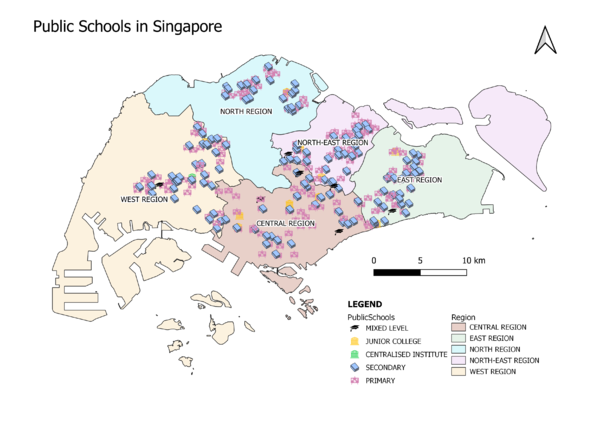
The map above shows the distribution of public education institutions, classified into distinct school levels over the backdrop of regions. As there are many features (i.e. public schools) and classes (i.e. school levels), the visual variables gets cluttered when viewing the whole map. Hence, a different colour is used to represent each school type so as to help map readers distinguish among the clusters easily. A relevant SVG is also given to the school type (e.g. abc chart for primary, books for secondary, etc), as it is more intuitive than colour differentiation. As the subject in question are public schools, I have filtered the data to only include government and government-aided schools under the assumptions that these are public institutions.
Road Network System
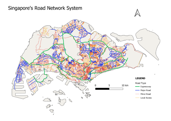
The map above depicts the hierarchy of Singapore's road network, classified into 4 different categories. Each category is given a different colour. They are also given a different stroke width, with expressway having the thickest stroke, then major, minor and local access roads, as it brings out the more important roads in the viewer's eyes before the rest. This is also because there are fewer expressways than major roads, fewer major roads than minor roads, etc. Therefore, it is easier to visualise if a lighter stroke is given to the category with more instances and vice versa.
2014 Master Plan Land Use
The above map shows the different types of land use in Singapore. As the data contains a whopping 32 categories, it is aggregated to combine similar categories into one, leaving us with 21 categories in total. This allows for better visualisation as there are 11 less colours the map readers have to take in, while still being able to understand the nature of the land use for each area.
Part 2: Choropleth Mapping
Aged Population in 2010
https://data.gov.sg/dataset/master-plan-2014-subzone-boundary-no-sea
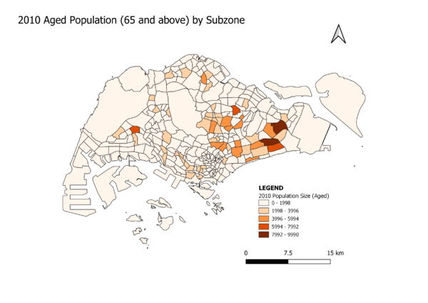
From the map, we can tell that Tampines East and Bedok North are the top 2 subzones that have the highest number of aged people (class 5), followed by Bedok South, Trafalgar and Hong Kah (class 4). Generally, there are higher count of aged people in the East as compared to other area.
Aged Population in 2018
https://data.gov.sg/dataset/master-plan-2014-subzone-boundary-no-sea
Again, the map is classified into 5 classes (graudated, equal interval). Tampines East and Bedok North are still the 2 subzones with the highest count of aged people. In particular, we can see that Yunnan has an increase of aged people when compared to the data in 2010. Overall, Singapore's ageing population had increased tremendously.
Proportion of Aged Population in 2010
https://data.gov.sg/dataset/master-plan-2014-subzone-boundary-no-sea
In general, we can see that the subzones in the South of Singapore are the ones with denser aged population, besides the other two prominent subzones, Changi Point and Turf Club which are further away from the identified area.
Proportion of Aged Population in 2018
https://data.gov.sg/dataset/master-plan-2014-subzone-boundary-no-sea
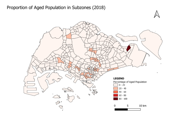
One jarring observation from the map is that the subzone, Loyang West, is solely made up of the aged group (i.e. 65 and above). Other than that, only a handful of subzones have around 20-40% of aged people in their respective area, while the rest have fewer than 20%.
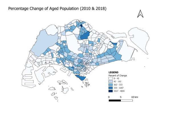
Percentage Change of Aged Population between 2010 and 2018
https://data.gov.sg/dataset/master-plan-2014-subzone-boundary-no-sea
The map above shows us the percentage change of aged population in each subzone. If the value is 100 (percent), there is no change of aged population, similarly, a value of 200 tells us that the aged population has increased or decreased by 2 times. In particular, we can see that Sembawang West went through the most changes, with a value of 4000, which translates to 40 times the headcount of such population.
Classification, Data Preparation
The choropleth maps uses graduated symbols as the value is numerical. The dataset for Singapore residents by age group and gender is imported as a layer, which I have used as the base reference layer to create a new virtual layer to extract the required information using SQL. The virtual layer is then joined with the subzone shapefile layer based on subzone name. Null values are replaced with 0 so that all subzones will be displayed.
