SMT201 AY2018-19T1 EX1 Aaron Lee Tian En
Contents
Part One: Thematic Mapping
2014 Master Plan Landuse
I noticed the BUSINESS had many sub categories and that made the map very grey (too many things on it) and the program took a while to load the map. So I combined all the sub categories for business and labelled it as business. That also made the legend much simpler and the map is better classified showing each area having which type of land use.
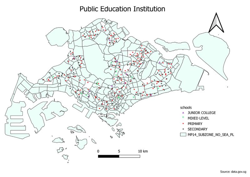
Level of Schools
I used different symbols and different colours to represent the 4 levels of institutions on the map. I had to decrease the size for all of the symbols because the large symbols were overlapping others. From the map, primary and secondary schools are much more in numbers as compared to JC and mixed levels.
Road Network System
I decided to put the Expressways as the thickest line and minor roads as the thinnest line and the 3 types of roads are different colour. This was to give a clear representation of the roads even without looking at the legend. Also, I differentiated the major and minor roads based on whether the naming had the word "road" in it. Those with the word "road" I classify them as major road. Those with "Lorong/ Jalan / street / Lane" are all classified as minor roads.
Part Two: Choropleth Mapping
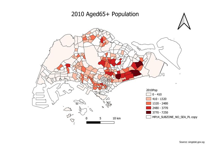
2010 Population Aged 65+
I summed up the population above the 65 age group to get the total number of elderly people in each subzone. I did this in excel before adding it into QGIS. From the map, there are significantly more red subzones in the east, meaning that the number of elderly in the east are high.
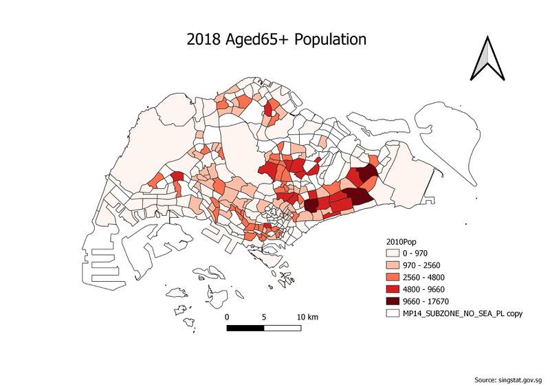
2018 Population Aged 65+
Similar to 2010 Population Aged, I summed up everyone aged 65+ to get the number of elderly in each subzone. Comparing it with 2010, we can see that the east side still has the largest number of elderly living there. We can also see the Ang Mo Kio, Serangoon area with more red subzones than 2010, so the number of elderly in those areas have increased as well.
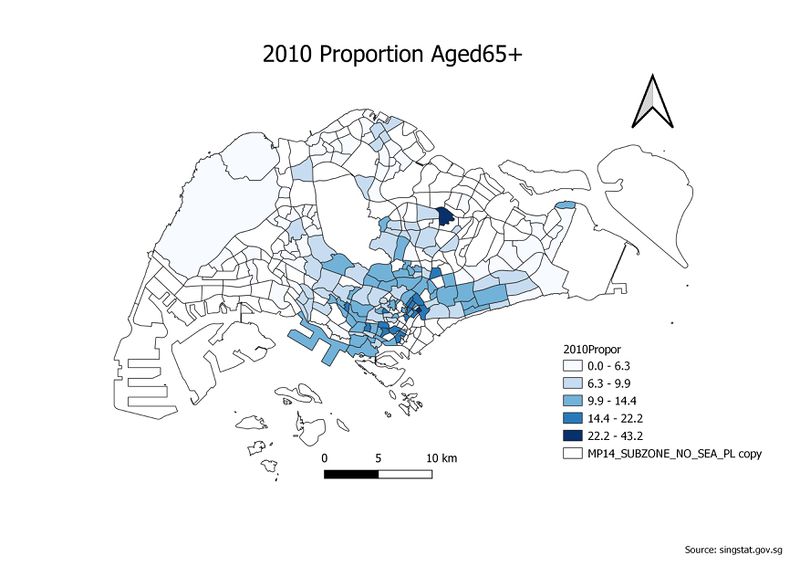
2010 Proportion Aged 65+
I interpreted the question as the proportion of people Aged65+ of each subzone rather than the proportion of Aged65+ in a subzone against the total in Singapore. So I took the number of Aged65+ divided by the total population of each subzone to find the proportion Aged 65+ of each subzone. There are more darker areas near the central of Singapore meaning there was a high proportion of elderly living in the center.
2018 Proportion Aged 65+
Similarly to the 2010 Proportion Aged 65+, the map shows the proportion aged 65+ for each subzone. Even though the scale is different, my intention was to show the subzones which weren't dark in 2010. So although there are still darker subzones in the center, the other parts of Singapore have also increased its proportion of elderly as well.
Percentage Change From 2010 and 2018
I joined the 2010 Proportion Aged 65+ and 2018 Aged 65+ columns together and came up with the 2010 to 2010 percentage change of elderly in each subzone. I decided to use the 2 colour scale and black indicates the subzone had a fall in elderly proportion while a red means an increase in elderly proportion. As seen on the map, the blacker areas are in the center, meaning the proportion aged fell. And the red areas are away from the city, meaning the elderly proportion increased.


