SMT201 AY2019-20T1 EX1 Tan Wei Long Ryan
Contents
- 1 Part One: Thematic Mapping
- 2 Part Two: Choropleth Mapping
- 2.1 Singapore's Aged Population (65+) in 2010
- 2.2 Singapore's Aged Population (65+) in 2018
- 2.3 Proportion of Singapore's Aged Population in 2010
- 2.4 Proportion of Singapore's Aged Population in 2018
- 2.5 Percentage Change of Aged Population From 2010 to 2018
- 2.6 Reasoning behind classification choices
- 2.7 Derivation of new variables and handling of missing values
- 2.8 Relevant judgments and assumptions
- 3 References and data sources
Part One: Thematic Mapping
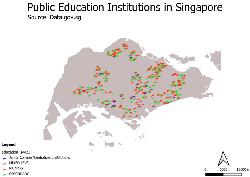
Distribution of Public Education Institutions in Singapore
The map shown is a qualitative thematic map with point symbols.
The different public education institutions are symbolized by classifying them based on the institution’s education level, namely Junior College/Centralized Institutions, Mixed Level, Primary and Secondary and plotted on the coastal outline of Singapore.
A light grey fill is chosen for the coastal outline which allows the symbols on the map to stand out with their respective colours, allowing readers to easily see the distribution of the schools across the island.
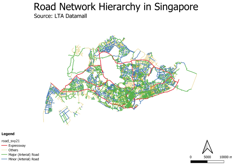
Hierarchy of Road Network System in Singapore
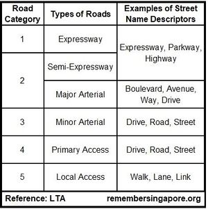
The map shown is a qualitative thematic map of lines. According to a reference from LTA (refer to Fig. 1), there are 5 different categories of roads in Singapore, which can be inferred from the suffixes of their names. For example, Expressways will be named with Expressway, Parkway or Highway.
An attribute, Road_Type was added into the attribute table of the layer, allowing each road to be classified based on its road type.
The different roads were plotted with contrasting coloured lines to allow users to visualize the hierarchy of the road network system easily.
2014 Master Plan Landuse
The map shown is a qualitative thematic map of areas.
The areas were classified based on their land use description, however due to having over 32 categories, similar categories were grouped under one colour on the map, such as purple for businesses and blue for water bodies and beach areas as having 32 different colours would make it difficult for the readers to identify features at glance.
Readers can see the types of categories that have been grouped together on the legend, preserving the original land use description provided in the master plan.
Part Two: Choropleth Mapping
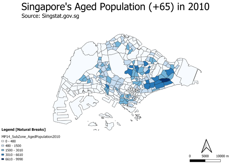
Singapore's Aged Population (65+) in 2010
At first glance, we can tell that there is a larger amount of people from the aged population living in the east due to the darker shades of blue as shown on the choropleth map and the rest of the map having a whitish colour, indicating the presence of little to no aged population residing there. However, these whitish areas are uninhabitable, such as water catchment areas. Hence, the aged population in 2010 is quite evenly spread out, with a slightly higher concentration in the east
Singapore's Aged Population (65+) in 2018
Comparing this 2018 choropleth map with the 2010 choropleth map, we can tell from the legend that the amount of people in the aged population is growing as seen from the increase in the raw numbers of the 5 different classes. Additionally, there are new areas having a darker shade of blue across the map, signalling that there is an overall increase in the amount of people living in Singapore that are in this aged population group, and hence having an aging population.
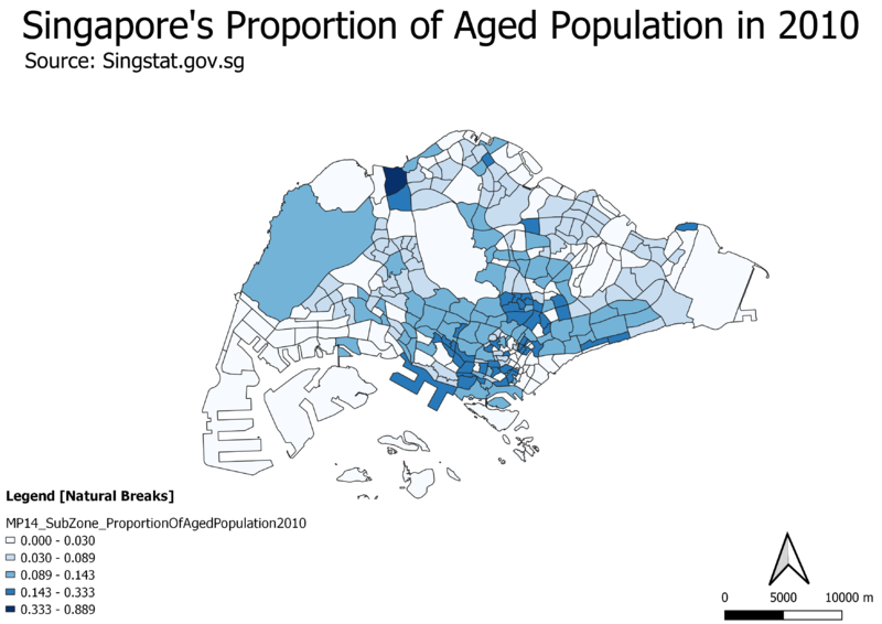
Proportion of Singapore's Aged Population in 2010
At first glance, we can see that there appears to be a trend where the central area of Singapore has a higher proportion of aged population whereby aged population is the ratio of the people aged 65 and above to the total amount of people living in that subzone. Additionally, there seems to be an area in the north with an unusually high proportion of aged population.
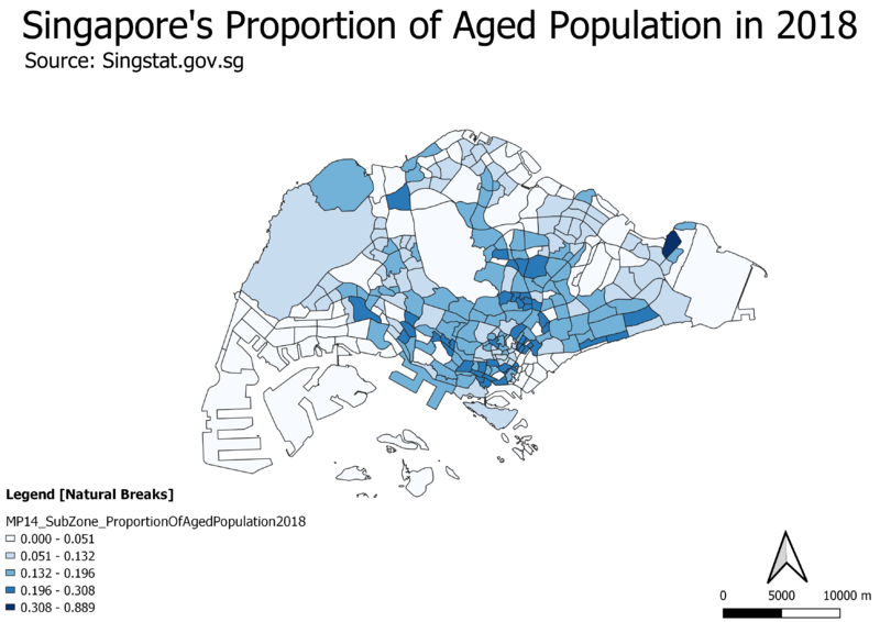
Proportion of Singapore's Aged Population in 2018
Comparing the 2018 choropleth map to the 2010 map, the 2018 map has less areas that stand out, and there is more areas with a deeper shade of blue spread across the map, this could just mean that there is an overall increase in the proportion of aged population across Singapore and that it has an aging population.
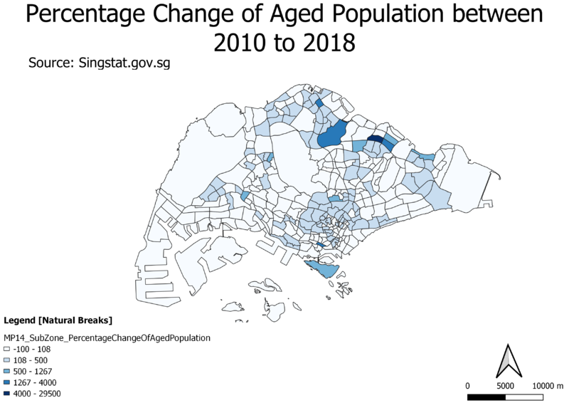
Percentage Change of Aged Population From 2010 to 2018
At first glance, it seems that there is only a major increase in the percentage change of aged population in the north as it stands out with the darker shade of blue. However, inspecting the legend closely, the areas with a slight tint of blue already signal a 108 – 500 % increase in aging population, and it is spread across all the map, which gives strong reason to support our previous deductions of an aging population trend across the country.
Reasoning behind classification choices
For all the 5 choropleth maps that I created, I used the natural breaks (Jenk’s statistical optimization) data classification method with 5 bins. I started out with symbolizing the respective data columns using the “graduated” option and using the natural breaks method first as it allowed me to find natural groupings in the data, which I thought is a good way to first visualize the spread of the data. Next, I tried increasing the number of bins, and observing if there was a significant change in the maps produced but ended up sticking with 5 bins as I realized that the increased number of classes did not make much difference. I also tried the other methods such as the equal interval, quantile and standard deviation method, monitoring the changes of the choropleth map produced and the spread of values across the histogram produced. Ultimately, I found that the natural breaks method was the most suitable as the data were mostly heavily skewed and the maps produced using this method gave the best results.
Derivation of new variables and handling of missing values
Based on the dataset obtained from Singstat, I cleaned it into a form suitable to be imported as a delimited text layer into qgis. In the excel worksheet, I created 5 new columns which would be pivotal in creating these choropleth maps and did the calculations on excel.
1. Aged population (+65) in 2010 – sum of number of people in age groups 65 and above
2. Aged population (+65) in 2018 – sum of number of people age groups 65 and above
3. Proportion of aged population in 2010 – ratio of aged population over total population in subzone
4. Proportion of aged population in 2018 – ratio of aged population over total population in subzone
5. Percentage change of aged population between 2010 to 2018
Joining the subzone field of the MP14 subzone layer and the excel sheet on qgis, it allowed me to get these 5 attributes for each subzone on the layer, and be able to plot the corresponding choropleth maps. There were no missing values in the dataset obtained.
Relevant judgments and assumptions
References and data sources
1. https://www.data.gov.sg/search?q=school+information
2. https://www.data.gov.sg/dataset/master-plan-2014-land-use
3. https://www.data.gov.sg/dataset/master-plan-2014-subzone-boundary-no-sea
4. https://www.lta.gov.sg/content/ltaweb/en/industry-matters/sale-of-plans-and-information/road-line-plan/road-line-plan-explanatory-notes.html
5. https://remembersingapore.org/2018/08/15/singapore-street-suffixes/
6. SMT201 elearn - Week 4 Hands on Ex 4 - Coastal Outline Shapefiles from SLA
7. https://www.mytransport.sg/content/mytransport/home/dataMall/search_datasets.html?searchText=road - Road Selection Line
