SMT201 AY2019-20G2 Ex1 Melanie Tan Ri Fang
Contents
Part One: Thematic Mapping
2014 Master Plan Landuse
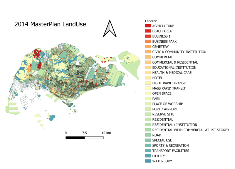
I categorised the MP14 Landuse into sub-categories based on their area of location. Then upon looking at the attributes, I realised that there are actually any repetitive words such as business and business - 1, therefore I decided to combine such datas together, to make the legend more compact and easier for the user to see.
Level of Schools
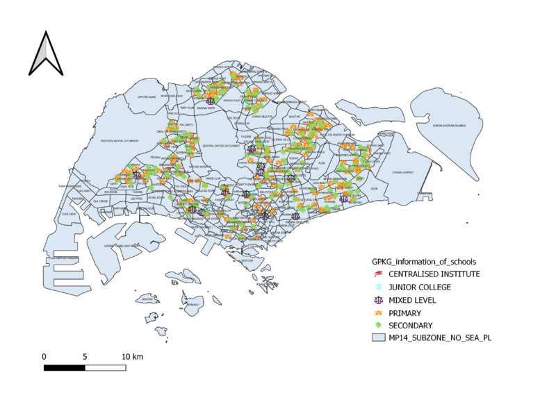
From the map, primary and secondary schools are much more in numbers as compared to JC and mixed levels.I have chosen 4 different symbols to represent the different schools. It is evident that there are more primary and secondary schools thus I had to increase the size of the mixed level and JC and centralised institutions to make it more visible from the map. I also chose to use catergorised mapping which is able to show the viewers exactly which area is the schools located at.
Road Network System
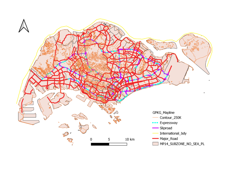
I chose to use a thicker line to show the major road and relatively thinner lines to display the slips roads and contour lines. This is to help the user to see the general major roads in Singapore at one glance. In addition, to also make the expressway more visible, I chose a neon color to make it stand out apart from the major roads as I feel these 2 roads are the most commonly used . This is displayed on an outline map of Singapore instead of the MP14 Landuse where some roads which are in the map itself may end up confusing the viewer. Thus, I feel this contrast to show the road hierarchy in Singapore is the best.
Part Two: Choropleth Mapping
2010 Population Aged 65+
calculated elderlies aged 65 and above before adding in to QGIS. The darker the colors, the more densely populated the area is with regards to elderly.
2018 Population Aged 65+
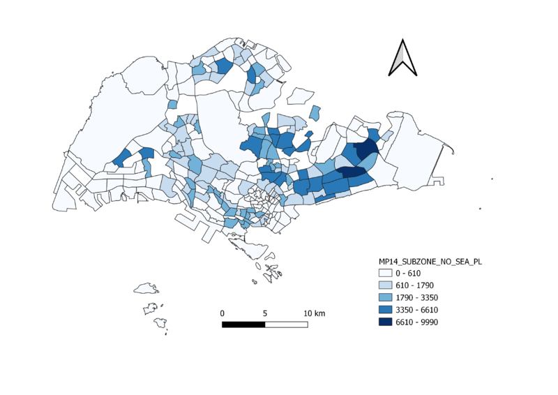
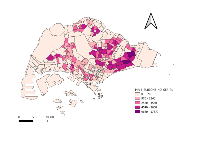
Calculated the aged65 and above in the excel sheet before adding it to QGIS. Then using the graduated function, the display on the map shows the spread of elderlies that are 65 years old and above. As seen on the map, the darker the colours, the more elderlies that are above 65 are staying around that area. It can be seen that there are more darker colours seen on the east side of the map, thus we can safely conclude that the east side of Singapore resides a lot of elderlies.
2010 Proportion Aged 65+
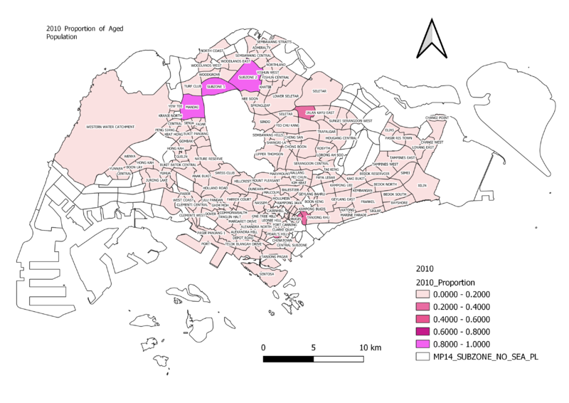
To get the proportion of the Aged population, I took the variable that was previously calculated "Age65+" divided by the total population in that year to find the proportion aged65+ of each subzone. Thus, based on the visual analysis of the map, we can see that the north side of Singapore had a higher density of aged population as compared to the other parts of Singapore.
2018 Proportion Aged 65+
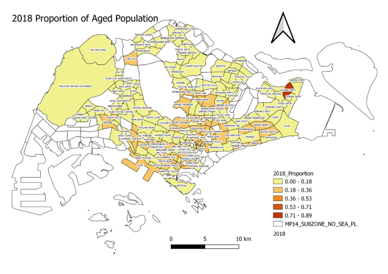
I classified the data into 5 classes by natural breaks as this classification can better represent the trends in the data. Comparing the distribution of aged proportion with year 2010, it can be said that there is indeed a higher density spread of aged population across Singapore as compared to 2010 where it was mainly in the north side of Singapore.
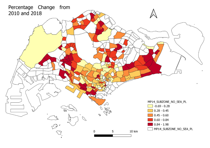
Percentage Change From 2010 and 2018
I joined the 2010 Proportion Aged 65+ and 2018 Aged 65+ columns together and came up with the 2010 to 2010 percentage change of elderly in each subzone. I decided to use the 1 colour scale. As seen on the map, the darker areas are in the center, meaning the proportion aged fell. And the lighter areas are away from the city, meaning the elderly proportion increased.
