SMT201 AY2019-20T1 EX1 Kong Yi Ru Kaelyn
Contents
- 1 Part 1: Thematic Mapping
- 1.1 Using school information from data.gov.sg, prepare a thematic map showing the distribution of public education institution by school types such as primary, secondary, etc.
- 1.2 Using road GIS data of LTA, prepare a thematic map showing the hierarchy of road network system of Singapore such as expressway, major road, minor road, etc.
- 1.3 Using road GIS data of LTA, prepare a thematic map showing the hierarchy of road network system of Singapore such as expressway, major road, minor road, etc.
- 1.4 Using master plan landuse GIS data from data.gov.sg, prepare a thematic map showing 2014 Master Plan Landuse.
- 2 Part 2: Choropleth Mapping
Part 1: Thematic Mapping
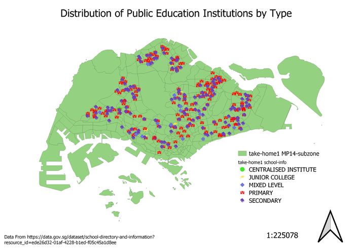
Using school information from data.gov.sg, prepare a thematic map showing the distribution of public education institution by school types such as primary, secondary, etc.
To show the distribution of public education institutions, I firstly classified the schools into the different Public Institution Types, namely “Primary School”, “Secondary School”, “Junior College”, “Mixed Level” and “Centralised Institute”. Different categorical markers and symbols were used to differentiate between the different school types, namely primary, secondary, mixed level and junior college. One marker was used for each type, for better visual representation of the distribution.
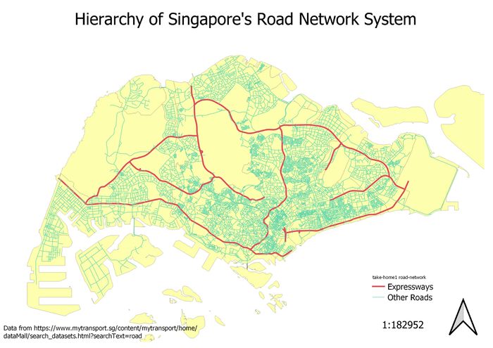
Using road GIS data of LTA, prepare a thematic map showing the hierarchy of road network system of Singapore such as expressway, major road, minor road, etc.
Using road GIS data of LTA, prepare a thematic map showing the hierarchy of road network system of Singapore such as expressway, major road, minor road, etc.
To show the Road Network System in Singapore, I first classified the roads into 2 types, “Expressways”, and “Other Roads”. Currently, there are 10 expressways in Singapore, and the 11th; the North-South Corridor will be completed in 2026. All 10 expressways are shown in thicker, red lines, while the other roads are in thinner, green lines. This helped to easily differentiate between the different types of roads, realistically depicting the sizes of roads.
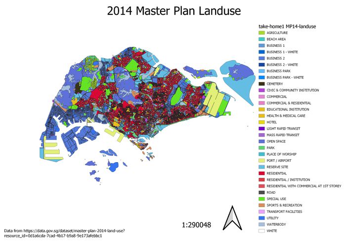
Using master plan landuse GIS data from data.gov.sg, prepare a thematic map showing 2014 Master Plan Landuse.
To show the different land uses in the 2014 Master Plan, I first classified the land according to LU_DESC, the different uses, such as Agriculture, or Business. However, there were many categories, and the map ended up very messy, and difficult to read. To solve this, I changed some of the colours to suit their uses, such as “White” to white, “Waterbody” to blue, and “Park” to green. Also, for areas that had similar uses, or were used for similar industries, I changed the colours, so that they were similar to each other. For example, land used for businesses, (Business 1, Business 1- White, Business 2, etc.) are in different shades of blue, and residential areas (residential, residential with commercial at first story, residential/institution) in red.
Part 2: Choropleth Mapping
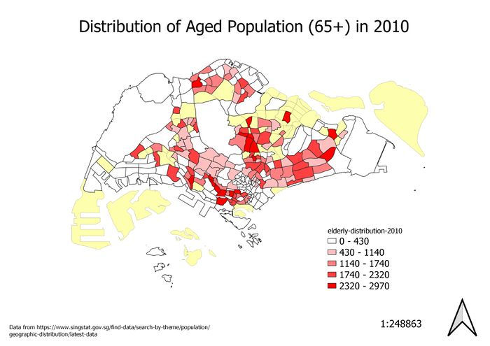
Aged population (+65) in 2010
In general, the areas with the greatest number of elderly people include areas in the central, south and east regions. However, many of the areas with fewer elderly people are not residential areas, referring to the Landuse map from Part 1.
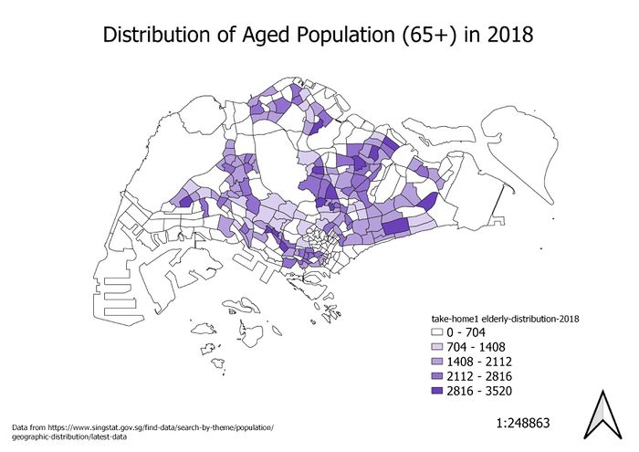
Aged population (+65) in 2018
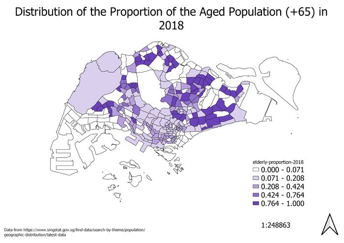
The size of the aged population increased from 2010 to 2018, as seen by the overall increase in the number of elderly people. The number of people increased in most subzones in every region where residential areas were present.
