SMT201 AY2018-19T1 EX1 Soh Ze Yu
Contents
Part One
Public education
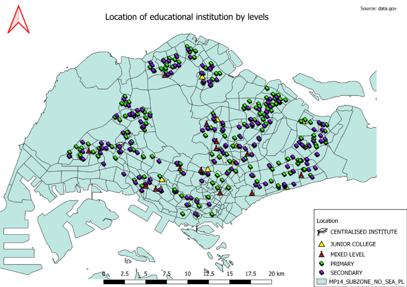
General educational institution information was found from data.gov and the excel sheet was loaded into qgis using python console. The file had already pre-categorised it into primary, secondary, mixed, junior college and centralised institutions. This information was also loaded into qgis and used to sort at the symbology table. Since secondary and primary school number the most and is easily understood, they have the same symbol but different colours. As there is only one centralised institution, it was given a larger icon to stand out.
Road type
For the creation of road hierarchy, a new attribute column was created and the roads were sorted into the 6 main categories: Expressway, Semi-expressway, Major arterial, Minor arterial, Primary access and Local access. Further breakdown of category will make the classification scope too narrow and result in too complicated map design. For the major and bigger roads, their size were edited to make them more obvious and show their capacity to hold more cars as compared to smaller roads.
Distribution of School by Type in Singapore
To achieve the location for each school. The information from general-information-of-schools was geocoded with the OneMap API using Python code. The Geocode shape layer is also later joined with general-information-of-school to get the various school types. The schools in the Thematic Map is represented by a Book SVG and the various colors show the different type of school (Primary, Secondary, Junior College). It appear like the most type of school in Singapore is Secondary.
Master plan
For the creation of the thematic map, the initial categorisation was too messy and colourful for it to be useful for users. Hence recategorization was done on a new attribute column, grouping subtypes into main types such as residential, commercial, agriculture, recreational, infrastructure, transport, green spaces, road, water body, hospitality and others. Users who need more specific information can always click on the map for further details. Colour scheme was decided at random but specific land use was chosen for more intuitive design such as green for green spaces and blue for water body.
