SMT201 AY2019-20G1 EX1 Eugene Choy Wen Jia
Contents
- 1 Part One
- 2 Part Two
- 2.1 Age Population (65 and Above) in Singapore by Subzone for Year 2010 & 2018
- 2.2 Proportion of Aged Population (65 and Above) in Singapore by Subzone for Year 2010 & 2018
- 2.3 Percentage Change of Aged Population (65 and Above) in Singapore by Subzone from Year 2010 to 2018
- 2.4 Classification Choice, New Variables, Relevant Judgement and Assumptions
- 3 References & Acknowledgements
Part One
2014 Master Plan Landuse
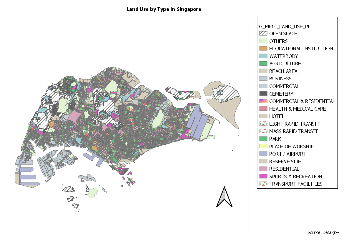
Categorized Symbology was used to show a visual representation of the various different usage of land in Singapore. Similar categories were grouped together (Business, Business 1, Business Park) to avoid displaying too many colors which may be confusing and difficult to understand. A pattern with lines is used on Open Space to show that the spaces were not planned for any specific kind of development. This clear distinct visualization makes it easier for user potential user who plans for Land Use to know that this space is opened for planning.
Road Section Line
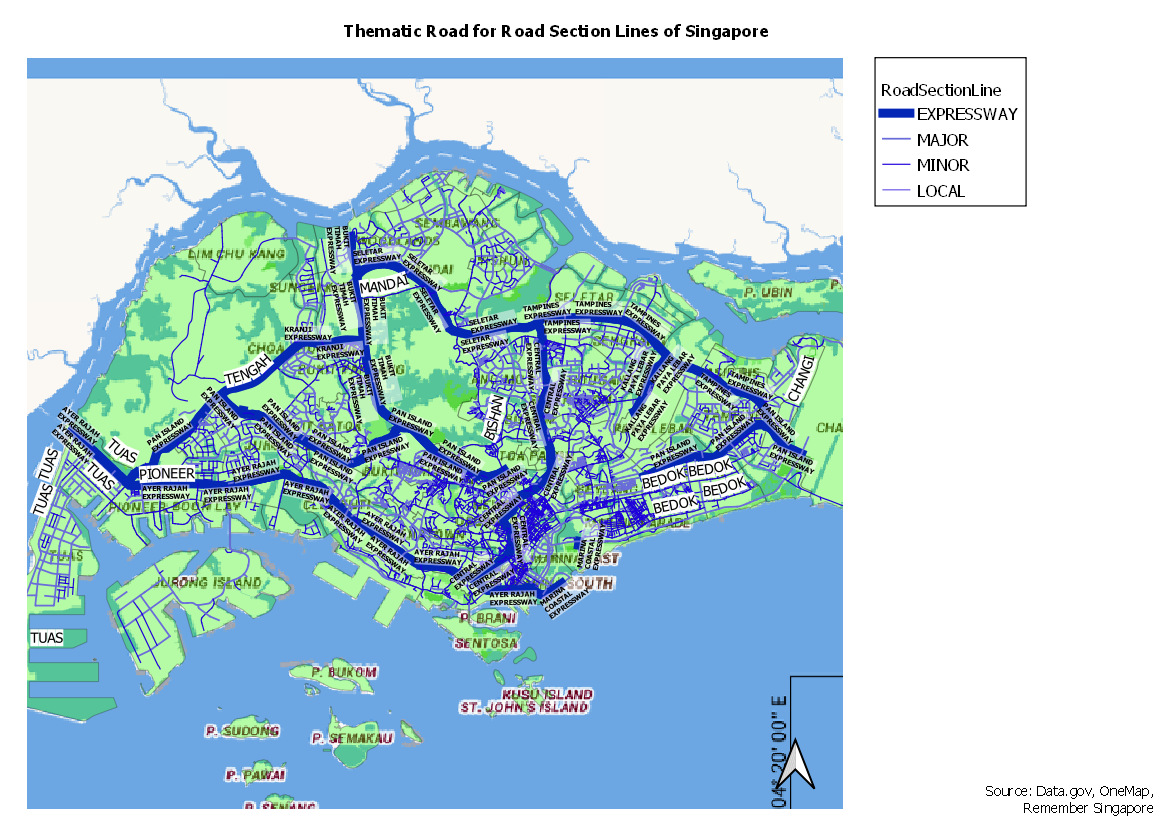
Road Section Lines are represented with Categorized Symbology as well. The type of roads are categorized with various width instead of difference in color, with Expressways having the thickest width. This helps the user to visualize the hierachy of the various road. The types of road are derived by whether it is a "Road , drive, Expressway" with reference from Remember Singapore.
Distribution of School by Type in Singapore
To achieve the location for each school. The information from general-information-of-schools was geocoded with the OneMap API using Python code. The Geocode shape layer is also later joined with general-information-of-school to get the various school types. The schools in the Thematic Map is represented by a Book SVG and the various colors show the different type of school (Primary, Secondary, Junior College). It appear like the most type of school in Singapore is Secondary.
File Structure for Part One
The Layers for the map were all saved into Geopackage (root/geopackage/take-home-ex1-pkg) with the corresponding Style for each Layer saved into (root/styles). The corresponding GeoPackage Layer and Style is as follows:
| Map Layer | GeoPackage Layer Name | Style Path | Remarks |
|---|---|---|---|
| G_MP14_LANDUSE_PL | TakeHome1_MP14_LandUse | TakeHome1_MP14_LandUse_Style | - |
| RoadSectionLine | TakeHome1_RoadSectionLine | TakeHome1_RoadSectionLine_Style | - |
| Schools | TakeHome1_Schools | TakeHome1_Schools | Geocoded from general-information-of-schools with Python Cdoe |
| general-information-of-schools | TakeHome1_SchoolInfo_csv | - | CSV for list of schools and their types |
Part Two
Age Population (65 and Above) in Singapore by Subzone for Year 2010 & 2018
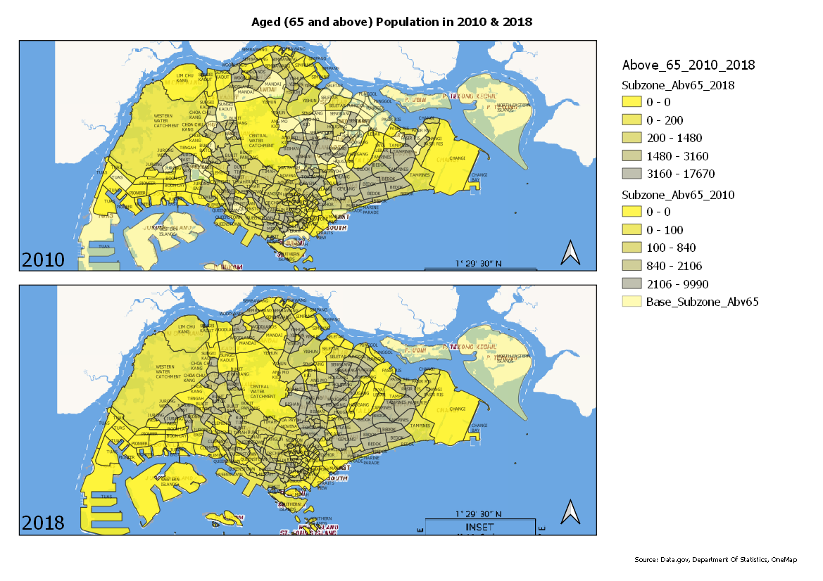
This Map shows the classification of regions based on the population of Aged Population. The more Aged Population there is on a particular subzone, the close to grey it is. By comparing both maps,we can see that there is a slight increase in aged population from the year 2010 to year 2018. This change shows an likelihood of an ageing population in some of this subzones. It is also noted that some Subzones did not exist prior to 2018.
Proportion of Aged Population (65 and Above) in Singapore by Subzone for Year 2010 & 2018
This Map shows the classification of regions based on the proportion of Aged Population. The higher the proportion of Aged Population there is on a particular subzone, the close to grey it is. Some area appears to be more grey in 018 as compared to 2010, implying that the proportion of Aged population increased over the years. This is an interesting because when compared to the Age Population Map for 2010-2018, it does not seem like the aged population increased a lot in some areas. However, the proportion of the Aged population increased significantly in some of this areas. This could imply that in the 2010s many of these population were about 60~64.
Percentage Change of Aged Population (65 and Above) in Singapore by Subzone from Year 2010 to 2018
The Map visualizes the change in percentage of Aged Population from 2010 to 2018. If the region is nearer to green, it indicates there is a drop or there is very minor increase in percentage. The redder the region is, the more significant the increase in aged population. The Max % change in Aged Population is 19% in the Boat Quay Sub Zone (calculated and obtained using Expression). Through this map, it is evident that Singapore is facing an increasing aging population from 2010 to 2018 as many of the regions appear to be in the red.
Classification Choice, New Variables, Relevant Judgement and Assumptions
Graduated Symbology were performed on all Choropleth Mapping with the Quantile Classification to get ranges of equal variance. In order to derive with the new variables, several steps were required starting from the selection of data from Department of Stats. After procuring the data source, some preparations have to be done on the Excel File. Relevant data was extracted from the relevant tab, with dashes replaced with 0 and commas were removed from the numbers (comma will confuse CSV). After converting the data into CSV format, a CSVT file is prepared to help QGIS understand the various Data Type for each column. The CSV is then imported into QGIS.
There were some Subzones missing from the 2010 one which existed in 2018. However, I did not change anything as I was unable to confirm the locations of the subzones although some seem to just be in a different naming. After the importing of both csv, field calculator was used to create columns for Sum of people above 65, percentage of population above 65 as well as upper casing the Subzone column in the Delimited Text Layer. A new Subzone layer was added and a new column was created to calculate the percentage change in aged population from 2010 to 2018.
For the Choropleth map for both Population and Percentage, I choose brighter colors to indicate a lower population/percentage of aged population and grey to indicate a "Greying" population. This helps to visualize the intensity of the Aged population in that particular subzone. The map that compares the percentage change, I used green to indicate a drop/minor increase and red to signify a major increase. This can help a user visualize the intensity of change. For a Urban Planner, seeing that a region is in the red could also mean that the velocity of aging population is high and there is a need to plan ahead to ensure that the needs of an aging population is met (facilities, ramps, handrails).
References & Acknowledgements
Data.gov For SHP file data
Department of Statistics For Subzone Age statistics
Remember Singapore Understanding how to differentiate Expressway, Major Road, Minor Road


