SMT201 AY2018-19T1 EX1 Pek Hui Leng Jolene
Part 1: Thematic Mapping
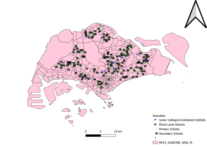
Thematic map showing distribution of public education insitution by school type
Cartographic technique is used as primary, secondary, mixed institution and junior college/centralised institutes are ordinal data. Since one institution is fixed at one location, symbols can be used to represent that particular institution. Each symbol corresponds to each type of institution respectively. Various distinct symbols (ie all not one shape) were used to differentiate the different institutions easily.
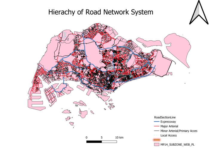
Thematic map showing hierachy of road network system of Singapore
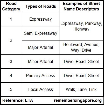
Cartographic technique is used as the hierarchy of roads are ordinal data too. The roads are classified as such:
The lines for each category are in different colors to differentiate them. To enhance the differentiation, the thickness of the line decreases as the roads become more minor.
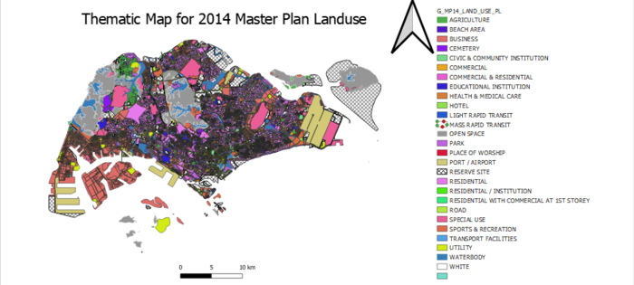
Thematic map showing 2014 Master Plan Landuse
The areas were classified based on the land description and they are nominal data hence cartographic technique is used. Each color represents a different land use. As there were many types of businesses, I decided to lump them altogether in a main category called “Business”.
Part 2: Choropleth Mapping
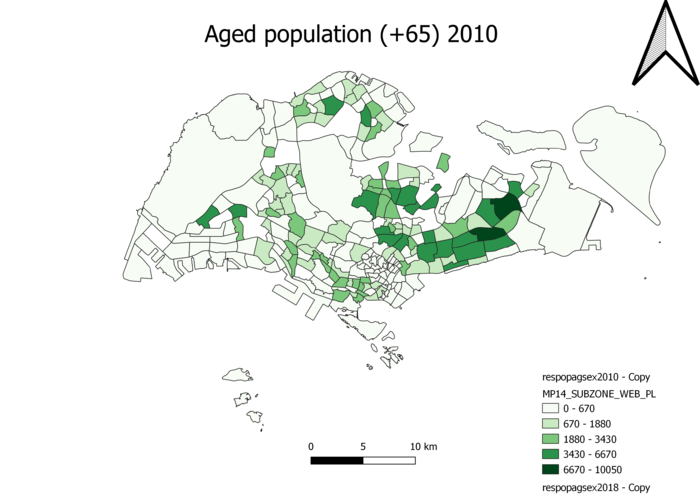
Aged population (+65) in 2010
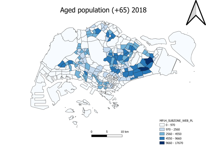
Aged population (+65) in 2018
The csv had the following data: planning area, subzone, age group, sex, population and year. Using excel, I filtered to focus on 2010 and 2018 respectively and saved these 2 years’ data in separate csv files. Then, I filtered again to obtain values from the various categories making up the elderly population(65-69, 70-74, 75-69, 80-84, 85+) and summed them up. I then joined this newly filtered csv file with MP_14_SUBZONE layer on the attribute ‘Subzone’ for the csv file and ‘SUBZONE_N’ for MP_14_SUBZONE layer. Since the data is quantitative and continuous, graduation was used to differentiate the population for each subzone. For both 2010 and 2018, there are more elderly living in the east and from the general increase in the intensity of the colors from both maps, the population of elderly increased from 2010 to 2018.
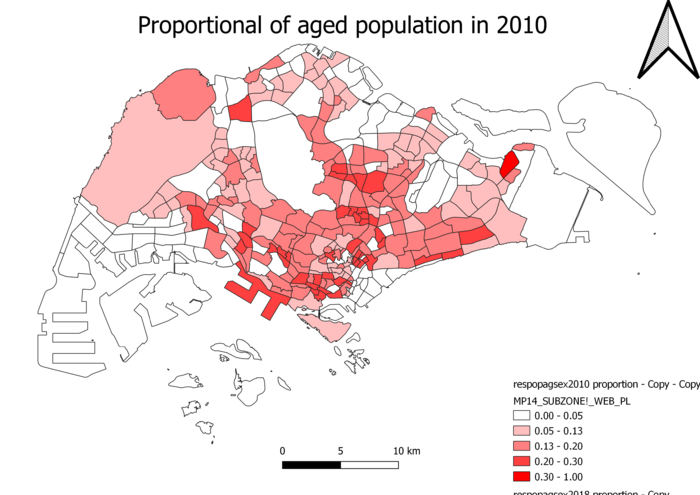
Proportional of aged population in 2010
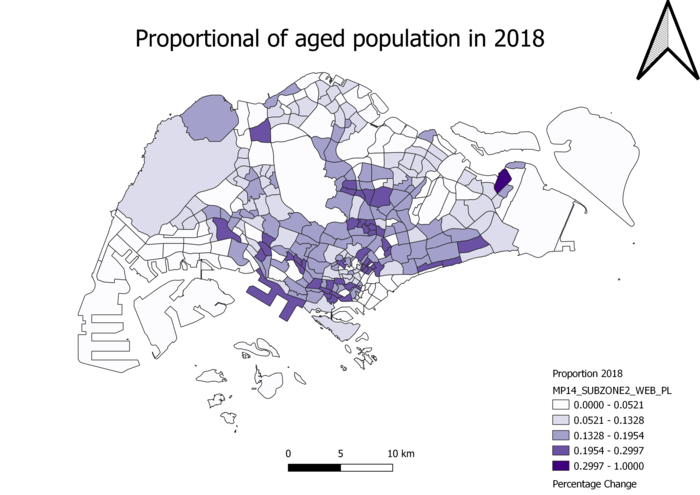
Proportional of aged population in 2018
Using the same csv file as above, I summed up the population from each subzone from all age groups in 2010 and 2018 respectively using excel. Using the data about elderly population from before, I created a new column ‘Proportion’ which is the ratio of elderly population to entire population of each particular subzone and year. The other steps are similar to above. It can be concluded that there is a higher proportion of elderly towards the south of Singapore.
Percentage change of aged population between 2010 and 2018
I imported the csv files that include the proportional of aged population in 2010 and 2018 respectively into qgis and joined them based on the attribute ‘Subzone’. Thereafter, using field calculator, I created a new field ‘Percentage change’ which took the formula ((Proportion2018-Proportion2010)/Proportion2010)*100. I then joined this new table with the Percentage field with MP_14_SUBZONE layer on the attribute ‘Subzone’ for table and ‘SUBZONE_N’ for MP_14_SUBZONE layer. There is generally a positive percentage change of elderly in Singapore.
