SMT201 AY2019-20T1 EX1 Wang Youjin
Contents
Part 1: Thematic Mapping
Explain how the mapping were developed with elaboration:
| Data | QGIS Techniques |
|---|---|
| data.gov - “School Directory and Information” |
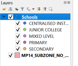
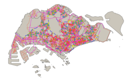
New Layer created: Schools created from csv file using Geocoding tool MMQGIS plugin. 'Address' attribute is used for openstreet map projection Distribution of school types: Under Symbology, select categoriszation by `mainlevel_` attribute.Different colors are used to indication different school types for easy illustrative reference purpose School types
Data not found CSV from geocoding: |
| data.gov - “Masterplan 2014 Landuse” "National Map Line"
SLA - "Road Selection Line" |
Layer Imported: Land Use, Road Selection Line, National Map Line Different color lines and width are used to represent different types of road with cateogirized technique performed on the map line layer use FIGURE II SCALE VISIBILITY
|
| “MP14_SUBZONE_NO_SEA_PL” by URA retrieved from data.gov.sg. | Layer: MP14_SUBZONE_NO_SEA_PL
Symbology: Light Brown simple fill
|
<brt
FIGURE IV
OVERVIEW OF THEMATIC MAPPING
Part 2: Choropleth Mapping
[[File:|center]]
FIGURE VIII
LAYERS EXPORTED
The choropleth mapping developed uses these following data and applied techniques:
Sources and Methods
| Dataset | Visualisation & Processing Technique |
|---|---|
| “Singapore Residents by Planning Area/Subzone, Age Group and Sex, June 2000 - 2018” from Department of Statistics Singapore. |
Layer: respopagsex2000to2018_unfiltered Processing: 1. [[File: |center|600px]] FIGURE IX FILTERING AGED POPULATION 2. .
FIGURE X AGGREGATING DATA USING GROUPSTATS
FIGURE XI IMPORTING GROUPSTATS GENERATED CSV USING CUSTOM DELIMITER s: a. `is. b. ones. [[File:|center|400px]] FIGURE XII DATA OVERVIEW OF IMPORTED GROUPSTATS DATA
[[File:|center|400px]] FIGURE XIII DATA OVERVIEW OF IMPORTED GROUPSTATS DATA 4. Led. 5. We [[File:|center|400px]] FIGURE XIV PROPORTION FIELD CREATION
a. [[File:|center|300px]] FIGURE XV DERIVING PERCENTAGE CHANGE 6. L
|
| Singapore Master Plan 2014 Subzone and Planning Area 2014 boundary data retrieved from data.gov |
1. `SumAgedPopulation2010_PA` layer joined with `sum_aged_pop_2010_pa` by matching attribute `PLN_AREA_N` and `Zone_ID_PA`. a. Symbology (Natural Jenks): [[File:|center|400px]] FIGURE XVI CATEGORISATION OF PLANNING AREA SUM AGED POPULATION DATA
[[File:|center|400px]] FIGURE XVII CATEGORISATION OF PLANNING AREA SUM AGED POPULATION DATA
[[File:|center|400px]] FIGURE XVIII CATEGORISATION OF SUBZONE SUM AGED POPULATION DATA 4. `SumAgedPopulation2018_SZ`layer joined with `sum_aged_pop_2018_sz` by matching attribute `SUBZONE_N` and `Zone_ID_SZ`. a. Symbology (Natural Jenks): [[File:|center|400px]] FIGURE XIX CATEGORISATION OF SUBZONE SUM AGED POPULATION DATA 5. `ProportionAgedPopulation2010_SZ` layer joined with `propotion_aged_pop_2010` by matching attribute `SUBZONE_N` and `Zone_ID_SZ`. a. Symbology (Natural Jenks):
FIGURE XX CATEGORISATION OF SUBZONE PROPORTION AGED POP DATA 6. `ProportionAgedPopulation2018_SZ` layer joined with `propotion_aged_pop_2018` by matching attribute `SUBZONE_N` and `Zone_ID_SZ`. a. Symbology (Natural Jenks): [[File:|center|400px]] FIGURE XXI CATEGORISATION OF SUBZONE PROPORTION AGED POP DATA 7. `Percentage_Change_SZ` layer joined with `2010_2018_percentage_change` by matching attribute `SUBZONE_N` and `Zone_ID_SZ`. a. Symbology: Below is the configuration used for percentage change of aged population. The legend classification intervals were split into 2 ways, negative changes which represents a decrease change were categorised using an equal distribution from the minimum decrease value of -100% to 0. Next, Natural Breaks (Jenks) were used to classify the 5 next categories for the positive values to indicate. Due to its high variance value, the Jenks classification represents best for this case. Additionally, 2 distinct colours (red and blue) were used to appropriately display the nature of percentage change of the aged population from 2010 to 2018. [[File:|center|500px]] FIGURE XXII CATEGORISATION OF SUBZONE PERCENTAGE CHANGE DATA [[File:|center|500px]] FIGURE XXIII 3 BASE COLOR PICK FOR SUBZONE PERCENTAGE CHANGE DATA
FIGURE XXIV DATA LABELLING For
FIGURE XXV CATEGORISATION OF SUBZONE PERCENTAGE CHANGE DATA
|
Data Interpretation
Aged population (+65) in 2010 and 2018
[[File:|center|800px]]
FIGURE XXVI
OVERVIEW MAP OF TOTAL AGED POPULATION IN 2010 BY PLANNING AREA
The plotted map a
FIGURE XXVII
OVERVIEW MAP OF TOTAL AGED POPULATION IN 2018 BY PLANNING AREA
As we \ -
[[File:|center|400px]]
FIGURE XXVIII
OVERVIEW MAP OF TOTAL AGED POPULATION IN 2010 BY SUBZONE WITH LABEL
Figure
[[File:|center|400px]]
FIGURE XXIX
OVERVIEW MAP OF TOTAL AGED POPULATION IN 2010 BY SUBZONE WITHOUT LABEL
[[File:|center|400px]]
FIGURE XXX
OVERVIEW MAP OF TOTAL AGED POPULATION IN 2018 BY SUBZONE WITHOUT LABEL THAT SHOWS INCREASE AGED POPULATION
Figure
[[File:|center|300px]]
FIGURE XXXI
LABELLING FOR TOTAL AGED POPULATION BY PLANNING AREA/SUBZONE
Fie map.
Proportional of aged population in 2010 and 2018
[[File:|center|400px]]
FIGURE XXXII
OVERVIEW MAP OF THE AGED POPULATION PROPORTION IN 2010 BY SUBZONE
[[File:|center|400px]]
FIGURE XXXIII
OVERVIEW MAP OF THE AGED POPULATION PROPORTION IN 2018 BY SUBZONE
We
Percentage change of aged population between 2010 and 2018
Percentage Change only include those that has non 0 value in year 2010. Thus if 2018 have value it still doesn’t count as the percentage change is not valid,
[[File:|center|600px]]
FIGURE XXXIV
OVERVIEW MAP OFPERCENTAGE CHANGE BETWEEN 2010 & 2018 BY SUBZONE WITH LABEL
Figu
[[File:|center|600px]]
FIGURE XXXV
OVERVIEW MAP OFPERCENTAGE CHANGE BETWEEN 2010 & 2018 BY SUBZONE WITHOUT LABEL


