SMT201 AY2019-20T1 EX1 Wang Youjin
Part 1: Thematic Mapping
Explain how the mapping were developed with elaboration:
| Data | QGIS Techniques |
|---|---|
| Data retrieved from data.gov - “School Directory and Information” |
New Layer created from csv file: Schools Symbology: Categorised by `mainlevel_` attribute which indicates if an indicated point belongs to either centralised institute, junior college, mixed level, secondary or primary school. Each category is labeled with following color: FIGURE I ROAD SELECTION LINE AND MAP LINE
Processing: The initial dataset was geocoded using the MMQIS by its `address` field in order to retrieve `latlong` projection of the data points. Data not found: |
| “Masterplan 2014 Landuse” dataset retrieved from data.gov.sg. | Layer: Land Use
Symbology: Light Grey simple fill
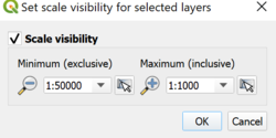
FIGURE II SCALE VISIBILITY
|
| SLA’s National Map Line retrieved from data.gov.sg. Road Selection Line dataset retrieved from SLA provided by Prof Kam (HandsOnEx1). |
Layer: Map Line & Road Network
FIGURE III ROAD SELECTION LINE AND MAP LINE Processing: 2 datasets was used to represent different types of road. The national map line only provides expressway, major roads, international boundary and contour lines, the road selection data provides overall road network in Singapore. The Map Line layer highlights its road types using the categorisation rule, applying different colours and line width to emphasize type of road. The minor road can be implied by excluding road network that belongs to express way, intersections, and major roads. |
| “MP14_SUBZONE_NO_SEA_PL” by URA retrieved from data.gov.sg. | Layer: MP14_SUBZONE_NO_SEA_PL
Symbology: Light Brown simple fill Was included to provide a macro view base layer as an optional display. The layer represents subzones that could be useful in interpreting where road networks or school is located. OpenStreetMap view could also be used, however the subzone layer better express the subzone boundaries through a simple display. |
FIGURE IV
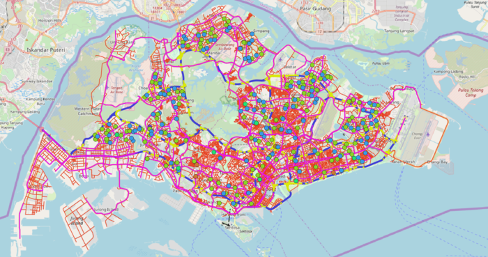
OVERVIEW OF THEMATIC MAPPING
Firstly, the thematic mapping shown in figure 5 represents the default view of the map. School data points, map line and road network are shown on top of the OpenStreetMap.
FIGURE IV
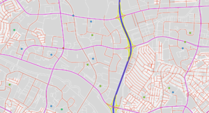
MICRO VIEW OF LAND USE VISIBILITY WITH ROAD NETWORKS AND SCHOOL DATA POINTS
The land use data was set with automatic scale visibility, the overall land use layer will only be clearly visible as the user zooms in for interpretation. The land use data provides a micro level data of the indicative polygon of each development land parcel. Thus, there’s no need for this layer to be displayed in a more macro view as lines will not be value-adding to visualisation interpretation.
Next, the national map line only provides expressway (blue line), major roads (magenta line), international boundary and contour lines (excluded), while the road selection data provides overall road network in Singapore. Thus, achieving an overview of all types of road can be done by overlapping the road networks to retrieve minor road (red line) through overlapping as shown in figure V.
FIGURE VI
SUBZONE VIEW
FIGURE VII
OPENSTREETMAP VIEW
The `MP14_SUBZONE_NO_SEA_PL` and OpenStreetMap layer (Figure VI & VII) were added as I believe that it might help in terms of data interpretation, eg: finding out where a junior college is located by subzones and its distance to major road where it's usually major road provides better transportation option/accessibility.
Part 2: Choropleth Mapping
[[File:|center]]
FIGURE VIII
LAYERS EXPORTED
The choropleth mapping developed uses these following data and applied techniques:
Sources and Methods
| Dataset | Visualisation & Processing Technique |
|---|---|
| “Singapore Residents by Planning Area/Subzone, Age Group and Sex, June 2000 - 2018” from Department of Statistics Singapore. |
Layer: respopagsex2000to2018_unfiltered Processing: 1. [[File: |center|600px]] FIGURE IX FILTERING AGED POPULATION 2. .
FIGURE X AGGREGATING DATA USING GROUPSTATS
FIGURE XI IMPORTING GROUPSTATS GENERATED CSV USING CUSTOM DELIMITER s: a. `is. b. ones. [[File:|center|400px]] FIGURE XII DATA OVERVIEW OF IMPORTED GROUPSTATS DATA
[[File:|center|400px]] FIGURE XIII DATA OVERVIEW OF IMPORTED GROUPSTATS DATA 4. Led. 5. We [[File:|center|400px]] FIGURE XIV PROPORTION FIELD CREATION
a. [[File:|center|300px]] FIGURE XV DERIVING PERCENTAGE CHANGE 6. L
|
| Singapore Master Plan 2014 Subzone and Planning Area 2014 boundary data retrieved from data.gov |
1. `SumAgedPopulation2010_PA` layer joined with `sum_aged_pop_2010_pa` by matching attribute `PLN_AREA_N` and `Zone_ID_PA`. a. Symbology (Natural Jenks): [[File:|center|400px]] FIGURE XVI CATEGORISATION OF PLANNING AREA SUM AGED POPULATION DATA
[[File:|center|400px]] FIGURE XVII CATEGORISATION OF PLANNING AREA SUM AGED POPULATION DATA
[[File:|center|400px]] FIGURE XVIII CATEGORISATION OF SUBZONE SUM AGED POPULATION DATA 4. `SumAgedPopulation2018_SZ`layer joined with `sum_aged_pop_2018_sz` by matching attribute `SUBZONE_N` and `Zone_ID_SZ`. a. Symbology (Natural Jenks): [[File:|center|400px]] FIGURE XIX CATEGORISATION OF SUBZONE SUM AGED POPULATION DATA 5. `ProportionAgedPopulation2010_SZ` layer joined with `propotion_aged_pop_2010` by matching attribute `SUBZONE_N` and `Zone_ID_SZ`. a. Symbology (Natural Jenks):
FIGURE XX CATEGORISATION OF SUBZONE PROPORTION AGED POP DATA 6. `ProportionAgedPopulation2018_SZ` layer joined with `propotion_aged_pop_2018` by matching attribute `SUBZONE_N` and `Zone_ID_SZ`. a. Symbology (Natural Jenks): [[File:|center|400px]] FIGURE XXI CATEGORISATION OF SUBZONE PROPORTION AGED POP DATA 7. `Percentage_Change_SZ` layer joined with `2010_2018_percentage_change` by matching attribute `SUBZONE_N` and `Zone_ID_SZ`. a. Symbology: Below is the configuration used for percentage change of aged population. The legend classification intervals were split into 2 ways, negative changes which represents a decrease change were categorised using an equal distribution from the minimum decrease value of -100% to 0. Next, Natural Breaks (Jenks) were used to classify the 5 next categories for the positive values to indicate. Due to its high variance value, the Jenks classification represents best for this case. Additionally, 2 distinct colours (red and blue) were used to appropriately display the nature of percentage change of the aged population from 2010 to 2018. [[File:|center|500px]] FIGURE XXII CATEGORISATION OF SUBZONE PERCENTAGE CHANGE DATA [[File:|center|500px]] FIGURE XXIII 3 BASE COLOR PICK FOR SUBZONE PERCENTAGE CHANGE DATA
FIGURE XXIV DATA LABELLING For
FIGURE XXV CATEGORISATION OF SUBZONE PERCENTAGE CHANGE DATA
|
Data Interpretation
Aged population (+65) in 2010 and 2018
[[File:|center|800px]]
FIGURE XXVI
OVERVIEW MAP OF TOTAL AGED POPULATION IN 2010 BY PLANNING AREA
The plotted map a
FIGURE XXVII
OVERVIEW MAP OF TOTAL AGED POPULATION IN 2018 BY PLANNING AREA
As we \ -
[[File:|center|400px]]
FIGURE XXVIII
OVERVIEW MAP OF TOTAL AGED POPULATION IN 2010 BY SUBZONE WITH LABEL
Figure
[[File:|center|400px]]
FIGURE XXIX
OVERVIEW MAP OF TOTAL AGED POPULATION IN 2010 BY SUBZONE WITHOUT LABEL
[[File:|center|400px]]
FIGURE XXX
OVERVIEW MAP OF TOTAL AGED POPULATION IN 2018 BY SUBZONE WITHOUT LABEL THAT SHOWS INCREASE AGED POPULATION
Figure
[[File:|center|300px]]
FIGURE XXXI
LABELLING FOR TOTAL AGED POPULATION BY PLANNING AREA/SUBZONE
Fie map.
Proportional of aged population in 2010 and 2018
[[File:|center|400px]]
FIGURE XXXII
OVERVIEW MAP OF THE AGED POPULATION PROPORTION IN 2010 BY SUBZONE
[[File:|center|400px]]
FIGURE XXXIII
OVERVIEW MAP OF THE AGED POPULATION PROPORTION IN 2018 BY SUBZONE
We
Percentage change of aged population between 2010 and 2018
Percentage Change only include those that has non 0 value in year 2010. Thus if 2018 have value it still doesn’t count as the percentage change is not valid,
[[File:|center|600px]]
FIGURE XXXIV
OVERVIEW MAP OFPERCENTAGE CHANGE BETWEEN 2010 & 2018 BY SUBZONE WITH LABEL
Figu
[[File:|center|600px]]
FIGURE XXXV
OVERVIEW MAP OFPERCENTAGE CHANGE BETWEEN 2010 & 2018 BY SUBZONE WITHOUT LABEL
Exported Maps from Map Composer
[[File:|center|800px]]


