SMT201 AY2019-20T1 EX1 Au Xue Qi Vanessa
Part 1: Thematic Mapping
Distribution of Public Education Institution by School Types
The point symbols I used in the Education layer represent each school and its location. Each school is a zero-dimensional feature on the map. This is done such that users can easily observe the spread of education institutions in each planning area. The educational institutes are discrete quantitative values that exist on a single location on the map. Each type of educational institute (ie. Centralised Institutes, Junior Colleges, Secondary, Primary) is represented by a different symbol of different colour so that it is easier to differentiate between them.
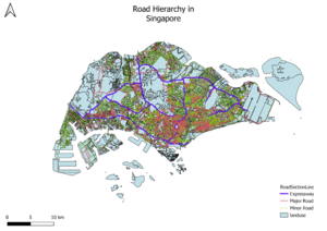
Road Network System Hierarchy of Singapore
I used a single colour for the RoadSection Line and colour saturation. The line symbols represent the various major and minor roads and expressways in Singapore, which are qualitative values. Line symbols are also one-dimensional as they indicate the flow of roads in the country. A new column “RD_TYPE” was added to the dataset to classify the dataset into different types of roads. Each type of road is represented by a different coloured line of different width to differentiate between them.
2014 Master Plan Landuse Singapore
The various types of lines represent the different types of land use in Singapore, such as the double lines which represent major roads and expressways, and uneven lines that meet to form polygons that represent the water catchment areas in Singapore.
Part 2: Choropleth Mapping
Aged Population (+65) in 2010 and 2018
I classified the data into 5 classes by natural breaks as this classification can better represent the trends in the data. The figures in raw data I used were rounded up by 10. For year 2010, the planning areas refer to areas demarcated in the Urban Redevelopment Authority's Master Plan 2008, while in year 2018, planning areas were areas demarcated in the 2014 Master Plan. A new variable, Age 65+ was also created for the QGIS projects of both 2010 and 2018 to calculate the total number of people aged 65 and above in the respective years. There was no missing data in the dataset used.
Proportion of Aged Population in 2010 and 2018
For year 2010, the planning areas refer to areas demarcated in the Urban Redevelopment Authority's Master Plan 2008, while in year 2018, planning areas were areas demarcated in the 2014 Master Plan. The figures in raw data I used were rounded up by 10. I created a new column in the Proportion2010.csv and Proportion_2010.csv called “Htotal” to calculate the total population in each subzone. Then I calculated the proportion of people age 65+ in each year in the QGIS program with the formula “Age 65+ / Total population * 100”. I classified the data into 5 classes by natural breaks as this classification can better represent the trends in the data.
Percentage Change of Aged Population between 2010 and 2018
For year 2010, the planning areas refer to areas demarcated in the Urban Redevelopment Authority's Master Plan 2008, while in year 2018, planning areas were areas demarcated in the 2014 Master Plan. The figures in raw data I used were rounded up by 10. I created a new field in the attribute table for the dataset of each year called “Age 65+”, before using the formula (“2018 Age 65+” – “2010 Age 65+”) / “2010 Age 65+” * 100 to calculate percentage change and saved it as a new field Percentage_chng.


