SMT201 AY2019-20G1 EX1 Sabrina Liau Ying Ying
Contents
Part One
Public Education Institution Distribution in Singapore
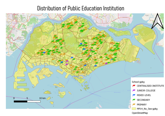
In this thematic map, I have used 3 different layers to show the distribution of the Public education institution in Singapore. Firstly, is the School information that I geocoded from the data that I got from data.gov; I used SVG marker and color code to differentiate the different types of institutions. Secondly, I used the OpenStreetMap to give the map more colors and detail. And finally, I used the MP14_Planning Subzone map to highlight the Singapore map.
Singapore's Road Section Line
For this thematic map, there are the sections are separated into 4 categories Expressway, Local Access, Major Road and Minor Road. And to make it simple for the readers, I adjusted the width and the opacity of the symbols. In addition, as I have done in the previous map, I make use of the OpenStreetMap and MP14_Planning Subzone to beautify and present more detail to the user.
2014 Master Plan Landuse
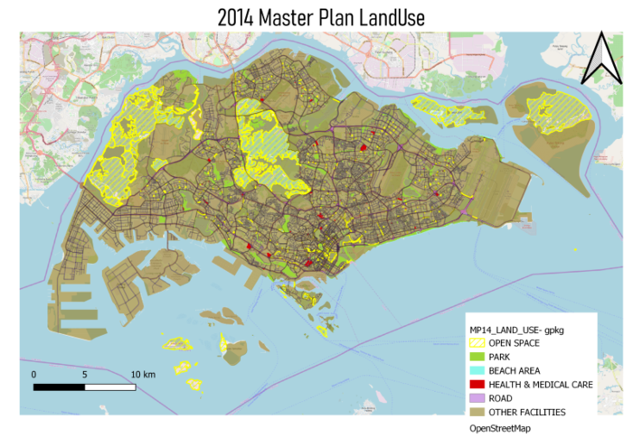
For this thematic map, I chose to merge some of the categories together as I hope to emphasis on some of the important land. For instance, the open space left that could be used in the future, or how much land spaces are a park, is it sufficient. OpenStreetMap is used to give a more detailed map.
Part Two
Age Population (65+) in Singapore by Subzone for Year 2010 & 2018
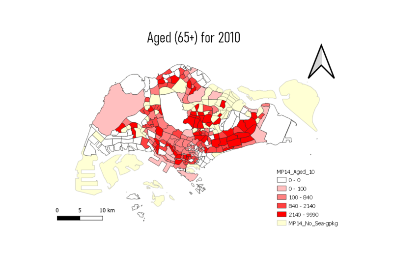
To prepare this Choropleth Map, I had to use 3 different layers, the MP14_Subzone and the 2 CSV file containing the Age Population for 2010 and 2018. I have to first join the Age.csv with the MP14 via the Subzone_n and then create a new field called the aged(+65) for the separate years using the field calculator. As shown in this map, the East region has the most aged population for both 2010 and 2018. This could be a consideration as to where the elderly homes can be focused on.
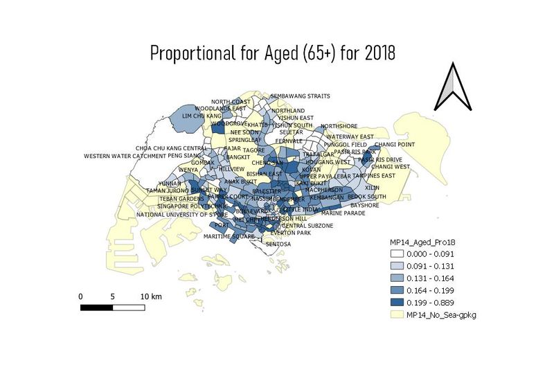
Proportion of Aged Population (65+) in Singapore by Subzone for Year 2010 & 2018
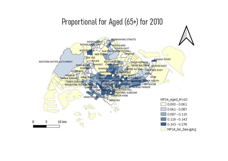
To prepare this Choropleth Map, I used the aged population divided by the total population for the year to derive the proportional of the aged. I used the labeling for the Subzone n to make it easier for the user to visualize the area where the proportional is the highest for each of the years. Comparing the data in 2018 and 2010, there is a significant increase as the darker color increase in the map in 2018.
Percentage Change of Aged Population (65+) in Singapore by Subzone from the Year 2010 to 2018
To prepare this Choropleth Map, I created a new field called the PercenChange to show differences in the proportional between 2010 and 2018. My calculations are proportional2010 - proportional2018 and multiply by 100 to get the percentage. As shown in the map, the area with the highest increased of proportional is Boon Lay with a 19% increase. This could be a concern and an area to improve in future projects
Discussion
The objectives of laying the maps is to derived new information from the existing data to find out concerning problems/ new solutions The different classification methods I have used in the mapping above are to firstly ensure the mapping are right and also it is visually preseentable to the user. The usage of color, symbols and labels would improve the presentationalas well as delivering the detail clearly to the user/ readers. The layout in the maps like the legends and the title lable is the allow the readers/users to understand better of the map. Understanding the data before mapping is very important as it would save more time and effort when mapping the data. And also the usage of the field calculator is important when trying the search, create or delete the fields.
