SMT201 AY2019-20T1 EX1 Eddie Leow Kian Giap
Part 1: Thematic Mapping
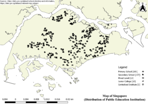
- Using school information from data.gov.sg, prepare a thematic map showing the distribution of public education institution by school types such as primary, secondary, etc.
I have categorized the data set according to the school type such as Primary, Secondary, Mixed Level, Junior College and Centralised Institution. My cartographic technique is to use an icon which represents the school type. For example, I used an icon that states "ABC" to indicate a primary school. The icon is given a width and height of 4 so that it can display clearly on the map without overlapping other nearby school types.
- Using road GIS data of LTA, prepare a thematic map showing the hierarchy of road network system of Singapore such as expressway, major road, minor road, etc.
For this data set, I have categorized them according to the road network system such as expressway, expressway slip road, main road and minor road. My cartographic technique is to use different line colours to represent each system or hierarchy. This gives a clear view of expressway, expressway slip road, major road and minor road to users.
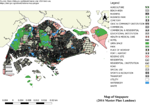
- Using master plan landuse GIS data from data.gov.sg, prepare a thematic map showing 2014 Master Plan Landuse.
As there are many different usage of land, I have grouped some of them together then categorized them with icons or colours to represent the type. One of the groupings I have done is all the business-related type is grouped into business. The icons selected for each type represents the purpose of it. For example, open space is defined by green colour and park is defined by a tree icon.
Part 2: Choropleth Mapping
Using planning subzone GIS data from data.gov.sg and Singapore residents by age group and gender, prepare the following choropleth maps:
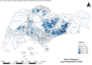
- Aged population (+65) in 2010.
- Aged population (+65) in 2018.
The spatial pattern for both choropleth maps for Aged population in 2010 and 2018 is Area Pattern. Aged population refers to Singapore Residents who are 65 years old and above. From the pattern, it is observed that there are changes to the subzone name over the years. For example, Tuas Coast has changed to Tuas View Extension. Seletar subzone has been further divided into Pulau Punggol Barat subzone and Seletar subzone. The maximum number of aged population in a subzone has a huge increase of around 74% from 9990 to 17389 within 8 years. Also, the two most prominent subzones affected by aged population are Tampines East and Bedok North. Newer estates are shown to have little to no aged population while the older or more mature estates have more aged population.
- Proportional of aged population in 2010.
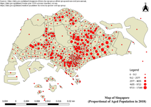
- Proportional of aged population in 2018.
Point pattern is the spatial pattern for both choropleth maps for Proportional of aged population in 2010 and 2018. As mentioned previously, Aged population refers to Singapore Residents who are 65 years old and above. The two types of point pattern observed from the map are uniform type and clustered type. This is because each subzone has only one point which is around the centroid of the subzone. Also, it is observed that some subzones such as Sentosa and small islands have clustered points. As the base map is 2014 Master Plan Subzone from data.gov, there are points in 2010 which are off the outline due to the changes over the years. Some subzones have increased in terms of the size when compared against 2010 and 2018.
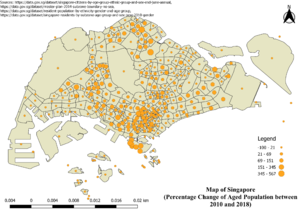
- Percentage change of aged population between 2010 and 2018.
For the percentage change of aged population between 2010 and 2018, the spatial pattern is point pattern. As mentioned previously, Aged population refers to Singapore Residents who are 65 years old and above. Similarly to the proportional of aged population in 2010 and 2018, the two types of point pattern observed from the map are uniform type and clustered type. In this map, clustered points are more prominent compared to the proportional of aged population in 2010 and 2018 because of the change of name for few subzones. It can be observed that there are some subzones which have a steep increase of aged population living in the subzone, vice versa.
In order to derive the missing values of the aged population (65 years old and above) in 2018, I calculated the percentage of each subzone based on the data set found in 2017 on data.gov. With the percentage, I multiplty it with another data set which compromises of aged population in 2018 found on data.gov to derive the value for each subzone in 2018. An assumption is made that the size of subzone does not change. The missing values found in the data set are ignored because it does not affect the outcome of the mapping.
When doing percentage change of aged population between 2010 and 2018, missing values are found. Due to the change in name for subzone, some values are missing when relational tables are joined. As some subzones are new or divided from a bigger and existing subzone, it is hard to determine the actual value. An assumption is made on the subzones which have NULL value is that it is a new subzone so there is no population at the start. Hence, NULL is replace with 0 to handle all the missing values.
Percentage change column is derived using formula of [(2018 aged population - 2010 aged population) / 2010 aged population * 100%].
