SMT201 AY2019-20T1 EX1 Chong Yun Yu
Part 1: Thematic Mapping
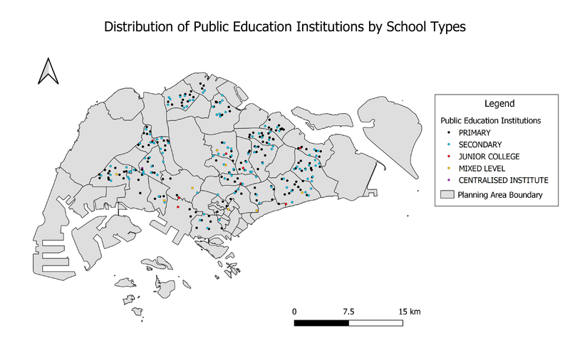
Distribution of Public Education Institution by School Types
Data Source: General information of schools.[1]. Master Plan 2014 Planning Area Boundary (No Sea) (SHP).[2].
To show the distribution of public education institution by school type, I used the variable “mainlevel_” to categorise the datasets. This classifies all school into the different school types, namely “Primary”, “Secondary”, “Junior College”, “Mixed Level” and “Centralised Institute”. I chose to use the same symbol, a coloured circle, for all classifications. I chose a different colour for each class, as shown in the legend. Rather than using different symbols for each category, I used this method as I think it is much easier to read and understand the distribution of the institutions using different colours than shapes.
Road Network System Hierarchy of Singapore
Data Source: Road Section Line.[3]. CoastalOutline from Prof Kan’s Hands-on_Ex01.
According to the URA Handbook on Guidelines for Naming of Streets[4], roads can be classified into 5 categories. I added a new column “RD_TYPE” in the file downloaded from LTA Datamall and classified all roads into the different categories, using the URA guidelines. The 5 categories, from the highest hierarchy to the lowest hierarchy, are “Expressway”, “Major Arterial Road”, “Minor Arterial Road”, “Primary Access Road” and “Local Access Road”. I used a different colour to represent each classification, where all classification has the same line width, as shown in the legend, for better visualisation.
2014 Master Plan Landuse Singapore
Data Source: Master Plan 2014 Land Use (SHP).[5].
To show the landuse in Singapore, I used “LU_DESC”, which contains the description of land usage for each parcel of land, to classify the data. As there are 32 different categories of landuse, it is quite difficult to identify each category easily with the random colours generated by QGIS. I attempted to make the visualisation better by changing the colours to make them make more sense. For example, I used different hues of green for open spaces and parks, bright red for special use and light grey for cemetery.
Part 2: Choropleth Mapping
Aged Population (+65) in 2010 and 2018
Proportion of Aged Population in 2010 and 2018
Percentage Change of Aged Population between 2010 and 2018
Discussion
test
test

