SMT201 AY2019-20G1 Ex2 Kang Hui Yun
Contents
Part 1: Base Map Views
Buildings
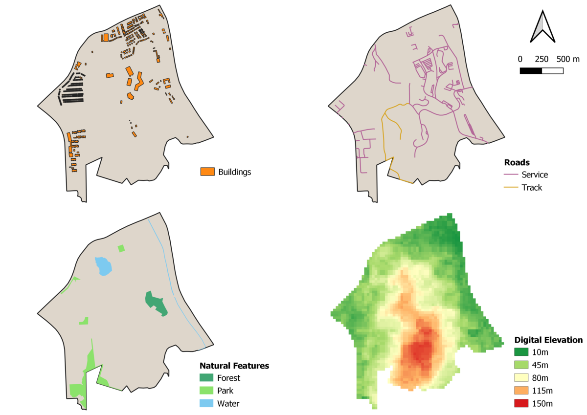
In Gombak, buildings are not evenly distributed—most of them are situated around the boundary of the subzone and exist in the form of clusters. More specifically, there are huge and dense concentration of buildings lying on the north, northwest and southwest area, while the central has fewer but bigger buildings built in a sparser manner. The south and southeast counterparts are rather remote, with only one building seen in southeast.
Roads
After filtering out the service roads and tracks from the rest, it is observed that the network is highly concentrated central east of Gombak, with the rest mostly situated around the boundary. Compared to tracks, service roads are predominant in the area.
Natural Features
Within Gombak there are also several natural features present. The 3 types of features are categorised into different colour representation, intuitively: light blue for waterbodies, light green for parks and dark green for forest. As it will be difficult to tell what both the long and narrow features are, the strokes are removed so that the colours do not get overshadowed. From observation, there are 2 stretches of waterbody near the east perimeter and a forest nearby. There is also another waterbody across north, sandwiched between 2 parks. We can also see 2 other parks located in west and southwest.
Digital Elevation
The map view of the digital elevation has been clipped to only show the Gombak area. This is because it is neater—the map reader will not get much out of the alternative view if the digital elevation of the whole extent is shown with the boundary overlay, as it is hard and/or unlikely for someone to observe the elevation around the boundary itself. The elevation is also intuitively colour-coded with 2 extremes: green and red. Green represents area with gentle slopes, red for steep slopes and anything between will be subdivided into equal intervals with its representative colour.
Part 2: Proximity/Slope Map Views
Proximity to Buildings
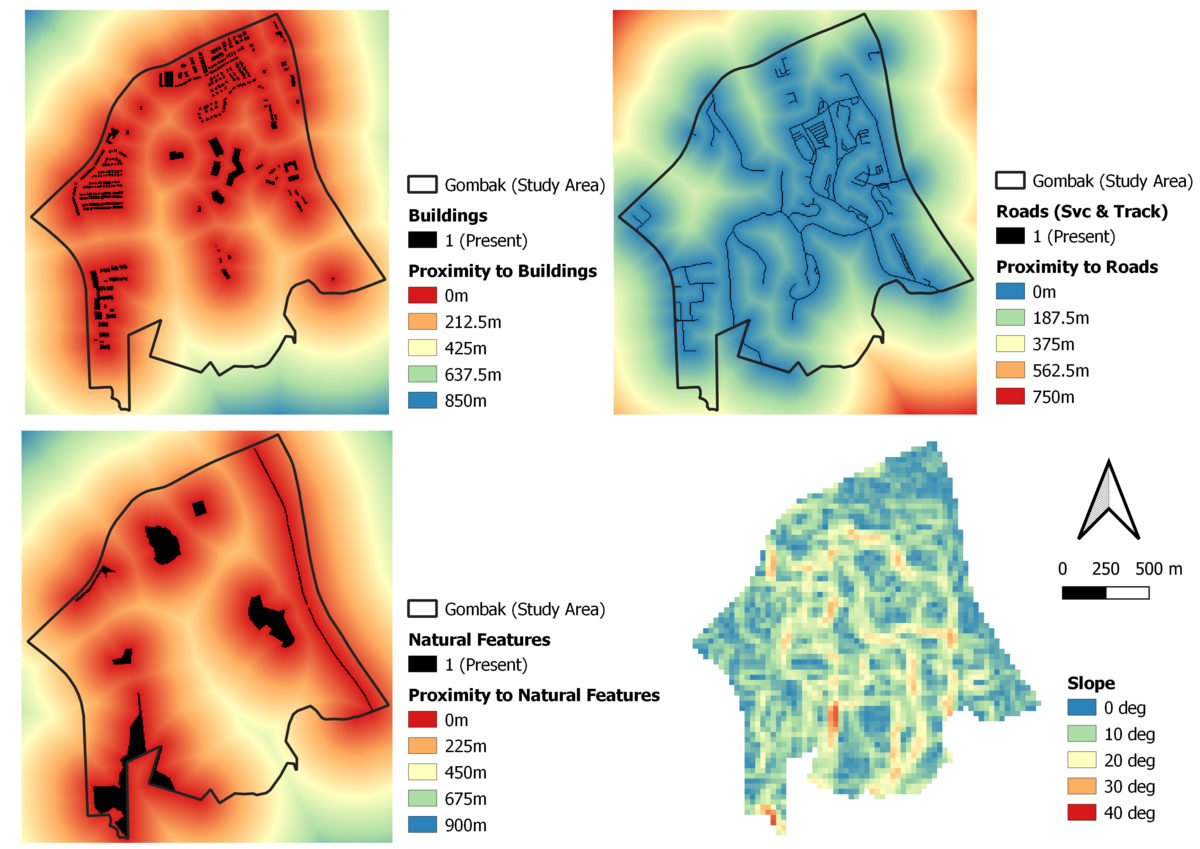
The proximity layer to buildings’ extent ranges up to approximately 850 metres. It is given given a spectral colour classification that is linear (colour blending with value interpolation). The redder it is, the closer it is to the buildings; the farther ones are denoted by green and blue. We can see that the orange-yellowish lines highlight areas that are moderately far from the buildings in Gombak, at least 212.5 metres away up to 425 metres and possibly a little farther. To prevent risking the unaffected population, the quarantine centre should not be erected at the hotspots (reddish areas), which implies high exposure of the disease due to close proximity (approx. less than 200m).
Proximity to Roads
Similarly, the proximity layer is represented by the linear spectral colour ramp but inverted, where blue now signifies areas close to the target (roads) and so on. In this case, we would like to focus on the blueish areas as the quarantine centre construction site should have high accessibility to facilitate materials transportation and logistics in general. The areas that are out of the question are the greenish ones, with the obvious ones being in the central west and south of Gombak.
Proximity to Natural Features
The proximity layer here also follows the previous representation (linear spectral colour classification). Sharing the same reason as the proximity analysis of buildings, we should avoid the red hotspots and look into the area that are orange/yellow/green within Gombak. This is to prevent the disease from spreading to places where people might be (parks and forest) and avoid possible contamination to waterbodies.
Slope Analysis
With the same reason as before, the slope layer is also shown within the boundary of Gombak. Here, the slope approximately ranges from 0 to 40 degrees. Intuitively, places with steep slopes are represented with orange/red colours as it intuitively signifies risk or danger. As the slope decreases, it goes to yellow, green and finally blue. From the map view, we can see that Gombak fortunately does not have many steep slopes (it is mostly green and blue, with yellow/orange/red taking up about 10-20% of the subzone and 80-90% for the former). With the interest of development cost, the possible areas based on the slope should be the blue/green ones. Hence, the steeper areas scattered around the central and also southwest of Gombak should not be of interest.
Part 3: Criterion Scores Map Views
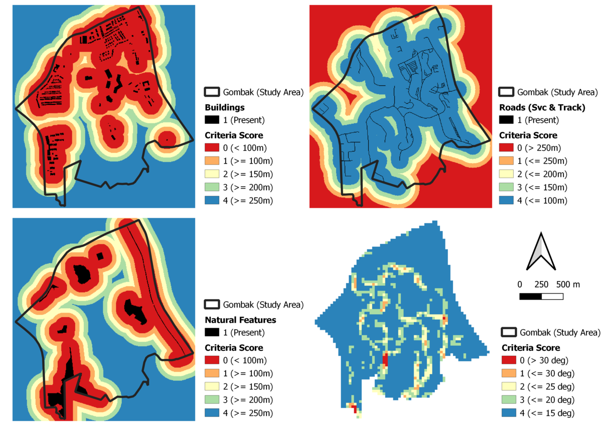
For the criterion scores, I have decided not to use the usual standardisation/normalisation that gives a value between 0-1, as it is only scaling the value and does not bring any further analytical insights or weightage to be factored in the suitability analysis. Hence, I have given each of the factors (buildings, roads, natural features and slope) a criteria score ranging from 0-4. Refer to below for details.
Buildings
As it is extremely important to prevent disease spread (health risk factor), a reasonable distance will be more than 100m away from the buildings. Hence, a criteria score of 0 will be attributed to the area that lies within the proximity of 100m and should not be considered. For every increase in 50m, the criteria score will up by 1, with 4 being the maximum (>= 250m).
Roads
Unlike buildings, the criteria score for roads are highest when the distance is closer to the network due to the accessibility factor. The colour ramp is inverted to allow intuitive map reading. A good distance here is considered as below 100m (highly accessible, score of 4), and the score decreases by 1 for every increment of 50m.
Natural Features
Similar to buildings, a distance of less than 100m away from natural features will be given a score of 0. The interval is set at 50m, upping the score by 1 each time.
Slope
For slope, the best case would be less than 15 degrees. The criteria score decreases by 1 for every increment of 5 degrees until it gets relatively high at 30 degrees, which will be given a score of 0.
Part 4: Analytical Hierarchical Process
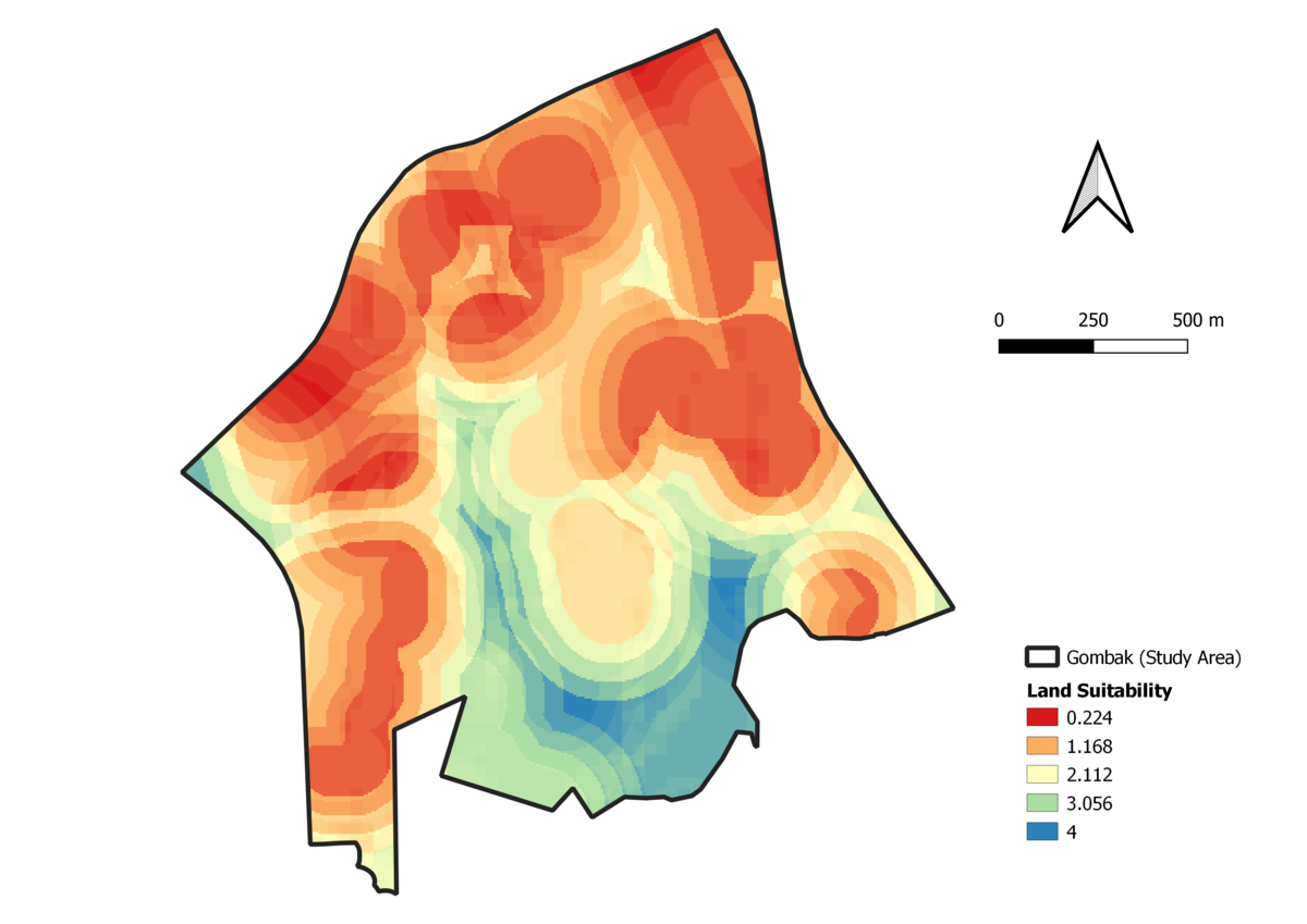
From a logical viewpoint, the health risk factor takes the highest priority as the obvious objective/goal is to prevent further outspread of disease by building the quarantine centre. The second most important factor is nature conservation—similar to that of health risk, the disease should not get carried to waterbodies and places (parks and forest) with high possibility of endangering living creatures and their naturally pristine environment. Subsequently, accessibility is prioritised above the last factor (economic) as it is more important to get the centre built up quickly than to make the economical choice now. This hence allows the affected people to be safely allocated in the centre to be treated while the disease exposure can be held under control. Moreover, it might even be the true economical decision since if accessibility was the last priority, the disease will jeopardise the population at a faster rate, resulting in a much higher cost.


