SMT201 AY2019-20T1 EX1 Peh Jin An
Contents
Project Overview
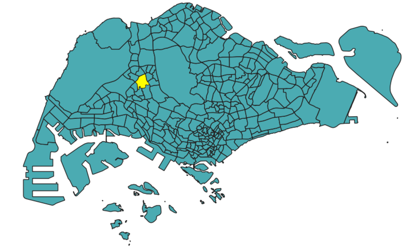
In search of location most suitable for building a National Communicable Disease Quarantine Center in Gombak, this project aims to achieve the given task based on the 4 major factors; The Economic, Accessibility, Health Risk and Natural Conservation factors.
Features of Gombak
Health Risk
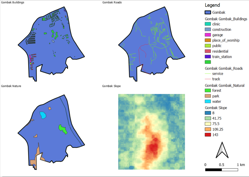
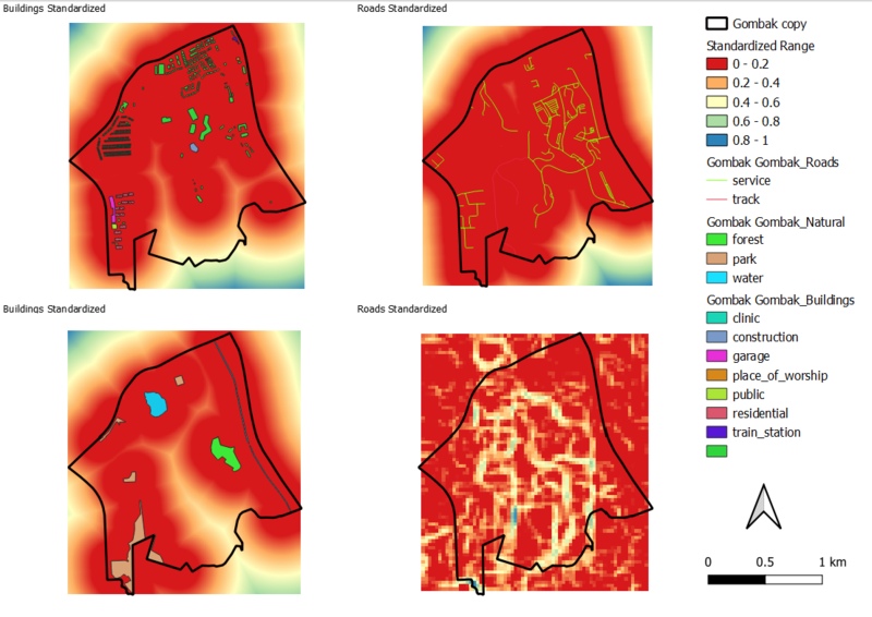
Refer to the screenshot on the top left
With the main objective of having a site that is quarantined from the contagious disease, housing areas and offices in Gombak should be located further away the Communicable Disease Quarantine Centre. This reduces the opportunities germs from reaching the site through human interaction, wind, objects exposed to the disease etc.
Accessibility
Refer to the screenshot on the top right
The service roads and tracks of Gombak will determine if the Communicable Disease Quarantine Centre is easily accessible. With heavy construction expected to take place during the construction stage, it is vital that the selected site is close to these service roads and tracks.
Natural Conservation
Refer to the screenshot on the bottom left
In effort to conserve Singapore’s natural grounds, the Communicable Disease Quarantine Centre should be located away from the forested land, parks and waterways in Singapore.
Economic
Refer to the screenshot on the bottom right
The different steepness levels of ground around Gombak will determine the Communicable Disease Quarantine Centre’s overall development cost. With step slope constructions tending to involve more ground filling, cutting and levelling, having the site built on slopes that are less steep is recommended.
Proximity of Gombak Features
Economic
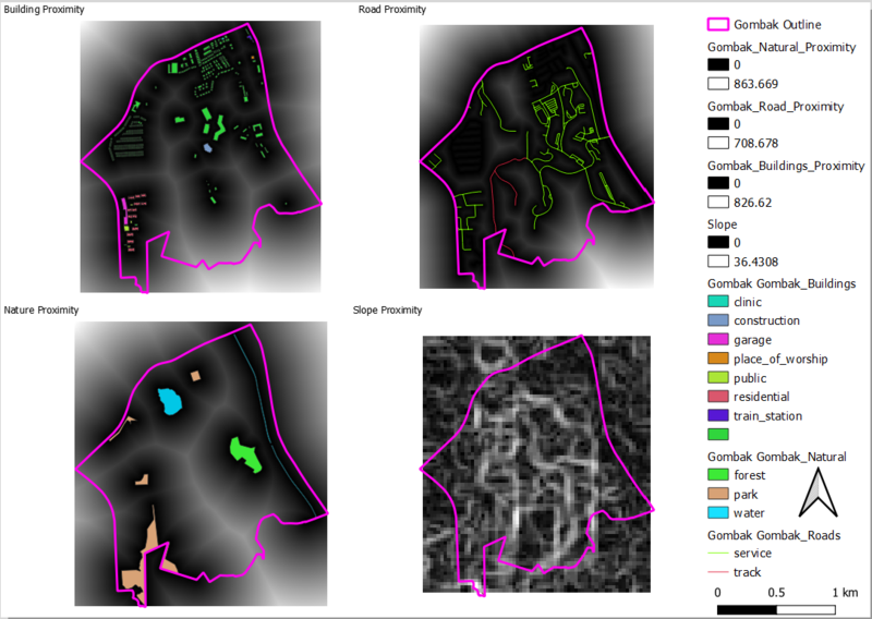
Refer to the screenshot on the bottom left
In Gombak, the steepness of slopes varies between a range of 0 to 36.4308. This can be visualised with the colour closer to black indicating a closer distance from the slope.
Accessibility
Refer to the screenshot on the top left
In Gombak, the distances from the roads varies between a range of 0 to 708.678. This can be visualised with the colour closer to black indicating a closer distance from the roads
Natural Conservation
Refer to the screenshot on the bottom left
In Gombak, the distances from the natural places varies between the range of 0 to 863.669. This can be visualised with the colour closer to black indicating a closer distance from nature.
Health Risk
Refer to the screenshot on the top left
In Gombak, the distances from the buildings varies between the range of 0 to 826.62. This can be visualised with the colour closer to black indicating a closer distance from buildings.
Standardization of Gombak Features
Reasons for Standardizing
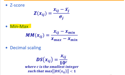
Before deriving the Criterion Score, I have standardized the proximity layers of in the above section to be of the same scale. Unlike the accessibility, natural conservation and health risk factors that measures in meters, the economic factor based on the steepness of slopes measures in degrees. Hence, to standardize the importance into its scores, I have used 1 of the 3 standardization methods to achieve that.
After doing so, I proceeded to standardize the ranges amongst all 4 maps; each having an equal interval score of 0.2. By theory, the score of a undesirable site has a color shade of red in the above diagram, with blue representing the more desirable site. In summary, the further the distance, the higher the score.
Not forgetting the requirements of site, it is vital that the site is build far from buildings and nature. It is also crucial for the site to be built far from roads and slopes.
Hence, before the generation of the combined layers containing the combined scores, I proceeded with the following formula:( (1-Standardized Building/Slope) * AHP Weightage)
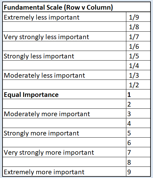
Analytical Hierarchical Process(AHP) Input Matrix and Result Report
I added a new column for both the 2010 and 2018 data files for the aged populations in the attributes table for citizens aged 65 and above. I also subsequently added the total populations column for both 2010 and 2018. Note that all these attributes have been added into the MP14 Web layer. I went on to calculate proportion using the field calculator by putting the dividing the total count of citizens aged over 65 for both years over the total population.
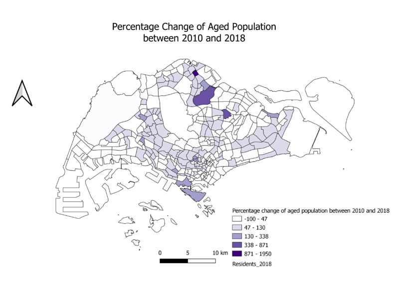
Percentage Change of Age Population between 2010 and 2018
For percentage, I added a new column for both the 2010 and 2018 data files for the aged populations in the attributes table for citizens aged 65 and above. I also subsequently added the total populations column for both 2010 and 2018. Note that all these attributes have also been added into the MP14 Web layer. I then went on to calculate the proportion by subtracting the differences between both files and dividing it over the 2010 value and multiplying the answer by 100. I then went on to render the data onto the map. Analyzing the map's data, the darker shades show a large percentage increase in the number of people aged 65 and above living in those subzones, while the lightest shade shows a percentage decrease in the number of people aged 65 and above living in those same subzones. Since there is a significant number of subzones with darker shades as compared to the first shade, it implies that the number of aged people living in these areas have had a increase, or even a significant amount of increase.
Missing Values
I have assumed for '-' values to be 0
Sources
Data.gov Sing Stat
