SMT201 AY2019-20T1 EX1 Kok Jim Meng
Contents
- 1 Part 1: Thematic Map
- 2 Part 2: Choropleth Map
- 2.1 1. Aged population (+65) in 2010 and 2018
- 2.2 2. Proportional of aged population in 2010 and 2018
- 2.3 3. Percentage change of aged population between 2010 and 2018
- 2.4 4. Explain the reasoning behind your classification choices, how you derived the new variables and handled missing values, and any other relevant judgments and assumptions.
- 3 References Used
Part 1: Thematic Map
1. School Distribution
The schools are distributed into different parts of Singapore towns which are categorised according to the icons in the legend stated. Most primary schools and secondary schools are heavily concentrated in the Northeast, East, and West. Northeast towns are known for many young families to live in while both East and West towns are heartlands districts. Most mixed-level institutions are located in the South. Many students from these schools are most likely from double income family and have car which their parents can fetch them to school while on their way to work in the city in the morning.
2. Road Network System
The roads are classified into different hierarchy, according to URA's Streets and Building Names, as shown in the legend by using line symbols. According to the map, roads in Singapore are very well connected especially the expressways are jointly connected in the South region. This is due to many people need to commute to-and-fro the city to work and go home. We also can see that local access roads are connected to minor roads which are surrounded by the major roads to provide access to the people in Singapore.
3. 2014 Master Plan Landuse
Similar categories were grouped together (eg. Business 1, Business 2) to avoid the display of overwhelming colours which causes confusion and difficulty to understand the representation. Overall, there is a high usage of both Residential area, and Road and Transport as there is high population density and travelling is essential for everyone. Business area usage is concentrated high at the West and low at the Northeast. There’s a probability that more business area usage will be planned in the Northeast due to the Punggol Digital District initiative which will be launched in 2023.
Part 2: Choropleth Map
1. Aged population (+65) in 2010 and 2018
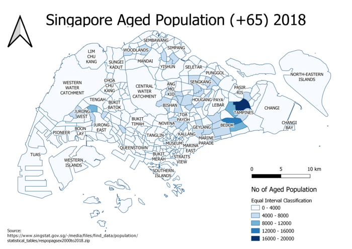
We can see that the distribution of aged population in both maps is quite similar even though there’s minor changes. Tampines, together with Bedok, remains the same with the most aged population in 2010 and 2018. Probably, this is not a useful way to depict.
2. Proportional of aged population in 2010 and 2018
By showing the proportion of aged population to total population for 2010 and 2018, there’s higher proportion of aged population in mature estates like Ang Mo Kio, Bedok, Bishan, Bukit Merah, Hougang, Jurong East, Kallang, Novena, and Queenstown. This is a better visualization than using distribution of aged population.
3. Percentage change of aged population between 2010 and 2018
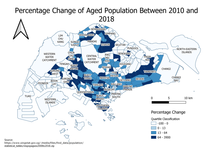
The map shows the percentage change of aged population between 2010 and 2018. It is evidently shown that there’s an high percentage change of aged populations in the mature estate such as Tampines, Bedok, Yishun, Woodlands, Sembawang, Clementi, Queenstown, Bukit Batok, and Bukit Panjang. But surprisingly, there is a high percentage change of aged population in Sentosa. Overall, this map has indeed shown that Singapore has been facing the rise of aging population between 2010 and 2018.
4. Explain the reasoning behind your classification choices, how you derived the new variables and handled missing values, and any other relevant judgments and assumptions.
When I was doing data cleaning on QGIS, it is very slow and lagging. Hence, I have used Microsoft Excel to do data cleaning instead. I have removed redundant data such as Gender and filtered out years (excluding 2010 and 2018) that are not useful for our visualization. Moreover, there are null values in the dataset and I have replaced them as 0 to handle the missing values and I have also converted the subzone names to capitalised version so that can able to do join with the MP14 Subzone SHP field (i.e. SUBZONE_N). Furthermore, I used PivotTable to clean the CSV dataset.
Age Group is used as a filter to select both 65 years old and above, and all ages so that can while Time (2010 and 2018) is set as columns while Subzone is used as rows and Population is used as values to calculate the total sum of the aged population in each subzone in each year. The table is derived as the following:
This is to show that the population are grouped by subzone and the year.
In the end, I have created a CSV datatable as shown below to fulfil the output of the above five map visualisations.
As I have checked through the newly created CSV data, there’s outliers for proportional of aged population in 2010 as well as in 2018 and there’s also outliers for percentage change. So, I have used quartiles for those 3 choropleth maps instead of equal intervals as quartiles are useful when the data is not symmetrically distributed and has outliers. This helps to bring in equal variances between the data.
Formulas used:
Proportion: (Aged Population/Total Population) * 100%
Percentage Change [(Aged Population 2018 – Aged Population 2010)/Aged Population 2018]*100%
References Used
URA's Streets and Building Names (Part 1’s Road Network System)
Land Use Concept Plan (Part 1’s 2014 Master Plan Land Use)
A big thanks to both Data.gov and Department of Statistics Singapore for providing us open source datasets.


