G1-Group10
Contents
Introduction
International Food Chain (IFC) is a leading brand in its sector, with over 18000 outlets worldwide and an ever-growing presence in the global market. In Taiwan alone, IFC has over 240 branches and are constantly expanding.
However, as the franchise grows bigger, so does its challenges. One of the challenges involves the lack of an analysis to efficiently compare the performance of each chain to one another.
Leveraging on this fact, our group aims to digitalise the data and conduct in-depth analysis on each branch. We hope to track the performance of each chain in relation to Point-Of-Interests surrounding each chain, uncovering and comprehending phenomena, with the aid of spatial data.
Problem and Motivation
To provide an analysis that allows for:
- Digitizing of each chain’s trade and delivery area
- Business profiling of the company’s outlet to determine Points-Of-Interests that can generate insights such as: Highest earning outlets, relative performance of outlets, outlet’s profile patterns and item sales information.
- Allow for informed business decisions, such as determining locations for new outlet openings with matching POIs of high sales outlets
- Scalable program to incorporate future data to generate current information (Using data from other cities besides Taiwan)
- Easy and intuitive tool to quickly view information with regards to all branches
Objectives
This project aims to provide insights into the following:
- Outlets with the highest monthly sales
- Relative monthly or yearly performance of each outlet
- Each branch geographical information, including the type and number of POI’s in the surroundings
- Profiling of similar types of branches
- Improvements for poor performing outlets
- Scalable data processing scripts to incorporate future data
Background Survey of Related Works (WIP)
| Visualizations | Explaination |
|---|---|
|
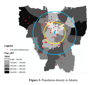
The visualization provides the buffer polygons, as well as representing population density of the area through colour. By comparing the two, we can conclude whether the center of activity is proportional to the population density in a region. It allows us to perform further exploration to see what spatial information significantly affects the level of activity in a city, such as the availability of points-of-interest. This visualization is great as it allows the viewer to clearly see multiple dimensions dealing with spatial data in an elegant way. |
|
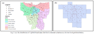
Data source: https://www.researchgate.net/publication/324949619_Visualization_of_Fast_Food_Restaurant_Location_using_Geographical_Information_System |
|
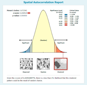
Data source: https://www.researchgate.net/publication/324949619_Visualization_of_Fast_Food_Restaurant_Location_using_Geographical_Information_System |
|
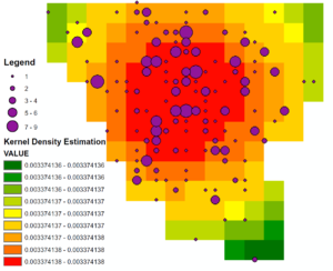
Data source: https://www.researchgate.net/publication/324949619_Visualization_of_Fast_Food_Restaurant_Location_using_Geographical_Information_System |
|
Data source:
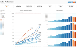
https://public.tableau.com/profile/mirandali#!/vizhome/Salesforce-SalesPerformance/SalesPerformance This databoard shows the cumulative sales. We could learn from this and display by outlets to compare the performance by having multiple forms of visualization. We really like the fact that certain key summarizations and variables are displayed on the top, and will consider using this in our project. |
Tools and Libraries
The following tools and libraries are used in the development of the web-based data visualisation application:
- QGIS
- Python
- R
- Tableau
Datasets
These are the datasets we plan to use:
| Dataset | Rationale |
|---|---|
| |
| |
| |
|
Foreseen Technical Challenges
We encountered the following technical challenges throughout the course of the project. We have indicated our proposed solutions, and the outcomes of the solutions.
| Key Technical Challenges | Proposed Solution | Outcome |
|---|---|---|
|
NA | |
|
We managed to start using the packages quickly and suit our own project needs. Each of us work on different parts such as setting up, designing, logic and deployment. This speeds up our project progress. | |
|
The adopted process was having clear instructions issued to each member in the team, along with maintaining constant communication with each other. In the event that the dataset is deemed too dirty to be usable, it was dropped along with sourcing for new data that would be a suitable replacement. | |
|
NA | |
|
The data points can better allow us to generate insights on the profile of each outlet via its trade area. | |
|
NA | |
|
NA |
Roles & Milestones
- Project Timeline
- Gantt Chart
References
- Tableau: https://www.tableau.com/learn/training
- R Shiny: https://shiny.rstudio.com/tutorial/
- QGIS: http://www.qgistutorials.com/en/
Ideation Drafts
This area is for iterations of our project proposal
Comments
Feel free to leave comments / suggestions!
