SMT201 AY2019-20T1 EX1 Tu Yang Lin
Part 1: Thematic Mapping
School Information
With the data from data gov, I converted the csv file into shp file using geocode. Since schools are discrete information, I use the book symbol to display it on the map. Each school type is differentiated based on its colour.
Road Network System
Using the road section data, I classify them according to the types of road (expressway, major road, minor road). Each different type of road is differentiated based on its colour.
Master Plan Land Use
The land use layer has different shades of blue representing the different use of the area. With the grey lines representing the road.
Part 2: Choropleth Mapping
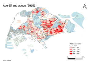
Aged Population (+65) in 2010
I retrieve the data from Singstat, I did some cleaning to the data before adding it into QGIS. Besides filtering the data and replacing values that are not readable with 0, I must sort the data accordingly so that it is easier to view and retrieve the data. Using planning subzone 2008 and age group 2010, I have come up with this choropleth map, showing the distribution of the aged population (age 65 and above) in 2010. After joining the two layers, I calculated the number of people aged 65 and above in the different subzone with the formula below: "AgeGroup2010_AGE65-69" + "AgeGroup2010_AGE70-74" + "AgeGroup2010_AGE75-79" + "AgeGroup2010_AGE80-84" + "AgeGroup2010_AGE85" Using the new calculated field, I derived the classified class as shown in the image above. As the colour of the area gets darker it implies that there are more who are aged 65 and above. Some subzones are not found in the map as they are either places with no aged population or no one lived in that area.
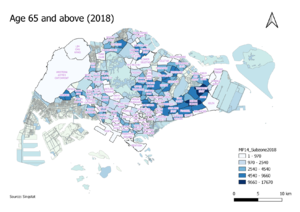
Aged Population (+65) in 2018
Similar to the previous map, this map is created from using planning subzone 2014 and age group 2018. As the blue colour becomes darker, it indicates that there are more people aged 65 and above living in that area. The formula for the calculation is: "AgeGroup2018_AGE65-69" + "AgeGroup2018_AGE70-74" + "AgeGroup2018_AGE75-79" + "AgeGroup2018_AGE80-84" + "AgeGroup2018_AGE85".
Proportion of Aged Population in 2010
The proportion of the aged population (age 65 and above) has been calculated by using the number of aged populations divided by the total population. The formula that I used is: "Age+65(2010)" / "AgeTotal2010". The darker the colour becomes, the higher the proportion of aged population is.
Proportion of Aged Population in 2018
Similar to the previous map, the calculation is derived from the formula: "Age+65(2018)" / "AgeTotal2018". The darker the shade of the yellow, the higher the proportion of people aged 65 and above is.
Percentage change in Aged Population between 2010 and 2018
The formula of the percentage change is calculated by getting the difference between the two field that was derived from the proportion and multiplied by 100. The formula is: ("AgeProportion2018" - "MP08_SubzoneProportion2010_AgeProportion2010" ) * 100 Subzone that are the darkest have a higher percentage change in the number of people aged 65 and above. While those subzones that are white in colour are those with negative or little percentage change.

