SMT201 AY2019-20G2 EX1 Siti Salihah Binte Mohamed Rilvan
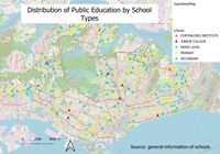
School Map: When it comes to classification, I used mainlevel_ category to classify as the column contains details such as secondary, primary etc. As such, we can see how the different type of schools are distributed throughout Singapore. To facilitate reading where the schools are located, I also displayed the OpenStreetMap in the background. As the OpenStreetMap is colourful, I tried to use bright colours to represent the schools so that the points are more visible. I used arrows instead of circles to represent the schools so that it is easier to detect overlapping points.
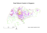
Road Map: For this map, I just categorised according to the road name at the symbology section. From the map, we could click and know the type of road network system. Also, because of the distinct colours, we can determine where each road lies and the line of points which make up each of the roads from the map
I used symbology and categorised the map LU_DESC which states the type of land use. There is a special colour assigned to each type of land use so that it is easier for the reader to determine the types of land uses at different regions by looking at the map.
For part 2:
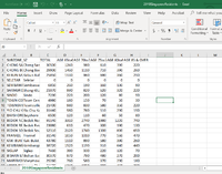
For Part 2, overall, I used ‘Singapore Residents by Planning Area/Subzone, Age Group and Sex, June 2000-2018’ excel file data (singstat.gov.sg). From that file, I created 2 other files for 2010 data and 2018 data respectively and I format it such that it looks like this:
When it comes to planning subzone GIS Data, I used Master Plan 2008 Subzone Boundary (for 2010SingaporeResidents Data) and Master Plan 2014 Subzone Boundary (for 2018SingaporeResidents Data).
However, when I joined Master Plan 2008 Subzone Boundary shapefile (MP08Subzone.gpkg) to 2010SingaporeResidents data, I encountered a lot of ‘NULLS’. I deleted the rows containing nulls and 0s for TOTAL so that I can calculate proportion of aged population in 2010.
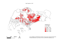
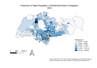
I used the graduated symbology to classify according to the density of aged population in the different subzones in 2010.The higher the intensity of the red colour, the greater the density of aged population. From the map, we can infer that the aged population is higher around the central and south-east area of Singapore.
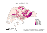
Just like the map previously, I classified according to the density of aged population in the different subzones in 2018. From the map, we can infer that the aged population is higher around the east area of Singapore.
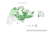
The darker the area, the greater the proportion of elderly living at a particular subzone area. From the map, Mandai has the greatest proportion of elderly among the residential areas throughout Singapore. We could also see that there are significant proportions of elderly around the bottom central area of Singapore. The proportion is in terms of percentage so that the difference becomes more obvious in terms of the numbers showed in the legend.
