Difference between revisions of "SMT201 AY2019-20G2 Ex1 Mabelle Tham Shiqin"
| Line 34: | Line 34: | ||
[(“AgeSubzone2018_Aged65+”-“AgeSubzone2010_Aged65+”)/ “AgeSubzone2010_Aged65+”] *100 | [(“AgeSubzone2018_Aged65+”-“AgeSubzone2010_Aged65+”)/ “AgeSubzone2010_Aged65+”] *100 | ||
| − | === Singapore's Density of Population Aged 65 and Above in 2010 | + | === Singapore's Density of Population Aged 65 and Above in 2010 === |
[[File:Singapore's Density of Population Aged 65 and Above (2010).png|1000px|center]] | [[File:Singapore's Density of Population Aged 65 and Above (2010).png|1000px|center]] | ||
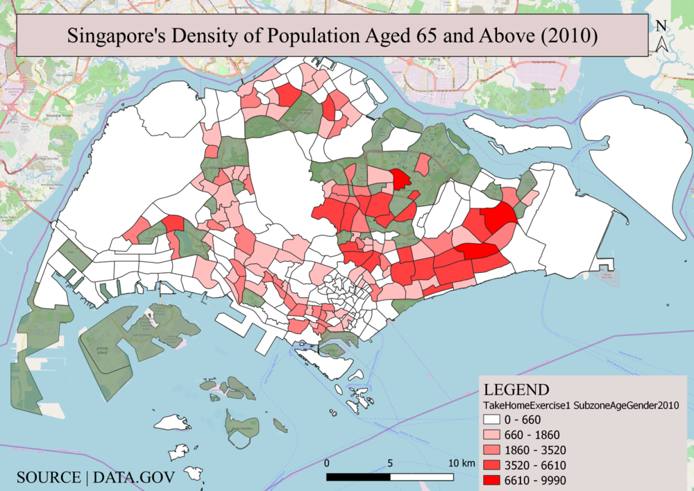
Overall, Singapore's density of elderly aged 65 and above are concentrated in the northeast areas such as Bishan, Ang Mo Kio, Toa Payoh, Khatib, Yishun, Tampines amongst others. It is observable that most sections of Singapore's land area are white. While this means that there is a low density of elderly aged 65 and above in the area, taking a closer look would lead us to realise that the reason for these relatively empty areas could be due to the area being a non-residential area eg. water catchment areas, ports or runways, undeveloped, and hence have no relevant information available. | Overall, Singapore's density of elderly aged 65 and above are concentrated in the northeast areas such as Bishan, Ang Mo Kio, Toa Payoh, Khatib, Yishun, Tampines amongst others. It is observable that most sections of Singapore's land area are white. While this means that there is a low density of elderly aged 65 and above in the area, taking a closer look would lead us to realise that the reason for these relatively empty areas could be due to the area being a non-residential area eg. water catchment areas, ports or runways, undeveloped, and hence have no relevant information available. | ||
Latest revision as of 13:44, 16 September 2019
Contents
- 1 Part One: Thematic Mapping
- 2 Part Two: Choropleth Mapping
- 2.1 Explanation
- 2.2 Singapore's Density of Population Aged 65 and Above in 2010
- 2.3 Singapore's Density of Population Aged 65 and Above in 2018
- 2.4 Singapore's Proportion of Population Aged 65 and Above by Subzone in 2010
- 2.5 Singapore's Proportion of Population Aged 65 and Above by Subzone in 2018
- 2.6 Percentage Change From 2010 and 2018
- 3 Conclusion
Part One: Thematic Mapping
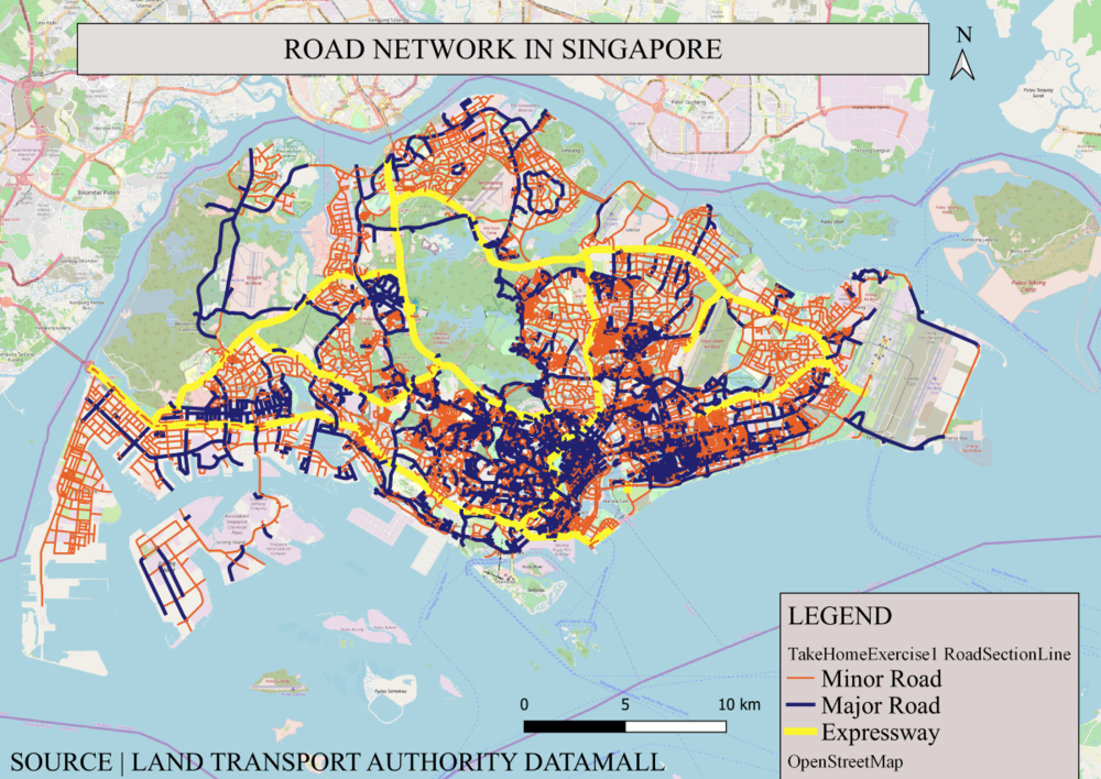
Figure 1: Road Network System of Singapore
Data sourced from LTA did not have distinctly categorized road types, hence I used QGIS to categorize the roads by Road Type – categorizing them into Expressways, Major Roads and Minor Roads segregating them by colour and thickness.
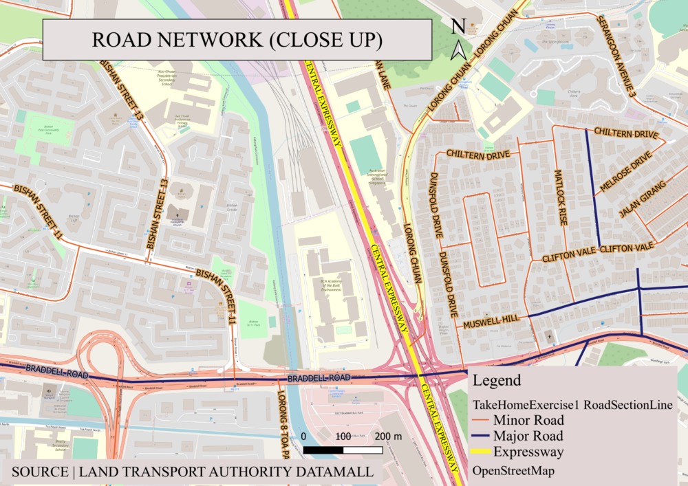
Figure 2: Road Network (Close Up)
For this map, I chose to contrast the roads using bright and distinct colours for the roads as seen from the 1cm thick bright yellow for Expressway, 0.5cm thick dark blue for Major Road and 0.25cm thin bright orange line for minor roads. For enhanced and clearer visualization, I applied the buffer for each label, ensuring that road names will be easy to read.
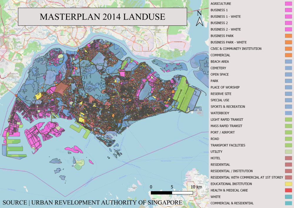
Figure 3: Masterplan 2014 Landuse
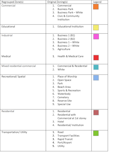
Upon classifying the data using categorized symbology method, there were a total of 31 sub-categories. As classes should be optimally kept between 5-8, I decided to re-group them into 8 categories after using the Written Statement to better understand the 2014 Master Plan Land use. Thus they are segregated into the following sections namely commercial, educational, industrial, medical, mixed residential-commercial, recreational/spatial, residential and transportation/utility.
Part Two: Choropleth Mapping
Explanation
To attain the data for Aged population (+65) in 2010 and 2018, I created a new field (Aged65+) for both the layers in 2010 and 2018 by using the field calculator.
Where "Aged65+" = “65_to_69” + ”70_to_74” + “75_to_79”+ “80_to_84”+ “85_and_over”
The proportional of the aged population in 2010 and 2018 was done by calculating the following columns
First I created a new field (Grand Total) for both the 2010 and 2018 csv by summing all group ages.
Calculation for PropOfAged = (“Aged65+”/ “Grand Total”) *100
To represent the spread of data for the proportion of aged population, I used the Natural Breaks classification method to categorize the data points into 5 clusters. Data values that cluster are placed into a single class, and Class breaks occur where there is a gap between clusters. I used this method as the data is unevenly distributed, with a few data points having same or similar values and there are gaps between groups of values.
The Percentage change of aged population between 2010 and 2018 was done by joining the SubzoneAgeGender2010 table and SubzoneAgeGender2018 table to the SubzonePlanning2014 layer. This was done specifically by doing a join on the columns “SUBZONE_N” in the Subzone Layer with “RowLabels” in AgeSubzone2010 and AgeSubzone2018 respectively. It was important to note that when creating a new field, the Output field type has to be changed to “Decimal number (real)” else the calculation would result in either 0/1/null.
Calculation for PercChange =
[(“AgeSubzone2018_Aged65+”-“AgeSubzone2010_Aged65+”)/ “AgeSubzone2010_Aged65+”] *100
Singapore's Density of Population Aged 65 and Above in 2010
Overall, Singapore's density of elderly aged 65 and above are concentrated in the northeast areas such as Bishan, Ang Mo Kio, Toa Payoh, Khatib, Yishun, Tampines amongst others. It is observable that most sections of Singapore's land area are white. While this means that there is a low density of elderly aged 65 and above in the area, taking a closer look would lead us to realise that the reason for these relatively empty areas could be due to the area being a non-residential area eg. water catchment areas, ports or runways, undeveloped, and hence have no relevant information available.
Singapore's Density of Population Aged 65 and Above in 2018
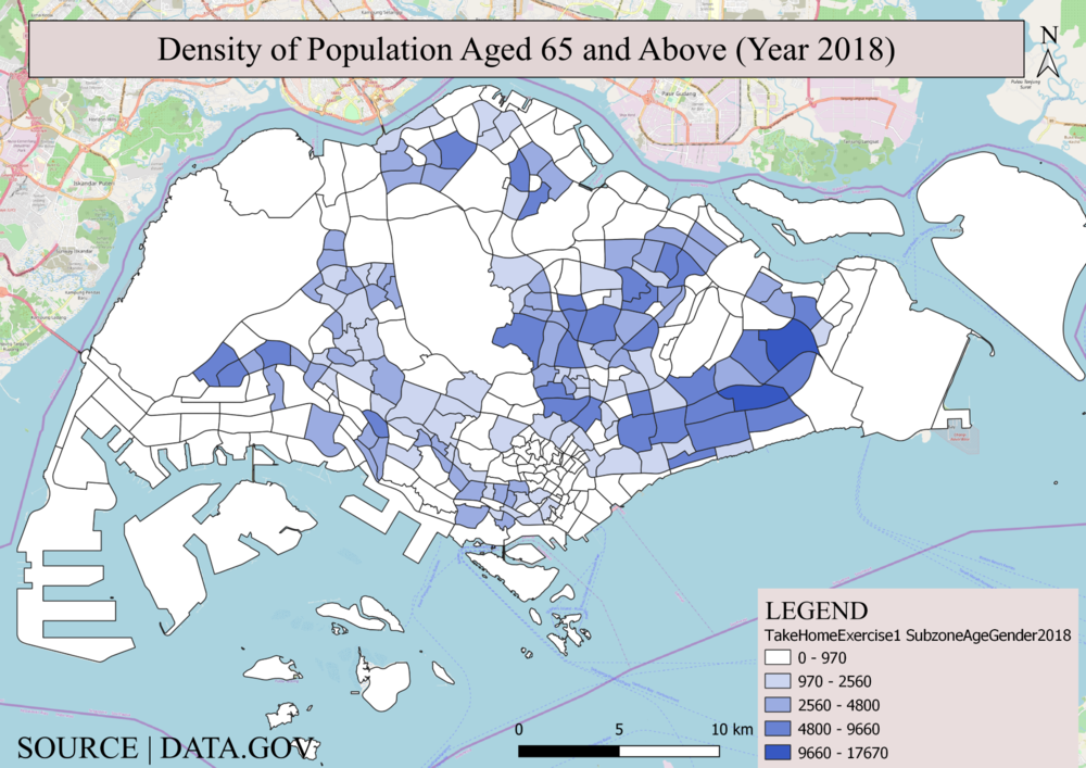
A higher concentration of population aged 65 and above are found in the northeast area with the highest concentration in Tampines and Bedok area. By comparing the legends of both figures above, it can be concluded that the number of elderly aged 65 and above are increasing as seen from the widening of each cluster to account for and include the increasing population. Comparing both the 2010 and 2018 figures, the conclusion is that the East consistently accounts for the high density of the elderly. This is observed from the consistent dark-toned subzone areas despite the widening of classes.
Singapore's Proportion of Population Aged 65 and Above by Subzone in 2010
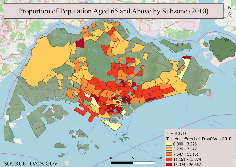
As seen from above, in the year 2010 there is a higher concentration of subzones with higher proportions of Aged65+ in the downtown area with Crawford being one of the subzone areas with the highest proportion of 22.86% elderly making up the population in the area. As the proportion of the aged population is relative to the population of the other age groups in their respective subzone, the areas with a higher proportion of the population aged 65 and above are no longer situated in the east but in the downtown area. This is mainly because there are now other factors affecting the spread of data eg. population of youths and children in the area.
Singapore's Proportion of Population Aged 65 and Above by Subzone in 2018
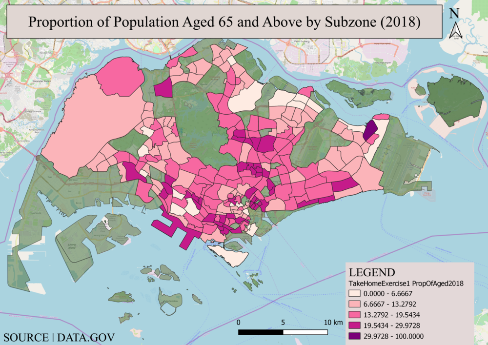
In the year 2018, a higher concentration of subzones with higher proportions of Aged65+ are observed in the downtown area similar to year 2010. For example, Pearl’s Hill with 21.77% is one of the subzones with relatively higher proportions of Aged65+ in the area.
By comparing the legends of both graphs of (2010 and 2018), we can conclude that generally, the population of Aged 65 and above has been rising. This is seen from the increase in the proportion of Aged per cluster as both maps were classified using the natural breaks classification method.
Percentage Change From 2010 and 2018
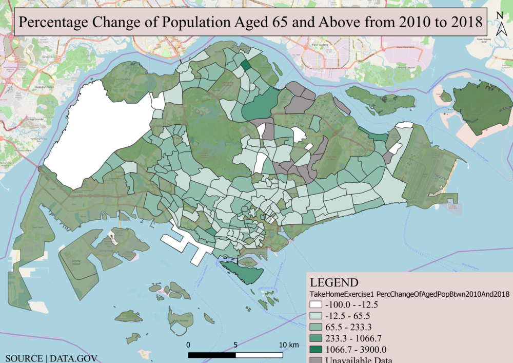
This map gives us new insights into the areas which experienced a large increase in the elderly population from the year 2010 to 2018. The highest increase in percentage change of elderly aged 65 and above from 2010 to 2018 can be observed in Sembawang with a percentage increase of 4000% as the number of elderly increased from 10 in the year 2010 to 400 in the year 2018. Whereas in Hougang Central, we observe an 84.15% fall of elderly aged65+ from 4480 in the year 2010 to 710 in the year 2018. This graph as compared to the other graphs show the effects of time more clearly and would be very useful when used for land-use planning over time, ensuring that areas with increasing aged populations will have the amenities they will need e.g. elderly homes, hospitals and even more elderly-friendly traffic lights.
Some limitations these time graphs face is the unaccounted developments which result in missing data for comparison purposes. In this case, there are 13 subzones (marked out in grey) which are unavailable to be used for comparison due to the missing data from 2010. In addition to the graduated data to account for the different classes of percentage change, I added in an 'unavailable data' section thru the use of rule-based labelling function to classify the following under the new section.
SUBZONE_C = 'PGSZ07' OR SUBZONE_C = 'HGSZ09' OR SUBZONE_C = 'HGSZ10' OR SUBZONE_C = 'PRSZ08' OR SUBZONE_C = 'AMSZ12' OR SUBZONE_C = 'SGSZ07' OR SUBZONE_C = 'HGSZ08' OR SUBZONE_C = 'SGSZ06' OR SUBZONE_C = 'SGSZ05' OR SUBZONE_C = 'SLSZ03' OR SUBZONE_C = 'SLSZ02' OR SUBZONE_C = 'SLSZ04' OR SUBZONE_C = 'AMSZ11'
Conclusion
Through this process of exploring, cleaning and manipulating data, I've come to realize that data are mere numbers which do not tell you the whole story. The above situation of new developments (13 subzones) can be used for illustration purposes to further elaborate my point. While the development of certain areas eg. Coney Island was a totally new discovery, the 'discovery'/'development' of Lorong Chuan was not the same. Lorong Chuan was formally part of Serangoon, thus its population back in the year 2010 was probably accounted for under Serangoon. However, by the year 2009, the Mass Rapid Transit (MRT) Station at Lorong Chuan was built and established itself as a subzone under URA. The population which was once under Serangoon then shifts over to be accounted for by the Lorong Chuan subzone, causing an outward flow of population from the Serangoon zone. This causes a fall in the population that most will not account for and as such, reaffirms my point that mere numbers on excel spreadsheets are not accurate without context to help you understand the situation better.
