Difference between revisions of "SMT201 AY2019-20G2 Ex1 Ng Qi Hui"
(→Part 2) |
(→Part 2) |
||
| Line 23: | Line 23: | ||
The chloropleth map shows that there is a large number of subzones that have a low number of residents aged 65 and above, as shown by the large number of white spaces as compared to those that are bright red. The areas which has more aged people tend to lie more in the east region of Singapore. I used Natural Breaks to classify the groups as in makes use of the real numbers within the data set, thereby giving a more detailed and accurate representation of the data. | The chloropleth map shows that there is a large number of subzones that have a low number of residents aged 65 and above, as shown by the large number of white spaces as compared to those that are bright red. The areas which has more aged people tend to lie more in the east region of Singapore. I used Natural Breaks to classify the groups as in makes use of the real numbers within the data set, thereby giving a more detailed and accurate representation of the data. | ||
| − | [[File: | + | [[File:Pop_2018.png |border|center|800x800px|]] |
Comparing this chloropleth map to the one in 2010, there is an increase in the number of people age 65 and above living in Singapore. This can be seen from the classes of the Number of Residents age (+65) in 2018, whereby the values for each classification has increased by quite a bit as compared to the values in 2010. This shows that Singapore is progressively being populated by an aging population. This data is useful for urban planners who will know where should they build more facilities for the elderly. | Comparing this chloropleth map to the one in 2010, there is an increase in the number of people age 65 and above living in Singapore. This can be seen from the classes of the Number of Residents age (+65) in 2018, whereby the values for each classification has increased by quite a bit as compared to the values in 2010. This shows that Singapore is progressively being populated by an aging population. This data is useful for urban planners who will know where should they build more facilities for the elderly. | ||
| − | [[File: | + | [[File:Pop 2010 Proportion.png |border|center|800x800px|]] |
For the proportion of aged population in 2010, I chose to define it as the number of residents age 65 and above living in that particular subzone over the total number of residents living in that same subzone. In comparison to the map ‘Aged Population (+65) in 2010’, there is an increase in the number of shaded areas in the west. This shows that there is a low number of residents younger than 65 years old living in that area, thereby making the proportion of elderly residents high in those subzones. On the contrary, there is an increase in the number of lighter shaded area in the east, which implies that there is a high number of residents younger than 65 years old living in those areas, thereby making the proportion of elderly residents low in those subzones. | For the proportion of aged population in 2010, I chose to define it as the number of residents age 65 and above living in that particular subzone over the total number of residents living in that same subzone. In comparison to the map ‘Aged Population (+65) in 2010’, there is an increase in the number of shaded areas in the west. This shows that there is a low number of residents younger than 65 years old living in that area, thereby making the proportion of elderly residents high in those subzones. On the contrary, there is an increase in the number of lighter shaded area in the east, which implies that there is a high number of residents younger than 65 years old living in those areas, thereby making the proportion of elderly residents low in those subzones. | ||
| − | [[File: | + | [[File:Pop 2018 Proportion.png |border|center|800x800px|]] |
For the proportion of aged population in 2018, I also chose to define it as the number of residents age 65 and above living in that particular subzone over the total number of residents living in that same subzone. In comparison to the map ‘Aged Population (+65) in 2018’, there is an even larger increase in the total number of shaded areas, especially in the west. The map looks similar to that in 2010, but since the values for each class has increased, this shows that there is a higher proportion of aged people living in the subzones, thereby indicating an aging population. | For the proportion of aged population in 2018, I also chose to define it as the number of residents age 65 and above living in that particular subzone over the total number of residents living in that same subzone. In comparison to the map ‘Aged Population (+65) in 2018’, there is an even larger increase in the total number of shaded areas, especially in the west. The map looks similar to that in 2010, but since the values for each class has increased, this shows that there is a higher proportion of aged people living in the subzones, thereby indicating an aging population. | ||
Revision as of 00:29, 16 September 2019
Contents
Distribution of School Types
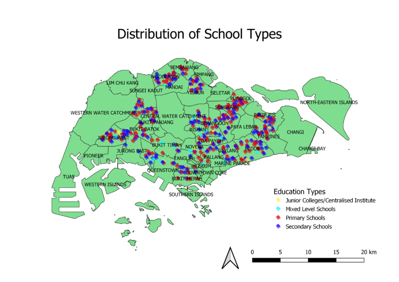
The school types are qualitative data with nominal scales, so I categorized the data in POI_CHAR from the attribute table. I made use of the SVG symbols to symbolize schools. Following that, by assigning a different color to every school type, I could show the distribution of the type of schools throughout Singapore. For better identification purposes, I added the planning area of Singapore and included their labels so that the user can know at a glance where are the different types of schools located at.
Hierarchy of Road Network System
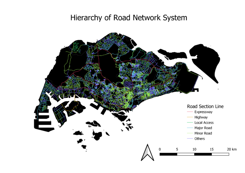
Since the types of roads in the network system is a form of qualitative data with nominal scales, I chose to categorize the roads. There were too many roads from the network system data initially which resulted in a very messy road network . Hence, I decided to categorize the roads into 6 big categories: Expressways, Highways, Local Access (walk, lane, link), Major Roads (boulevard, avenue, drive), Minor Roads (road, street), and Others. I created a new column RD_CLASS and filtered out the different roads into their various types. Then I opened field calculator to input the corresponding category type to the roads. Each category was assigned a different color for clearer illustration of the composition of the road network system.
Singapore Master Plan 2014 Land Use
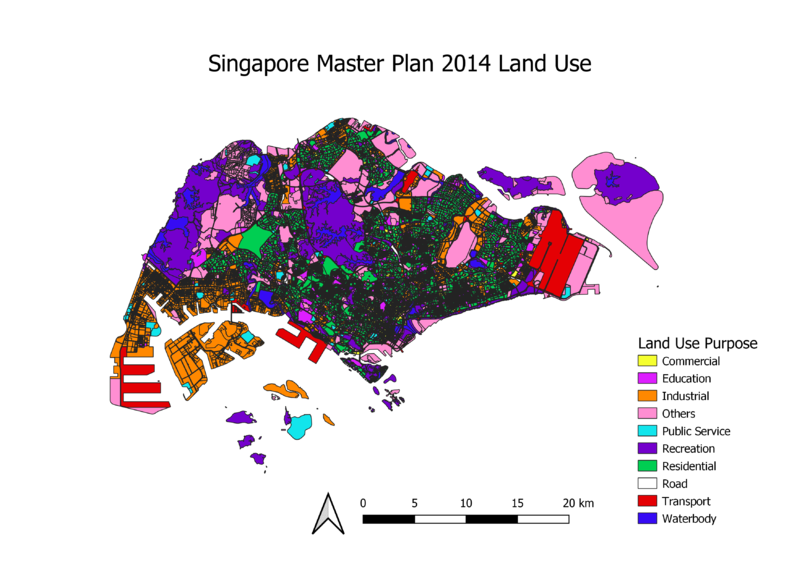
The land use features are qualitative data, so I used the data in LU_Desc from the attribute table to categorize the various land uses. Since there were too many separate land uses throughout Singapore which resulted in a very complicated map, I decided to merge some land uses which are common together into a larger group category. For instance, I grouped business 1 and business 2 together as ‘Industrial’. A different color was assigned to every land use category so that the user can identify how much of Singapore’s land is being used for that particular purpose.
Part 2
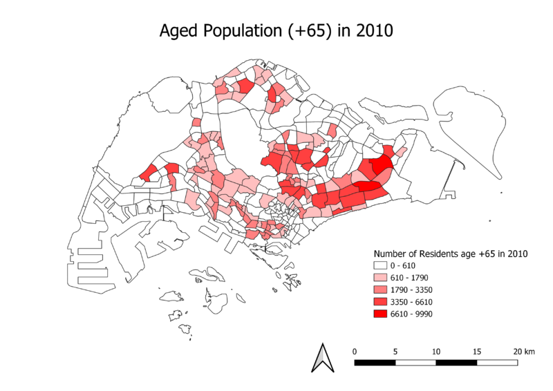
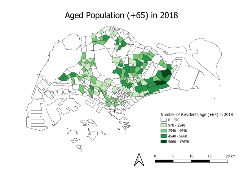
The chloropleth map shows that there is a large number of subzones that have a low number of residents aged 65 and above, as shown by the large number of white spaces as compared to those that are bright red. The areas which has more aged people tend to lie more in the east region of Singapore. I used Natural Breaks to classify the groups as in makes use of the real numbers within the data set, thereby giving a more detailed and accurate representation of the data.
Comparing this chloropleth map to the one in 2010, there is an increase in the number of people age 65 and above living in Singapore. This can be seen from the classes of the Number of Residents age (+65) in 2018, whereby the values for each classification has increased by quite a bit as compared to the values in 2010. This shows that Singapore is progressively being populated by an aging population. This data is useful for urban planners who will know where should they build more facilities for the elderly.
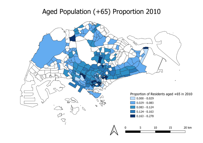
For the proportion of aged population in 2010, I chose to define it as the number of residents age 65 and above living in that particular subzone over the total number of residents living in that same subzone. In comparison to the map ‘Aged Population (+65) in 2010’, there is an increase in the number of shaded areas in the west. This shows that there is a low number of residents younger than 65 years old living in that area, thereby making the proportion of elderly residents high in those subzones. On the contrary, there is an increase in the number of lighter shaded area in the east, which implies that there is a high number of residents younger than 65 years old living in those areas, thereby making the proportion of elderly residents low in those subzones.
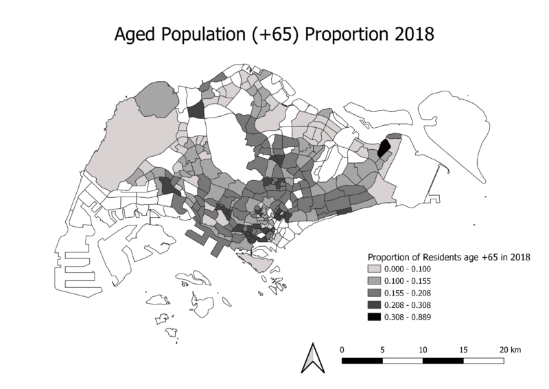
For the proportion of aged population in 2018, I also chose to define it as the number of residents age 65 and above living in that particular subzone over the total number of residents living in that same subzone. In comparison to the map ‘Aged Population (+65) in 2018’, there is an even larger increase in the total number of shaded areas, especially in the west. The map looks similar to that in 2010, but since the values for each class has increased, this shows that there is a higher proportion of aged people living in the subzones, thereby indicating an aging population.
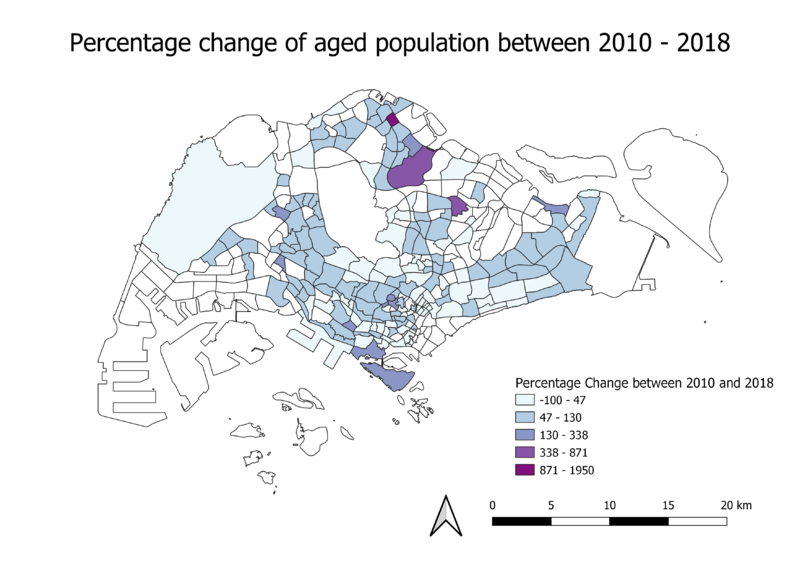
This map exemplifies the increasing aging population phenomenon in Singapore. The darker tones shows the greatest percentage change between the years 2010 to 2018. Majority of the areas has a medium blue tone, which still shows that there was an increase in the number of aging people living in each subzone. Through plotting this map out, we can clearly tell that approximately half of Singapore’s area has had an increase in the number of people aged 65 and above living in there, showing that aging population is definitely a pressing problem which we must tackle.
