Difference between revisions of "SMT201 AY2019-20T1 EX1 Gui yuqi"
(→Part 2) |
(→Part 2) |
||
| Line 24: | Line 24: | ||
= Part 2 = | = Part 2 = | ||
<br> | <br> | ||
| − | == Aged Population(+65) Distribution in 2010 and 2018 ==<br> | + | == Aged Population(+65) Distribution in 2010 and 2018 == |
| + | <br> | ||
[[File:2.1R.jpg|3000px|frameless|center|2010]] | [[File:2.1R.jpg|3000px|frameless|center|2010]] | ||
[[File:2.2R.jpg|3000px|frameless|center|2018]] | [[File:2.2R.jpg|3000px|frameless|center|2018]] | ||
Source: Data.gov.sg & Singstat.gov.sg<br> | Source: Data.gov.sg & Singstat.gov.sg<br> | ||
For the distribution of Aged population in 2010 and 2018, firstly I tidy up the data I got from Singstat.gov.sg and only use the data from 2010 and 2018, at the same time, I added a column called Aged_Pop_SZ for both 2010 and 2018 to add up all the aged population. As you can see from the maps above, the aged population is increased and some area in 2010 didn't have aged population, while it appears to have aged population in 2018, which shows that the population aging trend. In order to show the distribution clearly, I used Graduated Symbology and Labeled all the aged population number for each Subzone.<br> | For the distribution of Aged population in 2010 and 2018, firstly I tidy up the data I got from Singstat.gov.sg and only use the data from 2010 and 2018, at the same time, I added a column called Aged_Pop_SZ for both 2010 and 2018 to add up all the aged population. As you can see from the maps above, the aged population is increased and some area in 2010 didn't have aged population, while it appears to have aged population in 2018, which shows that the population aging trend. In order to show the distribution clearly, I used Graduated Symbology and Labeled all the aged population number for each Subzone.<br> | ||
| − | == Proportional of aged population in 2010 and 2018 ==<br> | + | == Proportional of aged population in 2010 and 2018 == |
| + | <br> | ||
[[File:2.3.jpg|3000px|frameless|center|2010]] | [[File:2.3.jpg|3000px|frameless|center|2010]] | ||
[[File:2.4.jpg|3000px|frameless|center|2018]] | [[File:2.4.jpg|3000px|frameless|center|2018]] | ||
| Line 37: | Line 39: | ||
[[File:2.5.jpg|3000px|frameless|center|percent]] | [[File:2.5.jpg|3000px|frameless|center|percent]] | ||
Source: Data.gov.sg & Singstat.gov.sg<br><br> | Source: Data.gov.sg & Singstat.gov.sg<br><br> | ||
| + | For the percentage change of aged population between 2010 and 2018, I use Graduated Symbology and I chose red and grey color ramp, so that it can show both negative change and positive change clearly. As you can see from the map above, the red color shows that there is a aged population percentage decrease in those area, some pink color area means there is a minor increase in these area. While for those grey or dark grey area, it indicates are significant increase in aged population percentage(blue color are 0 percentage change)<br> | ||
| + | == Classification Choice, New Variables, Relevant Judgement and Assumptions == | ||
| + | <br> | ||
Revision as of 23:23, 15 September 2019
Part 1
Singapore Public School Distribution by School Type
Source: Data.gov.sg
I used School-directory-and-information data from Data.gov and MP14_PLNG_AREA_NO_SEA_PL to achieve this task. I geocoded the school information data into the planning area data so that each school's location can be showed on the map. In order to show the number of school distribution on the map, I added new column called School_Num to calculation the school number for each Planning area.
Hierarchy of Road Network System of Singapore
Source: Data.gov.sg & LTA
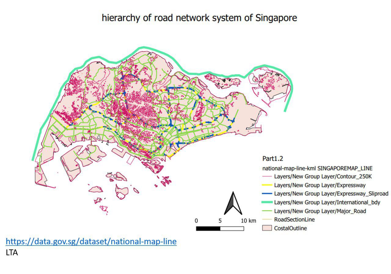
In order to display the hierarchy of road network system of Singapore, I found a data called National-map-line from Data.dov which includes a column called "FOLDERPATH", and this column indicates the category of this road. There are 5 types of roads, range from Contour, Expressway, Expressway Slip road to International boundary and Major Road. In order to display the road hierarchy clearer on the map, I applied different stroke size and different color for each type of roads.
2014 Master Plan Landuse
Source: data.gov.sg
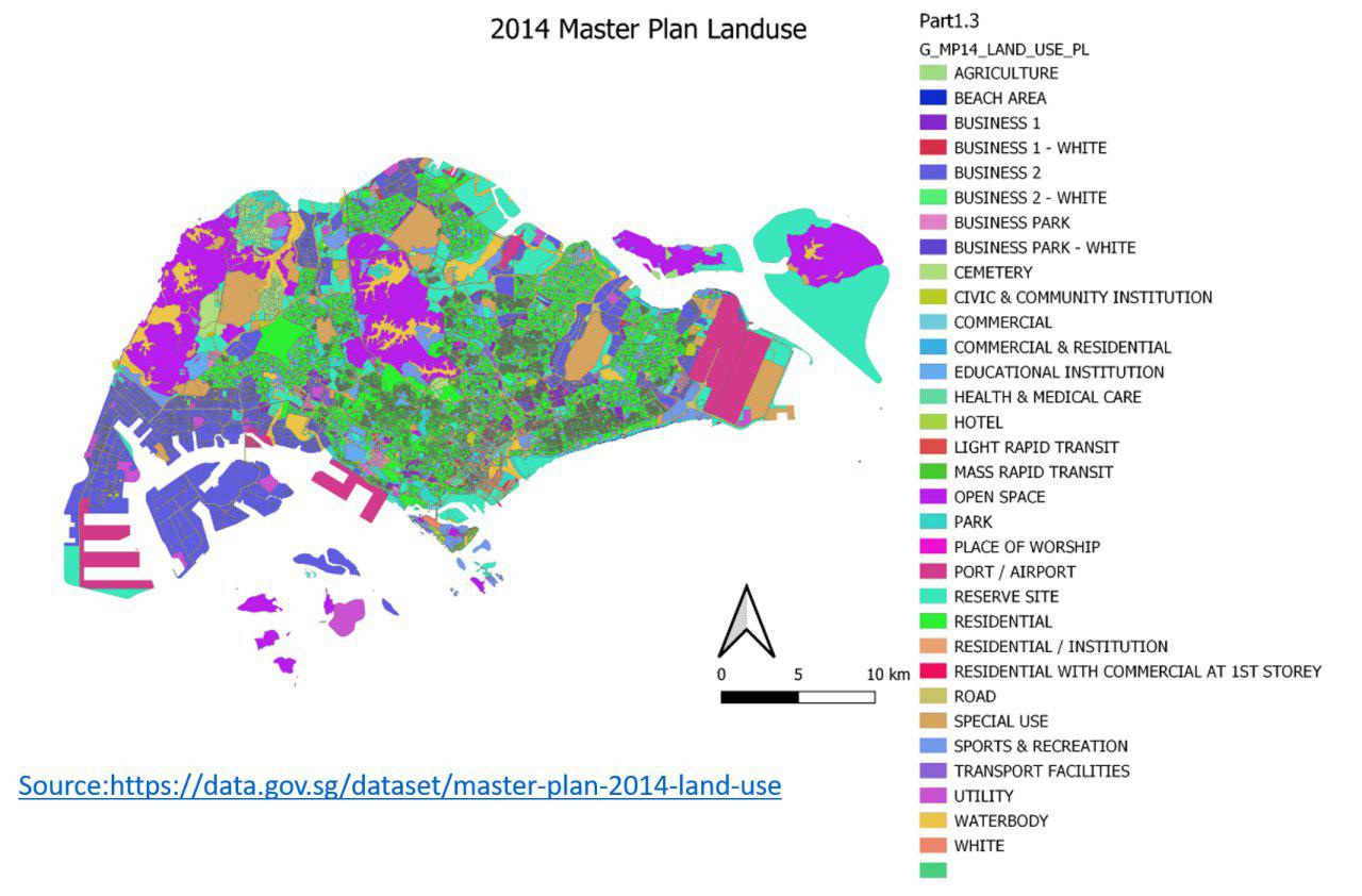
For a better and clearer visualization of 2014 Master Plan Landuse, I used categorized Symbology and distinct colors to represent different categories of land use, so that different land use area can be easily distinguished. In addition, since there are a lot of different landuse categories, I reduces stroke width so that each area can be clearly visualized.
Part 2
Aged Population(+65) Distribution in 2010 and 2018
Source: Data.gov.sg & Singstat.gov.sg
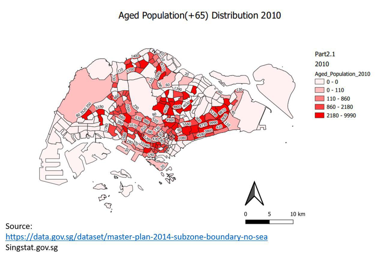
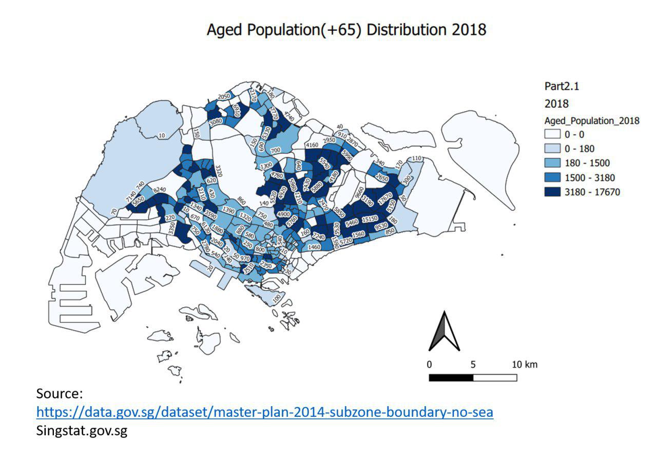
For the distribution of Aged population in 2010 and 2018, firstly I tidy up the data I got from Singstat.gov.sg and only use the data from 2010 and 2018, at the same time, I added a column called Aged_Pop_SZ for both 2010 and 2018 to add up all the aged population. As you can see from the maps above, the aged population is increased and some area in 2010 didn't have aged population, while it appears to have aged population in 2018, which shows that the population aging trend. In order to show the distribution clearly, I used Graduated Symbology and Labeled all the aged population number for each Subzone.
Proportional of aged population in 2010 and 2018
Source: Data.gov.sg & Singstat.gov.sg
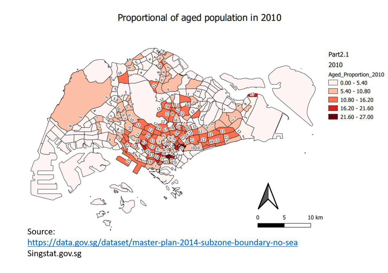
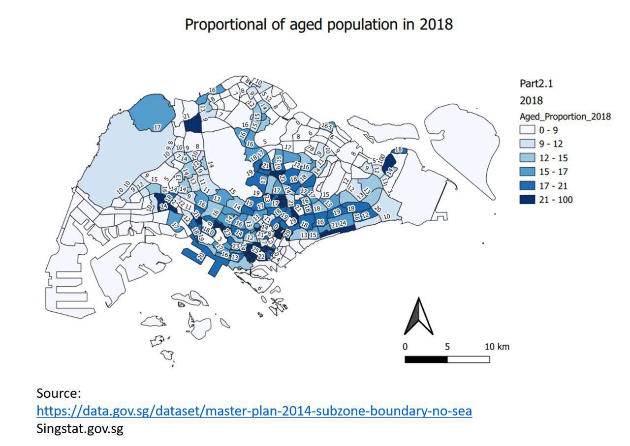
For the proportional of aged population of 2010 and 2018, I added a column called Total_pop to calculate the total population for each subzone for both 2010 and 2018, so that I can derive the proportion of aging population by using aged population number to divide total population number. As you can see from the maps above, we can tell that the proportion of aged population increased a lot along the years , while the aged population number didn't increase much(we can tell from the previous maps comparison).
Percentage Change of Aged Population (65 and Above) in Singapore by Subzone from Year 2010 to 2018
Source: Data.gov.sg & Singstat.gov.sg
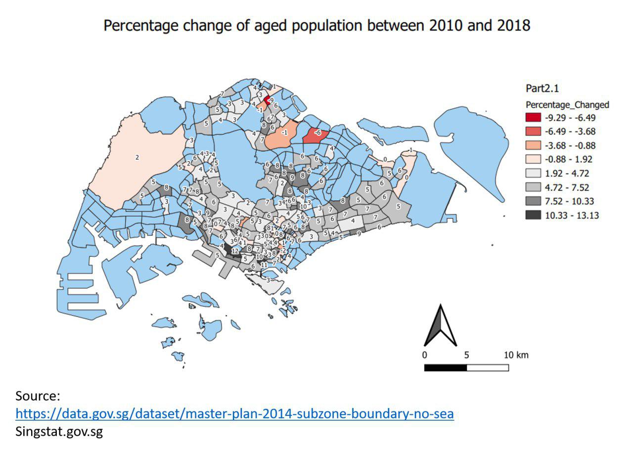
For the percentage change of aged population between 2010 and 2018, I use Graduated Symbology and I chose red and grey color ramp, so that it can show both negative change and positive change clearly. As you can see from the map above, the red color shows that there is a aged population percentage decrease in those area, some pink color area means there is a minor increase in these area. While for those grey or dark grey area, it indicates are significant increase in aged population percentage(blue color are 0 percentage change)
Classification Choice, New Variables, Relevant Judgement and Assumptions

