Difference between revisions of "SMT201 AY2019-20G2 Ex1 Ng Poh Yeng"
| Line 37: | Line 37: | ||
=== Percentage Change From 2010 and 2018 === | === Percentage Change From 2010 and 2018 === | ||
| + | [[File:Change2010to2018.jpg|thumb]] | ||
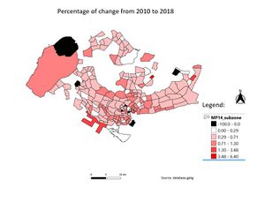
| + | this map shows the geographical distribution of the change in the ageing population from the year 2010 to 2018. I used the total ageing population of the year 2010 and divided it against the ageing population of 2018 to better see the percentage of change. Darker red subzones mean that there is a great change from 2010 to 2018. | ||
Revision as of 23:21, 15 September 2019
Contents
Part One: Thematic Mapping
Level of Schools
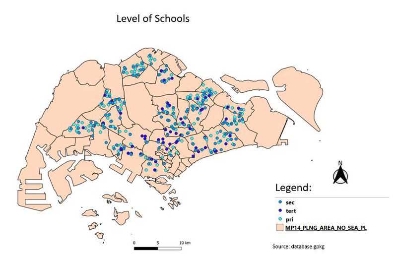
This map shows all the school in Singapore. The legend of the map clearly shows the different school categories - primary, secondary and tertiary. The mixed school does not have a category on its own because it is being added into either a secondary or tertiary category. The colour chosen for the labels is 3 different shades of blue. Starting from the light shade of blue to represent the primary school, followed by the medium shade of blue to represent the secondary school and lastly the darkest shade of blue to represent the tertiary school. There are overlapping points due to the closeness of the school as some are side by side each other, therefore overlap of labels are unavoidable.
Road Network System
This map shows the Road network in Singapore. The legend of the map shows that there are 3 major category - expressway, major roads, minor roads. Major roads are those roads with road name containing "road", whereas the minor roads consist of road names containing "lanes", "street", "avenue" and more. Expressway is shown by the brightest yellow colour mimicking the colour used by the google map. The major road is being represented by green lines and because there are plenty of minor roads in Singapore, they are being represented by brown lines to prevent confusion. According to the map, we can conclude that the road network is the most complicated around the town area as it is the most densed looking.
2014 Master Plan Landuse
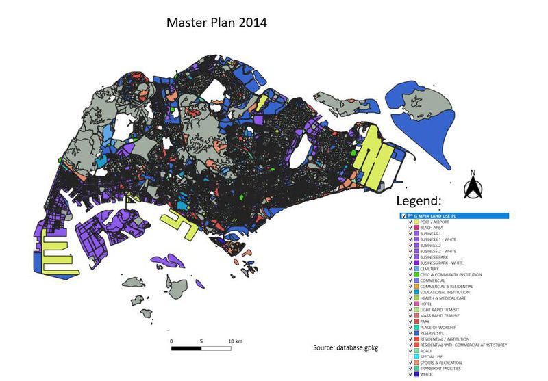
This map shows the master plan for Land use in Singapore year 2014. The legend contains a lot of different facilities in Singapore. To make things more visible, I grouped several facilities together. I grouped all form of business together and used purple to indicate them. I also mainly grouped all the residentials together to determine if the residentials are more densely populated at certain location. According to the map, both business and residential is largely spreaded around Singapore. We can also see that the port of Singapore is located at both ends.
Part Two: Choropleth Mapping
2010 Population Aged 65+
This map shows the subzones of Singapore coloured according to the density of the number of people who are aged 65 and above. The stronger red colour represents the fact that more people that are aged 65 and above stays at that area. According to the map, we can clearly see that in the east side, there are most subzones with darker and stronger red.
2018 Population Aged 65+
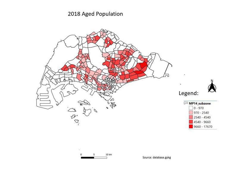
this map shows the geographical distribution of the ageing population of the year 2018. Similar to the 2010 distribution, the east side of Singapore tends to have a stronger red colour subzones, which means that there is a greater number of people who are 65 and above. We can also see that the west side is getting redder as compared to 2010.
2010 Proportion Aged 65+
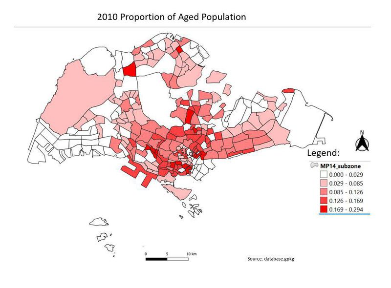
this map shows the geographical distribution of the proportion of the aging population of the year 2010. The legend was calculated using the total number of 65 and above people against the total number of people living in the subzone. This will give a better gauge on the proportion of the ageing group. We can clearly see that the central of Singapore is very densely populated with people aged above 65 and there is a good concentration on the redness of the subzone in the central.
2018 Proportion Aged 65+
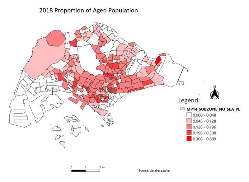
this map shows the geographical distribution of the proportion of the ageing population in the year 2018. We can clearly see the stark difference between the 2010 and 2018 map. The main difference is that the proportion of the ageing population is inevitably spreading from the centre of Singapore.
Percentage Change From 2010 and 2018
this map shows the geographical distribution of the change in the ageing population from the year 2010 to 2018. I used the total ageing population of the year 2010 and divided it against the ageing population of 2018 to better see the percentage of change. Darker red subzones mean that there is a great change from 2010 to 2018.
