Difference between revisions of "SMT201 AY2019-20T1 EX1 Lim Qiu Hui Candy"
| Line 13: | Line 13: | ||
== 2.1 Aged Population (above 65) in Singapore == | == 2.1 Aged Population (above 65) in Singapore == | ||
=== 2.1.1 Aged population in 2010 === | === 2.1.1 Aged population in 2010 === | ||
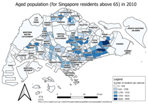
| − | [[File:AgedPopulationbySubzone 2010.png| | + | [[File:AgedPopulationbySubzone 2010.png|thumb]] |
*Based on the map, most of the aged population reside in Central to East areas. Specifically, Tampines East and Bedok North subzones have the highest number of aged population. | *Based on the map, most of the aged population reside in Central to East areas. Specifically, Tampines East and Bedok North subzones have the highest number of aged population. | ||
Revision as of 23:06, 15 September 2019
Contents
1.1 School Distribution
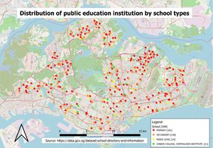
- Since institution type is measurable on a nominal scale, I chose point symbols (eg. a book) to indicate the schools on the map and for a reader’s easier understanding. Contrasting hues for the point symbols were used to differentiate between the 4 types of schools. The classification above was done by categorizing the data based on the “mainlevel_” column. OpenStreetMap is used as a background for my map, for readers to identify the rough locations of the schools easily.
1.2 Road Network System
Similar to 1.1, the data in 1.2 is qualitative and measured on a nominal scale. Lines are used to represent the roads instead and to differentiate between the 3 main types of roads, contrasting hues and line thickness were used. As such, the reader can easily tell that the thickest line represents expressways, thinnest line represents minor roads, just like how the width of these roads are in real life.
1.3 Master Plan Landuse
Polygons of different hues are used to represent the land use types. To allow clearer understanding of the map, I decluttered the classification result by grouping similar categories together, based on its official definition. For example, “Business, Industry”, “Commercial” and more are simplified categories. Lines are used to represent “Roads” like 1.2. For “Open Space” and “Reserve Site”, line pattern fills are used so that at a glance, readers know that these are open lands that can potentially be developed – if one is interested in doing so. Planning area labels are also included for easier identification of areas.
2.1 Aged Population (above 65) in Singapore
2.1.1 Aged population in 2010
- Based on the map, most of the aged population reside in Central to East areas. Specifically, Tampines East and Bedok North subzones have the highest number of aged population.
2.1.2 Aged population in 2018
The observations in 2.1.1 are visible in 2.1.2 as well. The general number of aged population have also increased, based on the increase in the intervals from 2.1.1 and 2.1.2 (Highest in 2010 was 9990; highest in 2018 was 17670).
2.2 Proportion of Aged population in 2010 and 2018
Generally, high aged population density can be observed in the Central, South and East areas in both 2010 and 2018. Following the trends described in 2.1.2, the proportion of aged population in 2018 is more than that of 2010 (highest in 2010 was 14.29%; highest in 2018 was 44.44%). Proportion against total population is also a better tool for us to determine population demographics, compared to just resident numbers in 2.1, since it tells us more about an area’s demographics in general.
2.3 Percentage change of aged population between 2010 and 2018
There is high percentage increase of aged population in Singapore, as there are more areas of darker saturations of green (representing a positive percentage change) as compared to the lighter saturations. In general, the West and North-East areas are of lighter saturations; indicating a zero or percentage decrease of aged population over the years; whereas the other areas are of the darker saturations. Perhaps this is a good indicator that more elderly-friendly facilities and services should be introduced island-wide.
2.4 General
To derive new field calculations and variables, I first had to clean up the data downloaded from Singstats. The general steps adopted were:
- 1. Save 2010 and 2018 data separately in csv files
- 2. Delete unnecessary fields (Eg. Breakdown of residents’ population by gender)
- 3. Replace ‘-‘ to 0, as it affects our field calculations in QGIS
- 4. Change population numbers to Number format on Excel (removes ,)
I joined all the different csv layers with the subzone layer by the Subzone names.
In QGIS, I replaced missing values with 0 instead. This replacement was also necessary because for 2010 data, some subzones were not present in 2018 and hence, would have resulted in an entirely blank subzone field.
For new field calculations, the general formula adopted in 2.2 was:
- (Aged Population by year per subzone / Subzone Total Population by year) * 100
- whereby: * 100 to account for %
For 2.3:
- ((Aged Population in 2018 per subzone – Aged Population in 2010) / Aged Population in 2010) * 100
- whereby: * 100 to account for %
For 2.1 and 2.2, after research, I selected the Natural Breaks (Jenks) method as the histogram derived from the values indicated the presence of outliers and highly skewed distribution, which is hence unsuitable for Equal Interval classification. For 2.3, I selected the Quantile (Equal Count) method instead, as it showed a more distinct data (more saturation on the map) than the Natural Breaks method, which showed little distinction in the data.
In general, single colour ramps with different saturations were used for my maps to distinguish the classes.

