Difference between revisions of "SMT201 AY2019-20T1 EX1 Ong Krystal"

From Geospatial Analytics for Urban Planning
Jump to navigation Jump to search
Line 1: Line 1:
'''Part 1:
+
[[File:KO jpg Aged Population (65+) - 2018.jpg|thumb|center|Aged Population 2018]]
'''
 
  
'''Distribution of Public Education
+
[[File:KO jpg Percentage Change of Aged Population.jpg|thumb|center|Percentage change between 2010 and 2018]]
'''
 
  
 +
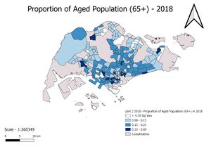
[[File:KO jpg Proportion of Aged Population - 2018.jpg|thumb|center|Proportion of Aged Population in 2018]]
  
I chose categorised from the symbol drop down list to group according to the school type, main level as they can be grouped into distinct groups and represented by symbols. I used SVG Symbols as representation, but different colours and symbols for easier visualisation for the viewers of the map.
+
[[File:KO jpg Proportion of Aged Population (65+) - 2010.jpg|thumb|center|Proportion of Aged Population in 2010]]
  
'''Hierarchy of Road Network System
+
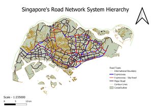
[[File:KO jpg Singapore Road Network System Hierarchy.jpg|thumb|center|Road Network distribution]]
'''
 
  
Categorised is chosen as choice of classification as well for this map. From the Symbol ID, I labelled accordingly based on the road types as shown below:
+
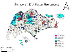
[[File:KO jpg Singapore's Master Plan Landuse.jpg|thumb|center|Landuse distribution]]
0. International Boundary
 
1. Expressway
 
2. Expressway - Sliproad
 
3. Major Road
 
4. Contour Lines
 
I did not use any symbols to represent the road lines, but instead used lines of varying thickness and colour for easier visualisation. Expressway had the thickest line, followed by slip road, contour lines and international boundary. This is because expressways are more major roads in Singapore which is used by more citizens, hence having the thicker lines as representation.


'''2014 Master Plan Landuse'''


Categorised grouping is chosen as it is used to group according to description of the purpose of the piece of land. There are many sub groups and by using different colour to classify each description makes it easier for visualisation.


However, due to the large number of purposes for land use, I chose to arrange the map that is closer to the most recent master plan that focuses on planning for inclusive, sustainable and green neighbourhoods. Areas that is less significant to this goal was removed from this map so that it would be easier for viewers to identify the land use that can help promote a more sustainable and green neighbourhood. Land use such as park, open spaces, waterbody were included to be used to promote sustainability in the country.


'''Part 2:
 
'''


'''Aged Population (65+) – 2010'''


Graduated classification is used as the number of aged population in each subzone was not identical, making it not suitable to use categorised as our tool of classification. Graduated was more relevant in this case as it spreads out over a range of values.
 
The lighter shade of blue means less number of aged population, regardless of how large or small the total population is in that subzone. Some areas in the east had larger number of aged population, such Bedok and Tampines. Areas that had a lower number of aged populations are closer to the coast of the island and non-residential districts like catchment areas.


'''Aged Population (65+) – 2018'''


The data was in a csv file and data had to be cleaned as there were irrelevant data in the file. Data where the total number of residents did not tally to the sum of all the individual age groups living in that subzone was cleaned to improve the accuracy of our analysis. 
 
A relational join was also carried out with the 2014 subzone by matching the subzone code. 
 
Generally, the spread remained relatively constant but number of aged population in Singapore has increased as seen from the scale from 2010. Certain subzones like Boon Lay saw an increase while others like Sengkang saw a decrease in aged population.


'''Proportion of Aged Population (65+) – 2010


I calculated the proportion of aged population as the number of aged population over the total number of residents in the subzone.
 
Graduated classification method was also used here as the proportion of aged population in each subzone was not identical, making it less relevant to use categorised as our tool of classification. Graduated was more relevant in this case as it spreads out over a range of values.
 
For the map analysing proportion, I used standard deviation instead of natural breaks as the histogram resembled a normal graph, with an outlier. I classified into 4 groups for each maps, namely,
 
1. 0 to σ
 
2. μ - σ 
 
3. μ + σ
 
4. More than μ + σ 


Subzones that have a standard deviation that fall within 0 to σ and more than μ + σ means they differ more from the mean value of proportion of aged population. Most subzones within 0 to σ mainly consists of subzones with less populated subzones like water catchment area or younger estates. Subzones with standard deviation more than μ + σ has a higher population of aged population, meaning it is an older estate. Subzones that have standard deviation closer to mean value means that they have proportion of aged population closer to one another.


Revision as of 22:10, 15 September 2019

Aged Population 2018
Percentage change between 2010 and 2018
Proportion of Aged Population in 2018
Proportion of Aged Population in 2010
Road Network distribution
Landuse distribution