Difference between revisions of "SMT201 AY2019-20G1 EX1 Lim Shi Xian Alvin"
| Line 46: | Line 46: | ||
== Part 2: Choropleth Mapping == | == Part 2: Choropleth Mapping == | ||
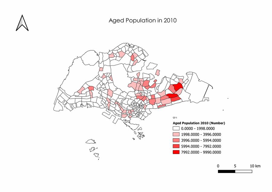
| − | + | ===Aged Population (+65) in 2010 and 2018=== | |
| + | |||
| + | |||
| + | [[File:QuestionTwoPartOne2010.jpg|900px|Left|Aged Population in 2010]] | ||
| + | [[File:QuestionTwoPartOne2018.jpg|900px|Right|Aged Population in 2018]] | ||
Revision as of 21:55, 15 September 2019
Part 1: Thematic Mapping
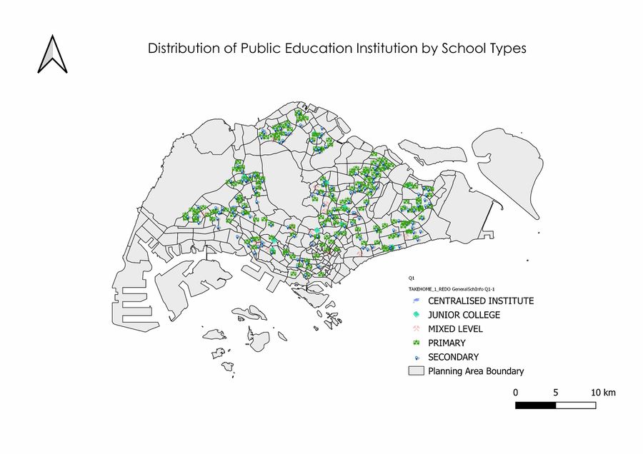
Distribution of Public Education Institution by School Types
Source: General Information Of School [1]. Master Plan 2014 Subzone Boundary [2].
To properly depict the public education institution of Singapore, I used the mainlevel_ attribute column to categorise each unique point on the map. With the mainlevel_ column, I was able to uniquely identify each type of public institution, such as primary schools, secondary schools, junior colleges etcetera. I've used the inbuilt SVG markers in QGIS to better differentiate the markers instead of the default simple dots and used a grey background to accentuate the colours of the markers.
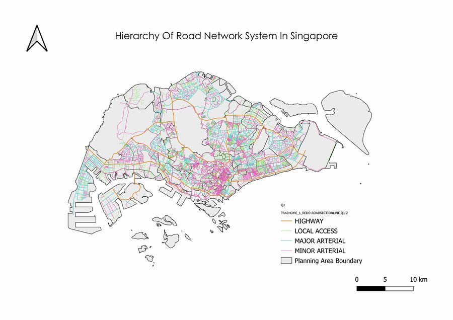
Road Network System Hierarchy of Singapore
Source: Road Section Line [3] Master Plan 2014 Subzone Boundary [4].
I downloaded the shapefile from mytransport.sg and proceeded to import it into QGIS, and discovered that all the road names are mapped out inside the attribute table. As such, my approach was to follow URA handbook guidelines to classify them to their respective category. I did not include a case for Primary Access Road due to the fact that they share overlapping naming conventions with "Local Access". In terms of visual representation, the width of a road is representative of its class. Highways will be the thickest as it is the broadest in the real world, and vice-versa. I used the following code to classify it:
 CASE
 WHEN "RD_CD_DESC" LIKE '%HIGHWAY%' THEN 'HIGHWAY'
 WHEN "RD_CD_DESC" LIKE '%EXPRESSWAY%' THEN 'HIGHWAY'
 WHEN "RD_CD_DESC" LIKE '%PARKWAY%' THEN 'HIGHWAY'
 WHEN "RD_CD_DESC" LIKE '%BOULEVARD%' THEN 'MAJOR ARTERIAL'
 WHEN "RD_CD_DESC" LIKE '%AVENUE%' THEN 'MAJOR ARTERIAL'
 WHEN "RD_CD_DESC" LIKE '%WAY%' THEN 'MAJOR ARTERIAL'
 WHEN "RD_CD_DESC" LIKE '%DRIVE%' THEN 'MINOR ARTERIAL'
 WHEN "RD_CD_DESC" LIKE '%ROAD%' THEN 'MINOR ARTERIAL'
 WHEN "RD_CD_DESC" LIKE '%STREET%' THEN 'MINOR ARTERIAL'
 ELSE 'LOCAL ACCESS'
 END
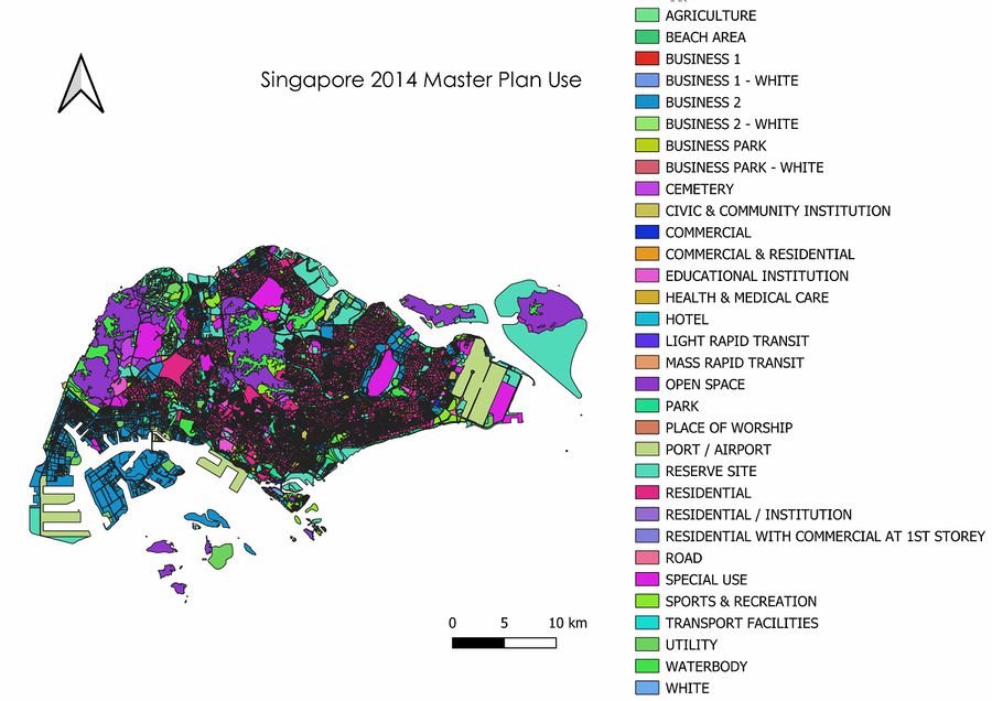
2014 Master Plan Landuse Singapore
Source: Master Plan 2014 Land Use [5]
I downloaded the shapefile and imported it into QGIS. I then scanned through the attribute table and realised that LU_DESC could be used to classify each individual segment. As there were many segments, upon allowing random classification of colour, the visualization was a horrendous mess due to the sheer amount of colours that were too similar with each other. As such, I tried to ensure that there was adequate contrast between each colour by changing its representation, with limited success.


