Difference between revisions of "SMT201 AY2019-20T1 EX1 Tang Wan Yee"
| Line 7: | Line 7: | ||
=== Thematic Map 2 : Road Network System === | === Thematic Map 2 : Road Network System === | ||
| + | [[File:Road network system .png|600px|center]] | ||
| + | Line symbols are used to represent linear features such as roads. In the above map, there are mainly 3 different type of roads. Road names with expressway was categorised into “Expressway” while road names with road was categorised into “Major Road”, leaving the remaining data to be categorised into “Minor Road”. The roads are being differentiated by the colour and thickness of the lines. I have chosen to use a thicker line to represent roads that are seen as “Larger”. | ||
| + | |||
| + | === Thematic Map 3: Land Use === | ||
| + | [[File:Land_Use.png|600px|center]] | ||
| + | The data of Singapore Land Use was categorised into many areas resulting in a map that has many different colours. Hence, to make it easier to view, I decided to re-categorised the data using QGIS’s rule-based symbology by grouping them together with similar land use description. Now, with one glance, we were able to understand how the government has planned the spaces. For example, many of the residential areas are accompanied by amenities as well as green spaces, allowing residents to enjoy both convenience and nature. | ||
| + | |||
| + | |||
| + | == Part 2: Choropleth Mapping == | ||
| − | + | === Choropleth Map 1: Aged Population (65+) in 2010 & 2018 === | |
| − | [[File: | + | [[File:Aged population in 2010 twy.png|600px|center]] |
| − | + | The above Choropleth map uses sequential colour scheme (from light to dark) to indicate the amount of aged people in each area. I used the Jenks natural breaks classification method to determine the best arrangement of values into different class. Areas with darker colours represent a larger amount of people who are age 65 and above. In this case, more of the aged population seems to be staying in the east as compared to the other area of Singapore. | |
| + | |||
| + | [[File:Aged population in 2018 twy.png|600px|center]] | ||
| + | In 2018, there are still more aged people staying in the east as compared to the rest of Singapore. However, one notable difference between 2018 and 2010 is the growing aged population in the west. In addition, looking at the legend, I noticed that the upper limit has also increased from 9990 in 2010 to 17670 in 2018, confirming our observation of a growing aged population in Singapore. From the legend, we also noticed that the lower limit starts from 0, I assumed that these areas in Singapore are non-residential thus there might be no population count. Another thing to note could be the difference in Masterplan Subzone used. Due to the changes in subzone code, we had to use 2008 Masterplan Subzone to join with 2010 Age Subzone and 2014 Masterplan Subzone to join with 2018 Age Subzone. | ||
| + | |||
| + | |||
| + | === Choropleth Map 2: Proportion of aged population (65+) in 2010 & 2018 === | ||
| + | [[File:Proportion 2010 twy.png|600px|center]] | ||
| + | Proportion of Aged population (65+) was calculated using the number of people aged 65 and above in a particular area divided by the total population of that area multiply by 100. One assumption is that the values in the data has been rounded to the nearest 10. As compared to the “Aged population (65+) in 2010” Map, the east side seems to be not as dark. '''This could mean that in the east, despite its large amount of people aged 65 and above, there are more people aged 65 and below.''' | ||
| + | |||
| + | [[File:Proportion 2018 twy.png|600px|center]] | ||
| + | The calculation as well as the assumption for this holds constant like in 2010. The proportion of people aged 65 and above and people aged 65 and below seems to be about the same as compared to in 2010. | ||
| + | |||
| + | |||
| + | === Choropleth Map 3: Percentage Change of aged population (65+) between 2010 & 2018 === | ||
| + | [[File:Percentage change twy.png|600px|center]] | ||
| + | To find percentage change, I took the (proportion of aged population in 2018 – proportion of aged population in 2010) divided by (proportion of aged population in 2010) multiply by 100. By doing so, we noticed that some areas show a percentage increased while others show a percentage decreased. One notable thing is the significant increase in proportion of aged population in the east and west resulting in the darker tones of those area. There are some areas (shown in black) that is categorised as unavailable due to the null values it amounted to cause of the update in subzone code from the MP08 to MP14. | ||
Latest revision as of 21:34, 15 September 2019
Part 1: Thematic Mapping
Thematic Map 1 : School Information
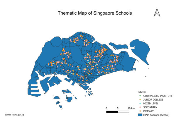
I used a point symbol as a qualitative symbol to map out the location and types of school. In comparison to a pictorial symbol, I find that having a point symbol with different colours would be easier to identify and more pleasing to the eyes as pictorial symbol on schools may be very similar to one another, defeating the purpose of differentiating. For colours, I went with a brighter palette for the point symbols in contrast with the darker colour of the background of the map. This is done so that the points will be able to stand out more to the viewer.
Thematic Map 2 : Road Network System
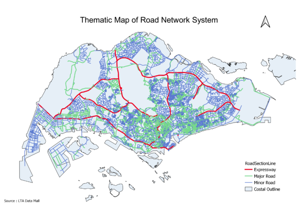
Line symbols are used to represent linear features such as roads. In the above map, there are mainly 3 different type of roads. Road names with expressway was categorised into “Expressway” while road names with road was categorised into “Major Road”, leaving the remaining data to be categorised into “Minor Road”. The roads are being differentiated by the colour and thickness of the lines. I have chosen to use a thicker line to represent roads that are seen as “Larger”.
Thematic Map 3: Land Use
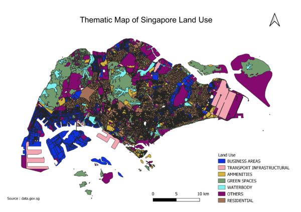
The data of Singapore Land Use was categorised into many areas resulting in a map that has many different colours. Hence, to make it easier to view, I decided to re-categorised the data using QGIS’s rule-based symbology by grouping them together with similar land use description. Now, with one glance, we were able to understand how the government has planned the spaces. For example, many of the residential areas are accompanied by amenities as well as green spaces, allowing residents to enjoy both convenience and nature.
Part 2: Choropleth Mapping
Choropleth Map 1: Aged Population (65+) in 2010 & 2018
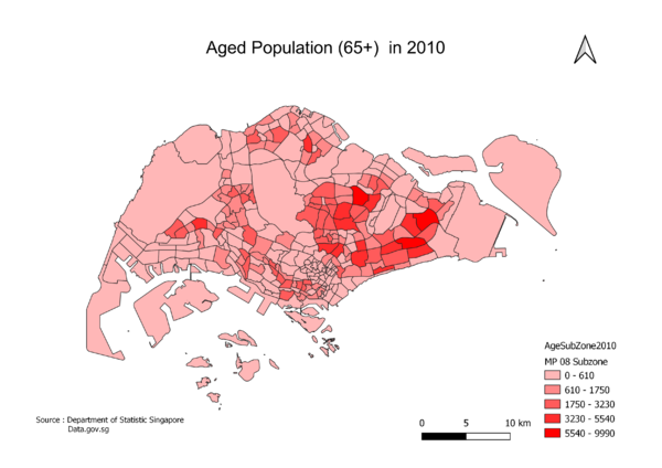
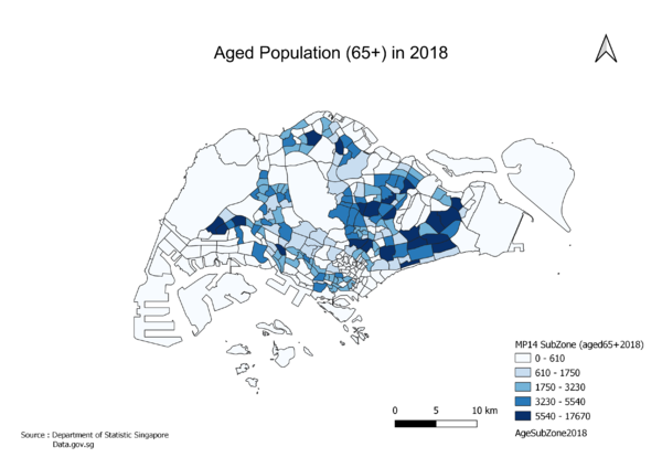
The above Choropleth map uses sequential colour scheme (from light to dark) to indicate the amount of aged people in each area. I used the Jenks natural breaks classification method to determine the best arrangement of values into different class. Areas with darker colours represent a larger amount of people who are age 65 and above. In this case, more of the aged population seems to be staying in the east as compared to the other area of Singapore.
In 2018, there are still more aged people staying in the east as compared to the rest of Singapore. However, one notable difference between 2018 and 2010 is the growing aged population in the west. In addition, looking at the legend, I noticed that the upper limit has also increased from 9990 in 2010 to 17670 in 2018, confirming our observation of a growing aged population in Singapore. From the legend, we also noticed that the lower limit starts from 0, I assumed that these areas in Singapore are non-residential thus there might be no population count. Another thing to note could be the difference in Masterplan Subzone used. Due to the changes in subzone code, we had to use 2008 Masterplan Subzone to join with 2010 Age Subzone and 2014 Masterplan Subzone to join with 2018 Age Subzone.
Choropleth Map 2: Proportion of aged population (65+) in 2010 & 2018
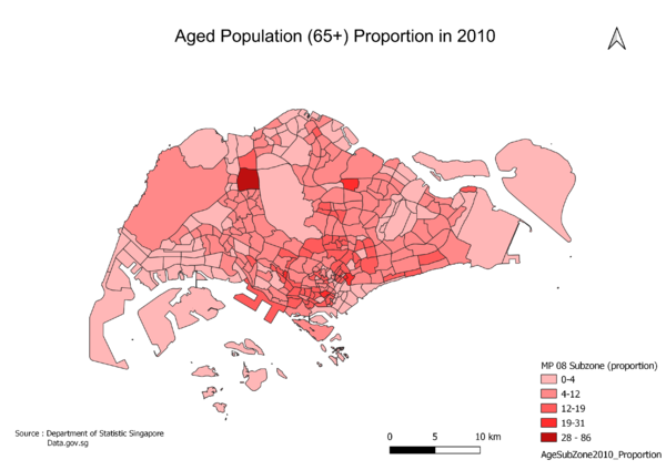
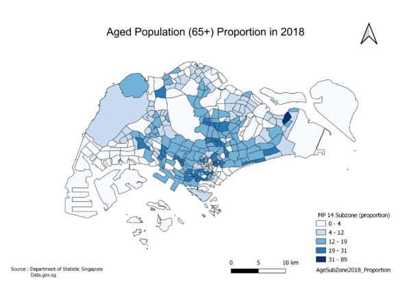
Proportion of Aged population (65+) was calculated using the number of people aged 65 and above in a particular area divided by the total population of that area multiply by 100. One assumption is that the values in the data has been rounded to the nearest 10. As compared to the “Aged population (65+) in 2010” Map, the east side seems to be not as dark. This could mean that in the east, despite its large amount of people aged 65 and above, there are more people aged 65 and below.
The calculation as well as the assumption for this holds constant like in 2010. The proportion of people aged 65 and above and people aged 65 and below seems to be about the same as compared to in 2010.
Choropleth Map 3: Percentage Change of aged population (65+) between 2010 & 2018
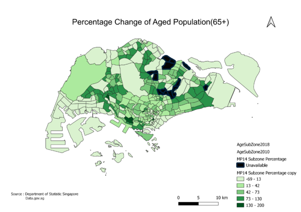
To find percentage change, I took the (proportion of aged population in 2018 – proportion of aged population in 2010) divided by (proportion of aged population in 2010) multiply by 100. By doing so, we noticed that some areas show a percentage increased while others show a percentage decreased. One notable thing is the significant increase in proportion of aged population in the east and west resulting in the darker tones of those area. There are some areas (shown in black) that is categorised as unavailable due to the null values it amounted to cause of the update in subzone code from the MP08 to MP14.
