Difference between revisions of "SMT201 AY2019-20T1 EX1 Lee Jayin"
| Line 3: | Line 3: | ||
=== 2014 Master Plan Landuse === | === 2014 Master Plan Landuse === | ||
| − | [[File: | + | [[File:TakeHomeEx1 Masterplan.png|800px|center]] |
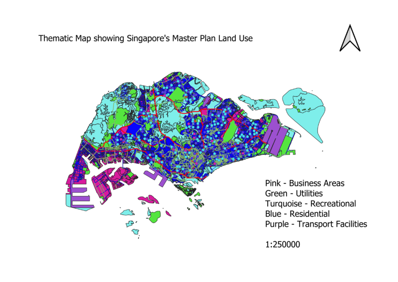
Upon classifying the data using categorized symbology method (as the data was discrete), there were 20 over categories. Classes should be optimally kept under 6, thus I chose to group them into 5 categories under residential, utilities, recreational, business areas and others. The categories are grouped this way as these are the main categories needed in a city. Different colours are used to differentiate the different categories clearly. | Upon classifying the data using categorized symbology method (as the data was discrete), there were 20 over categories. Classes should be optimally kept under 6, thus I chose to group them into 5 categories under residential, utilities, recreational, business areas and others. The categories are grouped this way as these are the main categories needed in a city. Different colours are used to differentiate the different categories clearly. | ||
Revision as of 18:17, 15 September 2019
Part One: Thematic Mapping
2014 Master Plan Landuse
Upon classifying the data using categorized symbology method (as the data was discrete), there were 20 over categories. Classes should be optimally kept under 6, thus I chose to group them into 5 categories under residential, utilities, recreational, business areas and others. The categories are grouped this way as these are the main categories needed in a city. Different colours are used to differentiate the different categories clearly.
Level of Schools
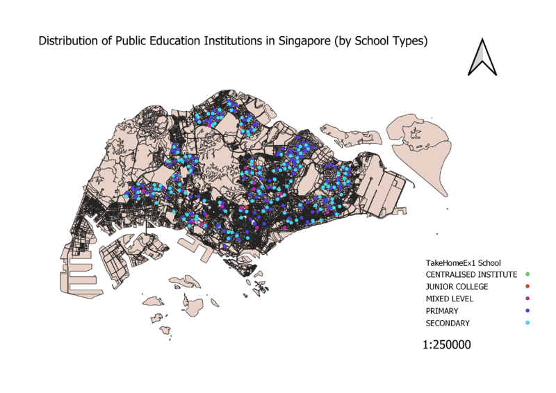
As data of educational institutes in Singapore are discrete, the categorized symbology method was used. When classified, this allows for 5 clear-cut categories of educational institutes to be seen. Different colours were used to differentiate the different categories more clearly. Also, as only ZIP codes were provided in the dataset, python had to be used to geocode the institutes data onto the GIS.
Road Network System
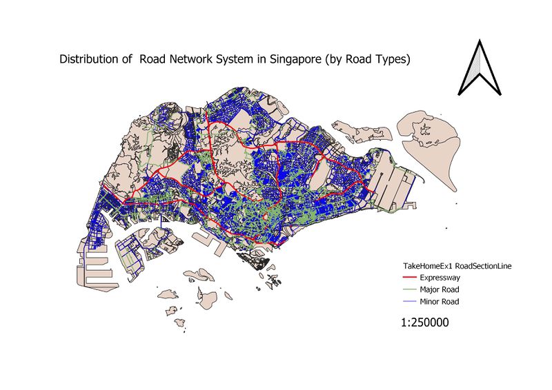
When classified, 3 road categories were produced – the expressway, major roads and minor roads. Different colours and widths were used for each category. Red for expressway as red is a sign of urgency, and the width is 3x the size of minor roads. This is to clearly indicate the more “crucial” roads. Major roads are set to be 2x the size of minor roads.
Part Two: Choropleth Mapping
Upon downloading the data, the data was cleaned and reformatted. Filtering out only the years required – 2010 and 2018, I then replaced all the blanks cells with a value “0”. 2010 and 2018 each had their own separate .csv files and were added into the geopackage. Data was joined using the subzones column, and a new field (Age+65) was calculated with the field calculator.
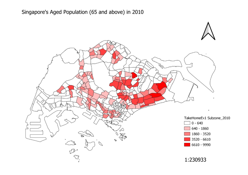
Singapore's Aged Population (65 and above) in 2010
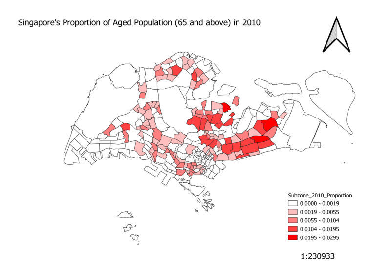
From the graph, we can see that Singapore's Aged Population are generally scattered around the whole of Singapore, especially the residential areas (comparing with the Master Plan Landuse map). However, there are certain areas with darker intonations of red, meaning a larger population of people over age 65 living around there. These areas are situated mainly in the East, with a few at the central areas.
Singapore's Aged Population (65 and above) in 2018
Singapore's Proportion of Aged Population (65 and above) in 2010
Singapore's Proportion of Aged Population (65 and above) in 2018
