Difference between revisions of "SMT201 AY2019-20G1 Ex1 Kang Hui Yun"
| Line 7: | Line 7: | ||
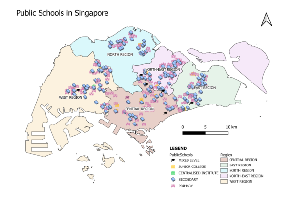
| − | The map above shows the distribution of public education institutions, classified into distinct school | + | The map above shows the distribution of public education institutions, classified into distinct school levels over the backdrop of regions. As there are many features (i.e. public schools) and classes (i.e. school levels), the visual variables gets cluttered when viewing the whole map. Hence, a different colour is used to represent each school type so as to help map readers distinguish among the clusters easily. A relevant SVG is also given to the school type (e.g. abc chart for primary, books for secondary, etc), as it is more intuitive than colour differentiation. |
=== Road Network System === | === Road Network System === | ||
| Line 15: | Line 15: | ||
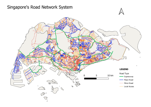
| − | The map above depicts the hierarchy of Singapore's road network, classified into 4 different | + | The map above depicts the hierarchy of Singapore's road network, classified into 4 different categories. Each category is given a different colour. They are also given a different stroke width, with expressway having the thickest stroke, then major, minor and local access roads, as it brings out the more important roads in the viewer's eyes before the rest. This is also because there are fewer expressways than major roads, fewer major roads than minor roads, etc. Therefore, it is easier to visualise if a lighter stroke is given to the category with more instances and vice versa. |
=== 2014 Master Plan Land Use === | === 2014 Master Plan Land Use === | ||
Revision as of 16:34, 15 September 2019
Contents
Part 1: Thematic Mapping
Public Schools
The map above shows the distribution of public education institutions, classified into distinct school levels over the backdrop of regions. As there are many features (i.e. public schools) and classes (i.e. school levels), the visual variables gets cluttered when viewing the whole map. Hence, a different colour is used to represent each school type so as to help map readers distinguish among the clusters easily. A relevant SVG is also given to the school type (e.g. abc chart for primary, books for secondary, etc), as it is more intuitive than colour differentiation.
Road Network System
The map above depicts the hierarchy of Singapore's road network, classified into 4 different categories. Each category is given a different colour. They are also given a different stroke width, with expressway having the thickest stroke, then major, minor and local access roads, as it brings out the more important roads in the viewer's eyes before the rest. This is also because there are fewer expressways than major roads, fewer major roads than minor roads, etc. Therefore, it is easier to visualise if a lighter stroke is given to the category with more instances and vice versa.
2014 Master Plan Land Use
The above map shows the different types of land use in Singapore. As the data contains a whopping 32 categories, it is aggregated to combine similar categories into one, leaving us with 21 categories in total. This allows for better visualisation as there are 11 less colours the map readers have to take in, while still being able to understand the nature of the land use for each area.


