Difference between revisions of "SMT201 AY2019-20T1 EX1 Peh Jin An"
| (55 intermediate revisions by one other user not shown) | |||
| Line 1: | Line 1: | ||
| + | ===School Distribution=== | ||
[[File:School_Distribution.png|border|center|800x800px|]] | [[File:School_Distribution.png|border|center|800x800px|]] | ||
I have decided to use the planning area layer alongside the education layer so that users will be able to locate schools in Singapore. I have also use 4 different colours to represent the 4 different levels of school. Purple representing Junior Colleges and Centralised Institutions, orange representing mixed level schools, red representing secondary schools and finally green representing primary schools. This way users will be able to differentiate the types of schools in its location. I have also used SVG icons to represent the schools to ensure that the icons would not be pixelized when zoomed into. | I have decided to use the planning area layer alongside the education layer so that users will be able to locate schools in Singapore. I have also use 4 different colours to represent the 4 different levels of school. Purple representing Junior Colleges and Centralised Institutions, orange representing mixed level schools, red representing secondary schools and finally green representing primary schools. This way users will be able to differentiate the types of schools in its location. I have also used SVG icons to represent the schools to ensure that the icons would not be pixelized when zoomed into. | ||
| + | ===Singapore Road Sections=== | ||
[[File:Singapore_Road_Sections(Updated).png|border|center|800x800px|]] | [[File:Singapore_Road_Sections(Updated).png|border|center|800x800px|]] | ||
In this question, I have categorised the roads into 4 main categories. Expressways, major roads, minor roads and local access. This way, the viewer would be able to tell where the roads are in a glance. I have used the filter function on the attribute table for the mentioned attributes to attain the following results. | In this question, I have categorised the roads into 4 main categories. Expressways, major roads, minor roads and local access. This way, the viewer would be able to tell where the roads are in a glance. I have used the filter function on the attribute table for the mentioned attributes to attain the following results. | ||
| + | ===Singapore Land Use=== | ||
[[File:Singapore Land Use.png|border|center|800x800px|]] | [[File:Singapore Land Use.png|border|center|800x800px|]] | ||
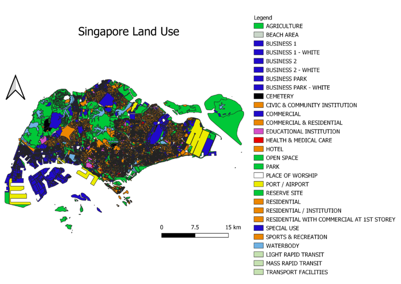
I have decided to utilize the LU_Desc column from the attribute table as it best fulfils the requirements of the question. I have classified the map into 4 main categories. | I have decided to utilize the LU_Desc column from the attribute table as it best fulfils the requirements of the question. I have classified the map into 4 main categories. | ||
| Line 18: | Line 21: | ||
I have classified them into these categories as I believe it has value when it comes to planning and understanding our land usage. | I have classified them into these categories as I believe it has value when it comes to planning and understanding our land usage. | ||
| + | ===Singapore Aged Population for 2010 and 2018=== | ||
[[File:Singapore Aged Population 2010.png|border|center|800x800px|]] | [[File:Singapore Aged Population 2010.png|border|center|800x800px|]] | ||
[[File:Singapore Aged Population 2018.png|border|center|800x800px|]] | [[File:Singapore Aged Population 2018.png|border|center|800x800px|]] | ||
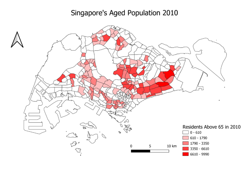
This map shows the classification of subzones based on Singapore’s aged population. The higher the number of aged populations, the darker the colour generated. In this case, the 2010 map will reflect a darker red while the 2018 will reflect a darker green. It was noticeable that some subzones that didn’t have darker shades in the 2010 map have emerged in the 2018 map. In addition, the values for the classes increased in the 2018 map, as compared to the 2010 map. This implies that the number of aged people living in those subzones has increased during these 8 years; and since there is a greater number of subzones that is coloured in 2018 as compared to 2010, this presents the trend of an aging population in Singapore. | This map shows the classification of subzones based on Singapore’s aged population. The higher the number of aged populations, the darker the colour generated. In this case, the 2010 map will reflect a darker red while the 2018 will reflect a darker green. It was noticeable that some subzones that didn’t have darker shades in the 2010 map have emerged in the 2018 map. In addition, the values for the classes increased in the 2018 map, as compared to the 2010 map. This implies that the number of aged people living in those subzones has increased during these 8 years; and since there is a greater number of subzones that is coloured in 2018 as compared to 2010, this presents the trend of an aging population in Singapore. | ||
| + | ===Singapore Aged Population Proportions for 2010 and 2018=== | ||
[[File:Proportional of Aged Population in 2010.png|border|center|800x800px|]] | [[File:Proportional of Aged Population in 2010.png|border|center|800x800px|]] | ||
[[File:Proportional of Aged Population in 2018.png|border|center|800x800px|]] | [[File:Proportional of Aged Population in 2018.png|border|center|800x800px|]] | ||
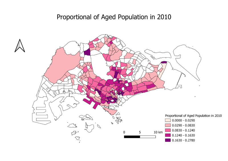
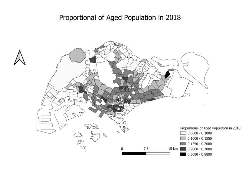
| − | I added a new column for both the 2010 and 2018 data files for the aged populations in the attributes table for citizens aged 65 and above. I also subsequently added the total populations column for both 2010 and 2018. Note that all these attributes have been added into the MP14 Web layer. I | + | I added a new column for both the 2010 and 2018 data files for the aged populations in the attributes table for citizens aged 65 and above. I also subsequently added the total populations column for both 2010 and 2018. Note that all these attributes have been added into the MP14 Web layer. I went on to calculate proportion using the field calculator by putting the dividing the total count of citizens aged over 65 for both years over the total population. |
| + | ===Percentage Change of Age Population between 2010 and 2018=== | ||
[[File:Percentage change of Aged Population between 2010 and 2018.png|border|center|800x800px|]] | [[File:Percentage change of Aged Population between 2010 and 2018.png|border|center|800x800px|]] | ||
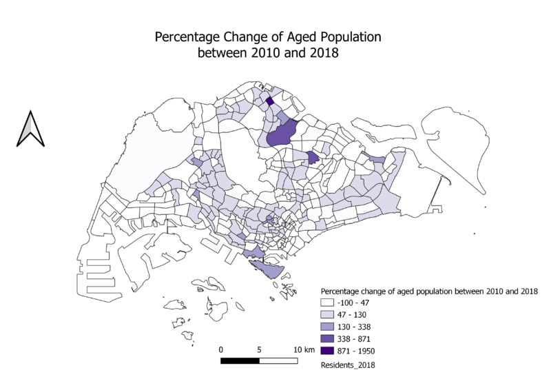
| − | For percentage, I added a new column for both the 2010 and 2018 data files for the aged populations in the attributes table for citizens aged 65 and above. I also subsequently added the total populations column for both 2010 and 2018. Note that all these attributes have been added into the MP14 Web layer. I then went on to calculate the proportion by subtracting the differences between both files and dividing it over the 2010 and multiplying the answer by 100. I then went on to render the data onto the map. Analyzing the map's data, the darker shades show a large percentage increase in the number of people aged 65 and above living in those subzones, while the lightest shade shows a percentage decrease in the number of people aged 65 and above living in those same subzones. Since there is a significant number of subzones with darker shades as compared to the first shade, it implies that the number of aged people living in these areas have had a increase, or even a significant amount of increase. | + | For percentage, I added a new column for both the 2010 and 2018 data files for the aged populations in the attributes table for citizens aged 65 and above. I also subsequently added the total populations column for both 2010 and 2018. Note that all these attributes have also been added into the MP14 Web layer. I then went on to calculate the proportion by subtracting the differences between both files and dividing it over the 2010 value and multiplying the answer by 100. I then went on to render the data onto the map. Analyzing the map's data, the darker shades show a large percentage increase in the number of people aged 65 and above living in those subzones, while the lightest shade shows a percentage decrease in the number of people aged 65 and above living in those same subzones. Since there is a significant number of subzones with darker shades as compared to the first shade, it implies that the number of aged people living in these areas have had a increase, or even a significant amount of increase. |
| − | + | ===Missing Values=== | |
| − | + | I have assumed for '-' values to be 0 | |
| + | |||
| + | ===Sources=== | ||
| + | Data.gov | ||
| + | Sing Stat | ||
Latest revision as of 21:19, 2 December 2019
Contents
School Distribution
I have decided to use the planning area layer alongside the education layer so that users will be able to locate schools in Singapore. I have also use 4 different colours to represent the 4 different levels of school. Purple representing Junior Colleges and Centralised Institutions, orange representing mixed level schools, red representing secondary schools and finally green representing primary schools. This way users will be able to differentiate the types of schools in its location. I have also used SVG icons to represent the schools to ensure that the icons would not be pixelized when zoomed into.
Singapore Road Sections
In this question, I have categorised the roads into 4 main categories. Expressways, major roads, minor roads and local access. This way, the viewer would be able to tell where the roads are in a glance. I have used the filter function on the attribute table for the mentioned attributes to attain the following results.
Singapore Land Use
I have decided to utilize the LU_Desc column from the attribute table as it best fulfils the requirements of the question. I have classified the map into 4 main categories. Blue representing the business and commercial parts Orange representing residential and recreational Green representing agriculture, open spaces, parks and reserved sites Turquoise representing waters White representing religious buildings Black representing cemeteries Pink representing educational institutions Red representing health and medical care Light green representing transport means I have classified them into these categories as I believe it has value when it comes to planning and understanding our land usage.
Singapore Aged Population for 2010 and 2018
This map shows the classification of subzones based on Singapore’s aged population. The higher the number of aged populations, the darker the colour generated. In this case, the 2010 map will reflect a darker red while the 2018 will reflect a darker green. It was noticeable that some subzones that didn’t have darker shades in the 2010 map have emerged in the 2018 map. In addition, the values for the classes increased in the 2018 map, as compared to the 2010 map. This implies that the number of aged people living in those subzones has increased during these 8 years; and since there is a greater number of subzones that is coloured in 2018 as compared to 2010, this presents the trend of an aging population in Singapore.
Singapore Aged Population Proportions for 2010 and 2018
I added a new column for both the 2010 and 2018 data files for the aged populations in the attributes table for citizens aged 65 and above. I also subsequently added the total populations column for both 2010 and 2018. Note that all these attributes have been added into the MP14 Web layer. I went on to calculate proportion using the field calculator by putting the dividing the total count of citizens aged over 65 for both years over the total population.
Percentage Change of Age Population between 2010 and 2018
For percentage, I added a new column for both the 2010 and 2018 data files for the aged populations in the attributes table for citizens aged 65 and above. I also subsequently added the total populations column for both 2010 and 2018. Note that all these attributes have also been added into the MP14 Web layer. I then went on to calculate the proportion by subtracting the differences between both files and dividing it over the 2010 value and multiplying the answer by 100. I then went on to render the data onto the map. Analyzing the map's data, the darker shades show a large percentage increase in the number of people aged 65 and above living in those subzones, while the lightest shade shows a percentage decrease in the number of people aged 65 and above living in those same subzones. Since there is a significant number of subzones with darker shades as compared to the first shade, it implies that the number of aged people living in these areas have had a increase, or even a significant amount of increase.
Missing Values
I have assumed for '-' values to be 0
Sources
Data.gov Sing Stat


