Difference between revisions of "SMT201 AY2019-20T1 EX2 Lim Jia Khee"
Jump to navigation
Jump to search


| Line 47: | Line 47: | ||
| <center>Study area with criterion scores of <strong>target roads</strong> layer</center> || Instead of directly applying the min-max formula over the target roads layer, the inverse of Xij (1 / Xij) was used instead. In turn, this changes the direction of our standardised road score. If we were to directly apply the min-max formula over this road layer, higher scores will be awarded to locations that are away from the roads, while lower scores will be given to sites that are closer to the roads. However, given that we want the inverse of that (higher scores allocated to locations closer to the road features), the inverse of Xij was used for this calculation. | | <center>Study area with criterion scores of <strong>target roads</strong> layer</center> || Instead of directly applying the min-max formula over the target roads layer, the inverse of Xij (1 / Xij) was used instead. In turn, this changes the direction of our standardised road score. If we were to directly apply the min-max formula over this road layer, higher scores will be awarded to locations that are away from the roads, while lower scores will be given to sites that are closer to the roads. However, given that we want the inverse of that (higher scores allocated to locations closer to the road features), the inverse of Xij was used for this calculation. | ||
|- | |- | ||
| − | | <center>Study area with criterion scores of <strong>buildings</strong> layer</center> || | + | | <center>Study area with criterion scores of <strong>buildings</strong> layer</center> || The min-max method was applied directly to the building layer. This current building view is exactly identical to the one in Map Layout 2, with the main difference being that the proximity ranges have been shrunk to between 0 and 1. The generated plot looks identical to the one above as the number of proximity bands created in both cases are the same, 5 classes. Hence, the objective remains the same - to keep an eye on locations where the standardised scores are highest. |
|- | |- | ||
| − | | <center>Study area with criterion scores of <strong>slope</strong> layer</center> || < | + | | <center>Study area with criterion scores of <strong>slope</strong> layer</center> || The thinking behind the criterion slope score layer is largely similar to that of the criterion score target roads layer. Instead of directly applying the min-max formula over the slope layer, the inverse of Xij (1 / Xij) was used instead. This is because we are looking for land that is <strong>not</strong> steep. If the inverse of Xij was not applied, higher scores will be given sites to steeper ground. However, we want higher scores to be given to flatter grounds. Hence, the inverse of Xij was used.</br> This inversed slope plot might be misleading in some sense, a reader may be misled to believe that most of the land in the area is of equal steepness (almost all of the sites fall inside the orange band). This is because the range of the values are extremely small - between 0.0007 and 0.08. Unlike other min-max plots where the values fall between the 0 and 1 range. |
|- | |- | ||
| − | | <center>Study area with criterion scores of <strong>target natural features</strong> layer</center> || | + | | <center>Study area with criterion scores of <strong>target natural features</strong> layer</center> || Similar to the building layer, the min-max method was directly applied to the target natural features layer. This current layer is exactly identical to the one in Map Layout 2, with the main difference being in the proximity ranges, for it has now been compacted to between 0 and 1. The generated plot looks identical to the one above as the number of proximity bands created in both cases are the same, 5 classes. The objective remains the same as with mentioned in map layout 02 - to keep an eye on locations where the standardised scores are highest, and also, in particular to be as far away as possible from presence of water bodies. |
|} | |} | ||
</br> | </br> | ||
Revision as of 10:24, 10 November 2019
Contents
Part 1: Data visualisation of vector layers

| Views (from top left to bottom left, clockwise direction) | Description (within 100 words) |
|---|---|
| After filtering our initial road layer for two types of roads, namely Service and Track roads, there are a total of 188 different road osm_id. Of the 188 different road types, there are only two track roads and the remaining 186 roads being of service type. | |
| There was no filtering done for this building layer. Of 527 different building osm_id there were only 22 rows where the building types were listed. The remaining 505 rows did not specify their building type and are categorised under 'Others'. | |
| The lowest ground in Gombak Planning subzone is 9 metres above sea level, while the highest ground in Gombak Planning subzone is 145 metres above sea level. From the Digital Elevation Map (DEM), the elevation of Gombak appears to follow that of a small hill. | |
| After filtering for only parks, water and forest nature types, there are eight such features present in Gombak Planning subzone. Forest features are denoted with a shade dark green as compared to the park features. |
Part 2: Proximity Analysis, Raster Layers

| Views (from top left to bottom left, clockwise direction) | Description (within 150 words) |
|---|---|
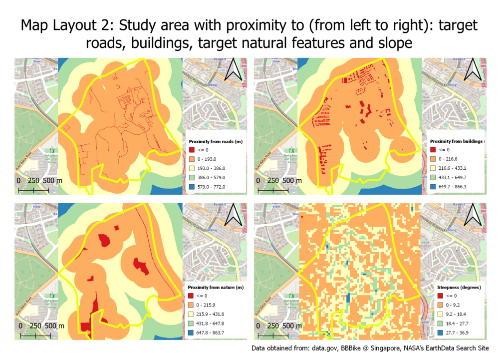
| The proximity for road layer ranges from between 0m (minimum) and 772.01m (maximum). To better illustrate the road proximity distance of this raster layer, I decided to create five different proximity bands. Majority of Gombak planning subzone falls within 193m from any track/service roads, making this planning subzone area highly accessible by foot. Within the planning subzone, the furthest distance one has to travel is within 579m (demarked by turquoise-coloured areas). This also means that road accessibility is likely to not be a significant problem when selecting a site to build our Quarantine centre. | |
| Similar to the target roads layer above, the proximity for building layer ranges from 0m (minimum) to 866.3m (maximum). To better illustrate the building proximity distance of this raster layer, I used Singleband pseudocolor to create five different proximity bands. Majority of Gombak planning subzone are between 0m and 433.1m apart. Given this densely populated area, it might be difficult to find an appropriate location that is far enough from all buildings in Gombak planning subzone. Hence, a premium will be placed on sites that are far away from all buildings within the Gombak planning subzone to prevent the spread of infectious diseases once the quarantine center is operational. | |
| From the raster image above, most of the land in Gombak have a steepness that is between 0 and 9.2 degrees. Only a small handful of land in Gombak Planning subzone have steepness of above 18.4 degrees, with the steepest being 36.9 degrees. It appears that the land in Gombak is relatively flat, with small patches of relatively steep grounds. When selecting our quarantine centre site, it is best to avoid the spots that are turquoise or blue in colour (between 18.4 and 36.9 degrees in steepness). This will help manage and keep construction cost low. | |
| As there are comparative less natural features in Gombak Planning subzone, a significant amount of land is at least 215.9m away from any target natural feature. There appears to be a plot of land to the South of Gombak Planning Subzone that is between 431.8m and 647.8m away from any target natural feature. This is certainly a good location that deserves more attention. Also, of the three target natural features - forest, park and water, I will keep an eye out for any potential quarantine site that is near a waterbody. This is so as some diseases are water-borne diseases and given Singapore's water scarcity problem, I will want to avoid that entirely. |
Part 3: Standardisation of Proximity Analysis, Min-Max method

Across all four views, the min-max standardisation technique was used. This standardisation is done to ensure that the ranges across all layers become identical. This ensures fairness when we apply our AHP weights in the future sections.
| Views (from top left to bottom left, clockwise direction) | Description (within 150 words) |
|---|---|
| Instead of directly applying the min-max formula over the target roads layer, the inverse of Xij (1 / Xij) was used instead. In turn, this changes the direction of our standardised road score. If we were to directly apply the min-max formula over this road layer, higher scores will be awarded to locations that are away from the roads, while lower scores will be given to sites that are closer to the roads. However, given that we want the inverse of that (higher scores allocated to locations closer to the road features), the inverse of Xij was used for this calculation. | |
| The min-max method was applied directly to the building layer. This current building view is exactly identical to the one in Map Layout 2, with the main difference being that the proximity ranges have been shrunk to between 0 and 1. The generated plot looks identical to the one above as the number of proximity bands created in both cases are the same, 5 classes. Hence, the objective remains the same - to keep an eye on locations where the standardised scores are highest. | |
| The thinking behind the criterion slope score layer is largely similar to that of the criterion score target roads layer. Instead of directly applying the min-max formula over the slope layer, the inverse of Xij (1 / Xij) was used instead. This is because we are looking for land that is not steep. If the inverse of Xij was not applied, higher scores will be given sites to steeper ground. However, we want higher scores to be given to flatter grounds. Hence, the inverse of Xij was used. This inversed slope plot might be misleading in some sense, a reader may be misled to believe that most of the land in the area is of equal steepness (almost all of the sites fall inside the orange band). This is because the range of the values are extremely small - between 0.0007 and 0.08. Unlike other min-max plots where the values fall between the 0 and 1 range. | |
| Similar to the building layer, the min-max method was directly applied to the target natural features layer. This current layer is exactly identical to the one in Map Layout 2, with the main difference being in the proximity ranges, for it has now been compacted to between 0 and 1. The generated plot looks identical to the one above as the number of proximity bands created in both cases are the same, 5 classes. The objective remains the same as with mentioned in map layout 02 - to keep an eye on locations where the standardised scores are highest, and also, in particular to be as far away as possible from presence of water bodies. |
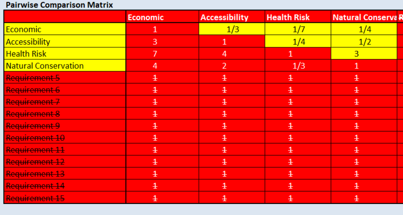
Part 4: Analytical Hierarchical Process (AHP) input matrix and result report
 |
 |
| Data | Source | Data Description | Source URL | Data Type |
|---|---|---|---|---|
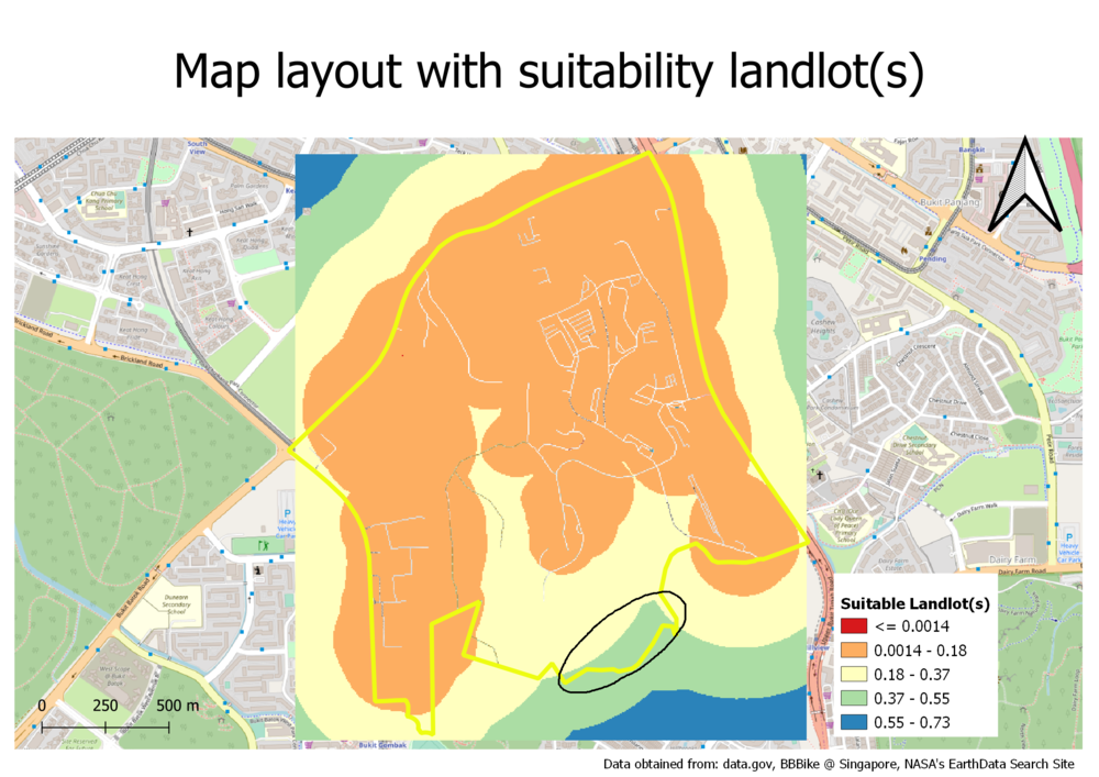
Part 5: Suitable landlot(s) identified

| Data | Source | Data Description | Source URL | Data Type |
|---|---|---|---|---|