|
|
| (47 intermediate revisions by the same user not shown) |
| Line 1: |
Line 1: |
| − | == Part 1: Thematic Mapping == | + | == Part One: Thematic Mapping == |
| − | The thematic mapping developed uses these following data and applied techniques: <br>
| |
| − | {| class="wikitable"
| |
| − | |-
| |
| − | ! Data !! Visualisation & Processing Technique
| |
| − | |-
| |
| − | | General information of schools from the “School Directory and Information” dataset retrieved from data.gov.sg.|| Layer: School
| |
| | | | |
| − | Symbology: Categorised by `mainlevel_` attribute which indicates if an indicated point belongs to either centralised institute, junior college, mixed level, secondary or primary school. Each category is labeled with following color:<br>
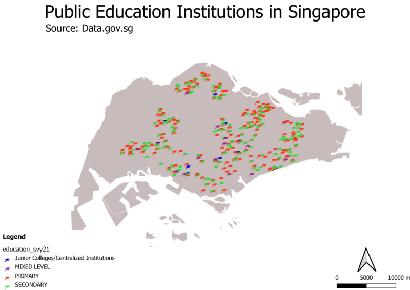
| + | === Distribution of Public Education Institutions in Singapore === |
| | + | [[File:Schools.png|800px|center]] |
| | + | </br> |
| | + | The map shown is a qualitative thematic map with point symbols. <br> |
| | + | The different public education institutions are symbolized by classifying them based on the institution’s education level, namely Junior College/Centralized Institutions, Mixed Level, Primary and Secondary and plotted on the coastal outline of Singapore.<br> |
| | + | A light grey fill is chosen for the coastal outline which allows the symbols on the map to stand out with their respective colours, allowing readers to easily see the distribution of the schools across the island. |
| | <br> | | <br> |
| − | [[center]]<br>
| |
| − | <p class=MsoNormal align=center style='text-align:center;line-height:normal'><span
| |
| − | lang=EN-GB style='font-size:8.0pt;font-family:"Times New Roman",serif;
| |
| − | mso-fareast-font-family:"Times New Roman";font-variant:small-caps;color:white'><span
| |
| − | style='color:windowtext'>FIGURE I</span></span></p>
| |
| − | <p class=MsoNormal align=center style='text-align:center;line-height:normal'><span
| |
| − | lang=EN-GB style='font-size:8.0pt;font-family:"Times New Roman",serif;
| |
| − | mso-fareast-font-family:"Times New Roman";font-variant:small-caps;color:white'><span
| |
| − | style='color:windowtext'>ROAD SELECTION LINE AND MAP LINE
| |
| − | </span></span></p>
| |
| | | | |
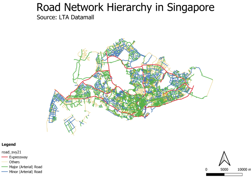
| | + | === Hierarchy of Road Network System in Singapore === |
| | + | [[File:RoadNetwork.png|800px|center]] |
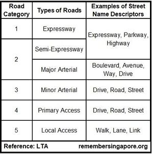
| | + | The map shown is a qualitative thematic map of lines. According to a reference from LTA (refer to Fig. 1), there are 5 different categories of roads in Singapore, which can be inferred from the suffixes of their names. For example, Expressways will be named with Expressway, Parkway or Highway. <br> |
| | + | [[File:LTA reference.jpg|thumb|center|Fig. 1 ]] |
| | + | An attribute, Road_Type was added into the attribute table of the layer, allowing each road to be classified based on its road type. <br> |
| | + | The different roads were plotted with contrasting coloured lines to allow users to visualize the hierarchy of the road network system easily. |
| | <br> | | <br> |
| − | Color choices were contrasted differently from other components/layers for easy reference.
| |
| | | | |
| − | Processing: The initial dataset was geocoded using the MMQIS by its `address` field in order to retrieve `latlong` projection of the data points.
| + | === 2014 Master Plan Landuse === |
| | + | [[File:MP14 LandUse.png|800px|center]] |
| | + | The map shown is a qualitative thematic map of areas. <br> |
| | + | The areas were classified based on their land use description, however due to having over 32 categories, similar categories were grouped under one colour on the map, such as purple for businesses and blue for water bodies and beach areas as having 32 different colours would make it difficult for the readers to identify features at glance. <br> |
| | + | Readers can see the types of categories that have been grouped together on the legend, preserving the original land use description provided in the master plan. |
| | | | |
| − | Data not found: <br>
| |
| − | - RAFFLES INSTITUTION, 1 RAFFLES INSTITUTION LANE.<br>
| |
| − | - BOWEN SECONDARY SCHOOL ,2 LORONG NAPIRI.
| |
| | <br> | | <br> |
| − | |-
| |
| − | | “Masterplan 2014 Landuse” dataset retrieved from data.gov.sg.|| Layer: Land Use
| |
| − | Symbology: Light Grey simple fill
| |
| | | | |
| − |
| + | == Part Two: Choropleth Mapping == |
| − | [[File:Fig2.png|250px|center]]<br>
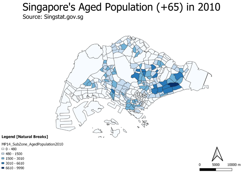
| + | === Singapore's Aged Population (65+) in 2010 === |
| − | <p class=MsoNormal align=center style='text-align:center;line-height:normal'><span
| + | [[File:AgedPopulation 2010.png|800px|center]] |
| − | lang=EN-GB style='font-size:8.0pt;font-family:"Times New Roman",serif;
| + | At first glance, we can tell that there is a larger amount of people from the aged population living in the east due to the darker shades of blue as shown on the choropleth map and the rest of the map having a whitish colour, indicating the presence of little to no aged population residing there. However, these whitish areas are uninhabitable, such as water catchment areas. Hence, the aged population in 2010 is quite evenly spread out, with a slightly higher concentration in the east |
| − | mso-fareast-font-family:"Times New Roman";font-variant:small-caps;color:white'><span
| |
| − | style='color:windowtext'>FIGURE II</span></span></p>
| |
| − | <p class=MsoNormal align=center style='text-align:center;line-height:normal'><span
| |
| − | lang=EN-GB style='font-size:8.0pt;font-family:"Times New Roman",serif;
| |
| − | mso-fareast-font-family:"Times New Roman";font-variant:small-caps;color:white'><span
| |
| − | style='color:windowtext'>SCALE VISIBILITY
| |
| − | </span></span></p>
| |
| − | <br><br>
| |
| − | Visualisation Rule: The visibility of Land Use layer is automatically displayed as the user zooms in approximately 1-2 times.
| |
| − | | |
| − | |- | |
| − | | SLA’s National Map Line retrieved from data.gov.sg. <br> Road Selection Line dataset retrieved from SLA provided by Prof Kam (HandsOnEx1). || Layer: Map Line & Road Network
| |
| | <br> | | <br> |
| − | Visualisation Rule:
| |
| − |
| |
| − | [[File:Fig3.png|250px|center]] <br>
| |
| − | <p class=MsoNormal align=center style='text-align:center;line-height:normal'><span
| |
| − | lang=EN-GB style='font-size:8.0pt;font-family:"Times New Roman",serif;
| |
| − | mso-fareast-font-family:"Times New Roman";font-variant:small-caps;color:white'><span
| |
| − | style='color:windowtext'>FIGURE III</span></span></p>
| |
| − | <p class=MsoNormal align=center style='text-align:center;line-height:normal'><span
| |
| − | lang=EN-GB style='font-size:8.0pt;font-family:"Times New Roman",serif;
| |
| − | mso-fareast-font-family:"Times New Roman";font-variant:small-caps;color:white'><span
| |
| − | style='color:windowtext'>ROAD SELECTION LINE AND MAP LINE
| |
| − | </span></span></p>
| |
| − | Processing: 2 datasets was used to represent different types of road. The national map line only provides expressway, major roads, international boundary and contour lines, the road selection data provides overall road network in Singapore. The Map Line layer highlights its road types using the categorisation rule, applying different colours and line width to emphasize type of road. The minor road can be implied by excluding road network that belongs to express way, intersections, and major roads.
| |
| − |
| |
| − | |-
| |
| − | | “MP14_SUBZONE_NO_SEA_PL” by URA retrieved from data.gov.sg.|| Layer: MP14_SUBZONE_NO_SEA_PL
| |
| − | Symbology: Light Brown simple fill
| |
| − |
| |
| − | Was included to provide a macro view base layer as an optional display. The layer represents subzones that could be useful in interpreting where road networks or school is located.
| |
| − |
| |
| − | OpenStreetMap view could also be used, however the subzone layer better express the subzone boundaries through a simple display.
| |
| | | | |
| − | |} | + | === Singapore's Aged Population (65+) in 2018 === |
| | + | [[File:AgedPopulation 2018.png|800px|center]] |
| | + | Comparing this 2018 choropleth map with the 2010 choropleth map, we can tell from the legend that the amount of people in the aged population is growing as seen from the increase in the raw numbers of the 5 different classes. Additionally, there are new areas having a darker shade of blue across the map, signalling that there is an overall increase in the amount of people living in Singapore that are in this aged population group, and hence having an aging population. |
| | <br> | | <br> |
| − | [[File:Image.jpg|700px|center]]
| |
| − | <p class=MsoNormal align=center style='text-align:center;line-height:normal'><span
| |
| − | lang=EN-GB style='font-size:8.0pt;font-family:"Times New Roman",serif;
| |
| − | mso-fareast-font-family:"Times New Roman";font-variant:small-caps;color:white'><span
| |
| − | style='color:windowtext'>FIGURE IV</span></span></p>
| |
| − | <p class=MsoNormal align=center style='text-align:center;line-height:normal'><span
| |
| − | lang=EN-GB style='font-size:8.0pt;font-family:"Times New Roman",serif;
| |
| − | mso-fareast-font-family:"Times New Roman";font-variant:small-caps;color:white'><span
| |
| − | style='color:windowtext'>OVERVIEW OF THEMATIC MAPPING</span></span></p>
| |
| − | <br>
| |
| − | Firstly, the thematic mapping shown in figure 5 represents the default view of the map. School data points, map line and road network are shown on top of the OpenStreetMap.
| |
| − | <br>
| |
| − | [[File:Img2.png|300px|center]]
| |
| − | <p class=MsoNormal align=center style='text-align:center;line-height:normal'><span
| |
| − | lang=EN-GB style='font-size:8.0pt;font-family:"Times New Roman",serif;
| |
| − | mso-fareast-font-family:"Times New Roman";font-variant:small-caps;color:white'><span
| |
| − | style='color:windowtext'>FIGURE IV</span></span></p>
| |
| − | <p class=MsoNormal align=center style='text-align:center;line-height:normal'><span
| |
| − | lang=EN-GB style='font-size:8.0pt;font-family:"Times New Roman",serif;
| |
| − | mso-fareast-font-family:"Times New Roman";font-variant:small-caps;color:white'><span
| |
| − | style='color:windowtext'>MICRO VIEW OF LAND USE VISIBILITY WITH ROAD NETWORKS AND SCHOOL DATA POINTS
| |
| − | </span></span></p>
| |
| | | | |
| − | <br>
| + | === Proportion of Singapore's Aged Population in 2010 === |
| − | The land use data was set with automatic scale visibility, the overall land use layer will only be clearly visible as the user zooms in for interpretation. The land use data provides a micro level data of the indicative polygon of each development land parcel. Thus, there’s no need for this layer to be displayed in a more macro view as lines will not be value-adding to visualisation interpretation.
| + | [[File:Proportion 2010.png|800px|center]] |
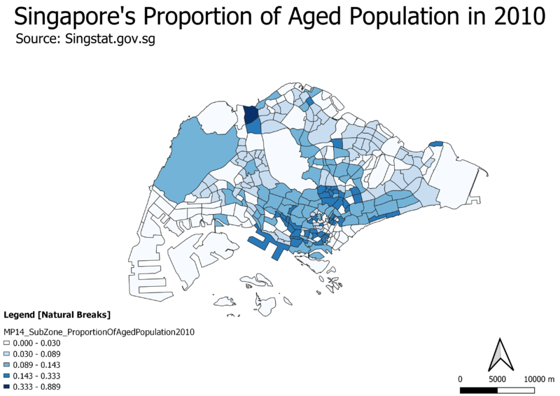
| | + | At first glance, we can see that there appears to be a trend where the central area of Singapore has a higher proportion of aged population whereby aged population is the ratio of the people aged 65 and above to the total amount of people living in that subzone. Additionally, there seems to be an area in the north with an unusually high proportion of aged population. |
| | <br> | | <br> |
| | | | |
| − | Next, the national map line only provides expressway (blue line), major roads (magenta line), international boundary and contour lines (excluded), while the road selection data provides overall road network in Singapore. Thus, achieving an overview of all types of road can be done by overlapping the road networks to retrieve minor road (red line) through overlapping as shown in figure V.
| + | === Proportion of Singapore's Aged Population in 2018 === |
| | + | [[File:Proportion 2018.png|800px|center]] |
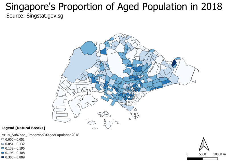
| | + | Comparing the 2018 choropleth map to the 2010 map, the 2018 map has less areas that stand out, and there is more areas with a deeper shade of blue spread across the map, this could just mean that there is an overall increase in the proportion of aged population across Singapore and that it has an aging population. |
| | <br> | | <br> |
| | | | |
| − | [[File:Img3.png|700px|center]]
| + | === Percentage Change of Aged Population From 2010 to 2018 === |
| − | <p class=MsoNormal align=center style='text-align:center;line-height:normal'><span
| + | [[File:PercentageChange 2010to2018.png|800px|center]] |
| − | lang=EN-GB style='font-size:8.0pt;font-family:"Times New Roman",serif;
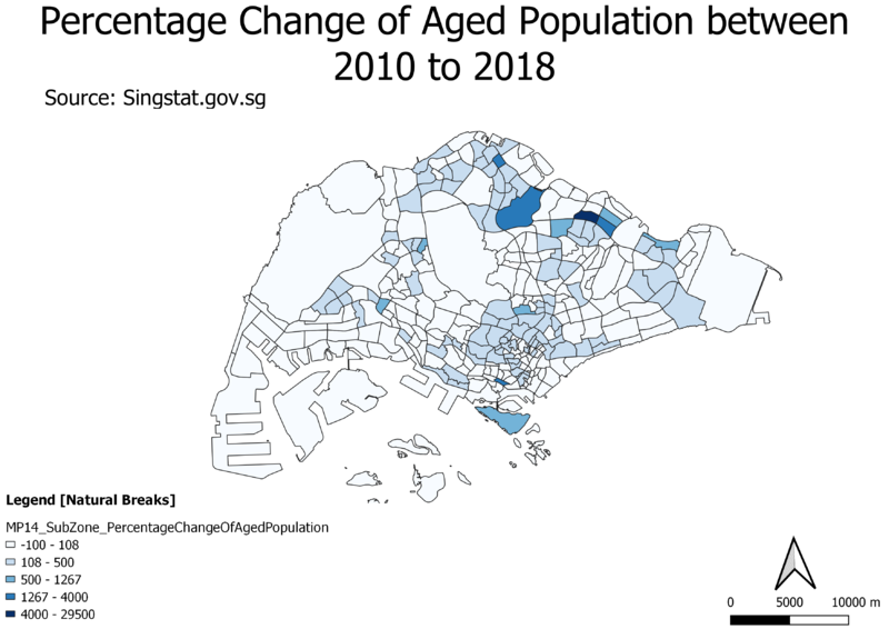
| + | At first glance, it seems that there is only a major increase in the percentage change of aged population in the north as it stands out with the darker shade of blue. However, inspecting the legend closely, the areas with a slight tint of blue already signal a 108 – 500 % increase in aging population, and it is spread across all the map, which gives strong reason to support our previous deductions of an aging population trend across the country. |
| − | mso-fareast-font-family:"Times New Roman";font-variant:small-caps;color:white'><span
| |
| − | style='color:windowtext'>FIGURE VI</span></span></p>
| |
| − | <p class=MsoNormal align=center style='text-align:center;line-height:normal'><span
| |
| − | lang=EN-GB style='font-size:8.0pt;font-family:"Times New Roman",serif;
| |
| − | mso-fareast-font-family:"Times New Roman";font-variant:small-caps;color:white'><span
| |
| − | style='color:windowtext'>SUBZONE VIEW
| |
| − | </span></span></p>
| |
| − | | |
| − | [[File:Img4.png|700px|center]] | |
| − | <p class=MsoNormal align=center style='text-align:center;line-height:normal'><span
| |
| − | lang=EN-GB style='font-size:8.0pt;font-family:"Times New Roman",serif;
| |
| − | mso-fareast-font-family:"Times New Roman";font-variant:small-caps;color:white'><span
| |
| − | style='color:windowtext'>FIGURE VII</span></span></p>
| |
| − | <p class=MsoNormal align=center style='text-align:center;line-height:normal'><span
| |
| − | lang=EN-GB style='font-size:8.0pt;font-family:"Times New Roman",serif;
| |
| − | mso-fareast-font-family:"Times New Roman";font-variant:small-caps;color:white'><span
| |
| − | style='color:windowtext'>OPENSTREETMAP VIEW
| |
| − | </span></span></p>
| |
| − | | |
| − | <br>
| |
| − | The `MP14_SUBZONE_NO_SEA_PL` and OpenStreetMap layer (Figure VI & VII) were added as I believe that it might help in terms of data interpretation, eg: finding out where a junior college is located by subzones and its distance to major road where it's usually major road provides better transportation option/accessibility.
| |
| − | <br>
| |
| − | <br>
| |
| | <br> | | <br> |
| − | == Part 2: Choropleth Mapping ==
| |
| − | [[File:|center]]
| |
| − | <p class=MsoNormal align=center style='text-align:center;line-height:normal'><span
| |
| − | lang=EN-GB style='font-size:8.0pt;font-family:"Times New Roman",serif;
| |
| − | mso-fareast-font-family:"Times New Roman";font-variant:small-caps;color:white'><span
| |
| − | style='color:windowtext'>FIGURE VIII</span></span></p>
| |
| − | <p class=MsoNormal align=center style='text-align:center;line-height:normal'><span
| |
| − | lang=EN-GB style='font-size:8.0pt;font-family:"Times New Roman",serif;
| |
| − | mso-fareast-font-family:"Times New Roman";font-variant:small-caps;color:white'><span
| |
| − | style='color:windowtext'>LAYERS EXPORTED
| |
| − | </span></span></p>
| |
| − |
| |
| − | The choropleth mapping developed uses these following data and applied techniques:
| |
| − |
| |
| − | ==== Sources and Methods ====
| |
| − |
| |
| − | {| class="wikitable"
| |
| − | |-
| |
| − | ! Dataset !! Visualisation & Processing Technique
| |
| − | |-
| |
| − | | “Singapore Residents by Planning Area/Subzone, Age Group and Sex, June 2000 - 2018” from Department of Statistics Singapore.
| |
| − | ||
| |
| − | Layer: respopagsex2000to2018_unfiltered
| |
| − |
| |
| − | Processing:
| |
| − | 1.
| |
| − |
| |
| − | [[File: |center|600px]]
| |
| − | <p class=MsoNormal align=center style='text-align:center;line-height:normal'><span
| |
| − | lang=EN-GB style='font-size:8.0pt;font-family:"Times New Roman",serif;
| |
| − | mso-fareast-font-family:"Times New Roman";font-variant:small-caps;color:white'><span
| |
| − | style='color:windowtext'>FIGURE IX</span></span></p>
| |
| − | <p class=MsoNormal align=center style='text-align:center;line-height:normal'><span
| |
| − | lang=EN-GB style='font-size:8.0pt;font-family:"Times New Roman",serif;
| |
| − | mso-fareast-font-family:"Times New Roman";font-variant:small-caps;color:white'><span
| |
| − | style='color:windowtext'>FILTERING AGED POPULATION
| |
| − | </span></span></p>
| |
| − |
| |
| − | 2. .
| |
| − |
| |
| − |
| |
| − | [[File:|center|500px]]
| |
| − | <p class=MsoNormal align=center style='text-align:center;line-height:normal'><span
| |
| − | lang=EN-GB style='font-size:8.0pt;font-family:"Times New Roman",serif;
| |
| − | mso-fareast-font-family:"Times New Roman";font-variant:small-caps;color:white'><span
| |
| − | style='color:windowtext'>FIGURE X</span></span></p>
| |
| − | <p class=MsoNormal align=center style='text-align:center;line-height:normal'><span
| |
| − | lang=EN-GB style='font-size:8.0pt;font-family:"Times New Roman",serif;
| |
| − | mso-fareast-font-family:"Times New Roman";font-variant:small-caps;color:white'><span
| |
| − | style='color:windowtext'>AGGREGATING DATA USING GROUPSTATS
| |
| − | </span></span></p>
| |
| − |
| |
| − |
| |
| − | [[File:|center|400px]]
| |
| − | <p class=MsoNormal align=center style='text-align:center;line-height:normal'><span
| |
| − | lang=EN-GB style='font-size:8.0pt;font-family:"Times New Roman",serif;
| |
| − | mso-fareast-font-family:"Times New Roman";font-variant:small-caps;color:white'><span
| |
| − | style='color:windowtext'>FIGURE XI</span></span></p>
| |
| − | <p class=MsoNormal align=center style='text-align:center;line-height:normal'><span
| |
| − | lang=EN-GB style='font-size:8.0pt;font-family:"Times New Roman",serif;
| |
| − | mso-fareast-font-family:"Times New Roman";font-variant:small-caps;color:white'><span
| |
| − | style='color:windowtext'>IMPORTING GROUPSTATS GENERATED CSV USING CUSTOM DELIMITER
| |
| − | </span></span></p>
| |
| − | s:
| |
| − | a. `is.
| |
| − | b. ones.
| |
| − |
| |
| − | [[File:|center|400px]]
| |
| − | <p class=MsoNormal align=center style='text-align:center;line-height:normal'><span
| |
| − | lang=EN-GB style='font-size:8.0pt;font-family:"Times New Roman",serif;
| |
| − | mso-fareast-font-family:"Times New Roman";font-variant:small-caps;color:white'><span
| |
| − | style='color:windowtext'>FIGURE XII</span></span></p>
| |
| − | <p class=MsoNormal align=center style='text-align:center;line-height:normal'><span
| |
| − | lang=EN-GB style='font-size:8.0pt;font-family:"Times New Roman",serif;
| |
| − | mso-fareast-font-family:"Times New Roman";font-variant:small-caps;color:white'><span
| |
| − | style='color:windowtext'>DATA OVERVIEW OF IMPORTED GROUPSTATS DATA
| |
| − | </span></span></p>
| |
| − |
| |
| − |
| |
| − |
| |
| − | [[File:|center|400px]]
| |
| − | <p class=MsoNormal align=center style='text-align:center;line-height:normal'><span
| |
| − | lang=EN-GB style='font-size:8.0pt;font-family:"Times New Roman",serif;
| |
| − | mso-fareast-font-family:"Times New Roman";font-variant:small-caps;color:white'><span
| |
| − | style='color:windowtext'>FIGURE XIII</span></span></p>
| |
| − | <p class=MsoNormal align=center style='text-align:center;line-height:normal'><span
| |
| − | lang=EN-GB style='font-size:8.0pt;font-family:"Times New Roman",serif;
| |
| − | mso-fareast-font-family:"Times New Roman";font-variant:small-caps;color:white'><span
| |
| − | style='color:windowtext'>DATA OVERVIEW OF IMPORTED GROUPSTATS DATA
| |
| − | </span></span></p>
| |
| − |
| |
| − | 4. Led.
| |
| − | 5. We
| |
| − |
| |
| − | [[File:|center|400px]]
| |
| − | <p class=MsoNormal align=center style='text-align:center;line-height:normal'><span
| |
| − | lang=EN-GB style='font-size:8.0pt;font-family:"Times New Roman",serif;
| |
| − | mso-fareast-font-family:"Times New Roman";font-variant:small-caps;color:white'><span
| |
| − | style='color:windowtext'>FIGURE XIV</span></span></p>
| |
| − | <p class=MsoNormal align=center style='text-align:center;line-height:normal'><span
| |
| − | lang=EN-GB style='font-size:8.0pt;font-family:"Times New Roman",serif;
| |
| − | mso-fareast-font-family:"Times New Roman";font-variant:small-caps;color:white'><span
| |
| − | style='color:windowtext'>PROPORTION FIELD CREATION
| |
| − | </span></span></p>
| |
| − |
| |
| − |
| |
| − |
| |
| − | a.
| |
| − | [[File:|center|300px]]
| |
| − | <p class=MsoNormal align=center style='text-align:center;line-height:normal'><span
| |
| − | lang=EN-GB style='font-size:8.0pt;font-family:"Times New Roman",serif;
| |
| − | mso-fareast-font-family:"Times New Roman";font-variant:small-caps;color:white'><span
| |
| − | style='color:windowtext'>FIGURE XV</span></span></p>
| |
| − | <p class=MsoNormal align=center style='text-align:center;line-height:normal'><span
| |
| − | lang=EN-GB style='font-size:8.0pt;font-family:"Times New Roman",serif;
| |
| − | mso-fareast-font-family:"Times New Roman";font-variant:small-caps;color:white'><span
| |
| − | style='color:windowtext'>DERIVING PERCENTAGE CHANGE
| |
| − | </span></span></p>
| |
| − |
| |
| − | 6. L
| |
| − |
| |
| − |
| |
| − |
| |
| − |
| |
| − |
| |
| − |
| |
| − |
| |
| − | |-
| |
| − | | Singapore Master Plan 2014 Subzone and Planning Area 2014 boundary data retrieved from data.gov
| |
| − | ||
| |
| − |
| |
| − |
| |
| − |
| |
| − | 1. `SumAgedPopulation2010_PA` layer joined with `sum_aged_pop_2010_pa` by matching attribute `PLN_AREA_N` and `Zone_ID_PA`.
| |
| − | a. Symbology (Natural Jenks):
| |
| − |
| |
| − | [[File:|center|400px]]
| |
| − | <p class=MsoNormal align=center style='text-align:center;line-height:normal'><span
| |
| − | lang=EN-GB style='font-size:8.0pt;font-family:"Times New Roman",serif;
| |
| − | mso-fareast-font-family:"Times New Roman";font-variant:small-caps;color:white'><span
| |
| − | style='color:windowtext'>FIGURE XVI</span></span></p>
| |
| − | <p class=MsoNormal align=center style='text-align:center;line-height:normal'><span
| |
| − | lang=EN-GB style='font-size:8.0pt;font-family:"Times New Roman",serif;
| |
| − | mso-fareast-font-family:"Times New Roman";font-variant:small-caps;color:white'><span
| |
| − | style='color:windowtext'>CATEGORISATION OF PLANNING AREA SUM AGED POPULATION DATA
| |
| − | </span></span></p>
| |
| − |
| |
| − |
| |
| − |
| |
| − |
| |
| − | 2. `SumAgedPopulation2018_PA` layer joined with `sum_aged_pop_2018_pa` by matching attribute `PLN_AREA_N` and `Zone_ID_PA`.
| |
| − | a. Symbology (Natural Jenks):
| |
| − |
| |
| − | [[File:|center|400px]]
| |
| − | <p class=MsoNormal align=center style='text-align:center;line-height:normal'><span
| |
| − | lang=EN-GB style='font-size:8.0pt;font-family:"Times New Roman",serif;
| |
| − | mso-fareast-font-family:"Times New Roman";font-variant:small-caps;color:white'><span
| |
| − | style='color:windowtext'>FIGURE XVII</span></span></p>
| |
| − | <p class=MsoNormal align=center style='text-align:center;line-height:normal'><span
| |
| − | lang=EN-GB style='font-size:8.0pt;font-family:"Times New Roman",serif;
| |
| − | mso-fareast-font-family:"Times New Roman";font-variant:small-caps;color:white'><span
| |
| − | style='color:windowtext'>CATEGORISATION OF PLANNING AREA SUM AGED POPULATION DATA
| |
| − | </span></span></p>
| |
| − |
| |
| − |
| |
| − | 3. `SumAgedPopulation2010_SZ` layer joined with `sum_aged_pop_2010_sz` by matching attribute `SUBZONE_N` and `Zone_ID_SZ`.
| |
| − | a. Symbology (Natural Jenks):
| |
| − |
| |
| − | [[File:|center|400px]]
| |
| − | <p class=MsoNormal align=center style='text-align:center;line-height:normal'><span
| |
| − | lang=EN-GB style='font-size:8.0pt;font-family:"Times New Roman",serif;
| |
| − | mso-fareast-font-family:"Times New Roman";font-variant:small-caps;color:white'><span
| |
| − | style='color:windowtext'>FIGURE XVIII</span></span></p>
| |
| − | <p class=MsoNormal align=center style='text-align:center;line-height:normal'><span
| |
| − | lang=EN-GB style='font-size:8.0pt;font-family:"Times New Roman",serif;
| |
| − | mso-fareast-font-family:"Times New Roman";font-variant:small-caps;color:white'><span
| |
| − | style='color:windowtext'>CATEGORISATION OF SUBZONE SUM AGED POPULATION DATA
| |
| − | </span></span></p>
| |
| − |
| |
| − | 4. `SumAgedPopulation2018_SZ`layer joined with `sum_aged_pop_2018_sz` by matching attribute `SUBZONE_N` and `Zone_ID_SZ`.
| |
| − | a. Symbology (Natural Jenks):
| |
| − |
| |
| − | [[File:|center|400px]]
| |
| − | <p class=MsoNormal align=center style='text-align:center;line-height:normal'><span
| |
| − | lang=EN-GB style='font-size:8.0pt;font-family:"Times New Roman",serif;
| |
| − | mso-fareast-font-family:"Times New Roman";font-variant:small-caps;color:white'><span
| |
| − | style='color:windowtext'>FIGURE XIX</span></span></p>
| |
| − | <p class=MsoNormal align=center style='text-align:center;line-height:normal'><span
| |
| − | lang=EN-GB style='font-size:8.0pt;font-family:"Times New Roman",serif;
| |
| − | mso-fareast-font-family:"Times New Roman";font-variant:small-caps;color:white'><span
| |
| − | style='color:windowtext'>CATEGORISATION OF SUBZONE SUM AGED POPULATION DATA
| |
| − | </span></span></p>
| |
| − |
| |
| − | 5. `ProportionAgedPopulation2010_SZ` layer joined with `propotion_aged_pop_2010` by matching attribute `SUBZONE_N` and `Zone_ID_SZ`.
| |
| − | a. Symbology (Natural Jenks):
| |
| − |
| |
| − |
| |
| − | [[File:|center|400px]]
| |
| − | <p class=MsoNormal align=center style='text-align:center;line-height:normal'><span
| |
| − | lang=EN-GB style='font-size:8.0pt;font-family:"Times New Roman",serif;
| |
| − | mso-fareast-font-family:"Times New Roman";font-variant:small-caps;color:white'><span
| |
| − | style='color:windowtext'>FIGURE XX</span></span></p>
| |
| − | <p class=MsoNormal align=center style='text-align:center;line-height:normal'><span
| |
| − | lang=EN-GB style='font-size:8.0pt;font-family:"Times New Roman",serif;
| |
| − | mso-fareast-font-family:"Times New Roman";font-variant:small-caps;color:white'><span
| |
| − | style='color:windowtext'>CATEGORISATION OF SUBZONE PROPORTION AGED POP DATA
| |
| − | </span></span></p>
| |
| − |
| |
| − | 6. `ProportionAgedPopulation2018_SZ` layer joined with `propotion_aged_pop_2018` by matching attribute `SUBZONE_N` and `Zone_ID_SZ`.
| |
| − | a. Symbology (Natural Jenks):
| |
| − |
| |
| − | [[File:|center|400px]]
| |
| − | <p class=MsoNormal align=center style='text-align:center;line-height:normal'><span
| |
| − | lang=EN-GB style='font-size:8.0pt;font-family:"Times New Roman",serif;
| |
| − | mso-fareast-font-family:"Times New Roman";font-variant:small-caps;color:white'><span
| |
| − | style='color:windowtext'>FIGURE XXI</span></span></p>
| |
| − | <p class=MsoNormal align=center style='text-align:center;line-height:normal'><span
| |
| − | lang=EN-GB style='font-size:8.0pt;font-family:"Times New Roman",serif;
| |
| − | mso-fareast-font-family:"Times New Roman";font-variant:small-caps;color:white'><span
| |
| − | style='color:windowtext'>CATEGORISATION OF SUBZONE PROPORTION AGED POP DATA
| |
| − | </span></span></p>
| |
| − |
| |
| − | 7. `Percentage_Change_SZ` layer joined with `2010_2018_percentage_change` by matching attribute `SUBZONE_N` and `Zone_ID_SZ`.
| |
| − | a. Symbology: Below is the configuration used for percentage change of aged population. The legend classification intervals were split into 2 ways, negative changes which represents a decrease change were categorised using an equal distribution from the minimum decrease value of -100% to 0. Next, Natural Breaks (Jenks) were used to classify the 5 next categories for the positive values to indicate. Due to its high variance value, the Jenks classification represents best for this case. Additionally, 2 distinct colours (red and blue) were used to appropriately display the nature of percentage change of the aged population from 2010 to 2018.
| |
| − | [[File:|center|500px]]
| |
| − | <p class=MsoNormal align=center style='text-align:center;line-height:normal'><span
| |
| − | lang=EN-GB style='font-size:8.0pt;font-family:"Times New Roman",serif;
| |
| − | mso-fareast-font-family:"Times New Roman";font-variant:small-caps;color:white'><span
| |
| − | style='color:windowtext'>FIGURE XXII</span></span></p>
| |
| − | <p class=MsoNormal align=center style='text-align:center;line-height:normal'><span
| |
| − | lang=EN-GB style='font-size:8.0pt;font-family:"Times New Roman",serif;
| |
| − | mso-fareast-font-family:"Times New Roman";font-variant:small-caps;color:white'><span
| |
| − | style='color:windowtext'>CATEGORISATION OF SUBZONE PERCENTAGE CHANGE DATA
| |
| − | </span></span></p>
| |
| − |
| |
| − | [[File:|center|500px]]
| |
| − | <p class=MsoNormal align=center style='text-align:center;line-height:normal'><span
| |
| − | lang=EN-GB style='font-size:8.0pt;font-family:"Times New Roman",serif;
| |
| − | mso-fareast-font-family:"Times New Roman";font-variant:small-caps;color:white'><span
| |
| − | style='color:windowtext'>FIGURE XXIII</span></span></p>
| |
| − | <p class=MsoNormal align=center style='text-align:center;line-height:normal'><span
| |
| − | lang=EN-GB style='font-size:8.0pt;font-family:"Times New Roman",serif;
| |
| − | mso-fareast-font-family:"Times New Roman";font-variant:small-caps;color:white'><span
| |
| − | style='color:windowtext'>3 BASE COLOR PICK FOR SUBZONE PERCENTAGE CHANGE DATA
| |
| − | </span></span></p>
| |
| − |
| |
| − |
| |
| − | [[File:|center|400px]]
| |
| − | <p class=MsoNormal align=center style='text-align:center;line-height:normal'><span
| |
| − | lang=EN-GB style='font-size:8.0pt;font-family:"Times New Roman",serif;
| |
| − | mso-fareast-font-family:"Times New Roman";font-variant:small-caps;color:white'><span
| |
| − | style='color:windowtext'>FIGURE XXIV</span></span></p>
| |
| − | <p class=MsoNormal align=center style='text-align:center;line-height:normal'><span
| |
| − | lang=EN-GB style='font-size:8.0pt;font-family:"Times New Roman",serif;
| |
| − | mso-fareast-font-family:"Times New Roman";font-variant:small-caps;color:white'><span
| |
| − | style='color:windowtext'>DATA LABELLING
| |
| − | </span></span></p>
| |
| − |
| |
| − | For
| |
| − |
| |
| − |
| |
| − | [[File:|center|200px]]
| |
| − | <p class=MsoNormal align=center style='text-align:center;line-height:normal'><span
| |
| − | lang=EN-GB style='font-size:8.0pt;font-family:"Times New Roman",serif;
| |
| − | mso-fareast-font-family:"Times New Roman";font-variant:small-caps;color:white'><span
| |
| − | style='color:windowtext'>FIGURE XXV</span></span></p>
| |
| − | <p class=MsoNormal align=center style='text-align:center;line-height:normal'><span
| |
| − | lang=EN-GB style='font-size:8.0pt;font-family:"Times New Roman",serif;
| |
| − | mso-fareast-font-family:"Times New Roman";font-variant:small-caps;color:white'><span
| |
| − | style='color:windowtext'>CATEGORISATION OF SUBZONE PERCENTAGE CHANGE DATA
| |
| − | </span></span></p>
| |
| − |
| |
| − |
| |
| − | Enabling each layer’s label can be done via `Layer Properties`.
| |
| − |
| |
| − | |}
| |
| − |
| |
| − | ==== Data Interpretation ====
| |
| − | ===== Aged population (+65) in 2010 and 2018 =====
| |
| − |
| |
| − | [[File:|center|800px]]
| |
| − | <p class=MsoNormal align=center style='text-align:center;line-height:normal'><span
| |
| − | lang=EN-GB style='font-size:8.0pt;font-family:"Times New Roman",serif;
| |
| − | mso-fareast-font-family:"Times New Roman";font-variant:small-caps;color:white'><span
| |
| − | style='color:windowtext'>FIGURE XXVI</span></span></p>
| |
| − | <p class=MsoNormal align=center style='text-align:center;line-height:normal'><span
| |
| − | lang=EN-GB style='font-size:8.0pt;font-family:"Times New Roman",serif;
| |
| − | mso-fareast-font-family:"Times New Roman";font-variant:small-caps;color:white'><span
| |
| − | style='color:windowtext'>OVERVIEW MAP OF TOTAL AGED POPULATION IN 2010 BY PLANNING AREA
| |
| − | </span></span></p>
| |
| − |
| |
| − | The plotted map a
| |
| − |
| |
| − |
| |
| − | [[File|center|400px]]
| |
| − | <p class=MsoNormal align=center style='text-align:center;line-height:normal'><span
| |
| − | lang=EN-GB style='font-size:8.0pt;font-family:"Times New Roman",serif;
| |
| − | mso-fareast-font-family:"Times New Roman";font-variant:small-caps;color:white'><span
| |
| − | style='color:windowtext'>FIGURE XXVII</span></span></p>
| |
| − | <p class=MsoNormal align=center style='text-align:center;line-height:normal'><span
| |
| − | lang=EN-GB style='font-size:8.0pt;font-family:"Times New Roman",serif;
| |
| − | mso-fareast-font-family:"Times New Roman";font-variant:small-caps;color:white'><span
| |
| − | style='color:windowtext'>OVERVIEW MAP OF TOTAL AGED POPULATION IN 2018 BY PLANNING AREA
| |
| − | </span></span></p>
| |
| − |
| |
| − | As we \
| |
| − | -
| |
| − |
| |
| − | [[File:|center|400px]]
| |
| − | <p class=MsoNormal align=center style='text-align:center;line-height:normal'><span
| |
| − | lang=EN-GB style='font-size:8.0pt;font-family:"Times New Roman",serif;
| |
| − | mso-fareast-font-family:"Times New Roman";font-variant:small-caps;color:white'><span
| |
| − | style='color:windowtext'>FIGURE XXVIII</span></span></p>
| |
| − | <p class=MsoNormal align=center style='text-align:center;line-height:normal'><span
| |
| − | lang=EN-GB style='font-size:8.0pt;font-family:"Times New Roman",serif;
| |
| − | mso-fareast-font-family:"Times New Roman";font-variant:small-caps;color:white'><span
| |
| − | style='color:windowtext'>OVERVIEW MAP OF TOTAL AGED POPULATION IN 2010 BY SUBZONE WITH LABEL
| |
| − | </span></span></p>
| |
| − |
| |
| − |
| |
| − | Figure
| |
| − |
| |
| − |
| |
| − | [[File:|center|400px]]
| |
| − | <p class=MsoNormal align=center style='text-align:center;line-height:normal'><span
| |
| − | lang=EN-GB style='font-size:8.0pt;font-family:"Times New Roman",serif;
| |
| − | mso-fareast-font-family:"Times New Roman";font-variant:small-caps;color:white'><span
| |
| − | style='color:windowtext'>FIGURE XXIX</span></span></p>
| |
| − | <p class=MsoNormal align=center style='text-align:center;line-height:normal'><span
| |
| − | lang=EN-GB style='font-size:8.0pt;font-family:"Times New Roman",serif;
| |
| − | mso-fareast-font-family:"Times New Roman";font-variant:small-caps;color:white'><span
| |
| − | style='color:windowtext'>OVERVIEW MAP OF TOTAL AGED POPULATION IN 2010 BY SUBZONE WITHOUT LABEL
| |
| − | </span></span></p>
| |
| − |
| |
| − |
| |
| − | [[File:|center|400px]]
| |
| − | <p class=MsoNormal align=center style='text-align:center;line-height:normal'><span
| |
| − | lang=EN-GB style='font-size:8.0pt;font-family:"Times New Roman",serif;
| |
| − | mso-fareast-font-family:"Times New Roman";font-variant:small-caps;color:white'><span
| |
| − | style='color:windowtext'>FIGURE XXX</span></span></p>
| |
| − | <p class=MsoNormal align=center style='text-align:center;line-height:normal'><span
| |
| − | lang=EN-GB style='font-size:8.0pt;font-family:"Times New Roman",serif;
| |
| − | mso-fareast-font-family:"Times New Roman";font-variant:small-caps;color:white'><span
| |
| − | style='color:windowtext'>OVERVIEW MAP OF TOTAL AGED POPULATION IN 2018 BY SUBZONE WITHOUT LABEL THAT SHOWS INCREASE AGED POPULATION
| |
| − | </span></span></p>
| |
| − |
| |
| − |
| |
| − | Figure
| |
| − |
| |
| − |
| |
| − |
| |
| − | [[File:|center|300px]]
| |
| − | <p class=MsoNormal align=center style='text-align:center;line-height:normal'><span
| |
| − | lang=EN-GB style='font-size:8.0pt;font-family:"Times New Roman",serif;
| |
| − | mso-fareast-font-family:"Times New Roman";font-variant:small-caps;color:white'><span
| |
| − | style='color:windowtext'>FIGURE XXXI</span></span></p>
| |
| − | <p class=MsoNormal align=center style='text-align:center;line-height:normal'><span
| |
| − | lang=EN-GB style='font-size:8.0pt;font-family:"Times New Roman",serif;
| |
| − | mso-fareast-font-family:"Times New Roman";font-variant:small-caps;color:white'><span
| |
| − | style='color:windowtext'>LABELLING FOR TOTAL AGED POPULATION BY PLANNING AREA/SUBZONE
| |
| − | </span></span></p>
| |
| − |
| |
| − | Fie map.
| |
| − |
| |
| − | ===== Proportional of aged population in 2010 and 2018 =====
| |
| − |
| |
| − | [[File:|center|400px]]
| |
| − | <p class=MsoNormal align=center style='text-align:center;line-height:normal'><span
| |
| − | lang=EN-GB style='font-size:8.0pt;font-family:"Times New Roman",serif;
| |
| − | mso-fareast-font-family:"Times New Roman";font-variant:small-caps;color:white'><span
| |
| − | style='color:windowtext'>FIGURE XXXII</span></span></p>
| |
| − | <p class=MsoNormal align=center style='text-align:center;line-height:normal'><span
| |
| − | lang=EN-GB style='font-size:8.0pt;font-family:"Times New Roman",serif;
| |
| − | mso-fareast-font-family:"Times New Roman";font-variant:small-caps;color:white'><span
| |
| − | style='color:windowtext'>OVERVIEW MAP OF THE AGED POPULATION PROPORTION IN 2010 BY SUBZONE
| |
| − | </span></span></p>
| |
| − |
| |
| − |
| |
| − |
| |
| − | [[File:|center|400px]]
| |
| − | <p class=MsoNormal align=center style='text-align:center;line-height:normal'><span
| |
| − | lang=EN-GB style='font-size:8.0pt;font-family:"Times New Roman",serif;
| |
| − | mso-fareast-font-family:"Times New Roman";font-variant:small-caps;color:white'><span
| |
| − | style='color:windowtext'>FIGURE XXXIII</span></span></p>
| |
| − | <p class=MsoNormal align=center style='text-align:center;line-height:normal'><span
| |
| − | lang=EN-GB style='font-size:8.0pt;font-family:"Times New Roman",serif;
| |
| − | mso-fareast-font-family:"Times New Roman";font-variant:small-caps;color:white'><span
| |
| − | style='color:windowtext'>OVERVIEW MAP OF THE AGED POPULATION PROPORTION IN 2018 BY SUBZONE
| |
| − | </span></span></p>
| |
| − |
| |
| − |
| |
| − | We
| |
| − |
| |
| − |
| |
| − |
| |
| − | ===== Percentage change of aged population between 2010 and 2018 =====
| |
| − |
| |
| − | Percentage Change only include those that has non 0 value in year 2010. Thus if 2018 have value it still doesn’t count as the percentage change is not valid,
| |
| − |
| |
| − |
| |
| − |
| |
| − | [[File:|center|600px]]
| |
| − | <p class=MsoNormal align=center style='text-align:center;line-height:normal'><span
| |
| − | lang=EN-GB style='font-size:8.0pt;font-family:"Times New Roman",serif;
| |
| − | mso-fareast-font-family:"Times New Roman";font-variant:small-caps;color:white'><span
| |
| − | style='color:windowtext'>FIGURE XXXIV</span></span></p>
| |
| − | <p class=MsoNormal align=center style='text-align:center;line-height:normal'><span
| |
| − | lang=EN-GB style='font-size:8.0pt;font-family:"Times New Roman",serif;
| |
| − | mso-fareast-font-family:"Times New Roman";font-variant:small-caps;color:white'><span
| |
| − | style='color:windowtext'>OVERVIEW MAP OFPERCENTAGE CHANGE BETWEEN 2010 & 2018 BY SUBZONE WITH LABEL
| |
| − | </span></span></p>
| |
| − |
| |
| − |
| |
| − |
| |
| − | Figu
| |
| − |
| |
| | | | |
| − | [[File:|center|600px]]
| + | === Reasoning behind classification choices === |
| − | <p class=MsoNormal align=center style='text-align:center;line-height:normal'><span
| + | For all the 5 choropleth maps that I created, I used the natural breaks (Jenk’s statistical optimization) data classification method with 5 bins. I started out with symbolizing the respective data columns using the “graduated” option and using the natural breaks method first as it allowed me to find natural groupings in the data, which I thought is a good way to first visualize the spread of the data. Next, I tried increasing the number of bins, and observing if there was a significant change in the maps produced but ended up sticking with 5 bins as I realized that the increased number of classes did not make much difference. I also tried the other methods such as the equal interval, quantile and standard deviation method, monitoring the changes of the choropleth map produced and the spread of values across the histogram produced. Ultimately, I found that the natural breaks method was the most suitable as the data were mostly heavily skewed and the maps produced using this method gave the best results. |
| − | lang=EN-GB style='font-size:8.0pt;font-family:"Times New Roman",serif;
| |
| − | mso-fareast-font-family:"Times New Roman";font-variant:small-caps;color:white'><span
| |
| − | style='color:windowtext'>FIGURE XXXV</span></span></p>
| |
| − | <p class=MsoNormal align=center style='text-align:center;line-height:normal'><span
| |
| − | lang=EN-GB style='font-size:8.0pt;font-family:"Times New Roman",serif;
| |
| − | mso-fareast-font-family:"Times New Roman";font-variant:small-caps;color:white'><span
| |
| − | style='color:windowtext'>OVERVIEW MAP OFPERCENTAGE CHANGE BETWEEN 2010 & 2018 BY SUBZONE WITHOUT LABEL
| |
| − | </span></span></p>
| |
| | | | |
| − | To conclude the observation
| + | === Derivation of new variables and handling of missing values === |
| | + | Based on the dataset obtained from Singstat, I cleaned it into a form suitable to be imported as a delimited text layer into qgis. In the excel worksheet, I created 5 new columns which would be pivotal in creating these choropleth maps and did the calculations on excel.<br> |
| | + | 1. Aged population (+65) in 2010 – sum of number of people in age groups 65 and above <br> |
| | + | 2. Aged population (+65) in 2018 – sum of number of people age groups 65 and above <br> |
| | + | 3. Proportion of aged population in 2010 – ratio of aged population over total population in subzone <br> |
| | + | 4. Proportion of aged population in 2018 – ratio of aged population over total population in subzone <br> |
| | + | 5. Percentage change of aged population between 2010 to 2018 <br> |
| | + | Joining the subzone field of the MP14 subzone layer and the excel sheet on qgis, it allowed me to get these 5 attributes for each subzone on the layer, and be able to plot the corresponding choropleth maps. <br> |
| | + | The missing values in the dataset obtained or null values were replaced with 0 in excel, using the replace function and iferror to set the proportion columns that were going to be divided by 0 to a ratio of 0. |
| | | | |
| − | ===== Exported Maps from Map Composer ===== | + | === Relevant judgments and assumptions === |
| − | [[File:Xg|center|800px]]
| + | The values in the data gathered may not be accurate as they were rounded to the nearest 10, which may affect the overall result. Additionally, the outliers were left as-is in the datasets I used, which would likely have displayed a much picture overall on these choropleth maps if they were removed, but I do believe that the overall trend and deductions would be the same. |
| − | [[File:g|center|800px]]
| |
| − | [[File:pg|center|800px]]
| |
| − | [[File:X|center|800px]]
| |
| − | [[File:|center|800px]]
| |
| − | [[File:g|center|800px]]
| |
| − | [[File:g|center|800px]]
| |
| | | | |
| − | == References == | + | == References and data sources == |
| − | [1] https://data.gov.sg/dataset/school-directory-and-information <br>
| + | 1. https://www.data.gov.sg/search?q=school+information <br> |
| − | [2] https://data.gov.sg/dataset/master-plan-2014-land-use?resource_id=ea9f3b26-991f-48ea-ab58-e6b6d5fbaade <br>
| + | 2. https://www.data.gov.sg/dataset/master-plan-2014-land-use <br> |
| − | [3] https://data.gov.sg/dataset/national-map-line <br>
| + | 3. https://www.data.gov.sg/dataset/master-plan-2014-subzone-boundary-no-sea <br> |
| − | [4] https://www.singstat.gov.sg/find-data/search-by-theme/population/geographic-distribution/latest-data <br>
| + | 4. https://www.lta.gov.sg/content/ltaweb/en/industry-matters/sale-of-plans-and-information/road-line-plan/road-line-plan-explanatory-notes.html <br> |
| − | [5] https://plugins.qgis.org/plugins/GroupStats/ <br>
| + | 5. https://remembersingapore.org/2018/08/15/singapore-street-suffixes/ <br> |
| − | [6] https://data.gov.sg/dataset/master-plan-2014-subzone-boundary-no-sea
| + | 6. SMT201 elearn - Week 4 Hands on Ex 4 - Coastal Outline Shapefiles from SLA <br> |
| | + | 7. https://www.mytransport.sg/content/mytransport/home/dataMall/search_datasets.html?searchText=road - Road Selection Line |
