Difference between revisions of "SMT201 AY2019-20G2 Ex2 JerryTohvan"
| Line 2: | Line 2: | ||
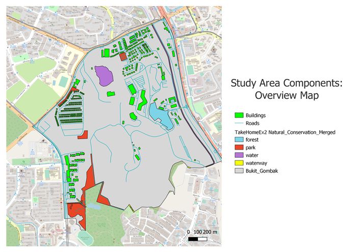
The following shows an overview of the study area and its map components we want to consider in this suitability land analysis for the Communicable Disease Quarantine Centre in Bukit Gombak: | The following shows an overview of the study area and its map components we want to consider in this suitability land analysis for the Communicable Disease Quarantine Centre in Bukit Gombak: | ||
<br> | <br> | ||
| − | + | [[File:Overview map.jpg|700px|center]] | |
| − | [[File: | ||
<p class=MsoNormal align=center style='text-align:center;line-height:normal'><span | <p class=MsoNormal align=center style='text-align:center;line-height:normal'><span | ||
lang=EN-GB style='font-size:8.0pt;font-family:"Times New Roman",serif; | lang=EN-GB style='font-size:8.0pt;font-family:"Times New Roman",serif; | ||
mso-fareast-font-family:"Times New Roman";font-variant:small-caps;color:white'><span | mso-fareast-font-family:"Times New Roman";font-variant:small-caps;color:white'><span | ||
| − | style='color:windowtext'>FIGURE | + | style='color:windowtext'>FIGURE I</span></span></p> |
<p class=MsoNormal align=center style='text-align:center;line-height:normal'><span | <p class=MsoNormal align=center style='text-align:center;line-height:normal'><span | ||
lang=EN-GB style='font-size:8.0pt;font-family:"Times New Roman",serif; | lang=EN-GB style='font-size:8.0pt;font-family:"Times New Roman",serif; | ||
mso-fareast-font-family:"Times New Roman";font-variant:small-caps;color:white'><span | mso-fareast-font-family:"Times New Roman";font-variant:small-caps;color:white'><span | ||
| − | style='color:windowtext'> | + | style='color:windowtext'>Study Area Map Components</span></span></p> |
<br> | <br> | ||
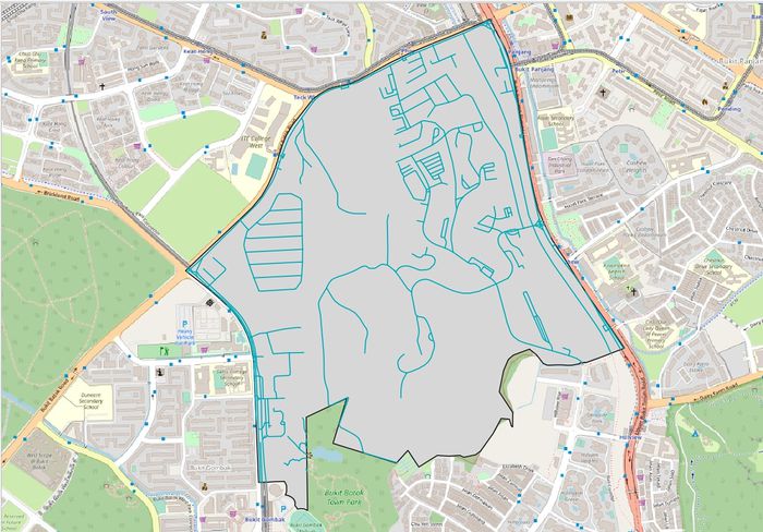
| + | [[File:Map Target Roads.jpg|700px|center]] | ||
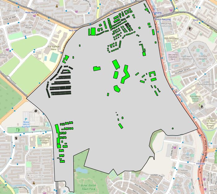
| + | [[File:Map Buildings.jpg|700px|center]] | ||
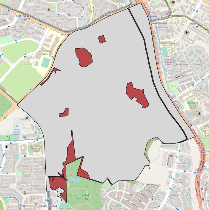
| + | [[File:Map Natural Features.jpg|700px|center]] | ||
| + | [[File:Map elevation.jpg|700px|center]] | ||
| + | |||
Firstly, the thematic mapping shown in figure 5 represents the default view of the map. School data points, map line and road network are shown on top of the OpenStreetMap. | Firstly, the thematic mapping shown in figure 5 represents the default view of the map. School data points, map line and road network are shown on top of the OpenStreetMap. | ||
| + | |||
| + | |||
<br> | <br> | ||
Revision as of 13:47, 3 November 2019
Part 1: Study Area Map Components
The following shows an overview of the study area and its map components we want to consider in this suitability land analysis for the Communicable Disease Quarantine Centre in Bukit Gombak:
FIGURE I
Study Area Map Components
Firstly, the thematic mapping shown in figure 5 represents the default view of the map. School data points, map line and road network are shown on top of the OpenStreetMap.
Part 2: Study Area Proximity Maps
FIGURE VIII
LAYERS EXPORTED
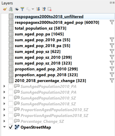
The choropleth mapping developed uses these following data and applied techniques:
Sources and Methods
Data Interpretation
Aged population (+65) in 2010 and 2018
FIGURE XXVI
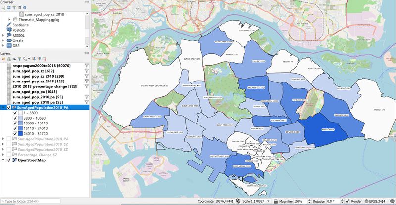
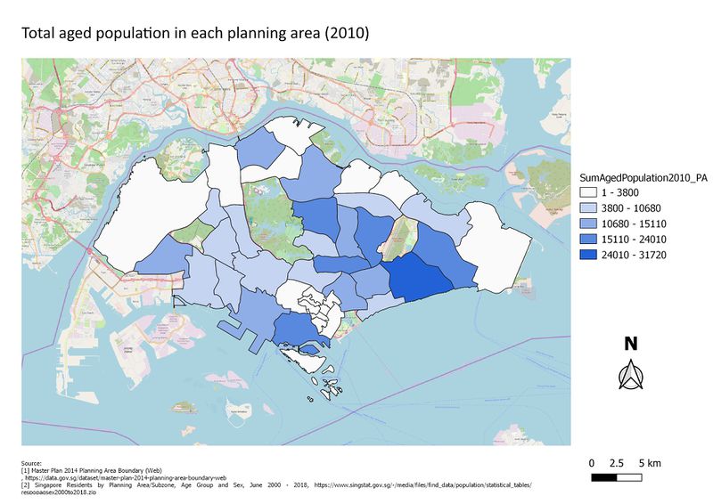
OVERVIEW MAP OF TOTAL AGED POPULATION IN 2010 BY PLANNING AREA
The plotted map above represents the total aged population (+65) in 2010 by each planning area at the macro level. We observe that there is a tendency that more of the aged population tend to reside in the east area, especially Bedok with an approximate figure of 31,720. Next, areas like Tampines, Hougang, Toa Payoh, Ang Mo Kio, and Bukit Merah were already recorded as areas with many older generations residing in 2010. The data classification excludes 0 as we are not interested in areas with unrecorded data as it doesn’t bring a value.
FIGURE XXVII
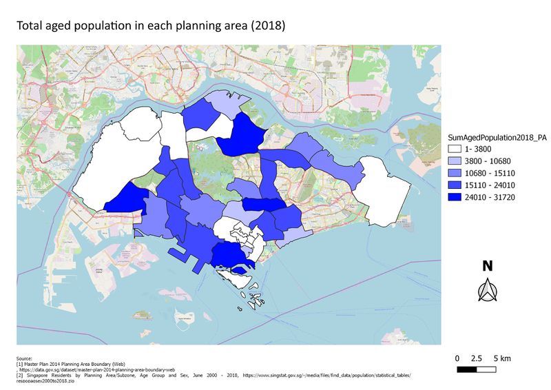
OVERVIEW MAP OF TOTAL AGED POPULATION IN 2018 BY PLANNING AREA
As we all already know that Singapore is one of the countries that is currently facing an aging population as a nation. In Figure XXVII, we can observe that the problem is currently displayed on the macro view of total aged population in 2018 map. We see areas like Woodlands which had a major increase of aged population from 12,580 to 22,040 in the span of 8 years and more such as: - Yishun, 12,810 in 2010 and 24,720 in 2018. - Punggol, 2,880 in 2010 and 10,930 in 2018. - Sengkang, 8,920 in 2010 and 20,400 in 2018. - Serangoon, 12,590 in 2010 and 20,150 in 2018. - Sembawang, 3,790 in 2010 and 7,230 in 2018. - Bishan, 8,850 in 2010 and 14,430 in 2018. - Toa Payoh, 18,610 in 2010 and 24,030 in 2018. - Novena, 6,110 in 2010 and 8,130 in 2018. - Kallang, 14,290 in 2010 and 19,890 in 2018. - Bukit Merah, 24,010 in 2010 and 31,490 in 2018. - Queenstown, 19,400 in 2010 and 19,400 in 2018. - Bukit Panjang, 8,270 in 2010 and 15,210 in 2018. While the above-mentioned planning areas have shown a significant increase there are locations that have been stagnant perhaps due to no recent surveys conducted yet and some areas experiencing decrease of aged population.
FIGURE XXVIII
OVERVIEW MAP OF TOTAL AGED POPULATION IN 2010 BY SUBZONE WITH LABEL
Figure XXVIII shows the total aged population of each subzone to provide a more detailed view in each subzone. Label attribute has been allocated to represent each subzone and easy reference which for the next map screenshots has been disabled for better classification analysis.
FIGURE XXIX
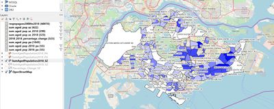
OVERVIEW MAP OF TOTAL AGED POPULATION IN 2010 BY SUBZONE WITHOUT LABEL
FIGURE XXX
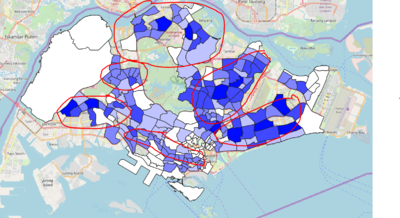
OVERVIEW MAP OF TOTAL AGED POPULATION IN 2018 BY SUBZONE WITHOUT LABEL THAT SHOWS INCREASE AGED POPULATION
Figure XXIX shows the total aged population of each subzone to provide a more detailed view in each subzone. Label attribute has been allocated to represent each subzone and easy reference which for the next map screenshots has been disabled for better classification analysis. The red indicated areas predominantly shown significant additional number of aged population.
FIGURE XXXI
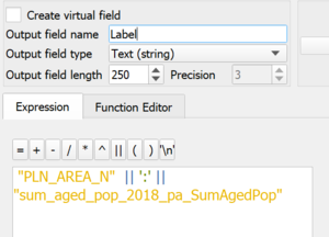
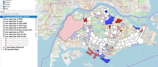
LABELLING FOR TOTAL AGED POPULATION BY PLANNING AREA/SUBZONE
Figure XXXI shows `Label` attribute created for both the aged population distribution by planning area and subzone for each of the map.
Proportional of aged population in 2010 and 2018
FIGURE XXXII
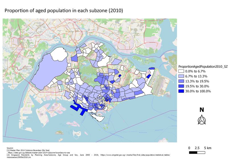
OVERVIEW MAP OF THE AGED POPULATION PROPORTION IN 2010 BY SUBZONE
FIGURE XXXIII
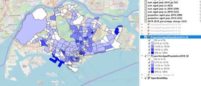
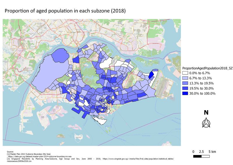
OVERVIEW MAP OF THE AGED POPULATION PROPORTION IN 2018 BY SUBZONE
We have seen the increase number of population total number for each planning area and subzone. However, we can’t seem to base the conclusion purely based on the increased number of aged population as we have to consider the proportion of non aged population to conclude that the proportion of the aged population is indeed increasing as to the overall population. We measure the proportion of the aged population with the following formulas:
● Total of aged population in 2010/total population in 2010.
● Total of aged population in 2018/total population in 2018.
Contrasting FIGURE XXXII and FIGURE XXXIIII we can see that in fact there is a trend of a spreading aged population especially in areas which used to be classified under 0% to 13.3% in 2010. In 2010, as we see that the increased proportion of the aged population has gone up to predominantly 6.7% to 19.5% with a spread across the subzones.
Percentage change of aged population between 2010 and 2018
Percentage Change only include those that has non 0 value in year 2010. Thus if 2018 have value it still doesn’t count as the percentage change is not valid,
FIGURE XXXIV
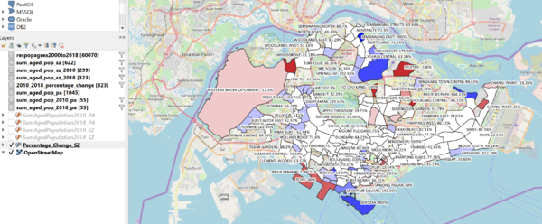
OVERVIEW MAP OFPERCENTAGE CHANGE BETWEEN 2010 & 2018 BY SUBZONE WITH LABEL
Figure XXXIV, shows the labeled region for the percentage of change between 2010 to 2018.
FIGURE XXXV
OVERVIEW MAP OFPERCENTAGE CHANGE BETWEEN 2010 & 2018 BY SUBZONE WITHOUT LABEL
To conclude the observation from the visualisation given, we apply percentage change of the aged population between 2010 and 2018. We are interested in knowing whether a particular region is experiencing a drop in the number of aged population or an increase. If there are either case we can to know the amount of increase and decrease. Firstly, we derive the percentage change shown in FIGURE XV. By applying negative and positive classification, we can conclude the extend of its aged population changed. While some areas are experiencing major increase of aged population like Alexandra Hill, Lower Seletar, Sembawang East and Pasir Ris Park, there are also areas that hand a major decrease of aged population like Pasir Panjang, Yio Chu Kang, Hougang Central, Seletar, Seletar Hills, Changi West, Changi Point, and Bugis. Interestingly, most subzones are in fact experiencing an increase of percentage change up to 6.7% indicated by the white subzones. Lastly, to end off it is crucial that the government will take into account the distribution of the aged population and redevelopment of programmes for the older generations. I believe that creating a tight-knit community also comes with being intentional in doing activities together, especially with those who are in the same generation. Next, with the current increasing rate of aging population which can be classified as pretty high, government can boost more initiatives in ensuring that we have enough next generations of leaders and citizens to carry on the Singapore successes in its development and economy as a nation.
Exported Maps from Map Composer
References
[1] https://data.gov.sg/dataset/school-directory-and-information
[2] https://data.gov.sg/dataset/master-plan-2014-land-use?resource_id=ea9f3b26-991f-48ea-ab58-e6b6d5fbaade
[3] https://data.gov.sg/dataset/national-map-line
[4] https://www.singstat.gov.sg/find-data/search-by-theme/population/geographic-distribution/latest-data
[5] https://plugins.qgis.org/plugins/GroupStats/
[6] https://data.gov.sg/dataset/master-plan-2014-subzone-boundary-no-sea
