Difference between revisions of "SMT201 AY2019-20T1 EX1 Wang Youjin"
| (One intermediate revision by the same user not shown) | |||
| Line 123: | Line 123: | ||
lang=EN-GB style='font-size:8.0pt;font-family:"Times New Roman",serif; | lang=EN-GB style='font-size:8.0pt;font-family:"Times New Roman",serif; | ||
mso-fareast-font-family:"Times New Roman";font-variant:small-caps;color:white'><span | mso-fareast-font-family:"Times New Roman";font-variant:small-caps;color:white'><span | ||
| − | style='color:windowtext'> | + | style='color:windowtext'>Proportion of Aged population of 2018</span></span></p> |
<p class=MsoNormal align=center style='text-align:center;line-height:normal'><span | <p class=MsoNormal align=center style='text-align:center;line-height:normal'><span | ||
lang=EN-GB style='font-size:8.0pt;font-family:"Times New Roman",serif; | lang=EN-GB style='font-size:8.0pt;font-family:"Times New Roman",serif; | ||
mso-fareast-font-family:"Times New Roman";font-variant:small-caps;color:white'><span | mso-fareast-font-family:"Times New Roman";font-variant:small-caps;color:white'><span | ||
| − | style='color:windowtext'> | + | style='color:windowtext'> |
</span></span></p> | </span></span></p> | ||
| Line 138: | Line 138: | ||
lang=EN-GB style='font-size:8.0pt;font-family:"Times New Roman",serif; | lang=EN-GB style='font-size:8.0pt;font-family:"Times New Roman",serif; | ||
mso-fareast-font-family:"Times New Roman";font-variant:small-caps;color:white'><span | mso-fareast-font-family:"Times New Roman";font-variant:small-caps;color:white'><span | ||
| − | style='color:windowtext'> | + | style='color:windowtext'>Proportion of Aged population of 2018</span></span></p> |
<p class=MsoNormal align=center style='text-align:center;line-height:normal'><span | <p class=MsoNormal align=center style='text-align:center;line-height:normal'><span | ||
lang=EN-GB style='font-size:8.0pt;font-family:"Times New Roman",serif; | lang=EN-GB style='font-size:8.0pt;font-family:"Times New Roman",serif; | ||
mso-fareast-font-family:"Times New Roman";font-variant:small-caps;color:white'><span | mso-fareast-font-family:"Times New Roman";font-variant:small-caps;color:white'><span | ||
| − | style='color:windowtext'> | + | style='color:windowtext'> |
</span></span></p> | </span></span></p> | ||
| Line 153: | Line 153: | ||
| − | + | The prominent difference is the increase in the ratio of aged population in the North region especially with the color block indication. | |
| − | |||
[[File:Wyj Difference.png|center|400px]] | [[File:Wyj Difference.png|center|400px]] | ||
| Line 160: | Line 159: | ||
lang=EN-GB style='font-size:8.0pt;font-family:"Times New Roman",serif; | lang=EN-GB style='font-size:8.0pt;font-family:"Times New Roman",serif; | ||
mso-fareast-font-family:"Times New Roman";font-variant:small-caps;color:white'><span | mso-fareast-font-family:"Times New Roman";font-variant:small-caps;color:white'><span | ||
| − | style='color:windowtext'> | + | style='color:windowtext'>& Change from 2010 to 2018 map</span></span></p> |
<p class=MsoNormal align=center style='text-align:center;line-height:normal'><span | <p class=MsoNormal align=center style='text-align:center;line-height:normal'><span | ||
lang=EN-GB style='font-size:8.0pt;font-family:"Times New Roman",serif; | lang=EN-GB style='font-size:8.0pt;font-family:"Times New Roman",serif; | ||
mso-fareast-font-family:"Times New Roman";font-variant:small-caps;color:white'><span | mso-fareast-font-family:"Times New Roman";font-variant:small-caps;color:white'><span | ||
| − | style='color:windowtext'> | + | style='color:windowtext'> |
</span></span></p> | </span></span></p> | ||
Latest revision as of 23:56, 15 September 2019
Part 1: Thematic Mapping
Explain how the mapping were developed with elaboration:
| Data | QGIS Techniques |
|---|---|
| 1.data.gov - “School Directory and Information” |
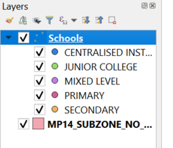
New Layer created: Schools created from csv file using Geocoding tool MMQGIS plugin. 'Address' attribute is used for openstreet map projection Distribution of school types: Under Symbology, select categoriszation by `mainlevel_` attribute.Different colors are used to indication different school types for easy illustrative reference purpose School types
Data not found CSV from geocoding: |
| 2.data.gov - “Masterplan 2014 Landuse” "National Map Line"
SLA - "Road Selection Line" |
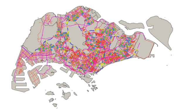
Layer Imported: Land Use, Road Selection Line, National Map Line Different color lines and width are used to represent different types of road with cateogirized technique performed on the map line layer use.Road_Type was created as the new column to assign category to each road based on its type. Road Network
|
| 3. data.gov - “MP14_SUBZONE_NO_SEA_PL” | Layer: MP14_SUBZONE_NO_SEA_PL
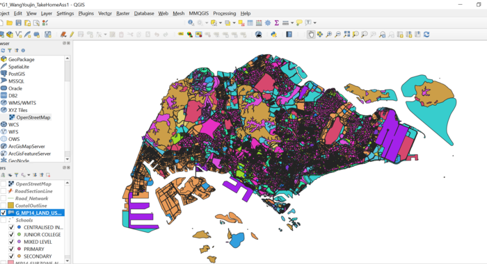
Categorization technique is used to indicate the land used for different purpose. <brt Land Use
|
Part 2: Choropleth Mapping
Below explain how the choropleth maps are developed and some elaboration.
| Data | QGIS Techniques |
|---|---|
| “Singapore Residents by Planning Area/Subzone, Age Group and Sex, June 2000 - 2018” from Department of Statistics Singapore. |
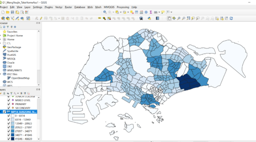
Layer: respopagsex2000to2018_ Processing: 1.Singapore's Aged Population (65+) in 2010 created new filtered layer with age 65+ and year = 2010. New column is created and caculated as the sum of the 65+ population for 2010. Join technique is used in the MP14 layer to join the Area Name. 2010 65+ Map
2.Singapore's Aged Population (65+) in 2018 created new filtered layer with age 65+ and year = 2018. New column is created and caculated as the sum of the 65+ population for 2018. Join technique is used in the new MP14 layer to join the Area Name. 2018 65+ Map
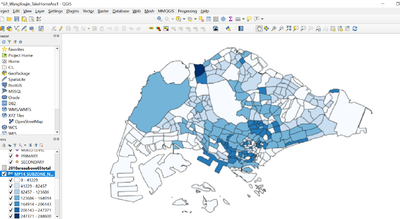
We are looking at the ratio of population that is above 65 and the total residence number The observation is that the 1)downtown area has a higher proportion of aged population. 2)North region also has high proportion of senior polulaiton. Proportion of Aged population of 2018
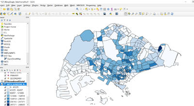
4.Proportion of Singapore's Aged Population in 2018 When we look at 2010 and 2018 map in terms of the aged population ratio that has been explained earlier. we can see that the 2018 statistics is more well spread as seen by the dark color block compared to that of 2010. This might be an indication of the aging population. Proportion of Aged population of 2018
|
| Percentage Change of Aged Population From 2010 to 2018 |
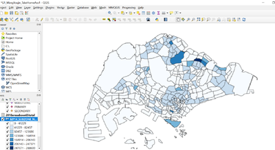
The prominent difference is the increase in the ratio of aged population in the North region especially with the color block indication. & Change from 2010 to 2018 map
|
