Difference between revisions of "SMT201 AY2019-20T1 EX1 Lee Yuan Kang"
Yklee.2017 (talk | contribs) |
Yklee.2017 (talk | contribs) |
||
| (17 intermediate revisions by the same user not shown) | |||
| Line 1: | Line 1: | ||
==Part 1 : Thematic maps== | ==Part 1 : Thematic maps== | ||
===Distribution of public education institution=== | ===Distribution of public education institution=== | ||
| − | [[File:Distribution of public education institution.png| | + | [[File:Distribution of public education institution.png|850px]] |
| − | The based map is using the Master Planning 2014 map from data.gov.sg. Using Master Planning map will be easier to | + | The based map is using the Master Planning 2014 map from data.gov.sg. Using Master Planning map will be easier to visualise as the image is clean. It is segregated based in the region with different colours. For all the points within the map are the different level of schools, and they are labelled with different icons and colours for the user to easily identify the location of the school. |
===Hierarchy of road network system of Singapore=== | ===Hierarchy of road network system of Singapore=== | ||
| + | [[File:Hierarchy of road network system of Singapore.png|850px]] | ||
| + | |||
| + | The background of the road is using MP planning area, which is clean and easy to visualise. The road is split by expressway, major roads and minor roads based on their road name. For example, highway and expressway will categorise as expressway under road type. The expressway will have bigger lines as it will be easier to identify. | ||
===2014 Master Plan Landuse=== | ===2014 Master Plan Landuse=== | ||
| + | [[File:2014 Master Plan Land use.png|850px]] | ||
| + | The background of the map is using Master Planning 2014 Landuse which present the land use planned and is separated based on the different purpose of use. As there are too many categories that will cause the map to be too cluttered, grouping the same categories together will be necessary. This visualisation will show the planned land use based on the categories and the categories are represented on different colours on the map. | ||
==Part 2 : Choropleth maps== | ==Part 2 : Choropleth maps== | ||
===Aged population (+65) in 2010 and 2018=== | ===Aged population (+65) in 2010 and 2018=== | ||
| + | [[File:Aged_population_more_than_65_in_2010.png|650px]] | ||
| + | [[File:Aged_population_more_than_65_in_2018.png|650px]] | ||
| + | |||
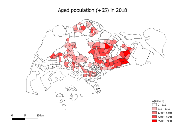
| + | From the chart, there is an increase in the age of 65 and above population. The charts show more areas are being shaded in darker tone in 2018 and spead across more areas in the map | ||
===Proportional of aged population in 2010 and 2018=== | ===Proportional of aged population in 2010 and 2018=== | ||
| + | [[File:Proportion of Age Population in 2018.png|650px]] | ||
| + | |||
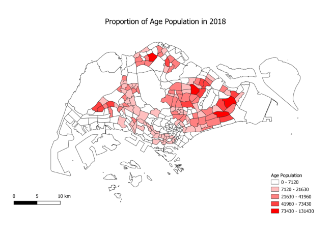
| + | The chart shows the population proportion of 2018 acoording to the density of the area. The darker the tone of red, the more dense the population is | ||
===Percentage change of aged population between 2010 and 2018=== | ===Percentage change of aged population between 2010 and 2018=== | ||
Latest revision as of 23:47, 15 September 2019
Part 1 : Thematic maps
Distribution of public education institution
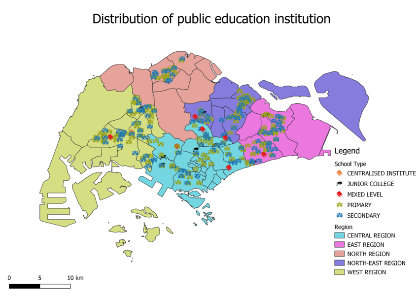
The based map is using the Master Planning 2014 map from data.gov.sg. Using Master Planning map will be easier to visualise as the image is clean. It is segregated based in the region with different colours. For all the points within the map are the different level of schools, and they are labelled with different icons and colours for the user to easily identify the location of the school.
Hierarchy of road network system of Singapore
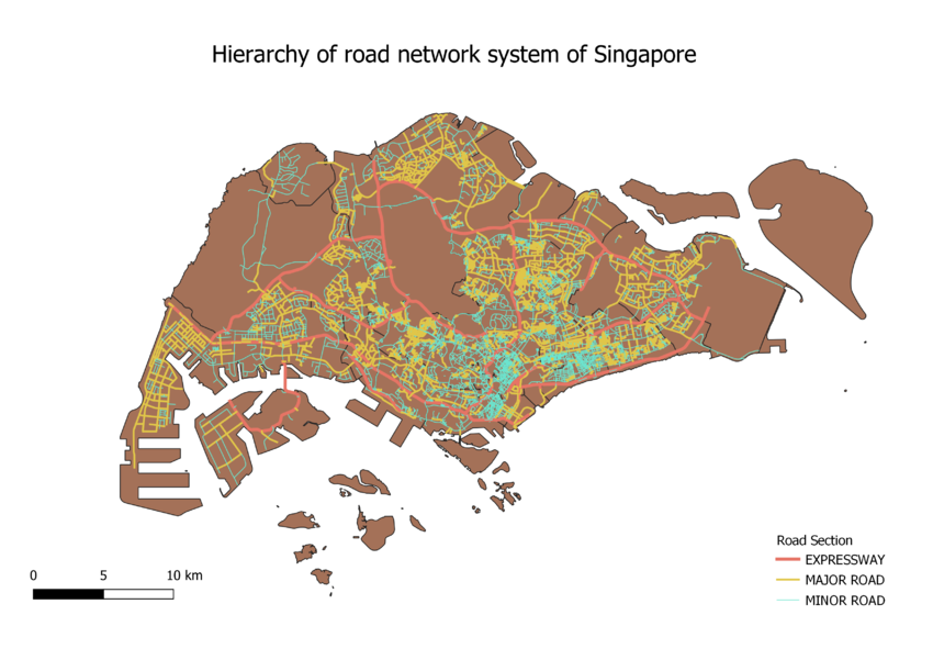
The background of the road is using MP planning area, which is clean and easy to visualise. The road is split by expressway, major roads and minor roads based on their road name. For example, highway and expressway will categorise as expressway under road type. The expressway will have bigger lines as it will be easier to identify.
2014 Master Plan Landuse
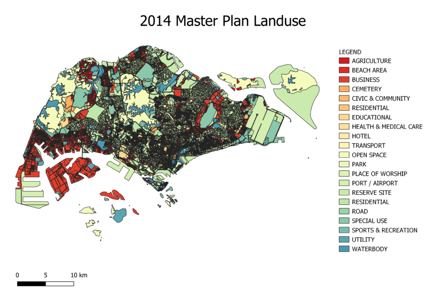
The background of the map is using Master Planning 2014 Landuse which present the land use planned and is separated based on the different purpose of use. As there are too many categories that will cause the map to be too cluttered, grouping the same categories together will be necessary. This visualisation will show the planned land use based on the categories and the categories are represented on different colours on the map.
Part 2 : Choropleth maps
Aged population (+65) in 2010 and 2018
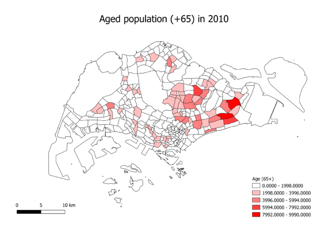
From the chart, there is an increase in the age of 65 and above population. The charts show more areas are being shaded in darker tone in 2018 and spead across more areas in the map
Proportional of aged population in 2010 and 2018
The chart shows the population proportion of 2018 acoording to the density of the area. The darker the tone of red, the more dense the population is
