Difference between revisions of "SMT201 AY2019-20G2 EX1 FAN YIXI"
| Line 32: | Line 32: | ||
'''Aged Population (+65) in 2010 and 2018''' | '''Aged Population (+65) in 2010 and 2018''' | ||
| − | [[File: | + | [[File:Proportional of aged population (2010).png|frameless]] |
<br> | <br> | ||
Revision as of 22:54, 15 September 2019
Part 1: Thematic Mapping
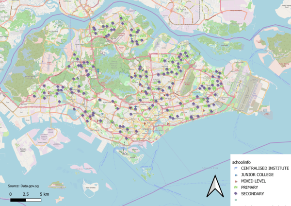
Distribution of Public Education Institution in Singapore
To depic the distribution of public education institution, I made use of the school information layer where the various institutions are categorized by school types.
Each school type is assigned to a specific SVG marker. I decided to use different markers such as books, location pin etc. for each school type in order to differentiate the different institutions.
I decided to use OSM instead of coastal outline for my background as it makes it clearer to the viewer, the institution options available in each subzones.
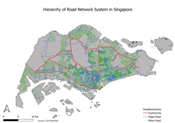
Hierarchy of Road Network Systemm in Singapore
This map shows the hierarchy of road network system in Singapore, classified under 3 main categories, expressway, major road and minor roads.
Making use of the GIS data from LTA, it allows us to separate the roads into the categories by using the RD_TYPE variable.
To highlight the hierarchy, the expressway lines are made thicker, followed by major road and minor road being the thinnest.
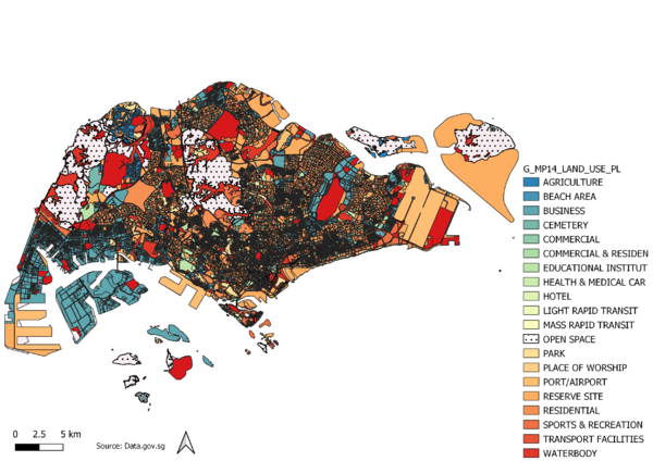
2014 Master Plan Landuse
Using the master plan land use GIS data, I have managed to plot a map representing the various use of land at the moment.
I made use of the “LU_DESC” variable to differentiate between the various categories, however I did make minor tweaks by creating a variable “CATEGORY”, categorizing some of the variables together. An example would be “Business” where I merged the numerous business variables together for easier reference.
For the map, I used the rainbow colour scheme on the areas except for “OPEN SPACE” which I feel that should have more focus to it as those are spaces available for development.
Part 2: Choropleth Mapping
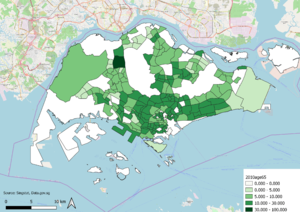
Aged Population (+65) in 2010 and 2018

To compare between the aged population (above 65) for both 2010 and 2018, i made use of the csv file from Singstat. I went on to make a new variable (Age65+) to group all residents above 65 and living in the same subzone together. This was done for both 2010 & 2018 before the map was plotted based on the number of people (above 65). The intensity of the colour corresponds with the no. of elderly living in the area. We can see that there was not much of a difference between 2010 & 2018 as the area with more elderly remains so.
Proportional of Aged Population in 2010 and 2018
[[1]]
Using the same csv file, I created a new variable called “TotalPop” to sum up the population per subzone, then used the “Age65+” variable to find the proportion of residents (above 65) in each of the subzone. Same as the previous maps, higher colour intensity meant that the percentage of elderly is higher. We realise that from 2010 to 2018, there are differences in intensity for some areas, especially near the south areas, where colour intensity grew.
Percentage change of Aged Population between 2010 and 2018
For all the choropleth mapping in part 2, I made use of graduated symbology as that allows us to visualize the differences based on the colour intensity. New variables were created along the way such as “TotalPop” which is a sum of all age groups as well as “Age65+” which is a sum of all age group above 65. With the new variables, it aids in the process of creating expressions to classify the various zones.


