Difference between revisions of "SMT201 AY2019-20G2 EX1 Ho Jing Yi"
| (9 intermediate revisions by the same user not shown) | |||
| Line 1: | Line 1: | ||
== Part 1: Thematic Mapping == | == Part 1: Thematic Mapping == | ||
=== Thematic Map showing the Distribution of Public Institutions in Singapore === | === Thematic Map showing the Distribution of Public Institutions in Singapore === | ||
| − | [[File:Distribution of Public Institutions in Singapore.png| | + | [[File:Distribution of Public Institutions in Singapore.png|950px]] |
| − | ''Source: School Directory and Information [https://data.gov.sg/dataset/school-directory-and-information]'' ''Coastal Outline: From Prof KAM Tin Seong's | + | ''Source: School Directory and Information [https://data.gov.sg/dataset/school-directory-and-information]'' ''Coastal Outline: From Prof KAM Tin Seong's HandsOn Ex.4'' |
To show the distribution of public institutions by school types in Singapore, I used various SVG markers to represent different school types. Since primary school accounted for the largest percentage of public institutions in Singapore, I decided to change the colour to black so it will not overshadow the rest of the institutions. For the rest of the institutions, I decided to use a mix of different vibrant colours so that it will appear more noticeable against the light blue coastal outline. | To show the distribution of public institutions by school types in Singapore, I used various SVG markers to represent different school types. Since primary school accounted for the largest percentage of public institutions in Singapore, I decided to change the colour to black so it will not overshadow the rest of the institutions. For the rest of the institutions, I decided to use a mix of different vibrant colours so that it will appear more noticeable against the light blue coastal outline. | ||
=== Thematic Map showing the Hierarchy of Road Network System of Singapore === | === Thematic Map showing the Hierarchy of Road Network System of Singapore === | ||
| − | [[File:Roadsection.jpg| | + | [[File:Roadsection.jpg|950px]] |
| + | |||
| + | ''Source: Road Section Line [https://www.mytransport.sg/content/mytransport/home/dataMall/search_datasets.html?searchText=road%20section]'' ''Coastal Outline: From Prof KAM Tin Seong's HandsOn Ex.4'' | ||
| + | |||
| + | I categorized the road in Singapore into 4 types based on their road name with reference to [https://remembersingapore.org/2018/08/15/singapore-street-suffixes/ Remembering Singapore's street suffixes]. I categorized road name that contains "Expressway", "Parkway", "Highway" into Expressway, road name that contains "Boulevard", "Avenue", "Way" into Major Road, road name that contains "Drive", "Street", "Road" into Minor Road and the rest into Local Access. The thickness of the line in the map is determined by how long and large the road is, in this case, expressway would be the thickest, followed by major, minor and then local access. A black coastal outline will also enable users to clearly see the strongly contrasted road system colours. | ||
| + | |||
| + | === Thematic Map showing 2014 Master Plan Landuse in Singapore === | ||
| + | [[File:Landuse1.jpg|950px]] | ||
| + | |||
| + | ''Source: LandUse in Singapore [https://data.gov.sg/dataset/master-plan-2014-land-use]'' | ||
| + | |||
| + | I created a new field where I categorized the field "LU_DESC" into 9 different categories such as business and commercial so as to create a better visualization of the different land use in Singapore for the user. Apart from that, I make sure that all 9 different categories are colored with contrasting colour so that user will be able to easily tell the different between them on the map. Since nature included 'Open Space' as well, I feel that it is relevant to make it the most striking colour so that urban planner will be able to easily identify the possible place that can be developed in the future. Since land use such as cemetery and worship place did not take up a huge area just by its own, I decided to categorized this type of land use into "Others" so that the map will not be overwhelm by too many categories. The 'Others' categories is coloured grey to prevent it from standing out compared to other categories. | ||
| + | |||
| + | == Part 2: Chloropleth Mapping == | ||
| + | === Chloropleth Map showing Aged Population in 2010 and 2018 === | ||
| + | [[File:2010age65.jpg|700px]] | ||
| + | [[File:2018Age65.jpg|700px]] | ||
| + | |||
| + | ''Source: Subzone Boundary [https://data.gov.sg/dataset/master-plan-2014-subzone-boundary-no-sea]'' ''Singapore Residents by Age Group and Subzone [https://www.singstat.gov.sg/find-data/search-by-theme/population/geographic-distribution/latest-data]'' | ||
| + | |||
| + | I relational joined two different layers: 'Subzone' and 'Residents by Age Group and Sub Zone' by comparing fields in this two layers and identifying the field that contains the same attributes. From there, I created a new field by summing up the residents that is above 65 years old (aged population) and then creates a gradient symbology using that field to show the different intensity of aged population in different parts of Singapore. The background is kept white so as to see the different intensity of the colour clearly and to minimize distraction. | ||
| + | |||
| + | In the map of 2010 and 2018, it show that the aged population is concentrated on the east west side of Singapore, based on the darker orange shown on the 2010 map and the darker purple shown on the 2018 map. | ||
| + | |||
| + | === Chloropleth Map showing Proportional of Aged Population in 2010 and 2018 === | ||
| + | [[File:Proportional2010.png|700px]] | ||
| + | [[File:Proportional2018.png|700px]] | ||
| + | |||
| + | ''Source: Subzone Boundary [https://data.gov.sg/dataset/master-plan-2014-subzone-boundary-no-sea]'' ''Singapore Residents by Age Group and Subzone [https://www.singstat.gov.sg/find-data/search-by-theme/population/geographic-distribution/latest-data]'' | ||
| + | |||
| + | To get the total population by subzone, I created a new field called "Whole population" and sum up all the relevant field using the field calculator function. Next, to derive the proportional aged population in 20XX, I used the formula: ''(Aged population in Singapore/Total population) * 100''. This formula will gives me the percentage of aged population over the total population in a particular subzone and it will then be used to creates a gradient symbology shown on the map. The background is kept white so as to see the different intensity of the colour clearly and to minimize distraction. | ||
| + | |||
| + | After comparing both map, I can see that there is not much changes in the proportion of aged population over the total population in 2010 and 2018. Both maps show that there is more proportion of aged residents living in the central-south side of Singapore based on the darker intensity of the colour that those area. | ||
| + | |||
| + | === Chloropleth Map Percentage Change of Aged Population between 2010 and 2018 === | ||
| + | [[File:PercentageChange2010to2018.png|950px]] | ||
| + | |||
| + | ''Source: Subzone Boundary [https://data.gov.sg/dataset/master-plan-2014-subzone-boundary-no-sea]'' ''Singapore Residents by Age Group and Subzone [https://www.singstat.gov.sg/find-data/search-by-theme/population/geographic-distribution/latest-data]'' | ||
| + | |||
| + | I relational joined two delimited text layer that contains data on population of 2010 and 2018 into a main subzone layer. After joining all 3 layers together, I proceed to create two new fields by summing up the aged population in 2010 and aged population in 2018 respectively. Next, I derived the percentage change of aged population between 2010 and 2018 with the formula: ''((Aged Population in 2018 - Aged Population in 2010)/Aged Population in 2010) * 100 '' Lastly, I used the newly computed percentage change data to creates a gradient symbology shown on the map. | ||
| + | |||
| + | From the map, it show that most area of Singapore have little to no growth in the number of aged residents between 2010 and 2018 based on the number of white area on the map. Areas that have the most percentage change will be located at the north side of Singapore and also, the north-east side of Singapore. | ||
| + | |||
| + | == Additional Notes: == | ||
| + | === Handling NULL Values === | ||
| + | To prevent myself from getting NULL value in the attributes table when I am working with QGIS, I make sure that I clean all the detail of the singapore residents by age group well before adding it as a text delimited layer in QGIS. Despite being cautious, NULL value still appeared in the attributes table. To get rid of these NULL value, I make sure of the expression function in QGIS to select all the features in NULL by typing 'Relevant_Field_name is NULL' in the expression box. After selecting all the features that is NULL, I used the field calculator function to change all the NULL value to the integer 0, getting rid of NULL values successfully. | ||
Latest revision as of 22:37, 15 September 2019
Part 1: Thematic Mapping
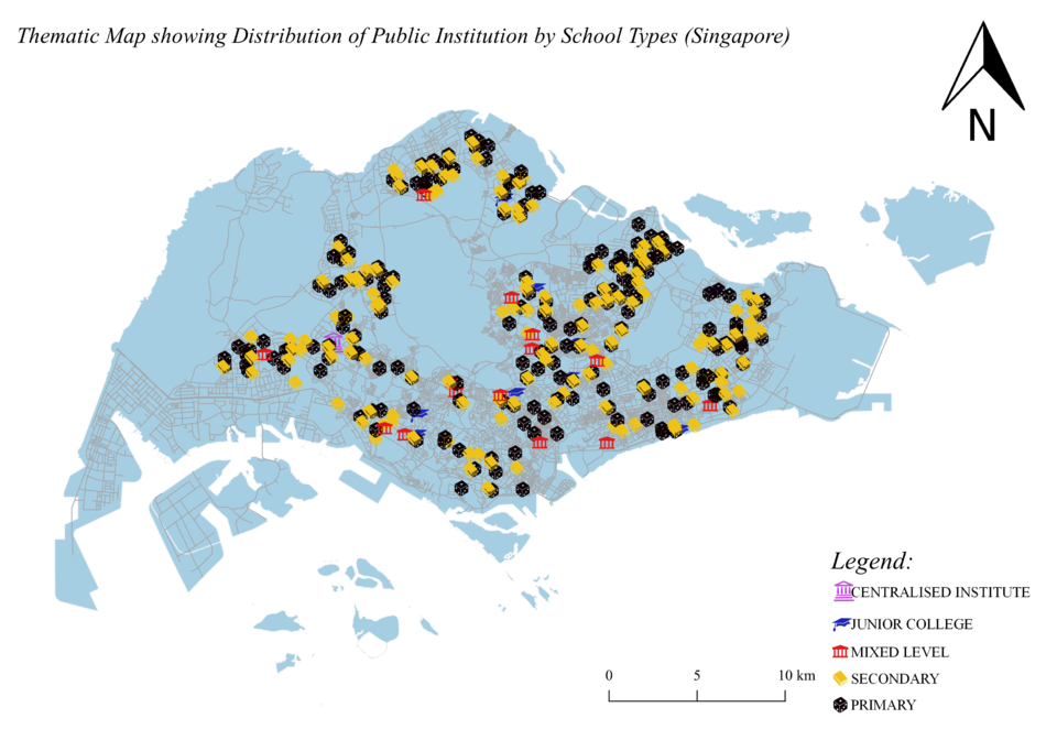
Thematic Map showing the Distribution of Public Institutions in Singapore
Source: School Directory and Information [1] Coastal Outline: From Prof KAM Tin Seong's HandsOn Ex.4
To show the distribution of public institutions by school types in Singapore, I used various SVG markers to represent different school types. Since primary school accounted for the largest percentage of public institutions in Singapore, I decided to change the colour to black so it will not overshadow the rest of the institutions. For the rest of the institutions, I decided to use a mix of different vibrant colours so that it will appear more noticeable against the light blue coastal outline.
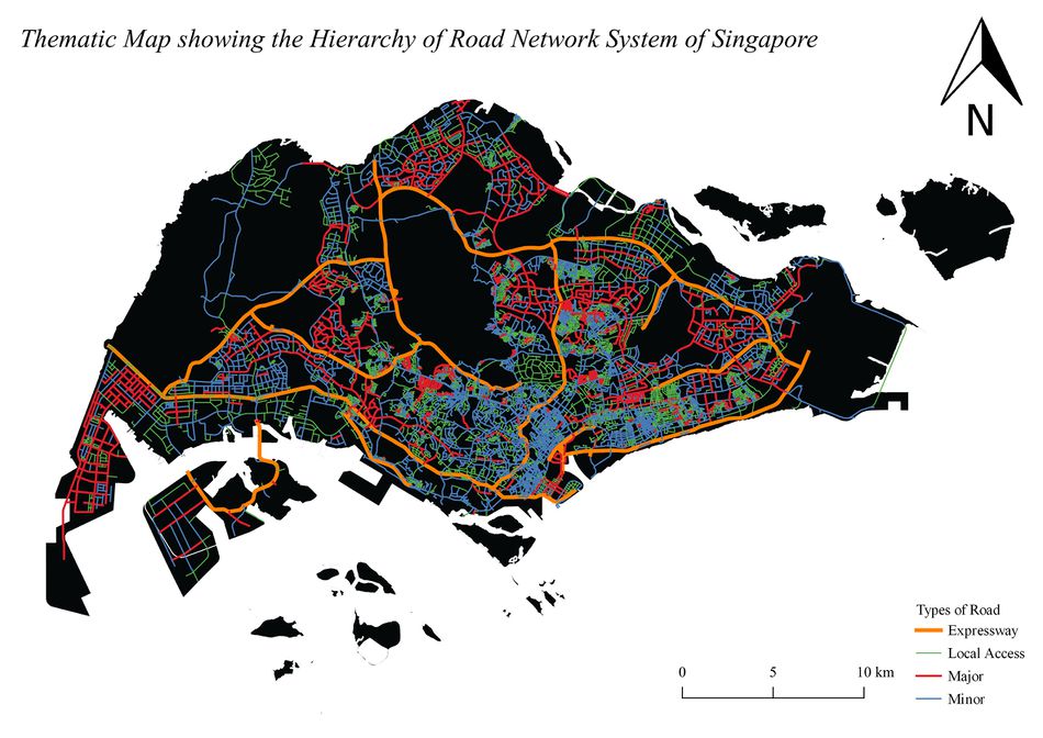
Thematic Map showing the Hierarchy of Road Network System of Singapore
Source: Road Section Line [2] Coastal Outline: From Prof KAM Tin Seong's HandsOn Ex.4
I categorized the road in Singapore into 4 types based on their road name with reference to Remembering Singapore's street suffixes. I categorized road name that contains "Expressway", "Parkway", "Highway" into Expressway, road name that contains "Boulevard", "Avenue", "Way" into Major Road, road name that contains "Drive", "Street", "Road" into Minor Road and the rest into Local Access. The thickness of the line in the map is determined by how long and large the road is, in this case, expressway would be the thickest, followed by major, minor and then local access. A black coastal outline will also enable users to clearly see the strongly contrasted road system colours.
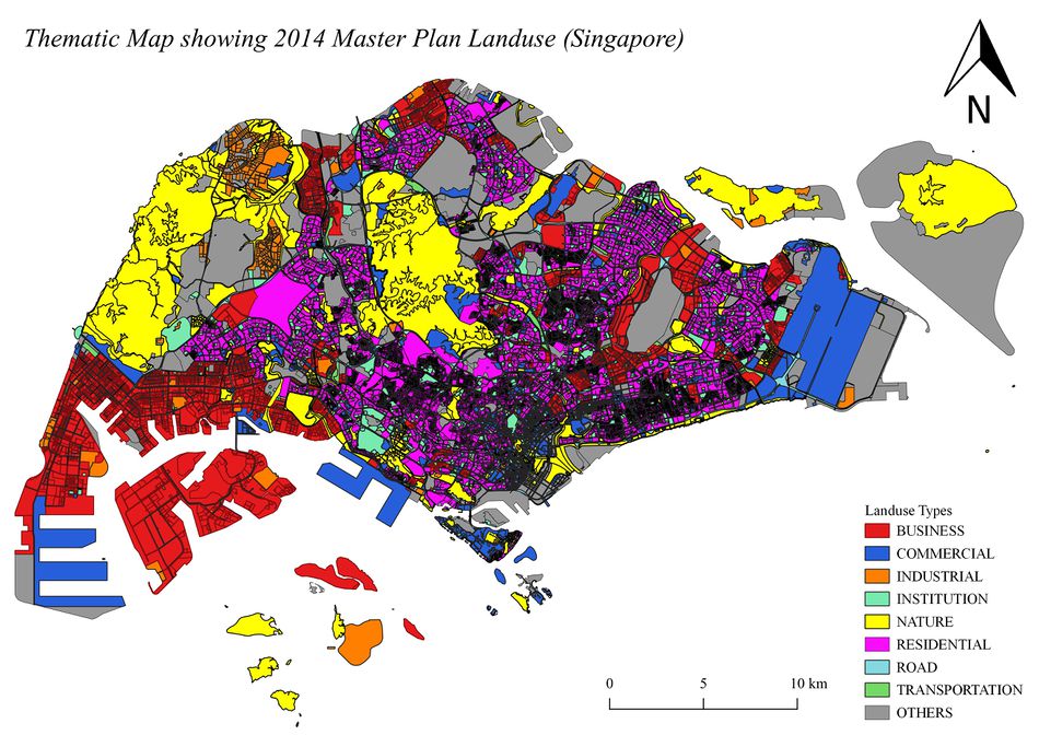
Thematic Map showing 2014 Master Plan Landuse in Singapore
Source: LandUse in Singapore [3]
I created a new field where I categorized the field "LU_DESC" into 9 different categories such as business and commercial so as to create a better visualization of the different land use in Singapore for the user. Apart from that, I make sure that all 9 different categories are colored with contrasting colour so that user will be able to easily tell the different between them on the map. Since nature included 'Open Space' as well, I feel that it is relevant to make it the most striking colour so that urban planner will be able to easily identify the possible place that can be developed in the future. Since land use such as cemetery and worship place did not take up a huge area just by its own, I decided to categorized this type of land use into "Others" so that the map will not be overwhelm by too many categories. The 'Others' categories is coloured grey to prevent it from standing out compared to other categories.
Part 2: Chloropleth Mapping
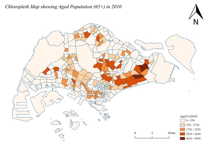
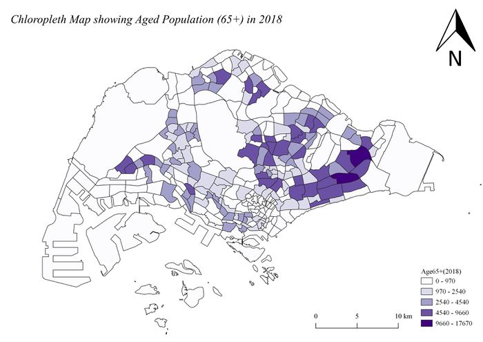
Chloropleth Map showing Aged Population in 2010 and 2018
Source: Subzone Boundary [4] Singapore Residents by Age Group and Subzone [5]
I relational joined two different layers: 'Subzone' and 'Residents by Age Group and Sub Zone' by comparing fields in this two layers and identifying the field that contains the same attributes. From there, I created a new field by summing up the residents that is above 65 years old (aged population) and then creates a gradient symbology using that field to show the different intensity of aged population in different parts of Singapore. The background is kept white so as to see the different intensity of the colour clearly and to minimize distraction.
In the map of 2010 and 2018, it show that the aged population is concentrated on the east west side of Singapore, based on the darker orange shown on the 2010 map and the darker purple shown on the 2018 map.
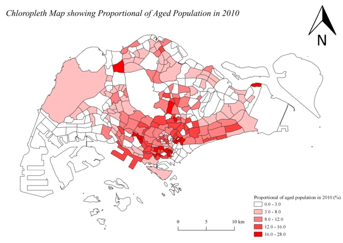
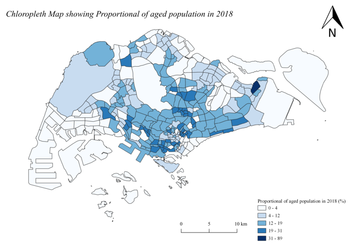
Chloropleth Map showing Proportional of Aged Population in 2010 and 2018
Source: Subzone Boundary [6] Singapore Residents by Age Group and Subzone [7]
To get the total population by subzone, I created a new field called "Whole population" and sum up all the relevant field using the field calculator function. Next, to derive the proportional aged population in 20XX, I used the formula: (Aged population in Singapore/Total population) * 100. This formula will gives me the percentage of aged population over the total population in a particular subzone and it will then be used to creates a gradient symbology shown on the map. The background is kept white so as to see the different intensity of the colour clearly and to minimize distraction.
After comparing both map, I can see that there is not much changes in the proportion of aged population over the total population in 2010 and 2018. Both maps show that there is more proportion of aged residents living in the central-south side of Singapore based on the darker intensity of the colour that those area.
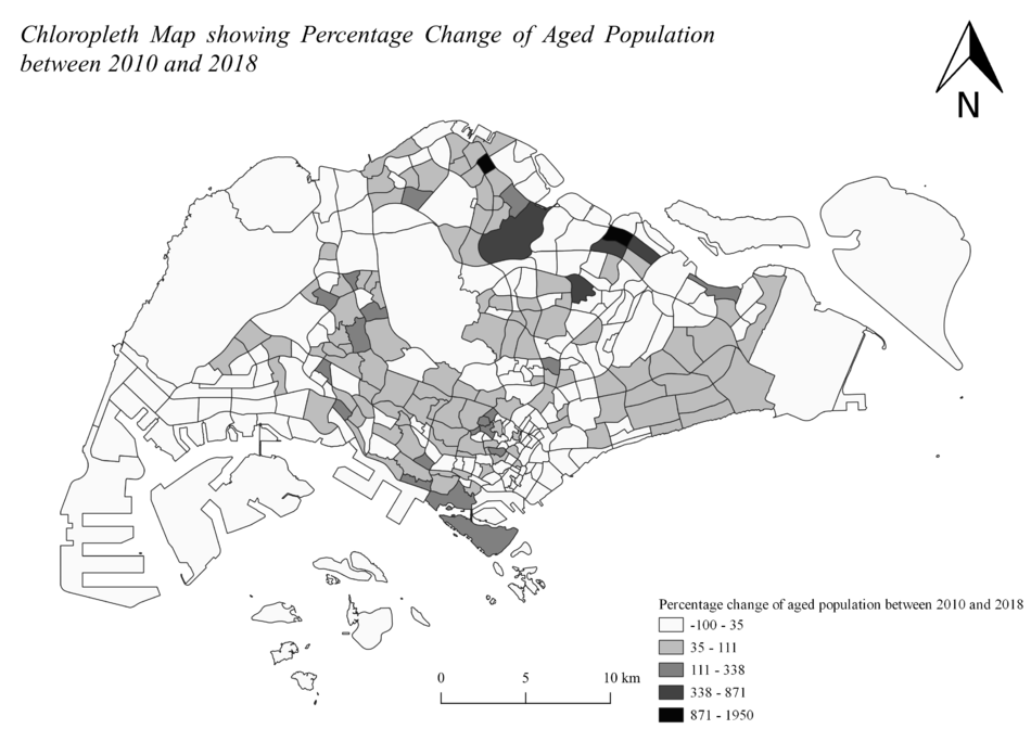
Chloropleth Map Percentage Change of Aged Population between 2010 and 2018
Source: Subzone Boundary [8] Singapore Residents by Age Group and Subzone [9]
I relational joined two delimited text layer that contains data on population of 2010 and 2018 into a main subzone layer. After joining all 3 layers together, I proceed to create two new fields by summing up the aged population in 2010 and aged population in 2018 respectively. Next, I derived the percentage change of aged population between 2010 and 2018 with the formula: ((Aged Population in 2018 - Aged Population in 2010)/Aged Population in 2010) * 100 Lastly, I used the newly computed percentage change data to creates a gradient symbology shown on the map.
From the map, it show that most area of Singapore have little to no growth in the number of aged residents between 2010 and 2018 based on the number of white area on the map. Areas that have the most percentage change will be located at the north side of Singapore and also, the north-east side of Singapore.
Additional Notes:
Handling NULL Values
To prevent myself from getting NULL value in the attributes table when I am working with QGIS, I make sure that I clean all the detail of the singapore residents by age group well before adding it as a text delimited layer in QGIS. Despite being cautious, NULL value still appeared in the attributes table. To get rid of these NULL value, I make sure of the expression function in QGIS to select all the features in NULL by typing 'Relevant_Field_name is NULL' in the expression box. After selecting all the features that is NULL, I used the field calculator function to change all the NULL value to the integer 0, getting rid of NULL values successfully.
