Difference between revisions of "SMT201 AY2019-20T1 EX1 Heng Bing Chow"
Bcheng.2018 (talk | contribs) |
Bcheng.2018 (talk | contribs) |
||
| (2 intermediate revisions by the same user not shown) | |||
| Line 5: | Line 5: | ||
[[File:Schools in Singapore by School Type.png|700px|center|Schools in Singapore by School Type]] | [[File:Schools in Singapore by School Type.png|700px|center|Schools in Singapore by School Type]] | ||
| − | + | This map is done using Categorized Symbology, to represent the different types of education instituition in Singapore. The schools are represented by: | |
| − | + | P for Primary, Baby Symbol for Secondary, Graduation Hat for Mixed Level, ABC board for Junior College, Stack of Books for Centralised Institute. | |
| − | + | <br> | |
| − | + | Based on the map, Singapore has a higher number of Primary and Secondary schools. | |
| − | |||
| − | |||
| − | |||
| − | |||
Source: https://www.data.gov.sg/dataset/school-directory-and-information | Source: https://www.data.gov.sg/dataset/school-directory-and-information | ||
| − | |||
| − | |||
| Line 26: | Line 20: | ||
[[File:Road Section Line.png|700px|center|Road GIS in Singapore]] | [[File:Road Section Line.png|700px|center|Road GIS in Singapore]] | ||
| − | + | Using the same method of classification as above (Categorized), the Map displays the different types of road we have in Singapore (Expressway, Major Arterial and Minor Arterial) | |
| − | + | <br> | |
| − | + | Expressways are shown as Green Lines, as green typically means 'GO' in traffic, and expressways do not have any traffic lights so the traffic is always 'GO'-ing. | |
| − | + | The rest of the road types were identified using the Streets and Building Names handbook obtained from ura.gov.sg. | |
| − | |||
| − | |||
| − | |||
| − | |||
| − | |||
| − | |||
| Line 47: | Line 35: | ||
[[File:MP14 Land Use (for wiki).png|700px|center|Singapore's Land Use based on MP14]] | [[File:MP14 Land Use (for wiki).png|700px|center|Singapore's Land Use based on MP14]] | ||
| − | + | Using Categorized Symbology again, the map displays the different types of land use purpose in Singapore, denoted by the different color schemes. | |
| − | + | From the map, we can infer that majority of Singapore's utility is located at West Singapore. | |
| − | |||
| − | |||
Source: | Source: | ||
| Line 64: | Line 50: | ||
[[File:2018 Age65 and above.png|700px|center]] | [[File:2018 Age65 and above.png|700px|center]] | ||
| + | Both maps show the Aging Population in Singapore for 2010 and 2018 respectively. The darker the shade, the larger the number in the subzone. <br> | ||
| + | We can conclude from both maps that there is a increase in aging population from 2010 as denoted by the increase in more areas with darker shades. | ||
| − | |||
| − | |||
| − | + | '''Proportion of aged population in 2010 and 2018''' | |
| − | + | [[File:2010 Proportion of Aged Population in Singapore.png|700px|center|2010 Proportion of Aged Population in Singapore]] | |
| − | + | [[File:2018 Proportion of Aged Population in Singapore.png|700px|center]] | |
| − | |||
| + | Both maps show the Proportion of aged population in 2010 and 2018 respectively. As per the previous maps, the darker the shade, <br> | ||
| + | the larger the proportion in the subzone. While one might think that 2010 has a higher proportion of Aged Population, we need to look carefully at the legend.<br> | ||
| + | 2018's Proportion numbers are higher than 2010's. | ||
| − | |||
| − | |||
| − | + | '''Percentage change of aged population between 2010 and 2018''' | |
| − | + | [[File:Percentage Change in Aged Population between 2010 and 2018.png|700px|center|Percentage Change in Aged Population between 2010 and 2018]] | |
| − | |||
| − | + | On the map, blue represents areas in Singapore with the highest decreasing change in Aged Population while red represents the highest increasing change. | |
| − | |||
| − | |||
| − | |||
| − | |||
| + | Purple areas represent minimal changes in aged population. | ||
| + | Source: https://data.gov.sg/dataset/master-plan-2014-subzone-boundary-no-sea | ||
| + | https://www.singstat.gov.sg/find-data/search-by-theme/population/geographic-distribution/latest-data | ||
| − | + | ==Discussion== | |
| + | I obtained the Singapore Population data from Singstat in Excel format, and then separated them into 2 csv files by year (2010 and 2018). | ||
| + | Some examples of data cleaning I did to the csv files were: Changing the Subzone column entries all to uppercase by using the UPPER formula in excel, | ||
| − | + | removing unnecessary columns and replacing all the dashes to 0 (as mentioned in class by Prof). Once the data has been cleaned, | |
| + | I added the delimited text layers into QGIS and joined both csv files to MP14 subzone layer, as required by the question. | ||
| − | + | Next, using field calculator, I created the Age65+ column by summing up all age groups above 65 for both 2010 and 2018. | |
| − | + | Next, I created the column for proportion of aged population for both years using this formula: (age65+ / Total Population) | |
| − | + | Finally, for Percentage change from 2010 to 2018, I used this formula: (Proportion of Aged Population in 2018 - Proportion of Aged Population in 2010). | |
| − | + | Once all the columns were added, I proceeded to do the Choropleth maps by using Graduated symbology. I used a red color ramp for 2010 and a blue color ramp for 2018 | |
| − | + | to make it easier for users to differentiate between the two years. | |
| − | + | The deeper the degree of color, the bigger the number in a subzone. E.g. In 2018, Tampines and Bedok North had the highest number of Aged Population across all of Singapore. | |
| − | |||
| − | |||
Latest revision as of 22:02, 15 September 2019
Part 1: Thematic Mapping
Distribution of public education institution by school types
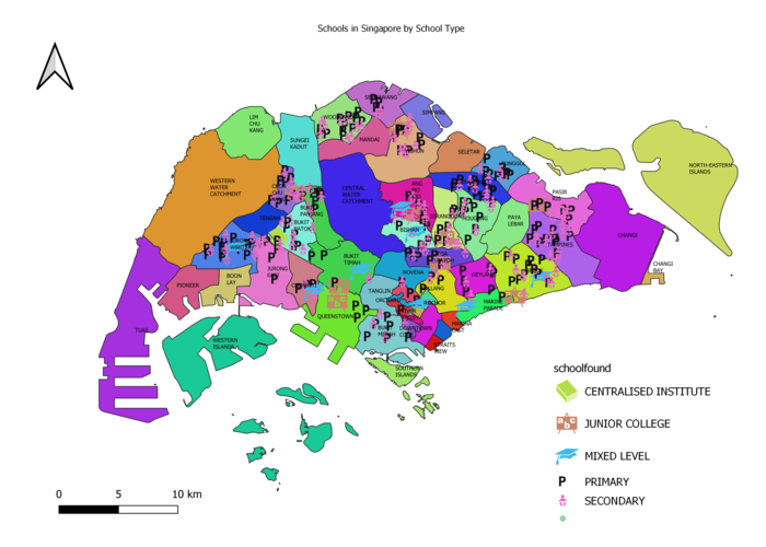
This map is done using Categorized Symbology, to represent the different types of education instituition in Singapore. The schools are represented by:
P for Primary, Baby Symbol for Secondary, Graduation Hat for Mixed Level, ABC board for Junior College, Stack of Books for Centralised Institute.
Based on the map, Singapore has a higher number of Primary and Secondary schools.
Source: https://www.data.gov.sg/dataset/school-directory-and-information
Road Network System of Singapore
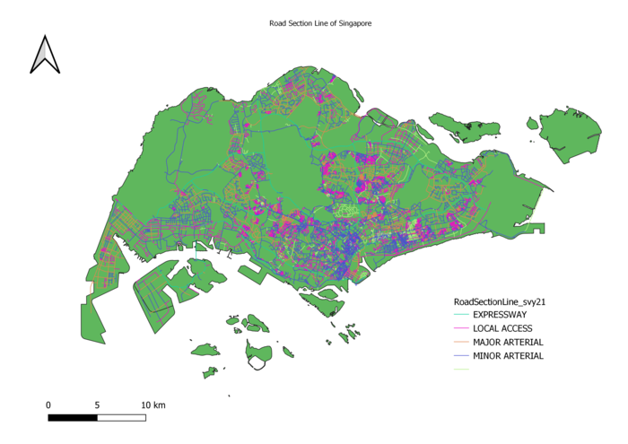
Using the same method of classification as above (Categorized), the Map displays the different types of road we have in Singapore (Expressway, Major Arterial and Minor Arterial)
Expressways are shown as Green Lines, as green typically means 'GO' in traffic, and expressways do not have any traffic lights so the traffic is always 'GO'-ing.
The rest of the road types were identified using the Streets and Building Names handbook obtained from ura.gov.sg.
2014 Master Plan Landuse
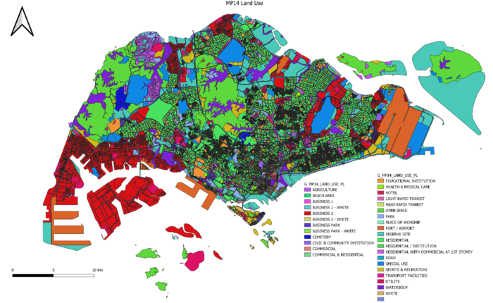
Using Categorized Symbology again, the map displays the different types of land use purpose in Singapore, denoted by the different color schemes. From the map, we can infer that majority of Singapore's utility is located at West Singapore.
Part 2: Choropleth Mapping
Aged population (+65) in 2010 and 2018
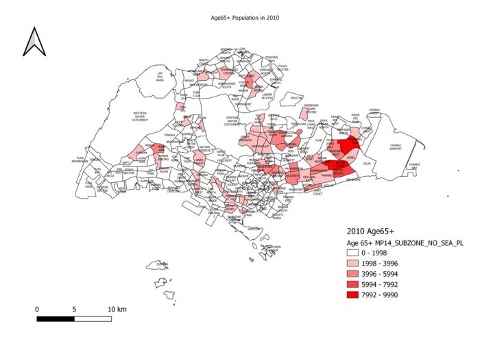
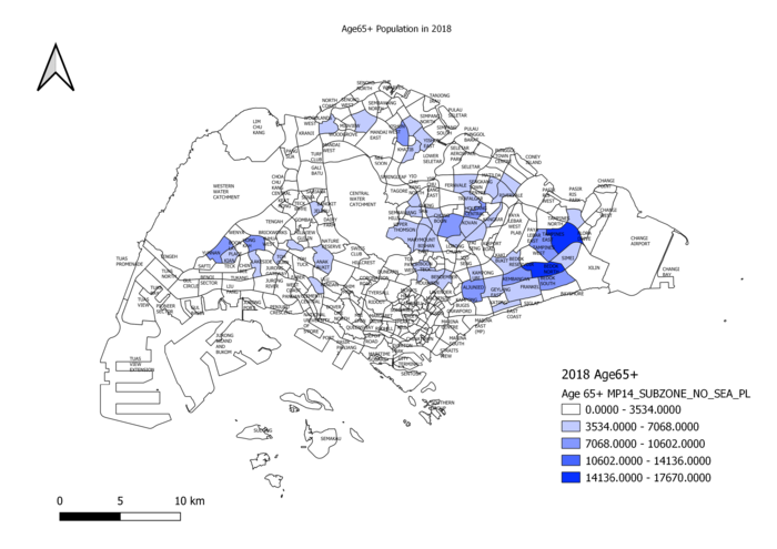
Both maps show the Aging Population in Singapore for 2010 and 2018 respectively. The darker the shade, the larger the number in the subzone.
We can conclude from both maps that there is a increase in aging population from 2010 as denoted by the increase in more areas with darker shades.
Proportion of aged population in 2010 and 2018
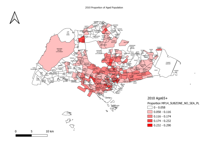
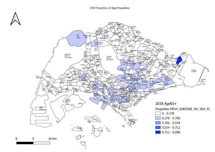
Both maps show the Proportion of aged population in 2010 and 2018 respectively. As per the previous maps, the darker the shade,
the larger the proportion in the subzone. While one might think that 2010 has a higher proportion of Aged Population, we need to look carefully at the legend.
2018's Proportion numbers are higher than 2010's.
Percentage change of aged population between 2010 and 2018
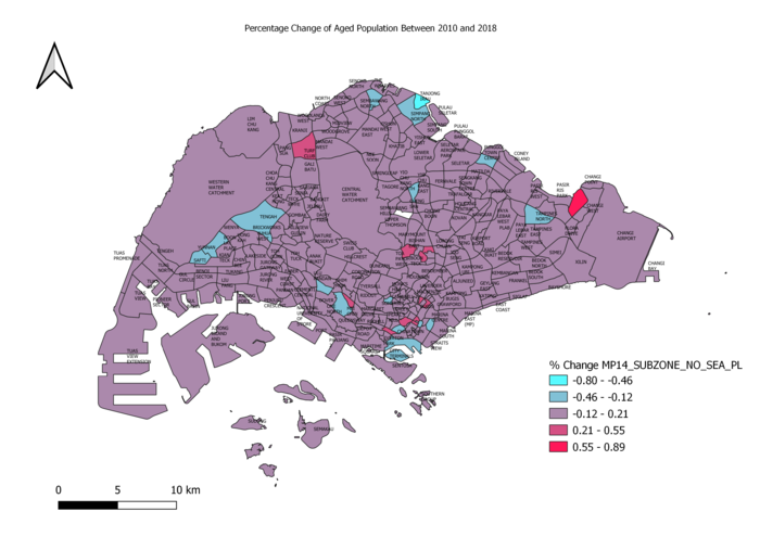
On the map, blue represents areas in Singapore with the highest decreasing change in Aged Population while red represents the highest increasing change.
Purple areas represent minimal changes in aged population.
Source: https://data.gov.sg/dataset/master-plan-2014-subzone-boundary-no-sea
https://www.singstat.gov.sg/find-data/search-by-theme/population/geographic-distribution/latest-data
Discussion
I obtained the Singapore Population data from Singstat in Excel format, and then separated them into 2 csv files by year (2010 and 2018).
Some examples of data cleaning I did to the csv files were: Changing the Subzone column entries all to uppercase by using the UPPER formula in excel,
removing unnecessary columns and replacing all the dashes to 0 (as mentioned in class by Prof). Once the data has been cleaned,
I added the delimited text layers into QGIS and joined both csv files to MP14 subzone layer, as required by the question.
Next, using field calculator, I created the Age65+ column by summing up all age groups above 65 for both 2010 and 2018.
Next, I created the column for proportion of aged population for both years using this formula: (age65+ / Total Population)
Finally, for Percentage change from 2010 to 2018, I used this formula: (Proportion of Aged Population in 2018 - Proportion of Aged Population in 2010).
Once all the columns were added, I proceeded to do the Choropleth maps by using Graduated symbology. I used a red color ramp for 2010 and a blue color ramp for 2018
to make it easier for users to differentiate between the two years.
The deeper the degree of color, the bigger the number in a subzone. E.g. In 2018, Tampines and Bedok North had the highest number of Aged Population across all of Singapore.
